portfolio

Topsafe

By | @YESstudio | No Comments

topsafe-1
topsafe-2
topsafe-3

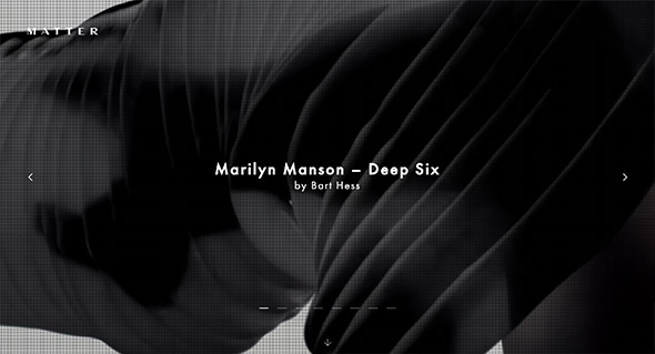
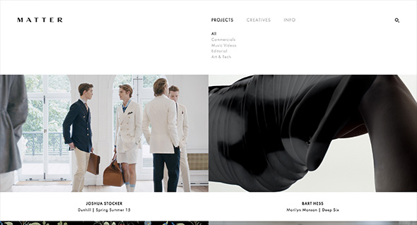
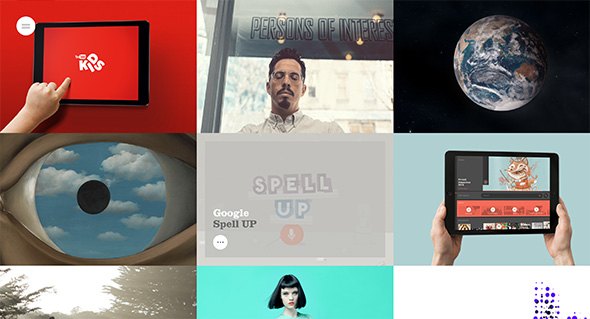
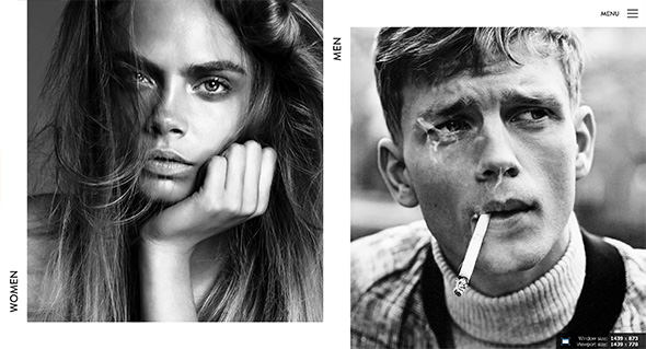
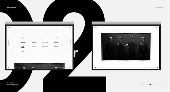
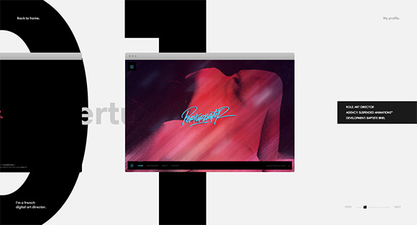
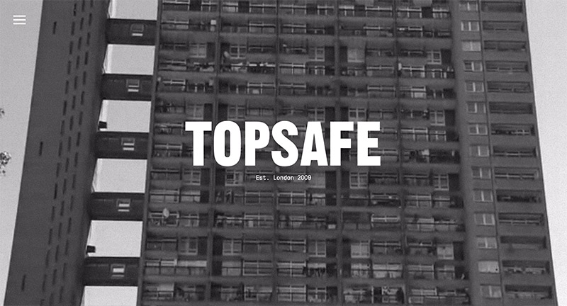
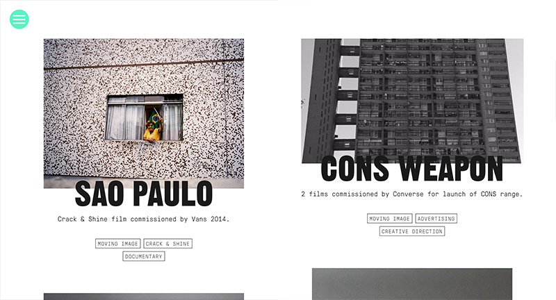
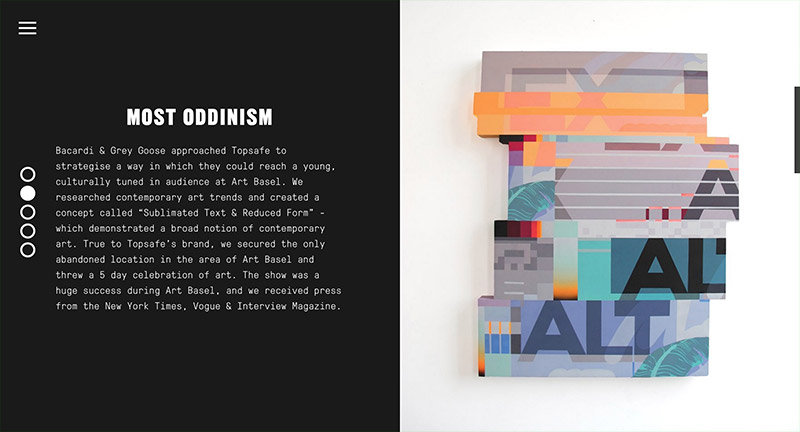
Site for Topsafe London, agency that helps connects brands to culture. Site features bold typography, and large photography, love the tiles – some animated and nice hints of colour. The feature pages are more like a magazine, with large pages that scroll into view and lock, like pages in a magazine. Large sliding menu is a nice touch.

Created by YES Studio (@YESstudio).

Site here…

Anton & Irene

By | @antonandirene | No Comments

anton-1 anton-2 anton-3

Site of new New York based creative duo & agency Anton & Irene. Lovely dynamic layout, combining nice typography, bold imagery and a playful elegance featuring the main protagonists Anton & Irene in a series of fun photographs. Nice showcase of what they are involved with from talks, conferences, and of course creating work. Love the in-depth case studies on their latest projects, where they talk about the process and the amount of thought and consideration that goes into each project. Love the feeling of energy in the layout and the personality which shines through, it is also responsive. Great example of a modern folio site.

Created by Anton & Irene (@antonandirene) and Oleg Chulakov Studio (@chulakov).

Site here…

Work & Co

By | @workandco | No Comments

work-1
work-2
work-3

Lovely site for digital agency Work & Co. Detailing their ethos, approach, and body of work in an elegant and effective way. Love the menu toggle – really fresh idea – to zoom out and see all the pages in a form of visual index. Love the splashes of colour here and there and the really nice typography used throughout the site – see the ‘facts’ page. It is responsive and reacts really nice to devices and screen size changes – works really well.

Created by Work & Co (@workandco).

Site here…

Do Amaral A

By | @oamaral | No Comments

andre-1
andre-2
andre-3

Slick portfolio of Brazilian Art Director and Designer Andre Do Amaral. Love the homepage with large bold typography and simple vertically scrolling carousel – click on a project and it transitions to full screen. Feels like a slick well crafted experience, which explains the projects in a very visual way – lots of nice transitions. Lots of very high quality work in there, and all wrapped up in this responsive, slick, and elegant portfolio.

Created by Andre Do Amaral (@oamaral).

Site here…

Mario Testino

By | @marckremers | No Comments

mario-1
mario-2
mario-3
mario-4
mario-5

Lovely new site for the famous photographer Mario Testino. Well thought out and considered, a fresh approach to the photographer’s portfolio. Love the news feed highlighting the latest projects, the project view, where scrolling down scrolls the photos horizontally, and at the end of the page – suggested next reading, and other useful links. There are loads on nice little details like these dotted all over the site. On top of this it all looks great, works really nicely and is responsive too, working great on mobile and tablet.

Created by Marc Kremers (@marckremers).

Site here…

Matter Productions

By | @webdesign | No Comments

matter-1
matter-2
matter-3

Site for Matter Production agency in London. Slick, simple and elegant – the site highlights their film projects spanning fashion, luxury and music. Nice use of video in the main carousel and layout which frames the content well, and the elegant transitions which bring in sliding panels of information.

Site here…

Benoit Senand

By | @nebnes | No Comments

ben-1
ben-2
ben-3

Fun portfolio of French interaction designer Benoit Senand. Bold colours mixed with minimal 3d models reveal some interesting work with robots, physical and digital interactions, and even lego printers. Some nice transitions and interactions bring it all to life in a playful way.

Created by Benoit Senand (@nebnes).

Site here…

Hello Monday

By | @hellomondaycom | No Comments

monday-1
monday-2
monday-3

Lovely new portfolio for Danish digital agency Hello Monday. Vibrant and dynamic – I love the way colour plays a big part in each of the project case studies. The sliding panels for additional content and smooth animations all add to the slickness – the editorial style layout giving a great readable experience and looks fantastic. Nice little touches and attention to detail such as the mouseover effects that add a bit of personality and depth. Great example of a modern responsive agency folio.

Created by Hello Monday (@hellomondaycom).

Site here…

Elite Model France

By | @verde_io | No Comments

elite-1
elite-2
elite-3

Nice site for Elite Models in France. Slick and simple, love the offset grid for all the models and bold photographic approach. Lots of nice transitions for the various panels and interface, which creates an elegant and professional experience. It looks great, with nice use of white space and allowing the imagery to do the talking.

Created by Verde (@verde_io).

Site here…

2A Studio

By | @bong_intl | No Comments

2a-1
2a-2
2a-3

Portfolio of London based multi-discipline studio 2A. Very simple site, some nice hero images using a nice depth of field effect to let you focus on the particular projects. Really nice way of putting together something visually interesting when there isn’t so much content available – a fun interaction to play around with.

Created by Bong (@bong_intl).

Site here…

Blitz

By | @BLITZagency | No Comments

blitz-1
blitz-2
blitz-3

New site for Blitz, digital agency in California. Nice and refreshing approach to an agency site – with a quasi-3d scrolling interface. Bold and bright, each section is full of information about the agency – like their approach to the project showcase – which feels like a slick presentation of videos and visuals. Lots of nice little details such as the menu to the left, really fresh agency site.

Created by BLITZ (@BLITZagency).

Site here…

Rockwell Group

By | @codeandtheory | No Comments

rockwell-1
rockwell-2
rockwell-3

Stunning site for Rockwell Group – cross-disciplinary architecture and design practice. Bold and beautiful design feels like reading a top end design magazine. Love the energy in the layouts and movement created by the offset grid and the various templates making up the pages. Projects are presented in a really dynamic way, with bold typography and large imagery and some intelligent sticky elements when scrolling to reveal details about each project. Not only does the site look great, but it also responsive and looks great also on mobile devices – one of the best responsive sites i’ve ever seen. This is what modern web design is all about, beautiful layouts, great functionality, simplicity and elegance.

Created by Code and Theory (@codeandtheory).

Site here…

Slanted

By | @raphaelbastide | No Comments

slanted-1
slanted-2
slanted-3

Unique site for photographer Enrico Floriddia. Love the CV-esque approach that explains the work through writing rather than simple thumbnails, click on one of the projects and viola thumbnails appear, click on them and see how it all expands. Really nice, unexpected, original execution of a portfolio website.

Created by Raphael Bastide (@raphaelbastide).

Site here…