europe

Nokia – Somebody Else’s Phone

By | WEBSITES | No Comments

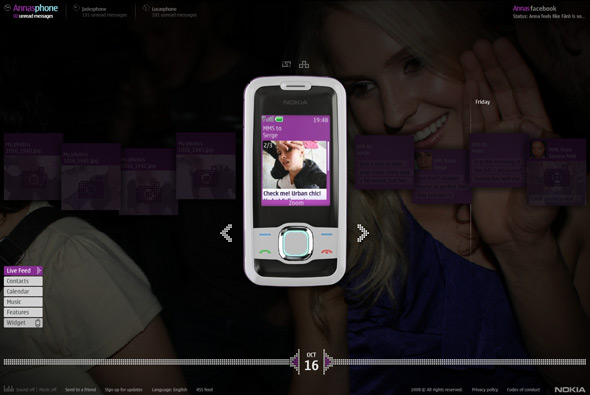
Interesting concept for Nokia – Somebody Else’s Phone. The idea is that 3 people’s phones are on display on the site, you can go through their messages, videos, pictures, contacts, calendar and so on. Each character has a storyline that you can follow in real time across the span of the campaign, even with ‘real’ phonecalls that you can listen to online. They each have a facebook page, some characters have flickr pages and some are interlinked. In typical advertising fashion they are aspirational, i.e. models, good looking, etc etc, their stories are relatively compelling – for example Anna the swedish student moving to London to get money for her studies, she has to model, so we see her going to castings and making friends, sending videos to her boyfriend back home and so on. Of course all at the same time as showing the features of the phone and being the primary tool to view the content.

There is a lot of detail and a lot of content, it’s quite incredible, all well produced and thought out. Not sure how effective it will be as a campaign, with some of the comments shown on this page, it will remain to be seen – but I quite like the concept. Its a good example of using online media to provide storytelling in a digital age, through the use of the very tools we use to communicate. The site looks cool and I like the attention to detail in the execution, interesting…

Made by W+K London and B-Reel.

Site here…

Adidas Y3 Lightbox

By | WEBSITES | No Comments

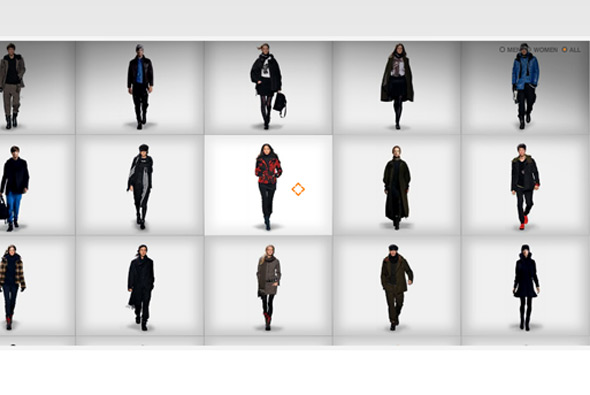
Stylish site for the Y3 collection of Adidas clothing. Like it’s name sake the items are presented as if on a lightbox, you can zoom in to see the details on the clothes and scroll around to explore the video of the model walking, you can view the items from different angles too. Nice design, effects and transitions make this a simple and stylish microsite.

Made by Neue Digitale.

Website here…

Hello Hikimori

By | WEBSITES | No Comments

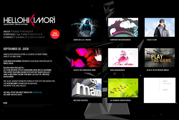
Great website of studio Hello Hikimori. Showcasing some really nice work, the site is a slick, stylish, and  to-the-point, portfolio. Led by a young creative team this shows in their work – colourful, vibrant, and full of interactivity the 2008 showreel is a must see. The background animation is a 3d sound responsive flash piece – Very cool.

Site here…

Agent Provocateur

By | WEBSITES | No Comments

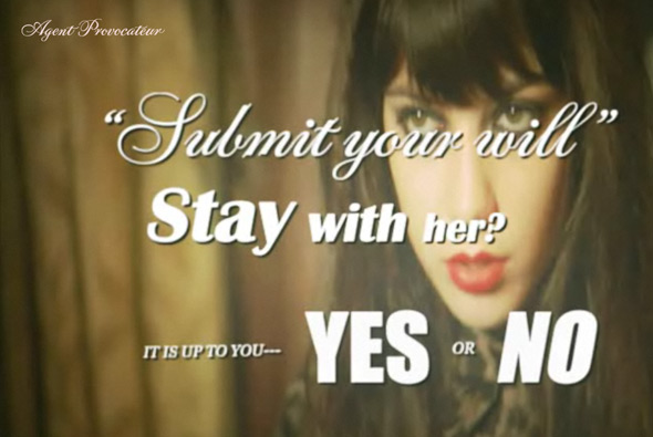
Interactive movie, showing the latest range of lingerie by Agent Provocateur. Very stylised interactive story that plays fullscreen and pauses to get your choice of direction by presenting questions at crossroads in the story. Quite an abstract plot but essentially its just a nice way of showing the lingerie in an intertactive video format that gets the audience’s attention. I really like the visual style and the simplicity of execution.

Created by one of my long time favourites Hi-Res.

Site here…

Panasonic – Everything Matters

By | WEBSITES | No Comments

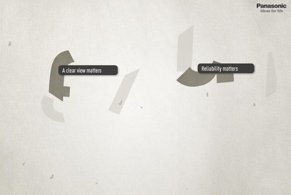
Great site promoting the concept ‘everything matters’ for Panasonic. Presented in a 3d universe, sections of the site showcase how important the details are for all Panasonic products. Explore the sections to see the stories behind the details, from interactive sponges to visitor’s submitted thoughts. Very nice looking and lots of good animations and nice interactivity, providing a more human personality to the brand.

Created by de-construct.

Website here…

IKEA – Warte Bis September

By | WEBSITES | No Comments

IKEA - September website

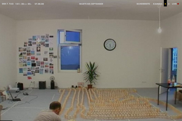
Campaign site promoting the new IKEA catalogue in Germany, released in September, as the name suggests: ‘Waiting for September’. It followed the days leading up to the release, where Nils sits in his flat and is visited by friends, does things, answers phone calls from the public, interacts with users on his laptop, and so on. Over the days we see the room change when finally the new cataloge is released and we see his flat tranformed with IKEA products.

Presented in a full screen format you see the live camera footage from a choice of 2 angles, you could also embed the live feed into your blog and so on. Very similar to the Diesel Heides campaign site but taken a few steps further. Its effectiveness lies in its simplicity, and the way the content has been thought out, in the end you can see the difference the furniture makes and it provided a sense of anticipation and buzz about IKEA. Nice idea well executed!

Site here…

Cristof Echard

By | WEBSITES | No Comments

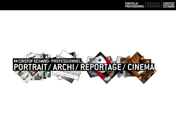
Photography portfolio of Cristof Echard. Full of movement and a using a quasi 3d interface this website is a good example of a modern, slick portfolio. I like the way the images move around in 3d space and the many touches and high attention to detail, i.e. the tumbnails and the way images are loaded in. Nice!

Made by Creaktif.

Website here…

Eva Padberg

By | WEBSITES | No Comments

Eva Padberg

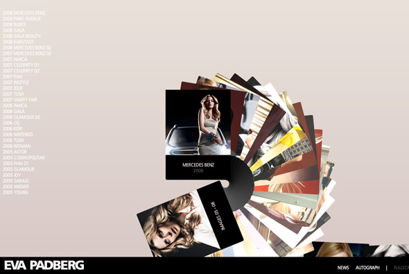
Lovely portfolio website of model Eva Padberg. A slick website showcasing shots of the model, via a fan like carousel of images. I particularly like the way you navigate through the images and can also select any from the left hand list. It works really well and is easy to use, and fun to navigate.

Crafted by Siteseeing.

Site here…

Melmac

By | WEBSITES | No Comments

Melmac website

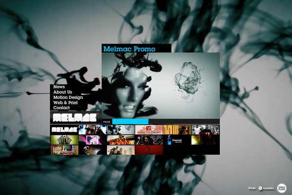
Nice portfolio site of Danish agency Melmac. Nicely executed and easy to use portfolio of some good work, in particular the motion design section reveals some nice videos. Although done many times before, I like the full screen layout and the way each section and project is presented with fresh content with each click. Nothing ground breaking, just nice stuff!

Site here…

Beach Volleyball

By | WEBSITES | No Comments

Beach Volleyball

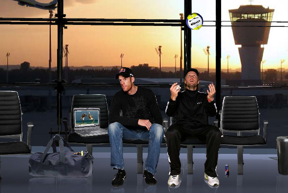
Very interesting site for the German beach volleyball team. I’ve selected this because of the mechanism used to explore each section of the site. Each section has its own 3D scene, using your mouse to move left to right the movement causes the camera to move and pan along a path. This all provides a very fluid and intuitive navigation system that looks and feels great – with the camera floating through the scene it gives a really interesting and enjoyable way of exploring the site.

Created by Decade One.

Website here…

Lexus RX 350

By | WEBSITES | No Comments

Lexus RX 350

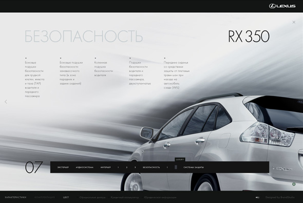
Russian website for the Lexus RX 350. Working on the premise of not clicking, you interact with all sections of the site just by mousing over elements of the site. Initially a bit clunky but you get used to it, but it is an interesting approach that works well. The site looks great, with loads of really effective transitions and animations, and many nice touches. Some sections are done in a quasi 3D paralax style which, again, looks great and works well – nice site. 

Made by Brand Studio.

Site here…

Nike Lab

By | WEBSITES | No Comments

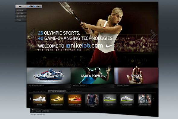
Nike Lab

Nike’s site to promote their products for the olympics. This is a great example of good slick website design, lots of great touches and rollovers/animations. Full Flash site, with many sections, it is functional, easy to use, but with the addition of looking great and providing a good user experience – great attention to detail.

Created by AKQA

Site here…

Julian Velard

By | WEBSITES | No Comments

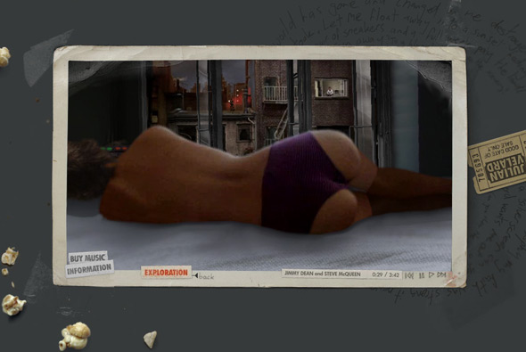
Julian Velard

Fantastic website for singer/songwriter Julian Velard. You are free to explore his mind and play puzzles, reveal music and experience his world. Incredibly addictive you want to explore every area, and discover all the scenes, it draws you in and of course the background music is his own. Great way of keeping the audience captive and providing an enjoyable way of promoting yourself. I played on this for over half an hour and loved it, really well designed and executed was a joy to play with.

Crafted by the amazing WEFAIL.

Website here…