Yearly Archives: 2009

Armani Jeans

By | WEBSITES | No Comments

armani jeans

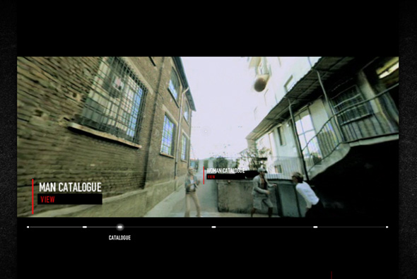
Interesting new site of Armani Jeans. Presented in a very cool way – from a first person perspective, you are given a 360 degree view as you run around with models wearing Armani Jeans clothing, with the action stopping at intervals so you can view the products and view the catalogue and so on. What I like is the way the ‘video’ is presented with you being able to look around as your view and the actors move through the environment. It’s a very simple site with an interesting way to show the product line ‘in situ’, with a very cool interface, very clever.

Created by Saatchi & Saatchi Rome.

Site here…

Nossa

By | WEBSITES | No Comments

nossa

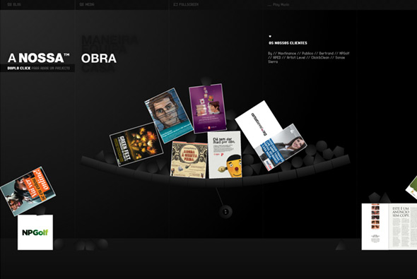
Fantastic site of Portugese agency Nossa. The attention to detail and polish in this site has really got to be experienced to be believed, really incredible. For example when you look at their work, each case happens to be part of fully interactive physics engine. Look at their location, Google maps is fully integrated into the interface. All the rollovers / buttons / user actions are thought about, the whole site is well laid out and designed, it really is a shining example of a great portfolio site… very impressive…

Site here…

Beams

By | WEBSITES | No Comments

beams clothing

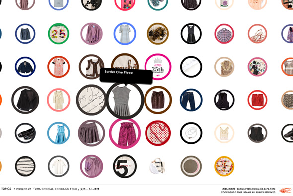
Site promoting Beams, specifically Women’s clothing 25th anniversary. A very simple interface showing thumbs of the items, when you click on an item they have used a really nice way of zooming in/out of the photo. You hold down your mouse button to zoom in / pan around (with the item slightly rotating on left/right movement) and let go to zoom out, complete with nice little sound fx. Again another typically Japanese site design, where the interface and interaction design is top notch, the site is fun and simple  to use.

Website here…

Churaumi Hakken – Okinawa Aquarium

By | WEBSITES | No Comments

Okinawa Aquarium

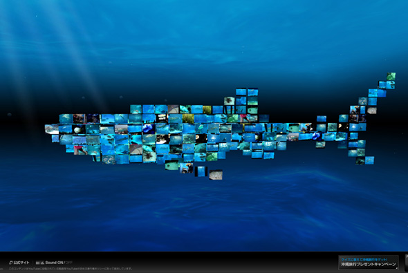
Nice site, promoting the Okinawa Churaumi Aquarium in Japan. Simply using videos from YouTube that feature videos made at the aquarium, made special by forming the shape of a ‘shark’, which swims gracefully through the ocean. Lovely music and sound, the interface is minimal and typically Japanese, all combined it gives a nice feeling! The combination of a fluid moving ocean creature composed of YouTube videos is quite mesmerising, and gives a positive feeling that is amplified when you see the videos of people amazed by the animals they are filming. As it uses tags from YouTube the content of the videos stays fresh. Really pretty damn cool…

Created by Asahi Advertising.

Site here…

Hyundai Genesis Coupe

By | WEBSITES | No Comments

hyundai genesis coupe

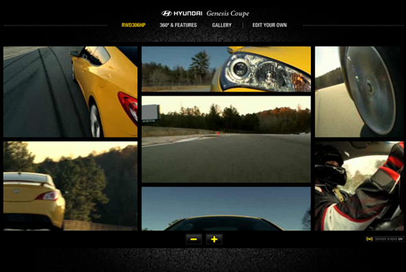
Really nice site for the new Hyundai Genesis Coupe. Very slick, simple site that features multi angle videos showing the car being driven at high speed around a race track. You can add and remove cameras to the interface to see the action unfold, even with driver’s commentary, you can also enlarge any view. Really nice sound track of the car’s engine, with some subtle hints of music in other sections. Nice twist on the 360 degree video of the car,  with it doing a donut! The main features highlighted whilst tracking the car, pretty cool. There is also a subsection of the site where you can edit your own video using clips from the shoot, all in a mock Premier Pro interface, very full on, can imagine it took a long time to code! Extremely detailed online editing tool! Lots of polish and attention to detail, from the preloader to the rollovers, very very cool…

Created by grupo w, and Goody Silverstein.

Site here…

Nike Air Jordan 2009 – Beyond

By | WEBSITES | No Comments

jumpman 23 2009

Damn cool website promoting the Nike Air Jordan 2009 shoe. 3D interface showing videos of Nike athletes and the shoe, you click and drag to pan the camera through the 3d scene, with nice lighting and visuals. I like the way by clicking a video moves the camera to the correct position, also love the camera panning on click and drag. Nicely polished, nice icons, VERY clean and simple, love the progression and lack of patronising the audience. So simple and clean, really appreciate the interface, very cool… 

Website here…

Uniqlo – Parka Style 1000

By | WEBSITES | No Comments

uniqlo parkastyle

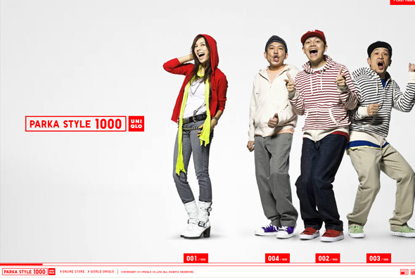
Very simple microsite promoting Uniqlo’s parka collection. Pretty cutesy and fun, but I really appreciate again Uniqlo’s simplicity – horizontal scrolling navigation highlighting the different styles of parka featuring a mix of Japanese celebrities and models. The whole thing just gives a positive impression of the brand, with clean and crisp interactivity, and a nice layout.  

Website here…

SEED – The Universe in 09

By | WEBSITES | No Comments

seed universe 09

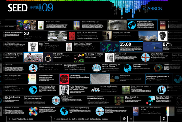
Site promoting SEED magazine and it’s articles. Providing an overview of articles on science, design, politics and so on that the world will face in 2009. Nice way of presenting a lot of data in an interesting way, nice colour based navigation system at the top which highlights the articles that address the topic you have selected. Zooming interface also allows you to isolate an article and read all about it. Quite interesting…

Created by Fangohr.

Website here…

Space Is The Limit

By | WEBSITES | No Comments

space is the limit

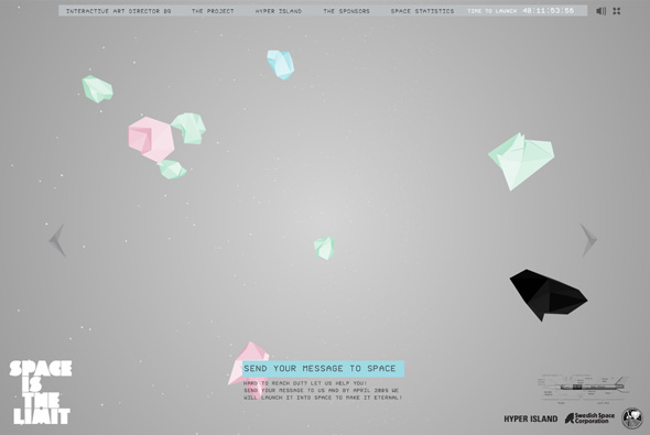
Cool site from Hyper Island with the idea to send messages you submit into space via the Swedish Space Corporation, essentially to promote Hyper Island and it’s Interactive Art Director students. Nice 3D interface with messages floating around from users, you pan around the environment, cool background music, nice layout and design. Like the way the camera moves around with the mouse. Simple, clean, looks cool…

Developed by Kristofer Forsell.

Website here…

NIL

By | WEBSITES | No Comments

nil

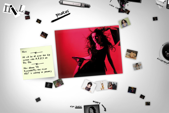
Site of singer known as Nil Karaibrahimgil. The style is a bit of a blast from the past, but it looks pretty nice, and some fun drag and drop features and other nice touches.

Created by iGOA.

Website here…

JVST

By | WEBSITES | No Comments

jvst website

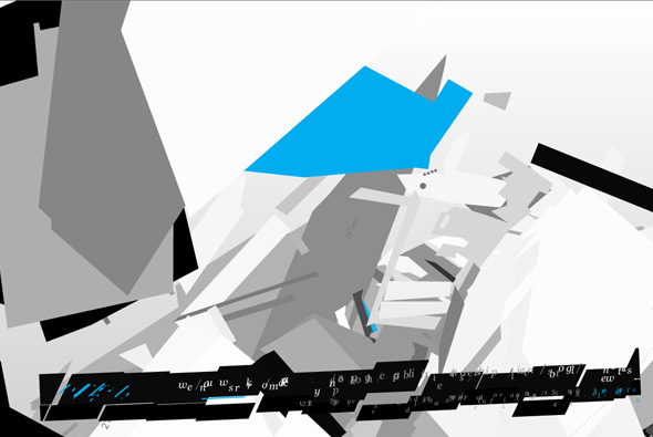
Interesting navigation for the site of JVST an agency based in California. I like the transitions between the sections, lots of floating 3d planes and objects – but it all seems a bit, well unfinished maybe? It was created by one of the old masters, Joshua Davis, who did the groundbreaking Praystation, and makes incredible digital paintings. Was he restricted? Were things changed? How much input did he have? You would think that such a name would bring greatness. It’s a shame as the navigation transitions are nice, but on the whole it doesn’t really work… a lesson to be learned here maybe…

Created by Joshua Davis.

Website here…

Noodle on Noodle – Aim for Space!

By | WEBSITES | No Comments

noodle on noodle

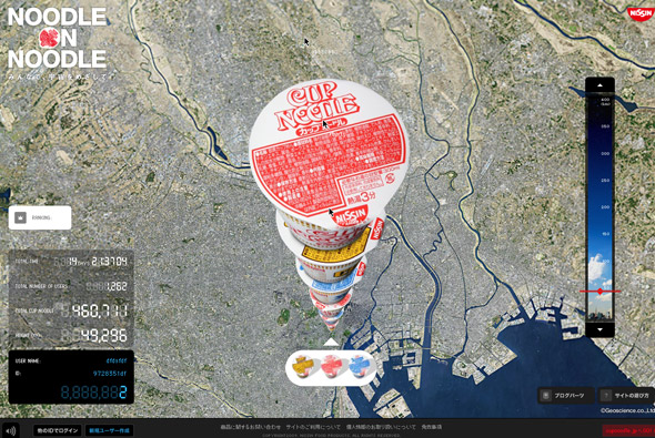
Really cool website, promoting Japanese Cup Noodles – in Japan. From a google earth-esque viewpoint users stack up pots of cup noodles with the aim of reaching space. Really simple idea, really nicely executed – you can watch other users stack up pots and see their mouse cursors and watch how they interact with the site. The screen refreshes with each newly stacked noodle pot, you can also drag a slider to the right to zoom right down to the bottom or where the stack is currently. Typically Japanese style minimal interface and clean slick interaction, looks great too – bit of a cultural nod to the google earth interface, nicely angled to bring out the full ‘stack’ of noodle pots. Really awesome…

Created by Dentsu and Dentsu Razorfish.

Website here…

Sims Snowboards

By | WEBSITES | No Comments

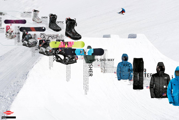
Sims snowboards

Site of Sims snowboards. Pretty interesting navigation and layout for a product website; parallax scrolling and rotation, zooming around items and info. All makes for a nice sense of depth with cool animation and interaction. Quite experimental menus that take a while to get the hang of, it’s always great to see new things and ways of navigation. Love it…

Created by FL2.

Site here…