Yearly Archives: 2008

Michael Cook Photography

By | WEBSITES | No Comments

Nice portfolio site of photographer Michael Cook. Interesting way of navigating the pictures – you grab and slide, the next images comes in, click once to zoom in and again to zoom out, this provides an immersive viewing experience – that actually feels quite tactile. Nice animations on the menu and it is a breeze to use, some good photography also!

Created by Cru Digital.

Site here…

Adidas Y3 Lightbox

By | WEBSITES | No Comments

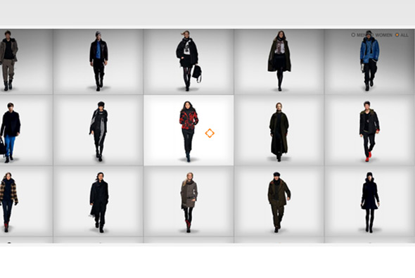
Stylish site for the Y3 collection of Adidas clothing. Like it’s name sake the items are presented as if on a lightbox, you can zoom in to see the details on the clothes and scroll around to explore the video of the model walking, you can view the items from different angles too. Nice design, effects and transitions make this a simple and stylish microsite.

Made by Neue Digitale.

Website here…

Marc Ecko

By | WEBSITES | No Comments

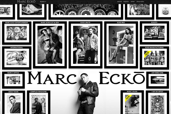
Very slick site of clothing label Ecko. Extensive website with a lot of content, presented in a really nice format, more like a magazine with nice visuals and lots of animation. I like that each section is slightly different to each other, and although it is a flash site, there is deep linking and so on. Very well crafted and thoughtout website of a large brand site.

Created by WDDG.

Website here…

Hello Hikimori

By | WEBSITES | No Comments

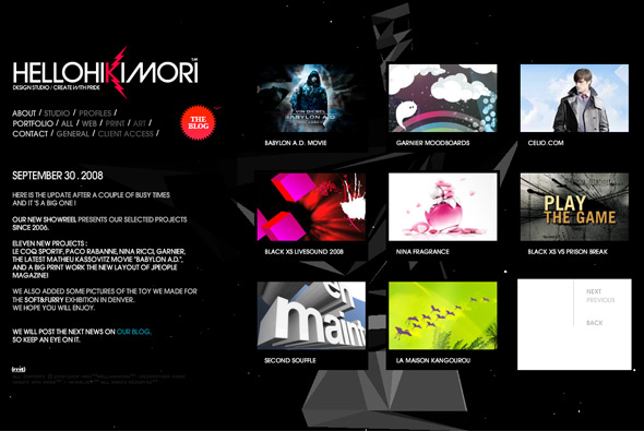
Great website of studio Hello Hikimori. Showcasing some really nice work, the site is a slick, stylish, and  to-the-point, portfolio. Led by a young creative team this shows in their work – colourful, vibrant, and full of interactivity the 2008 showreel is a must see. The background animation is a 3d sound responsive flash piece – Very cool.

Site here…

Shanghai World Financial Center

By | WEBSITES | No Comments

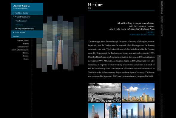
Website of the Shanghai World Financial Center. Interesting website of the huge SWFC building, based on the concept of its height the website is thus very long! In its vertical format you can scroll through the various floors and explore the building, each section cleverly loading when you scroll into its vicinity. Nice use of flash, with deeplinking and so on, slick animations and a lot of detail.

Created by Mount Inc and Triple 7.

Site here… 

Lee Towndrow Photography

By | WEBSITES | No Comments

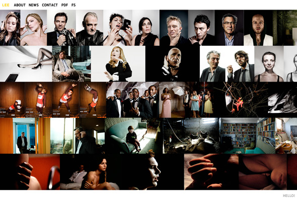
Great photographer’s portfolio site, presented in a really nice way. You can drag and slide each row as if they were laying on a table in front of you, by clicking on an image you slide down and view in a larger format and by default the browser goes full screen, which is a nice touch. Really nice high res photography and intuitive interactivity make this site a joy to use, nice animation and great photography!

Made by HelloHello.

Site here…

ULeChang

By | WEBSITES | No Comments

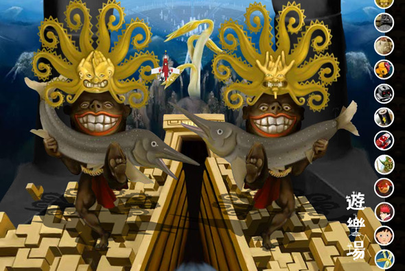
Surreal parallax vertical scrolling experience! Interesting site that you explore by means of the arrow keys to see random facts about our world. Just a nice distraction with good illustrations and interesting messages. I like the scrolling and the look and feel – pretty cool.

Website here…

Calibre Photo

By | WEBSITES | No Comments

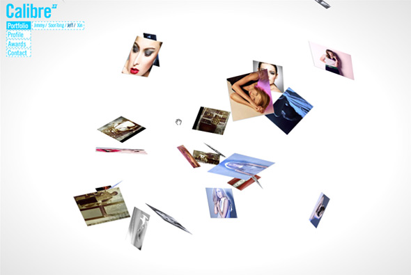
Photography portfolio site showcasing photographs in a 3D environment. Clean and simple interface allows the photographs to speak for themselves, drag and rotate to view the photos from different directions. I particularly like the way you rotate the camera to get different angles, it gives the site a lot of depth and allows you to see the images in a fun way.

Made by Kinetic Singapore.

Site here…

Agent Provocateur

By | WEBSITES | No Comments

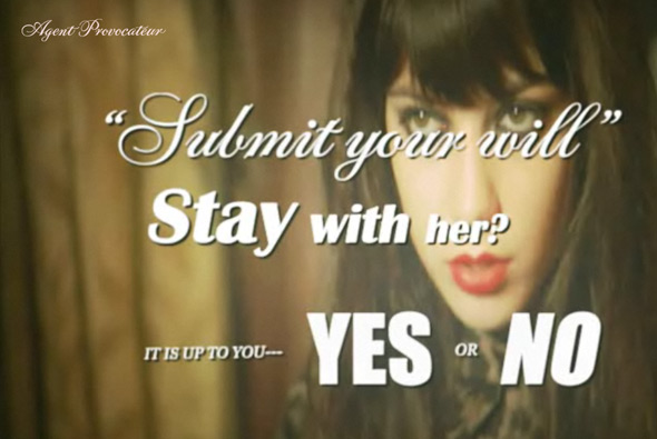
Interactive movie, showing the latest range of lingerie by Agent Provocateur. Very stylised interactive story that plays fullscreen and pauses to get your choice of direction by presenting questions at crossroads in the story. Quite an abstract plot but essentially its just a nice way of showing the lingerie in an intertactive video format that gets the audience’s attention. I really like the visual style and the simplicity of execution.

Created by one of my long time favourites Hi-Res.

Site here…

Nescafe Charge

By | WEBSITES | No Comments

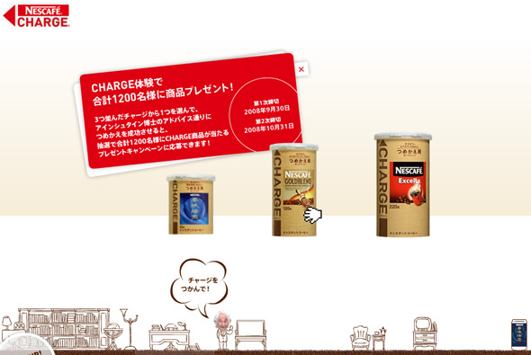
Japanese Microsite for Nescafe Charge, an easy and environmentally friendly way to replenish your instant coffee jar. Again the Japanese prevail, I love the way they demonstrate the product, you learn about it by using it to ‘charge’ an empty jar – it becomes more like an enjoyable game than a product demonstration, by grabbing the charge jar and dragging in onto an empty jar, then dragging down to simulate how you would use it in real life. Along with the slick animations and ease of use I feel its a thoroughly effective way of promoting a product.

Site here…

Panasonic – Everything Matters

By | WEBSITES | No Comments

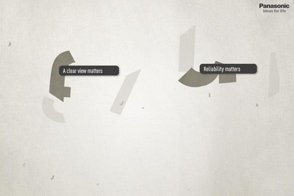
Great site promoting the concept ‘everything matters’ for Panasonic. Presented in a 3d universe, sections of the site showcase how important the details are for all Panasonic products. Explore the sections to see the stories behind the details, from interactive sponges to visitor’s submitted thoughts. Very nice looking and lots of good animations and nice interactivity, providing a more human personality to the brand.

Created by de-construct.

Website here…

IKEA – Warte Bis September

By | WEBSITES | No Comments

IKEA - September website

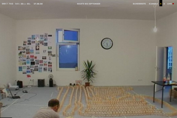
Campaign site promoting the new IKEA catalogue in Germany, released in September, as the name suggests: ‘Waiting for September’. It followed the days leading up to the release, where Nils sits in his flat and is visited by friends, does things, answers phone calls from the public, interacts with users on his laptop, and so on. Over the days we see the room change when finally the new cataloge is released and we see his flat tranformed with IKEA products.

Presented in a full screen format you see the live camera footage from a choice of 2 angles, you could also embed the live feed into your blog and so on. Very similar to the Diesel Heides campaign site but taken a few steps further. Its effectiveness lies in its simplicity, and the way the content has been thought out, in the end you can see the difference the furniture makes and it provided a sense of anticipation and buzz about IKEA. Nice idea well executed!

Site here…

Wanted

By | WEBSITES | No Comments

Wanted movie website

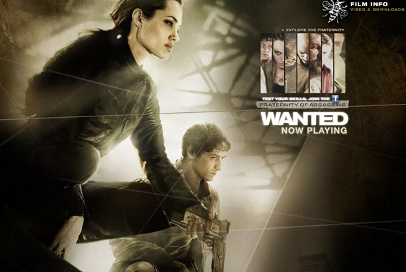
Pretty cool website of the movie ‘Wanted’. What I like about this site is the smooth slick navigation and the full screen layout, and the way the camera moves in and out to reveal the sections for each character. Might have been even better if the interface was not pre-rendered and more dynamic.

Made by projectc.net.

Website here…

Cristof Echard

By | WEBSITES | No Comments

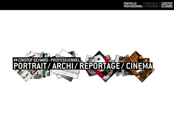
Photography portfolio of Cristof Echard. Full of movement and a using a quasi 3d interface this website is a good example of a modern, slick portfolio. I like the way the images move around in 3d space and the many touches and high attention to detail, i.e. the tumbnails and the way images are loaded in. Nice!

Made by Creaktif.

Website here…