drink

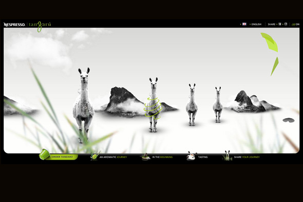
Nespresso Tanzaru

By | WEBSITES | No Comments

Site of Nespresso’s newest flavour ‘Tanzaru’. Essentially an interactive musical slideshow – really interesting style, with parallax scrolling and depth of field, giving a feeling of the kind of flavours and influences the coffee has. When rolling over the various items in the scene they play different sounds – so along with the background music a fun interactive composition is created. Really nice visual style and great animations and interactivity, very cool.

Created by Soleil Noir.

Website here…

Coca-Cola Light Plus

By | WEBSITES | No Comments

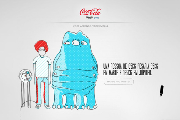
Website promoting Coca-Cola Light Plus in Brazil. Draw a shape on screen it is then brought to life with funky illustrations that continue on from your doodle, appearing along with product info. Nice light minimal interface, fun style, and really nice animations, all in all a bit of fun – well executed and nicely designed.

Created by Gringo.

Website here…

Black Sunshine

By | WEBSITES | No Comments

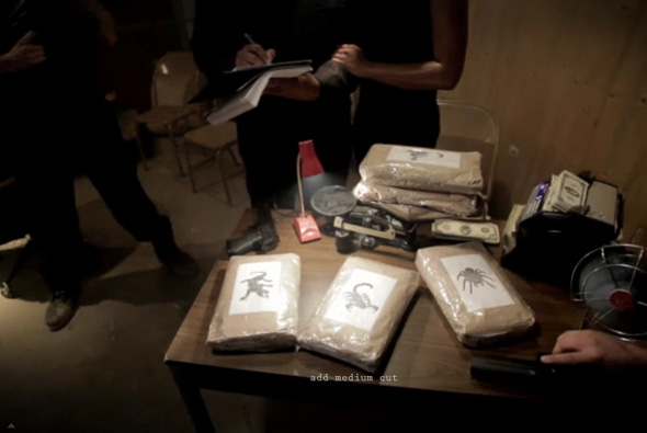
Interesting concept for a new coffee bean brand ‘Black Sunshine’. Based from a FPS perspective you go underground the meet a ‘drug’ dealer, look at the product, and order online your favourite morning ‘drug’. All shot from your perspective looking around the shady underground dealings of ‘the dealer’. Love the perspective panning with the video, they make it a little bigger than the screen so you can slightly pan around to see the scene – brings a really in depth feeling. Love the art direction and the how the buttons float around following your view. They have made these coffee beans very desirable by just making it very cool and very funny…

Created by Extreme Group and Lollipop.

Website here…

Red Bull Project X

By | WEBSITES | No Comments

Red Bull Project X

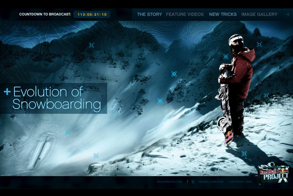
Project X – take Shaun White and a huge backcountry half pipe with foam pit, film Shaun going off the charts, put results online! Currently in teaser format but with loads of videos, photos, and snippets of info. Apparently Shaun has really pushed the boundaries of progressive pipe riding in this project – so looking forward to seeing the results. Videos are really cool, also giving behind the scenes footage of how they created it all. Nicely designed too, with each section having parallax animation giving a senstation of depth. Nice transitions and rollovers and so on, all in all a pretty cool site.

Created by Archrival.

Website here…

Nestlé – Born Better

By | WEBSITES | No Comments

nestle born better

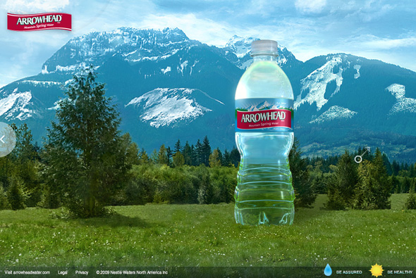
Website promoting Nestlé ‘Born Better’ bottled water range. Placing you in 3d panoramas where you scroll around to pan your view of mountain vistas. Nicely designed with a great drag and pan mechanism, slick animation and a pretty good attention to detail.

Created by Your Majesty & McCann Worldgroup.

Website here…

Zoogami Beer

By | WEBSITES | No Comments

zoogami beer
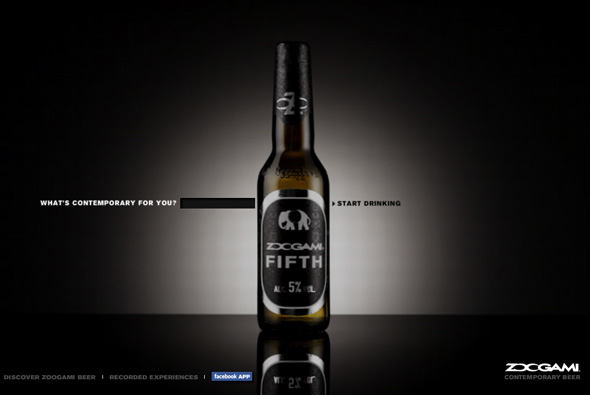
Interesting site promoting the launch of new beer Zoogami. Based around the idea of  ‘contemporary’, the site acts as a mash up of digital media – video, sound, and images all related to a search term that you provide. In the end you get a sequence of images, videos, and music given a treatment with colours, with it all moving in time with the music. It gets images from the web, sound/music from YouTube and video from Google Video. There is a gallery of saved searches, and even a Facebook Application. Sadly they all end with the same treatment, also it takes an extremely long time to load, and when there isn’t enough content it always uses the same images from some image resource – so after 2 times of making a new sequence you see a lot of the same things. Interesting idea, nice to see a brand experimenting with ‘contemporary’ digital ideas…

Created by Saatchi & Saatchi Rome.

Website here…

26000 Vodka

By | WEBSITES | No Comments

2600 vodka

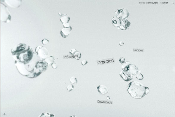
Beautiful site of 26000 Vodka, a vodka from New Zealand that is made from water which is 26,000 years old. Really well designed, a lovely interface, and simplicity at it’s core. Your navigation is presented with droplets of vodka, freeze framed in a 3d interface along with the main navigation, your viewpoint pans and tilts as you move your mouse – all giving a nice perception of depth. Each of the sections have a similar effect and navigation highlighting it’s ingredients, recipes, downloads and so on. You pick up small facts and info along the way, between each section are short questions (relating to 26,000 years) or ‘vodka secrets’.  I love the play with the depth of field and the subtle 3d, which is not intrusive or detractive. As you navigate the site you feel inspired by the subtle interactivity and simplicity of the whole thing. Even the age check is done nicely, lot’s of attention to detail, nice animation and transitions, great sound design, and mostly you come away feeling enchanted and learning something about the product… fantastic.

Created by Resn.

Website here… 

6 Beers of Separation – Tooheys

By | WEBSITES | No Comments

6 beers

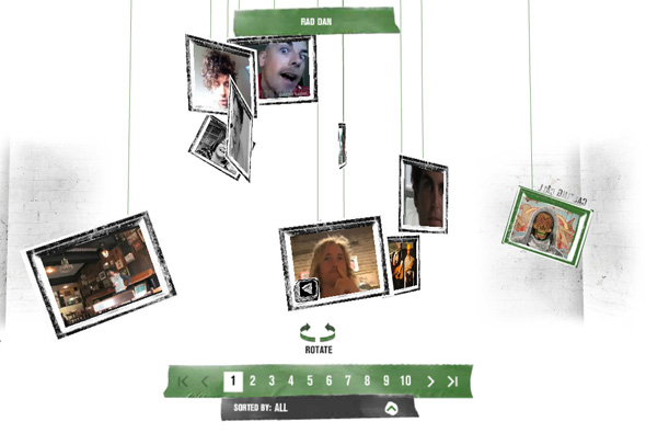
Following the theory of ‘6 degrees of separation’, Australian beer Tooheys have launched a competition for people to meet their hero, via their idea of  ‘6 beers of separation’. You can view the many submitted videos from potential winners, and explore the site, all in 3D. There are some really nice touches, and attention to detail, particularly the interface and navigation whereby you float around a 3D space, where you can also interact with the videos that are suspended by string and bounce around. Looks pretty good too!

Created by Holler Sydney.

Site here…

Coca Cola Zero & Nokia

By | WEBSITES | No Comments

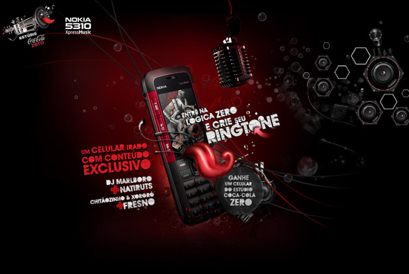
Nice site from Brazil – ‘Estúdio Coca-Cola Zero’. You can record your own message and apply effects to it and send the recording to a friend or download it to your phone to use as you please. Nice parallax scrolling effects and nicely designed and well coded – pretty slick.

Made by Gringo.

Site here…

Nescafe Charge

By | WEBSITES | No Comments

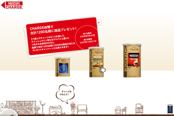
Japanese Microsite for Nescafe Charge, an easy and environmentally friendly way to replenish your instant coffee jar. Again the Japanese prevail, I love the way they demonstrate the product, you learn about it by using it to ‘charge’ an empty jar – it becomes more like an enjoyable game than a product demonstration, by grabbing the charge jar and dragging in onto an empty jar, then dragging down to simulate how you would use it in real life. Along with the slick animations and ease of use I feel its a thoroughly effective way of promoting a product.

Site here…

In an ABSOLUT World

By | WEBSITES | No Comments

In an ABSOLUT World

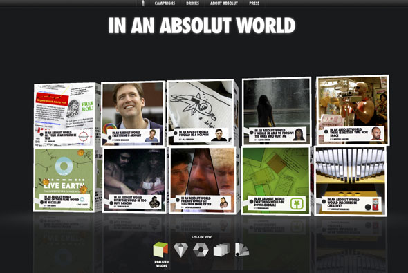
Another great Absolut microsite, promoting the visions of ‘an Absolut world’. Each vision can be opened up – the box unfolds -and shows a 3D animated vision. It provides a really nice user experience, and you can even upload your own. Really like the way the boxes open and reveal their contents – really cool. Lots more info here.

Created by Greatworks with the help of Papervision creator Carlos Ulloa.

Website here…