music

Resonance

By | @SN_Studio | No Comments

orchestra-1
orchestra-2
orchestra-3

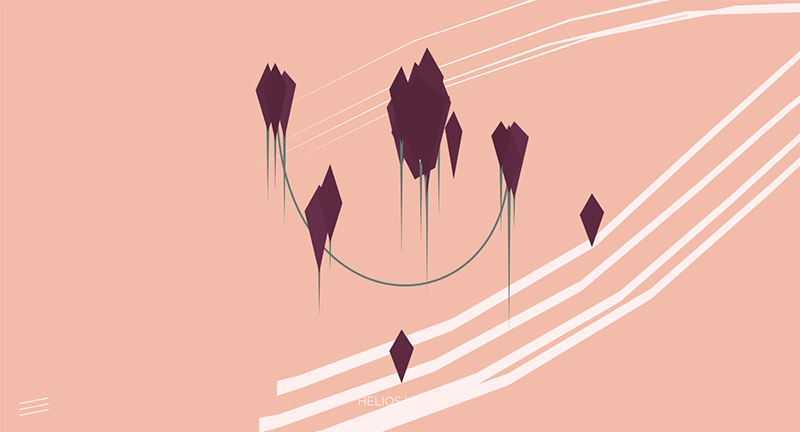
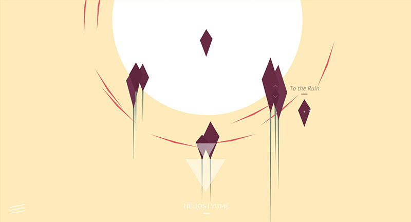
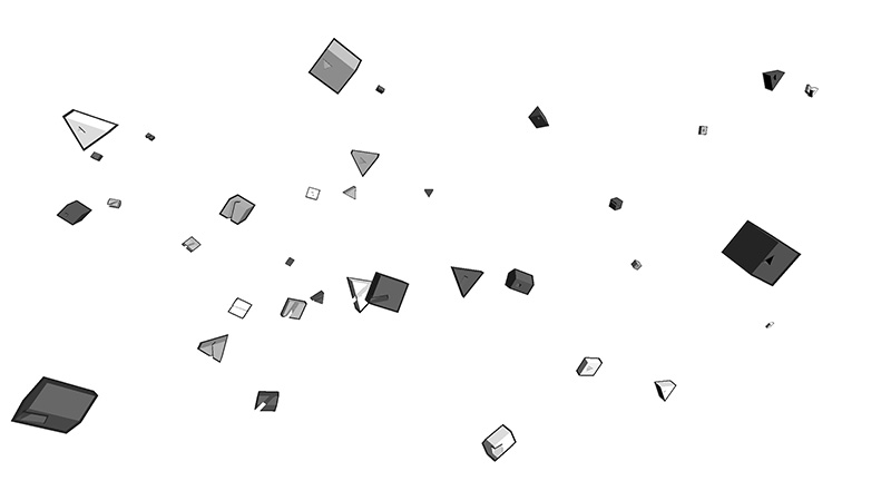
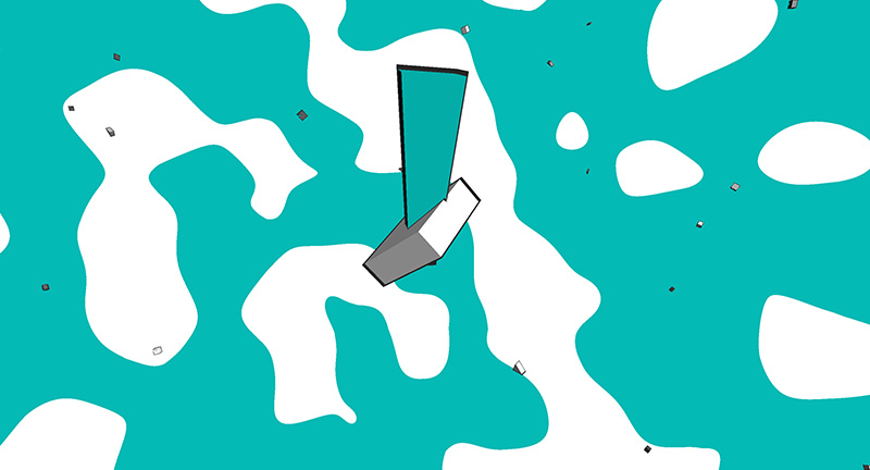
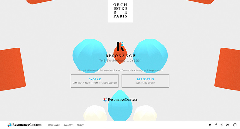
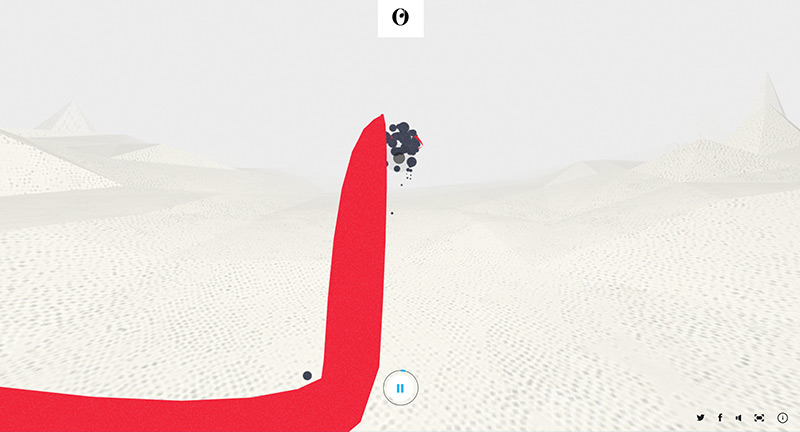
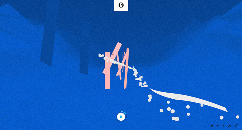
Interactive experience for The Orchestra of Paris. Using pieces of music and setting them to dynamic 3D fly throughs of imaginary landscapes, as you move your cursor a trail appears and shapes move depending on your position. A nice interactive way of engaging with classical music. Love the way the colours change over time and fun to play with.

Created by Soleil Noir (@SN_Studio).

Site here…

Music for a Dying Star

By | @prty_ny | No Comments

dying-star-1
dying-star-2
dying-star-3

Site promoting new compilation album ‘Alma music box’ – a collaboration with various artists using data from space observatories in Japan. The site shows 3D rotating discs playing snippets from the album, highlighting some of the data used as rhythms – tying back to the idea of star constellations. Beautiful execution and interesting way of creating a new album microsite.

Created by Epiphany Works (@Epiphanyworks) and Party NY (@prty_ny).

Site here…

YUME

By | @whitevinyluk | No Comments

yume-1
yume-2
yume-3

Beautiful 3D musical experience for band Helios and their new album Yume. Drag around the various 3D shapes to mix various elements from the tracks in the album. Different scenes have different music, love the way when you add bass or drums the landscape reacts – either in a sound reactive vibration or adding new 3D shapes into the mix. Site is minimal and simple which allows the music to take centre stage, a really beautiful and thoughtful site.

Created by WhiteVinyl (@whitevinyluk).

Site here…

Kenji Endo

By | @spc_tips | No Comments

kenji-1
kenji-2
kenji-3

Lovely site for Japanese DJ and musician Kenji Endo. Lots of fun details hidden here, from 3D rollover mesh typography, embedded music players with accompanying sound reactive visuals, lots of little features. Nice layout and design, love the large type, monotone look and feel, with subtle splashes of colour.

Created by Stronghold (@spc_tips).

Site here…

Taste Rewind – Spotify

By | @Razorfish, @stinkdigital | No Comments

rewind-1
rewind-2
rewind-3
rewind-4

Site for Spotify that creates playlists for you based on your preferences that rewinds musical tastes back a couple of decades. Really nice design and animations that inject a sense of playfulness and colour. Love all the preloading sequences and transitions – that creates a sense of narrative and storytelling and shows how you can get more out of Spotify.

Created by Razorfish (@Razorfish) and Stink Digital (@stinkdigital).

Site here…

Amy

By | @watsondg | No Comments

amy-1
amy-2
amy-3
amy-4

Stunning site promoting a new movie about the musician Amy Winehouse. Divided into main themes about her life brought to life with full screen video and imagery. Love the typography and quotes, with a well designed layout – the menu also looks great. Full of little animations and transitions that ease you through each section. Really great example of a film site…

Created by Watson/DG (@watsondg).

Site here…

Born in the Echoes

By | @helloneu | No Comments

chem-1
chem-2
chem-3

Microsite promoting The Chemical Brothers new album ‘Born in the Echoes’. Using a sound reactive 3D hoop that responds to the various frequencies in the tracks – visualizing nicely the music, especially peaks in the bass and high notes. Site also allows you to create a playlist from an historic collection of Chemical Brothers tracks.

Created by NEU (@helloneu).

Site here…

Reboot – Files Rec.

By | @webdesign | No Comments

file-rec-1
file-rec-2
file-rec-3

Promo site for File Rec. an international underground electronic record label. The site explores a whole range of electronic music which is visualised through a 3D sound reactive pattern, which changes over time. Love the build up of layers with text, patterns, and shapes formed from large pixels. Love the minimal black and white design, and the subtle pause state of the music.

Site here…

DENNIS

By | @georgealways | No Comments

dennis-1
dennis-2
dennis-3

Generative 3D music video featuring music by popcorn_10. Each time you watch the video it changes, with colours, shapes and sequencing changing depending on the details in the music. Love the playful and colourful feel and the way the 3D shapes appear, collide, and interact with each other – a great bit of fun.

Created by Always & Forever (@georgealways).

Site here…

Revelator

By | @hellomondaycom | No Comments

revelator-1
revelator-2
revelator-3

Site for Revelator a new online service that helps music businesses streamline their revenue online. I like the horizontal scrolling layout, with a nice blue and black look and feel, videos and animated graphics to highlight the key features. Slick animations and transitions to the individual sections of the site, with sliding panels and so on pulling it all together.

Created by Hello Monday (@hellomondaycom).

Site here…

Inside Abbey Road

By | @google | No Comments

abbey-rd-1
abbey-rd-2
abbey-rd-3
abbey-rd-4
abbey-rd-5

Take an interactive journey through the iconic recording studio Abbey Road. Using a custom photo shoot and Google Streetview technology to show the insides of the famous studio. The amount of detail is incredible, from historic photos mapped to your viewpoint, inline videos of musicians, and even an interactive mixing studio. They used high res cameras to take ultra high detail of each panorama – if you read the about page you will really see the amount of detail and technical craftsmanship that has gone into this project. You can get lost exploring the studios and all the different views and snippets of information – it is a real feat and a real pleasure to explore – great piece of work.

Created by Google Creative Lab (@google).

Site here…

Lincoln Musical Selfie

By | @jam3 | No Comments

musical-selfie-1
musical-selfie-2
musical-selfie-3

Interesting site for Lincoln cars, using the contours and shape of your face to make a ‘musical selfie’. Simply upload your image / take a snapshot or view the gallery – the site will pick up key features of your face and arrange a song. The main thing I like here is the execution, it looks great – from the sliding mechanic in the gallery to the small animations and attention to detail. They have really made it feel alive and dynamic, and even tried to treat the uncertainty of user generated content, by making sure the imagery looks good, like the 3D moving shapes around the corner of the images.

Created by Jam3 (@jam3) and Hudson Rouge (@HudsonRouge).

Site here…

Dream and Reach

By | @mediamonks | No Comments

d1
d2
d3
d4

Site for Bose the speaker and electronics creators. Focussing on what makes up Bose, from their history through to their innovations. Presented in an interesting almost encyclopaedic way, with individual chapters with an app like appearance. Lots of nice little transitions and animations which lift the content and make it feel so much more dynamic. Love all the diagrams and the short snippets of video that really illustrate the content well. Nice work.

Created by MediaMonks (@mediamonks).

Site here…

The DNA Project

By | @hellomondaycom | No Comments

dna-1
dna-2
dna-3
dna-4

Fascinating site for j.views, documenting the creation of the new album. Brilliant insight into how the artist creates new music, from sources of inspiration to soundbites and video clips. Not only a great idea, but executed beautifully – a very exploratory interface with elements animating i.e. waveforms in a hexagonal pattern to represent sound recordings, and a timeline approach. Love the look and feel and all of the small details that breathe in life and dynamism. The DNA view is mental! But harks back to the day of more experimental interfaces and experiences – which ties in hand in hand with the concept.

Created by Hello Monday (@hellomondaycom).

Site here…