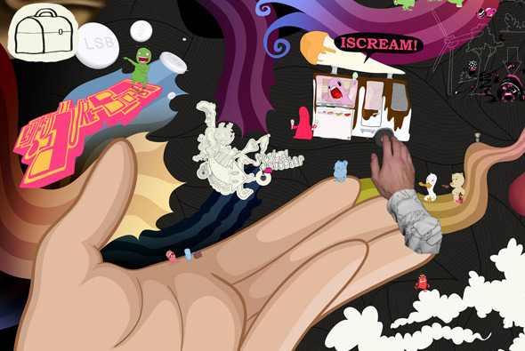
I remember seeing the first version of this site a while back and being very impressed, now v2 is out and it is awesome. Essentially it’s Coen Grift’s portfolio – navigating via a drag interface, zoom in and out with the mouse scroller, you can view the basic information such as biography, contact, etc, but the most interesting part of the site is the little games and puzzles you discover in the ‘explore’ mode. It is a huge canvas – 1000 megapixels – full of great illustrations and characters. Really great attention to detail and very stylish, you really feel that he is not restraining himself and it’s so refreshing to see a totally ‘different’ portfolio. Nicely coded and really intuitive, fantastic!
detail
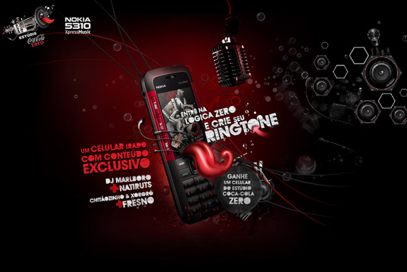
Nice site from Brazil – ‘Estúdio Coca-Cola Zero’. You can record your own message and apply effects to it and send the recording to a friend or download it to your phone to use as you please. Nice parallax scrolling effects and nicely designed and well coded – pretty slick.
Made by Gringo.
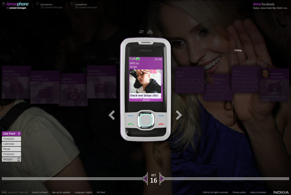
Interesting concept for Nokia – Somebody Else’s Phone. The idea is that 3 people’s phones are on display on the site, you can go through their messages, videos, pictures, contacts, calendar and so on. Each character has a storyline that you can follow in real time across the span of the campaign, even with ‘real’ phonecalls that you can listen to online. They each have a facebook page, some characters have flickr pages and some are interlinked. In typical advertising fashion they are aspirational, i.e. models, good looking, etc etc, their stories are relatively compelling – for example Anna the swedish student moving to London to get money for her studies, she has to model, so we see her going to castings and making friends, sending videos to her boyfriend back home and so on. Of course all at the same time as showing the features of the phone and being the primary tool to view the content.
There is a lot of detail and a lot of content, it’s quite incredible, all well produced and thought out. Not sure how effective it will be as a campaign, with some of the comments shown on this page, it will remain to be seen – but I quite like the concept. Its a good example of using online media to provide storytelling in a digital age, through the use of the very tools we use to communicate. The site looks cool and I like the attention to detail in the execution, interesting…
Made by W+K London and B-Reel.
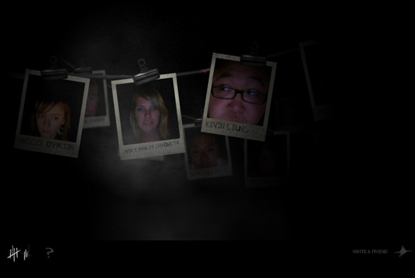
Immersive site, open only from 6 PM to 6 AM, set in a haunted hotel and presented in a first person perspective. The story starts as you awaken and try to escape the hotel, you must complete a series of tasks to get out. These tasks range from clicking on doorways whilst navigating the hotel’s hallways to taking pictures of a ‘thing’ to blind it, to trying not to wake the baby from hell. It all has high production value and is very well crafted, from the sound design to the animation to the video. I particularly like the 3d video and the interactivity (although limited) whilst moving through the hotel, the movement it provides feels relatively realistic.
Its quite intriguing as it’s all for Doritos, under the guise of the ‘Snack Strong Productions’, who just make nice sites and games like this one. There is really little branding involved – just the concept that Doritos the brand is providing enjoyable experiences like ‘The Quest’ that was earlier in 2008.
Made by Goodby Silverstein & Partners, the people behind the famous ‘Milkatraz’ game that was so popular last year.
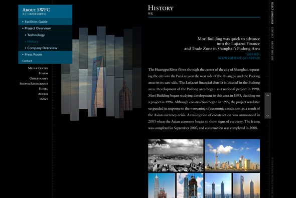
Website of the Shanghai World Financial Center. Interesting website of the huge SWFC building, based on the concept of its height the website is thus very long! In its vertical format you can scroll through the various floors and explore the building, each section cleverly loading when you scroll into its vicinity. Nice use of flash, with deeplinking and so on, slick animations and a lot of detail.
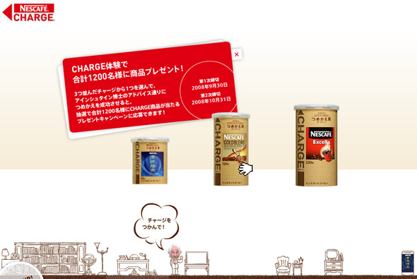
Japanese Microsite for Nescafe Charge, an easy and environmentally friendly way to replenish your instant coffee jar. Again the Japanese prevail, I love the way they demonstrate the product, you learn about it by using it to ‘charge’ an empty jar – it becomes more like an enjoyable game than a product demonstration, by grabbing the charge jar and dragging in onto an empty jar, then dragging down to simulate how you would use it in real life. Along with the slick animations and ease of use I feel its a thoroughly effective way of promoting a product.
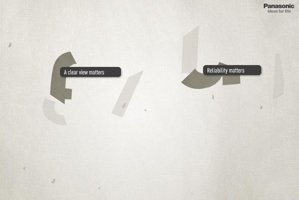
Great site promoting the concept ‘everything matters’ for Panasonic. Presented in a 3d universe, sections of the site showcase how important the details are for all Panasonic products. Explore the sections to see the stories behind the details, from interactive sponges to visitor’s submitted thoughts. Very nice looking and lots of good animations and nice interactivity, providing a more human personality to the brand.
Created by de-construct.
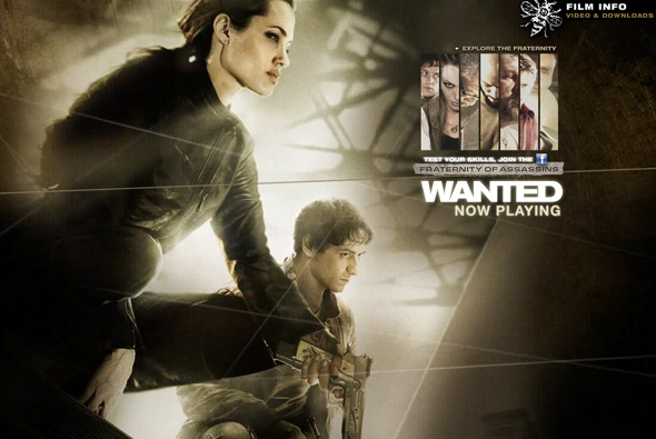
Pretty cool website of the movie ‘Wanted’. What I like about this site is the smooth slick navigation and the full screen layout, and the way the camera moves in and out to reveal the sections for each character. Might have been even better if the interface was not pre-rendered and more dynamic.
Made by projectc.net.
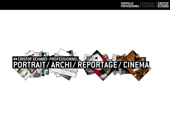
Photography portfolio of Cristof Echard. Full of movement and a using a quasi 3d interface this website is a good example of a modern, slick portfolio. I like the way the images move around in 3d space and the many touches and high attention to detail, i.e. the tumbnails and the way images are loaded in. Nice!
Made by Creaktif.
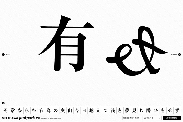
The Morisawa Font Park 2.0 is a playground for creating images from characters. By dragging characters onto the stage you can then scale, rotate, break apart and move the various letters. This is all done via a really intuitive interface that is very fluid and easy to use. You can also view a gallery of images other people have made, it even goes as far as to show the movements they made to create the final image. The polish and high level of coding makes this a really accomplished website.
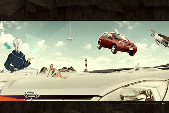
Great website for the new Ford Ka in Brazil. Based on the concept that you are tiny – you select an insect character to begin the story – so you can explore the features of a car from a new, small perspective. The site is navigated horizontally scrolling through a tapestry of surreal artwork showing the features of the car. There are lots of little interactive and animated elements encouraging you to explore the various sections and thus discovering the features of the car. I really like the attention to detail but also the style of the artwork, slightly bleached and surreal, it looks fantastic. A really interesting way of providing a unique user experience promoting a car – much more interesting than the usual car sites.
Made by JWT Brazil.
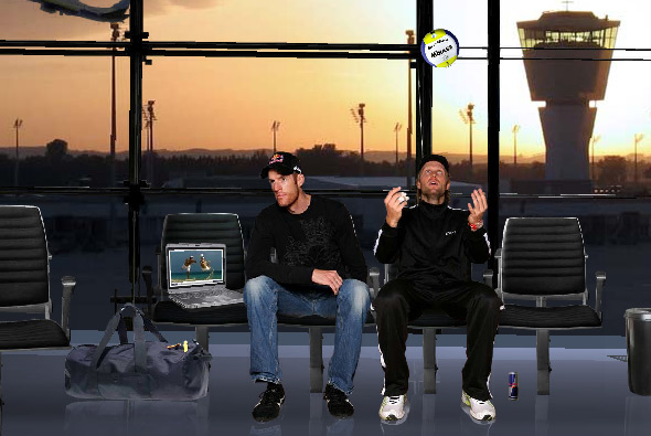
Very interesting site for the German beach volleyball team. I’ve selected this because of the mechanism used to explore each section of the site. Each section has its own 3D scene, using your mouse to move left to right the movement causes the camera to move and pan along a path. This all provides a very fluid and intuitive navigation system that looks and feels great – with the camera floating through the scene it gives a really interesting and enjoyable way of exploring the site.
Created by Decade One.
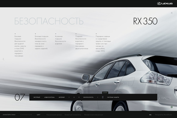
Russian website for the Lexus RX 350. Working on the premise of not clicking, you interact with all sections of the site just by mousing over elements of the site. Initially a bit clunky but you get used to it, but it is an interesting approach that works well. The site looks great, with loads of really effective transitions and animations, and many nice touches. Some sections are done in a quasi 3D paralax style which, again, looks great and works well – nice site.
Made by Brand Studio.
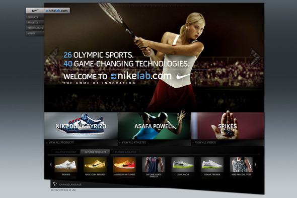
Nike’s site to promote their products for the olympics. This is a great example of good slick website design, lots of great touches and rollovers/animations. Full Flash site, with many sections, it is functional, easy to use, but with the addition of looking great and providing a good user experience – great attention to detail.
Created by AKQA.

