detail

SEED – The Universe in 09

By | WEBSITES | No Comments

seed universe 09

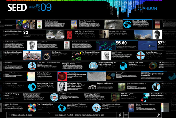
Site promoting SEED magazine and it’s articles. Providing an overview of articles on science, design, politics and so on that the world will face in 2009. Nice way of presenting a lot of data in an interesting way, nice colour based navigation system at the top which highlights the articles that address the topic you have selected. Zooming interface also allows you to isolate an article and read all about it. Quite interesting…

Created by Fangohr.

Website here…

Noodle on Noodle – Aim for Space!

By | WEBSITES | No Comments

noodle on noodle

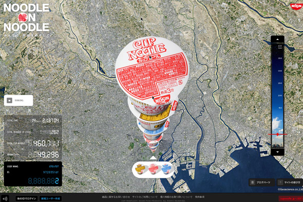
Really cool website, promoting Japanese Cup Noodles – in Japan. From a google earth-esque viewpoint users stack up pots of cup noodles with the aim of reaching space. Really simple idea, really nicely executed – you can watch other users stack up pots and see their mouse cursors and watch how they interact with the site. The screen refreshes with each newly stacked noodle pot, you can also drag a slider to the right to zoom right down to the bottom or where the stack is currently. Typically Japanese style minimal interface and clean slick interaction, looks great too – bit of a cultural nod to the google earth interface, nicely angled to bring out the full ‘stack’ of noodle pots. Really awesome…

Created by Dentsu and Dentsu Razorfish.

Website here…

Sims Snowboards

By | WEBSITES | No Comments

Sims snowboards

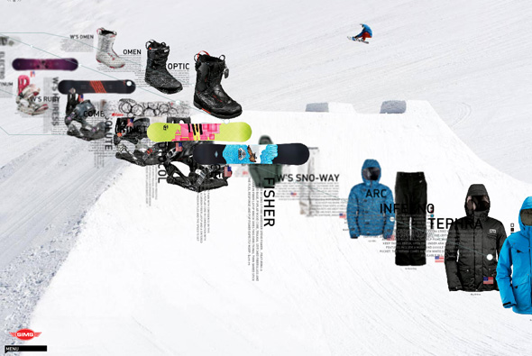
Site of Sims snowboards. Pretty interesting navigation and layout for a product website; parallax scrolling and rotation, zooming around items and info. All makes for a nice sense of depth with cool animation and interaction. Quite experimental menus that take a while to get the hang of, it’s always great to see new things and ways of navigation. Love it…

Created by FL2.

Site here…

Milk Matters

By | WEBSITES | No Comments

milk matters

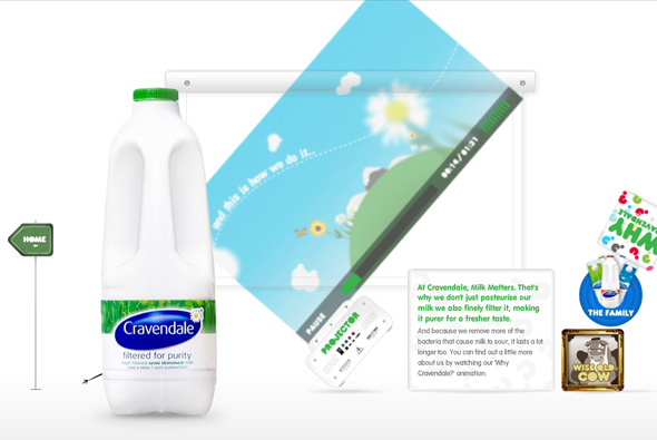
Really cool brand site for milk brand Cravendale. Like the previous incarnation this site is also highly interactive and fun, in this edition all navigational elements are interactive and can picked up and thrown around, all with realistic physics. Small hand drawn characters come on stage and add a humorous touch to things, these can also be picked up and chucked around! I particularly like the ‘why cravendale’ section where a projector playing a video can also be thrown around with projected video distorting and so on, the shadows on the picked objects are really great too. Lots of nice touches and attention to detail with really excellent Flash execution!

Created by Outside Line.

Site here…

NAWLZ

By | WEBSITES | No Comments

nawlz

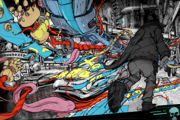
Really incredible interactive comic book, set in the future world of NAWLZ, described as ‘an experiment in interactive story-telling.’, it really is quite great (to experience it best you really need your speakers / headphones on). Basically an interactive story set alongside animation and sound design, which is all combined to make an immersive experience. The level of detail is amazing, everything has a multitude of layers and really great illustration… 

But what really makes it great is the way it works, you choose to progress the story, along with it comes the animation and the great sound design, together with all so much detail. It all really feels very fresh but also a hawk back to ‘good old days’ of experimentation, new design and progression, reminds me a lot of the earlier Hi-Res! days. Totally awesome…

Created by SUTU (Stuart Campbell).

Website here…

Sport Chalet – The Mountain

By | WEBSITES | No Comments

sportchalet

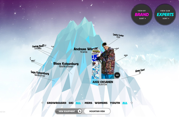
Site for Sport Chalet, promoting their range of snowboarding/skiing products. You are presented with a 3D mountain, you can rotate your perspective around it with each professional boarder/skiier name floating around it. By clicking on one of the names the mountain falls apart spectacularly to form up a new environment where you can see your selected boarder. In some there are videos, interviews, or multi perspective photos – each highlighting the gear they are wearing, where you can see the price and so on – these cool little rollovers follow the person around… I really like this site, from the way it looks, to the high production values (the keying is great), to the fun and engaging way of viewing products, so much better than the standard thumbails and product info – it’s also got some 3D! Awesome!

Created by Firstborn.

Website here…

Killers

By | WEBSITES | No Comments

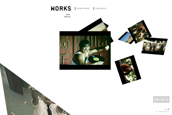
Pretty slick site of ‘Killers’, a South American production company. Yes, another 3D interface whereby you click on the images and the camera moves to show the image, which in turn loads a video highlighting the project. What I like about this example, is the smoothness, and slickness of the animation and 3D environment, it’s very simple, very fast and so smooth that just clicking between projects is a joy! I also like the little touches and attention to detail, when you view a project they have reimagined the scrubber for the video, it’s a little semi circle, it looks good – the rollovers and the buttons all feel nice and animate well. Cool site…

Created by Grafikonstruct.

Site here…

Honda FIT

By | WEBSITES | No Comments

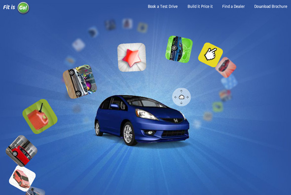
Fantastic site promoting the Honda FIT. Very cool interface, with a the car centre stage, you click and drag the car around and the thumbnails which float around the car in 3D space move so you can select them. Each section features something different, some with little games or images, each highlighting different features of the car. It’s a really fun colourful site, with a really nice use of 3D – which is followed through to the information sections – which is actually quite good fun. I like that you have to explore to get to the various sections – as they are fun you want to see most of them. Love the floating thumbnails and the great feeling of depth in the site, awesome.

Created by Grip Limited.

Website here…

Recom

By | WEBSITES | No Comments

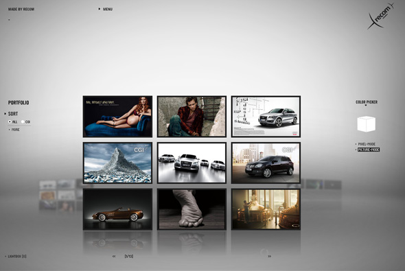
Portfolio of recom, a postproduction/artwork/CGI studio with 3 main offerings – recomPOST, recomCGI und recomART. A really great looking site, some nice touches – with the theme of pixels running throughout – you can even pick a colour and all images that have that range will display. The transitions are pretty cool, each being a cloud of pixels that morph into shapes and text. Some amazingly slick work in there too…

Created by Jung Von Matt/Neckar.

Site here…

Own Your C 2.0

By | WEBSITES | No Comments

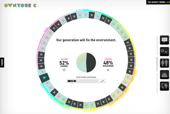
Self proclaimed as the ‘first-ever choice-making community’, the site poses questions to you, then displays how others have answered. Run by ‘The Colorado State Tobacco Education & Prevention Partnership’ to help young people form their own opinions and encourage better decisions about tobacco.

Presented in a really nice way, in 3D space! with floating responses waiting to form the results of the posed questions. You can also see how your opinions match with other user’s and see comments about each question. It is also possible to narrow results by country, gender, and age – amongst others. It’s a really nice way of presenting data in a simple, easy to narrow way. I also like the great use of 3D, really helps to add depth to the site and provide interesting transitions.

Created by AgencyNet.

Website here…

Speak Visual

By | WEBSITES | No Comments

Website promoting nVidia graphics cards & processors. Presented in a 3D interface, you can see nVidia user’s perspectives and thoughts about using their products. (Even Joshua Davies is in there!!) There is also a 3D gallery of images from user’s the world over. I like the way they have used 3D to give a great sense of depth to the site, they often break the frame of the site to give an even more pronounced effect. Throughout is a realistic sense of light and shade with polished animations, layout and typography.

Made by Odopod & Cutwater.

Site here…

Hobnox – Audiotool

By | WEBSITES | No Comments

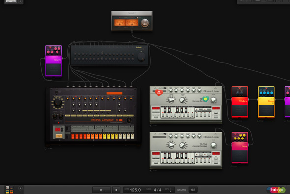
Incredible website that emulates the Roland set of synthesisers, drum machines, effects pedals and so on. You can control everything from which components you use to the tempo, rhythm, to effects – all to make compositions and sound effects. You can create a profile and save your creations and even download 5 minutes worth of material. Incredible amount of detail – you control all of the individual knobs and buttons, drag leads into mixers and boxes – and it looks great too. An example of how complex you can make Flash 10 applications…

Website here…

Safe Trip Home

By | WEBSITES | No Comments

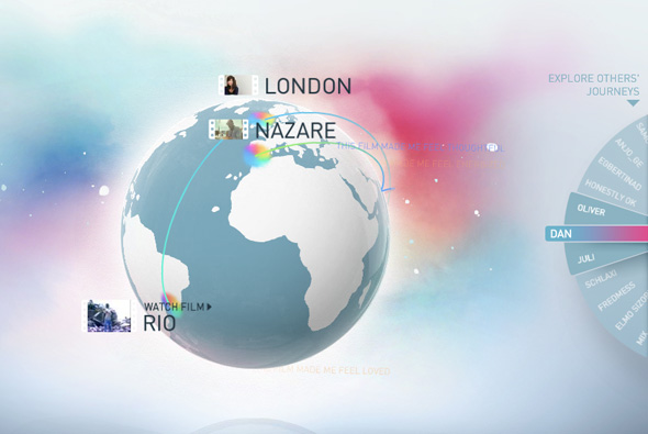
Website promoting the female vocal artist Dido and her new album ‘Safe Trip Home’. Featuring film director’s videos that are inspired by the idea ‘what home means to them’, they accompany selected songs from the album – the audience can also respond with their opinions which then float around the globe and when you are looking at specific videos. Navigated by dragging around a 3D globe and viewing the various videos.

It’s a really nicely crafted site, lots of attention to detail, nice typography, and a great interface, really easy to use and great to look at. Really a rich site and a nice idea for promoting a new album, you get the hear snippets of the songs, see nice visuals and interesting short films, and get emotional responses from people all over the world…

Created by B-Reel and Work Club.

Site here…

Toshiba – The Journey of Innovation

By | WEBSITES | No Comments

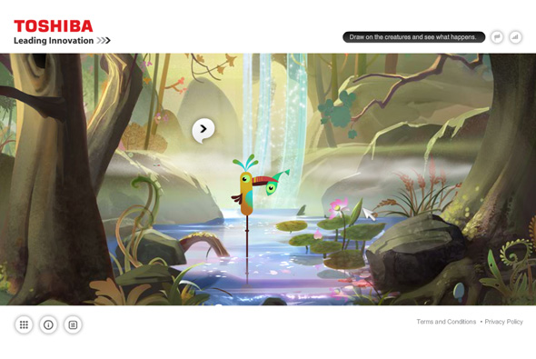
Lovely site promoting the latest Toshiba range of electronics, laptops, cameras and so on. Best explained by Unit 9, ‘An experiential website engaging users through gesture navigation allowing them to spend time with Toshiba’s innovations and products in a new and innovative way. The website detects patterns. Interact by drawing.’

Really like the illustrations and the adventurous approach to navigation and interaction, it works quite nicely, for example you draw a swirl around one of the fish and it changes shape, or draw a zig zag over the characters playing music and the soundtrack changes. It looks great and a nice, positive, non-techy approach to an electronics brand.

Made by Unit9.

Site here…