detail

Julian Velard

By | WEBSITES | No Comments

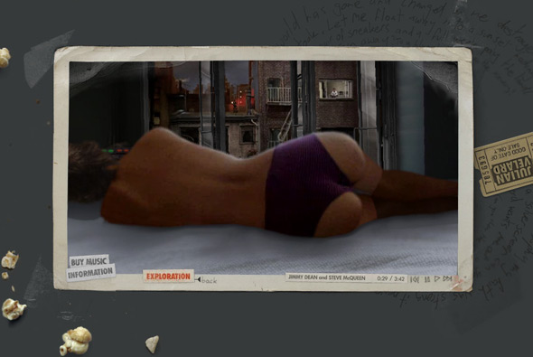
Julian Velard

Fantastic website for singer/songwriter Julian Velard. You are free to explore his mind and play puzzles, reveal music and experience his world. Incredibly addictive you want to explore every area, and discover all the scenes, it draws you in and of course the background music is his own. Great way of keeping the audience captive and providing an enjoyable way of promoting yourself. I played on this for over half an hour and loved it, really well designed and executed was a joy to play with.

Crafted by the amazing WEFAIL.

Website here…

Natasja Fourie

By | WEBSITES | No Comments

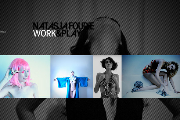
Natasja Fourie

Very stylish portfolio site of photographer Nastasja Fourie, great work, great site. Divided by ‘work’ and ‘play’ sections to display a collection of photographs. Slightly pretentious intro, but once past that, there is a nice soundtrack and sound fx, a motion design feel to it, lots of nice effects and transitions – all stylish. Really like the amount of animation and attention to detail throughout the site – really provides a nice presentation to the work.

Created by Kris Cook.

Site here…

The Eco Zoo

By | WEBSITES | No Comments

The Eco Zoo

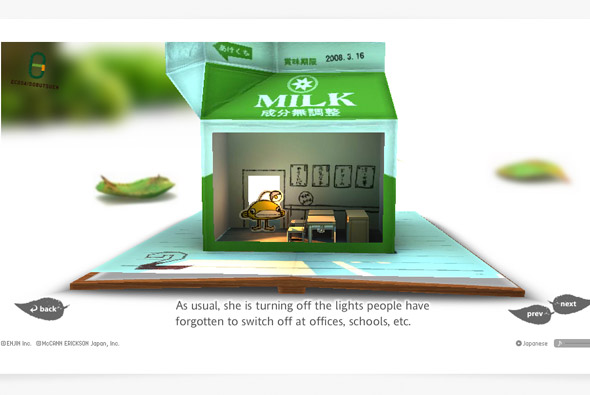
Beautiful, stunning work! Not quite sure what it is for – but it is inspiring you to take better care of the environment. Just simply an amazing website. Built around a cut out concept where the stories of various characters are told, through a cut out look and feel executed in a 3d fashion. When you click on a character your view zooms to the pop up book of their story, the beauty of it is the panning and rotating of the camera around the book, there is a huge attention to detail – by rotating the view you can see more details and explore the scene. I love the concept and the look and feel of the whole site, it is truly inspiring – where technology and design meet in unison – the 3d element is smooth and perfectly executed, the visuals are great and fun.

Created by the ultra talented Masayuki Kido, known as ROXIK – of Pictaps fame. He used his own 3d engine ‘Sharikura’.

Website here…

Uniqlo Try

By | WEBSITES | No Comments

Uniqlo Try

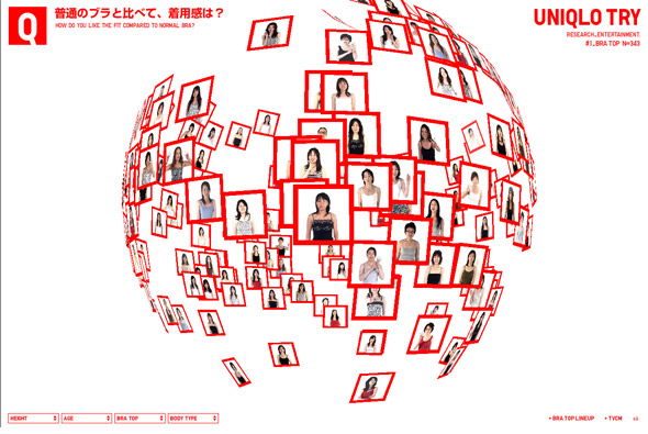
Wow, another amazing Japanese website for Uniqlo – the presentation of opinions of 343 customers to a bra Uniqlo make! The work created for Uniqlo has been consistently amazing, always technically brilliant backed up with a nice concept. This is another example of that, instead of producing something simple & boring, something that is essentially about a survey, a fantastic 3d representation of opinions has been created. Floating through the opinions the way the data is presented is constantly flowing from one state to another, making new 3d shapes, and morphing colours. I really like the crisp presentation coupled with the smooth transitions and fast performance of the site. Technically proficient and well executed to present a really enjoyable user experience.

I have long been a fan of Japanese web design and its really good to see so many amazing sites appearing. The mix of music, technical excellence, and simple layouts provide the fun, colourful, and enjoyable approach that is often common place in Japanese designs. So often the more imaginative, conceptual side of web design is ignored for the slicker, polished look and feel, it is so refreshing to see a different viewpoint.  

Created by Simone Inc.

Website here…

Samsung People

By | WEBSITES | No Comments

Samsung People

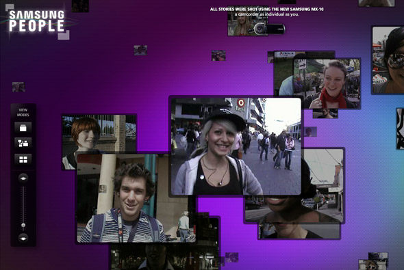
Site promoting Samsung’s MX-10 camcorder – hundreds of people were asked ‘Where is your mind?’, this site shows the results. A nice scrolling interface to display the various videos, which you can view in different ways. Good attention to detail and nice transitions and effects.

Made by Holler Sydney.

Site here…

TERM’IT

By | WEBSITES | No Comments

Term’it

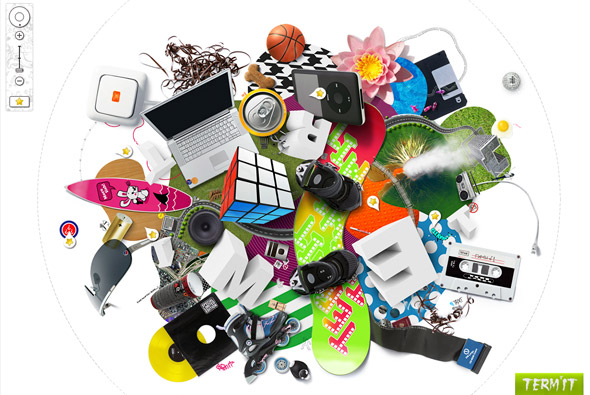
Interesting site for Russian clothing brand Term’it. The explorable interface has 3 main levels, where you can zoom in, rotate and pan around to see the clothing amongst other things. Technically it well accomplished, and works well – the rotation and zooming is smooth and feels good to use. Nice attention to detail and intelligent loading of sections means it all provides a good user experience. I like the thumbnails of the clothing and the playful way they are displayed.

Made by PARK Studio.

Website here…

Louis Vuitton Journeys

By | WEBSITES | No Comments

Louis Vuitton Journeys

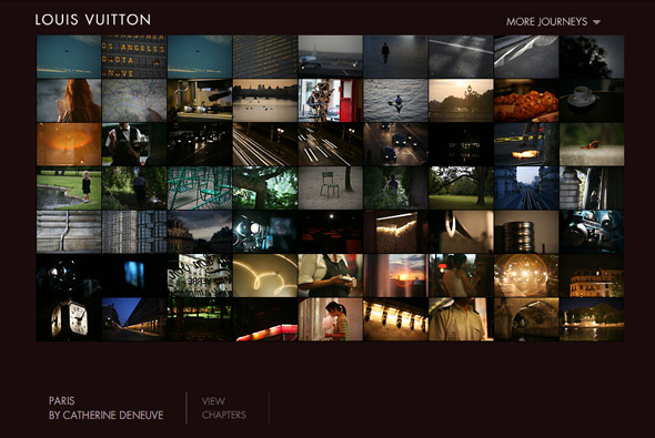
Website promoting the ‘jouneys’ campaign for Louis Vuitton. A very nice experiential site, with various people describing and painting a picture of their favourite cities for example London by Keith Richards. In each of the ‘journeys’ you experience images, videos, and sound from the various cities. It is a nice concept well executed – it is interesting to see ‘famous’ people give insight into their feelings about these places. With lots of nice little touches and details together it all provides a fairly cinematic montage of these amazing cities and inspires feelings to create your own ‘journey’.

Created by Ogilvy Interactive Paris.

Website here…

Leslie Low

By | WEBSITES | No Comments

Leslie Low

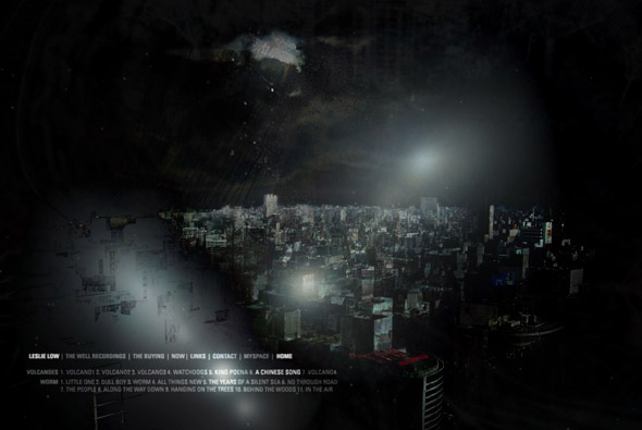
Website of Singapore based singer/songwriter Leslie Low. Explore an environment inspired by the music which acts as a backdrop and soundtrack to the visual fly through. Lots of layers that affect the scenes through different blending modes and provide a very visually interesting experience. Talking about ‘experiential’ sites, this is a nice example, nice attention to detail and I like the ‘about’ section (leslie low button) where the artist talks through his history and inspiration – which all overlays the background.

Overall the site provides a calming diversion that makes you want to explore all aspects of the site and provides a nice insight into the artist.

Website here…

Audi RS 6

By | WEBSITES | No Comments

Audi RS 6

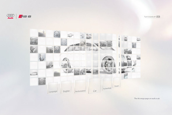
Another great Papervision site, this time promoting the Audi RS 6. Well, Papervision again used for great effect, this site shows how you can convert nice concepts into reality. The individual boxes react to the soundtrack and also act as a mask for a video. They also move along paths in 3d space to make up the interface, all very slick. Really like the attention to detail regarding the overall almost cinematic experience.

From the same guys who brought us ‘Rhythm Of Lines’, Good Technology.

Website here…

Elastic Mind

By | WEBSITES | No Comments

Design & Elastic Mind

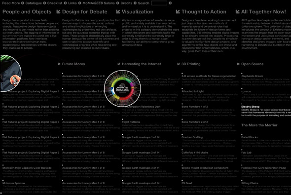
Extensive collection of artwork from MoMA’s Design and the Elastic Mind exhibition with some 240 pieces. With such a mission to display this amount of work, a well conceived and executed navigation system has been produced. Each item is interlinked with varying categories and more detail can be seen. With such complexity the site is easy to use, and totally intuitive. The work in the site is amazing too, a really great website.

Created by the legendary tha ltd.

Website here…

In an ABSOLUT World

By | WEBSITES | No Comments

In an ABSOLUT World

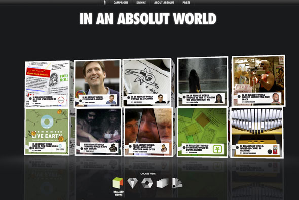
Another great Absolut microsite, promoting the visions of ‘an Absolut world’. Each vision can be opened up – the box unfolds -and shows a 3D animated vision. It provides a really nice user experience, and you can even upload your own. Really like the way the boxes open and reveal their contents – really cool. Lots more info here.

Created by Greatworks with the help of Papervision creator Carlos Ulloa.

Website here…

The Vacuum Design

By | WEBSITES | No Comments

The Vacuum Design

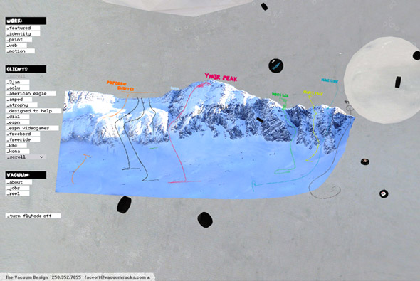
Really cool website for The Vacuum Design. You float around their portfolio in 3D, demonstrating their style of work. There are some really great sites and motion design showcased here. A great 3D website where the form really adds to the design – nice concept and nice design.

Website here…

Red Bull – Flugtag Flight Lab

By | WEBSITES | No Comments

Redbull - Flugtag Flight Lab

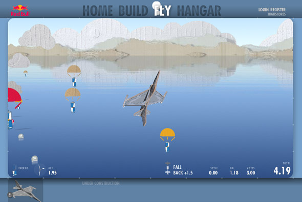
Wow, incredible site for Red Bull promoting the Flugtag – an international event where people create flying contraptions and run off a large ramp into a lake! This is the interactive equivalent. You can design your own plane, edit other peoples, or use templates – you can paint it, choose what material the parts are made of and so on. You then enter the flying arena where you take your design to the skies and perform tricks and try and get a high score.

The attention to detail is incredible, created by Less Rain, as they write in their blog: “Flight Lab gives you the real thing: It’s a 6DOF (degrees of freedom) flight simulator modeled by a physics engine in 3D using rigid body dynamics. Real airplane wings can be described by specific lift and drag coefficients, depending on how quickly and from which angle the air flows over a wing section. That’s what Flight Lab does.” Some great ‘making ofs’ can be found on their blog, part 1, part 2. Just a really amazing, ground breaking site, made in Papervision that really couples great design, usability and latest technology. I love the art direction and the concept has been well thought out and executed, really impressive!

Site here…

Project Cloverfield

By | Loose | No Comments

Project Cloverfield

Having recently seen the movie ‘Cloverfield’, it reminded me of the viral campaign that preceded it last year at some point. I love the idea – even though its all of course manufactured – of the whole enigmatic backstory. I think as humans, well i am, we are drawn into the ‘code of enigma’ that is generated by such marketing techniques. We ‘need’ to know the answer and we hunt down and investigate until we know the answer – well sometimes!

The suite of websites created for the movie is not spectacular – but include the inevitable myspace character pages, a Japanese corporate website, and Flash microsites amongst others. This is the great aspect of interactive work, a web of mystery can be created, sent around, and talked about – you don’t get this to the same extent in print or tv. Other campaigns have also been interesting – I remember a pretty cool NIN trail of websites http://www.securebroadcastinformatics.com/, try and find the hidden login box (also read: this post).

List of known Cloverfield websites:
http://www.1-18-08.com
Example character
http://www.slusho.jp
http://www.tagruato.jp
http://www.tidowave.com
http://www.jamieandteddy.com (password: jllovesth)

know that its all pretty cheesy and tacky and transparent, however I just believe that its a great way of involving your audience and makes it all seem that little more interesting…