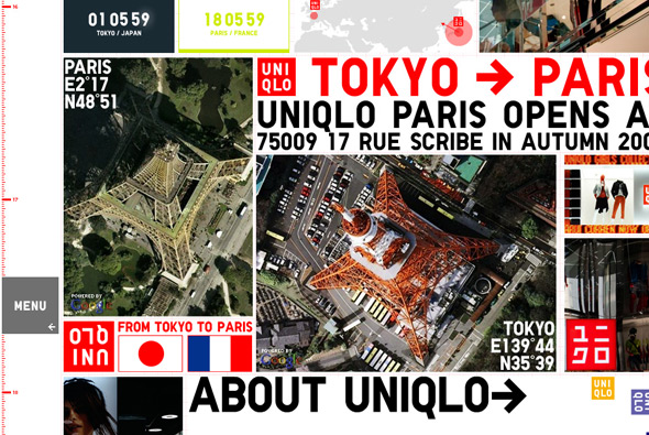
Yes another Uniqlo microsite, this time promoting the new launch of a Uniqlo store in Paris. Apart from that it’s pretty unclear – apart from general promotion – but this site is very flashy and fun. Currently it’s at 16000 pixels tall, which i’m assuming will grow as new content is added – along with the date scale on the left. Lots of little videos and products on display as you scroll down the huge page – all a bit mental really – but looks great!
detail
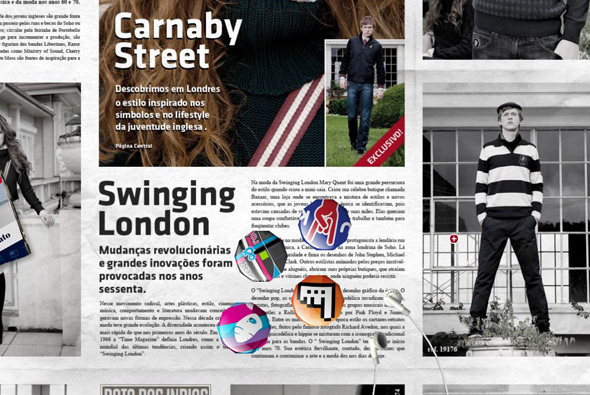
Brazilian site promoting Banana Cafe clothing. Using the newspaper visual metaphor to display the range of clothing and copy. The nice thing about this is that they have created it all in 3d, using the loading screen to give a brief tutorial on using the interface, you click and drag to move around – with the paper tilting and panning realistically. What I love about it is the level of detail – on top of the paper are 3d objects you can drag around and interact with, they even collide with each other. For example there is a London bus, you click it and then you can drive it around the newspaper, you can click and drag the individual headphones on the iPod, etc etc. When you view the photos they come out of the newspaper and enlarge so you can see them better. Love all the attention to detail and the interactivity, it also happens to look great, really cool site…
Created by Fábrica Do Design.
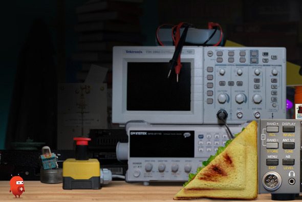
Site promoting the Museum of Science and Industry in Chicago. Designed to teach children basic physics, the whole experience is played out via ‘Twitch’ a little character who you interact with to complete physics challenges. Really nice puzzle games that are well designed and polished, with great animations, cool music & sfx and a nice physics engine – all together combine an ideal fun and engaging site for kids (and adults!) to learn about physics.
Created by Unit9.
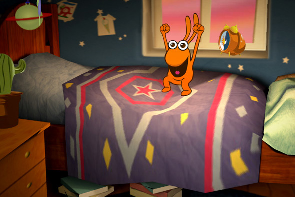
Entertaining site accompanying the BBC kids show ‘Big & Small’ – designed for children aged 3-6 and their parents. The site is a playground, with little interactive games and experiences such as hand painting, music, videos and so on. But what makes this so remarkable is the depth and polish of the site itself. Set within a detailed 3d environment you explore the setting via the interactive experiences, with your mouse affecting your view. But it isn’t just the way it looks, the interactive sections are really a lot of fun, each of them highly polished, with great animations and sound fx – it’s been a while since i’ve interacted with a site like this for so long! For example there is a small game where you have to try and brush the teeth of one of the characters and the toothpaste spreads all over the 3d items in the bathroom, the sink, the mirror etc. Another where one of the characters jumps on the bed and the bed surface reacts to his movement. The little touches all add up to make a fantastic website with incredible use of Papervision – really detailed environments, highly interactive, and really well designed.
Created by Plug-in Media. Really nice write up from Seb Lee-Delisle one of the team members that helped shape Papervision.
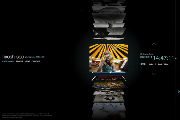
Portfolio site of photographer Hiroshi Seo. Slick timeline based interface which allows you to quickly scroll through thumbnails of his photos. Each of the thumbnails are 3d and flip upwards, much like a vertical coverflow interface, and organised upon time – on click the photo enlarges. Really like the scrolling interface, and the whole minimal slick look & feel. All in all a very nicely made photographers portfolio with some really nice touches with smooth fluid animation, nice interface that fits the content well.
Created by Murakami Design.
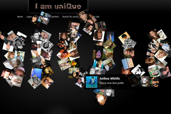
Interesting site promoting Foxtel’s IQ TV box, the site allows you to create an ‘interactive 3d portrait’ of yourself. Using photographs, words, stories, Twitter feeds, and so on – users can make a tiled 3d image of themselves which they can share with friends, Facebook etc. What I like about it, is the 3d build up of the ‘i am unique’ text made up of photos, and the way you interact with the scene, also the way the portrait is made up of various bits such as uploaded photos and descriptive words. Overall design is nice and simple, with a lack of overwhelming branding, the 3d portrait is a bit buggy but the idea is pretty nice…
Made by Lowe Sydney.
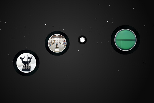
Website of artist Keith Tyson. Nice site which presents the works of Keith Tyson, presented in a floaty 3d space, you select projects and then view them from within a circular interface. A well designed site, with a clear interface and all the features you come to expect, but all done in an excellent way. Nice attention to detail, interface and look & feel, a great example of an online gallery…
Created by De-contruct.
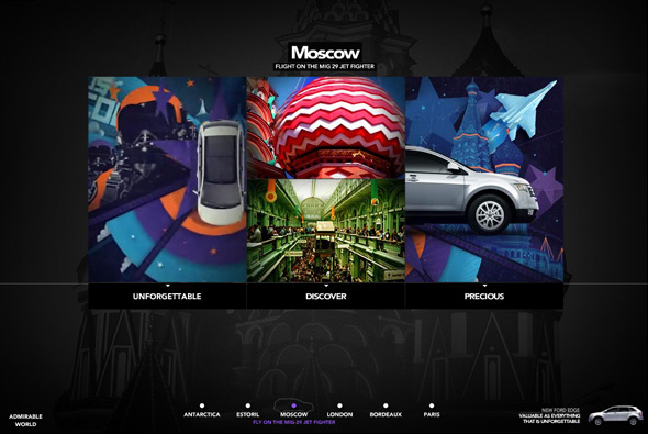
Site promoting the new Ford Edge. Nice looking site with lots of animations, transitions, and so on, bit of a weird one, I guess because it is mainly for the Brazilian market the copy does not translate across so well. Nothing ground breaking, but interesting and varied animations, attention to detail and lots of movement, all making it visually ‘exciting’.
Created by JWT Brazil.
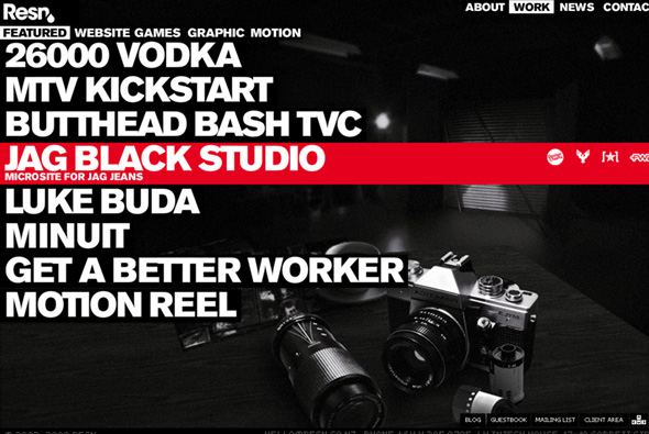
Cool portfolio site of digital agency Resn, from New Zealand. Nicely done, their personality and slick Flash design skills comes through. Like the use of bold typography and nice detailing and animation. Good to see something slightly different and an agency not scared to show their personality…
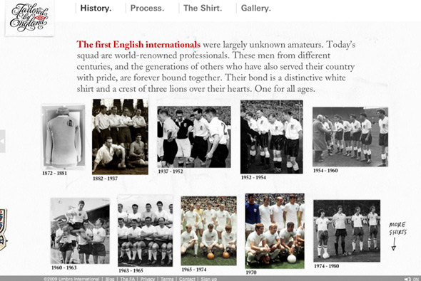
Site promoting the new England football shirt. This site goes for the angle of showing the craftsmanship and history of the England shirt, how the design has changed over the ages and how it is today. Nicely designed to reflect the shirt the site itself is well crafted – you move your view around a nice 3D area with the different sections of the site located in various places, your perspective changing swiftly through the scene. I like the rotating view of the new shirt with the different features highlighted – with a really nice panning detailed photo of each feature. The site also looks great, lots of nice touches and cool buttons, all with that ‘hand crafted’ look which the site is aiming for. Great animation and transitions and nice use of 3d, draws you into exploring all the different sections of the site, pretty cool…
Created by Perfect Fools and Anomaly.
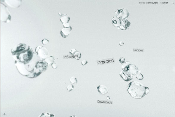
Beautiful site of 26000 Vodka, a vodka from New Zealand that is made from water which is 26,000 years old. Really well designed, a lovely interface, and simplicity at it’s core. Your navigation is presented with droplets of vodka, freeze framed in a 3d interface along with the main navigation, your viewpoint pans and tilts as you move your mouse – all giving a nice perception of depth. Each of the sections have a similar effect and navigation highlighting it’s ingredients, recipes, downloads and so on. You pick up small facts and info along the way, between each section are short questions (relating to 26,000 years) or ‘vodka secrets’. I love the play with the depth of field and the subtle 3d, which is not intrusive or detractive. As you navigate the site you feel inspired by the subtle interactivity and simplicity of the whole thing. Even the age check is done nicely, lot’s of attention to detail, nice animation and transitions, great sound design, and mostly you come away feeling enchanted and learning something about the product… fantastic.
Created by Resn.
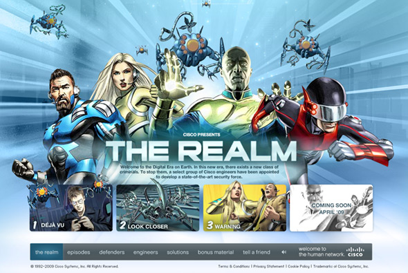
Site promoting Cisco System’s security. Desperately trying to make IT security interesting, this site has some pretty nice content… Well polished comic book characters play out scenes in which people’s IT security is in danger… But what I really like about this site is the really nice buttons/rollovers/video players/transitions and so on. The design also feels very fresh and modern with well considered typography and layout – very similar to the Nike.com. But really the attention to detail is quite superb, there is also a lot of content to go through, one of the nicest video players i’ve seen, you just feel that every part of this site has been well crafted and coded. One of the best pieces of Flash work i’ve seen for a while…
Created by Ogilvy West and Your Majesty.
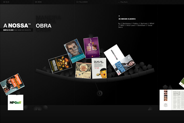
Fantastic site of Portugese agency Nossa. The attention to detail and polish in this site has really got to be experienced to be believed, really incredible. For example when you look at their work, each case happens to be part of fully interactive physics engine. Look at their location, Google maps is fully integrated into the interface. All the rollovers / buttons / user actions are thought about, the whole site is well laid out and designed, it really is a shining example of a great portfolio site… very impressive…
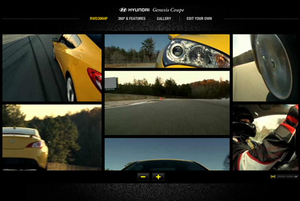
Really nice site for the new Hyundai Genesis Coupe. Very slick, simple site that features multi angle videos showing the car being driven at high speed around a race track. You can add and remove cameras to the interface to see the action unfold, even with driver’s commentary, you can also enlarge any view. Really nice sound track of the car’s engine, with some subtle hints of music in other sections. Nice twist on the 360 degree video of the car, with it doing a donut! The main features highlighted whilst tracking the car, pretty cool. There is also a subsection of the site where you can edit your own video using clips from the shoot, all in a mock Premier Pro interface, very full on, can imagine it took a long time to code! Extremely detailed online editing tool! Lots of polish and attention to detail, from the preloader to the rollovers, very very cool…
Created by grupo w, and Goody Silverstein.

