design

Design Embraced

By | @DesignEmbraced | No Comments


Slick folio site of Anthony Goodwin Creative Director / Art Director – and his refreshed portfolio. Minimal and well considered layout which transitions nicely into project pages with a satisfying ripple / bounce. Great body of work and nice attention to detail like the little cursor ‘bump’ along the material-esque background.

Created by Design Embraced (@DesignEmbraced)

Site here…

Beyond Beauty

By | @LouisAnsa | No Comments


Site showcasing several female actresses that reveal hidden depths and go beyond what they are often known for. Beautifully designed, lots of imaginative and bold use of type, juxtaposed with all the fluid and dynamic visual flourishes. Love the speeches inside of the profiles that animate the text as spoken, lots of nice attention to detail such as the end of the profiles, menus and so on.

Created by Louis Ansa (@LouisAnsa) and team.

Site here…

Ethics for design

By | @designandhuman | No Comments


Interactive documentary about ethics in design. “Every day we use objects, services and applications designed by all kinds of designers. But does this mean that everything a designer conceives is done in our interest? Some interfaces are designed to get all of our attention and some products are designed to die prematurely.” This documentary aims to cover some of the interesting topics in design in a thoughtful and innovative way. Love the use of the pane mechanic to dynamically resize the windows.

Created by Design and Human (@designandhuman).

Site here…

Visibility

By | @hawrafintl | No Comments


Site of industrial design studio based in NYC. Clean minimal layout led with lovely product photography. Love the clean aesthetic and imagery heavy product pages, fun contrast to the playful homepage, which I also love. Fun site and beautifully designed.

Created by HAWRAF (@hawrafintl).

Site here…

Norman

By | @presstube | No Comments


Norman is a neat web tool to created animated 3D scenes viewable with a supported VR device. If you have the VR controllers you can create your own animated scenes – like Tiltbrush but all browser based – pretty amazing. Love the hand drawn and organic feel that really brings sketches to life.

Created by James Paterson (@presstube) and Google Creative Lab.

Site here…

Flavien Guilbaud

By | @baptistebriel, @flavienguilbaud | No Comments


Super slick, super cool folio of Flavien Guilbaud digital Art Director. Love the homescreen, transitioning between monotone photography and bold type. Tap on a project and transition into the project pages, heavy on visuals and screen captures. Beautiful and bold Art Direction and well executed, great example of a modern stand out folio.

Created by Flavinsky (@flavienguilbaud) and Baptiste (@baptistebriel).

Site here…

R Magazine

By | @webdesign | No Comments


Site of Japanese lifestyle magazine R Magazine. Featuring a variety of content such as fashion through to food. Sleek and minimal design with editorial and fashion photography. Love the subtle scrolling effect and art direction throughout, with lots of small UI details and transitions.

Site here…

Wind and Words

By | @WeAreImpossible | No Comments

ww-1
ww-2
ww-3
ww-4
ww-5
ww-6

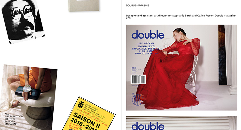
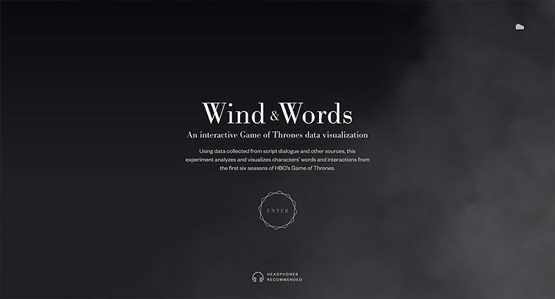
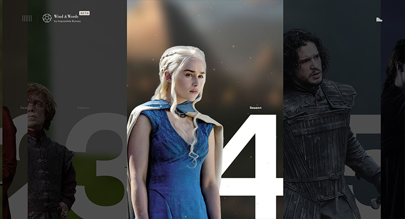
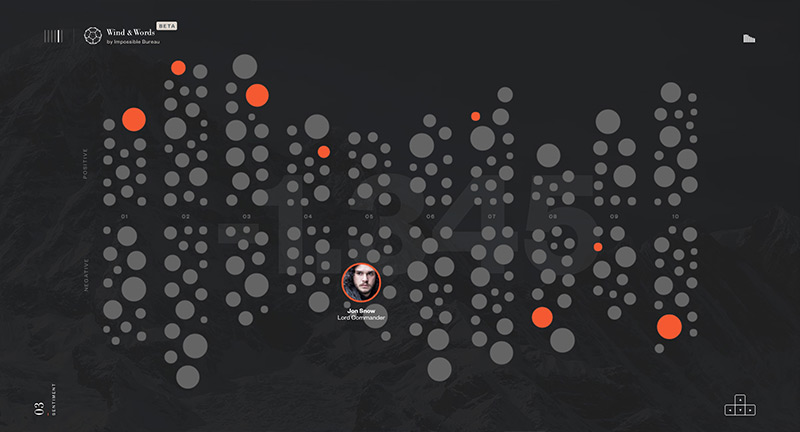
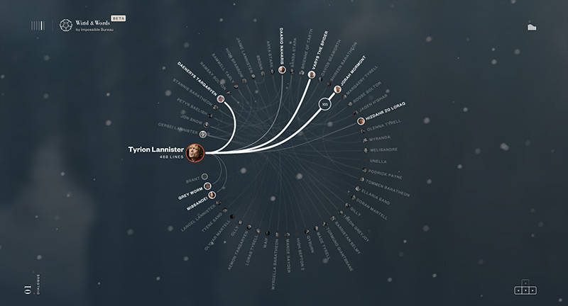
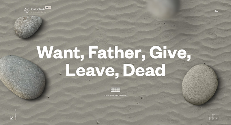
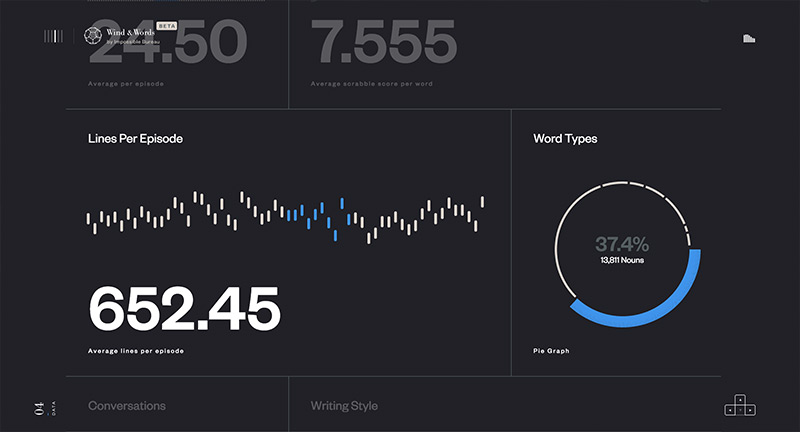
Beautiful site and data vis of the words and dialogue from Game of Thrones. Divided by each of the seasons, each with their own custom ambience, you can dive into the relationships between the characters and explore the data. Love the various ways they have visualized the data, one chart showing the amount of dialogue and who they spoke to, another showing the sentiment, one allows you to explore the words, and another shows types of words with a more graphic approach. The level of polish and detail is amazing, from particle effects, fantastic imagery, to nice type – you can tell they have poured heart and soul into this project – and it shows. All of the design is lifted by transitions and animations that add a dynamic element to the experience.

Created by Impossible Bureau (@WeAreImpossible).

Site here…

Dev Random Notes

By | @webdesign | No Comments

dev-notes-1
devnotes-2
devnotes-3

Site of Chinese based designer and coder Du Haihang. Nice exploratory of visual code experiments that play with 3D, textures, and physics. Simple scroll mechanic to go through the experiments, love the transitions and bold type – nicely wrapped up in a minimal interface, fun to play around with.

Created by Du Haihang.

Site here…

Gabe Ferreira

By | @gabe_ferreira_ | No Comments

gabe-1
gabe-2
gabe-3

Site of Gabe Ferreira US based designer and creative. Love the ultra minimal approach, beautifully pared down UX and design that really lets the work shine. Some fun interactive moments like the rollovers on the projects, and blur transitions that just add some dynamism into the site. Lovely work too!

Created by Gabe Ferreira (@gabe_ferreira_).

Site here…

Draft

By | @SHIFTBRAIN | No Comments

draft-1
draft-2
draft-3

Site for Japanese interior design firm Draft. Lovely portfolio of work brought to life with lots of nice animation, transitions and interactions. It looks great, lots of large type and offset details that really break up the page and inject a sense of energy.

Created by Shiftbrain Inc (@shiftbrain).

Site here…

Number 04

By | @_number04 | No Comments

number4-1
number4-2
number4-3

Site for US based design studio Number 04. Playful and simple with large type that spells out rather than showing what they do. Nice mixture of imagery, video, gifs and so on for the project pages. Love the fun cursor replacements that add a surprising element, lots of nice little features like this – such as rolling over the project thumbs changes the background colour, also – if you leave the site idle for a while – you can play pong! Also a closing note reveals a drawing canvas. Nice modern site with personality.

Created by Number 04 (@_number04).

Site here…

Tank Magazine

By | @tankmagazine | No Comments

tank-1
tank-2
tank-3

Site for Tank magazine, UK independant quarterly on contemporary culture, design, art and so on. Love the 3D panels showing the latest issues content outline – some interesting interaction, where the entire paragraph splits and reveals imagery. Minimal design makes a nice juxtaposition with the content and imagery from the magazine.

Created by Tank Magazine (@tankmagazine).

Site here…

Jeremy Vitte

By | @TristanBagot | No Comments

jeremy-1
jeremy-2
jeremy-3

Site of Jeremy Vitte art director and designer for magazines, books and identity. Simple folio site that shows the range of work in a minimal way, love the way the screen splits to show the open project down the right side of the screen. Nice range of work displayed in an elegant and complimentary way.

Created by Tristan Bagot (@TristanBagot).

Site here…