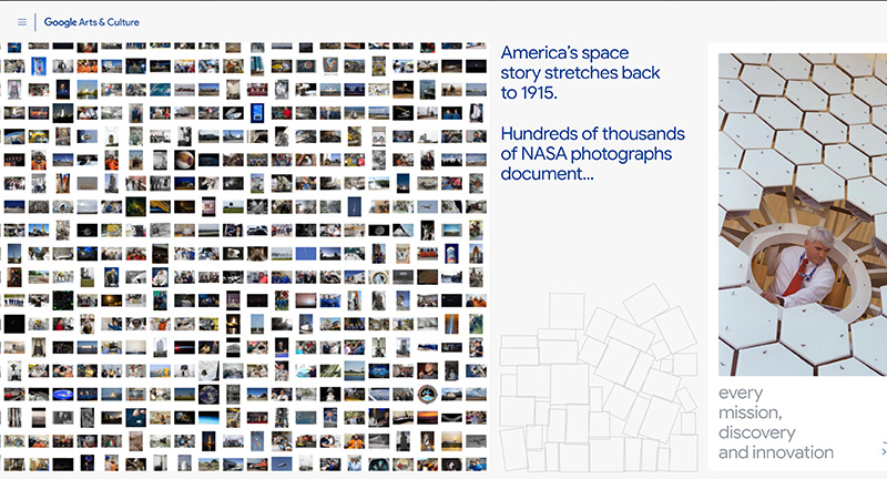
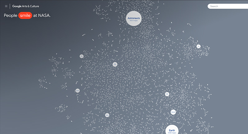
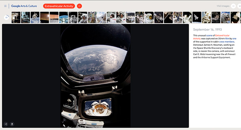
NASA’s photography archive analysed and group by ML into interesting clusters, editorialised by machines. Fascinating concept to make a huge photo library more browsable, by using sorting mechanics to spot similarities and group subjects together. Love the slideshow-esque exploration of themes which takes you through some fascinating themes. Very exploratory interface, with a smart search function, and fun to browse dive deeper on range of topics.
Created by Google Arts & Culture (@googlearts).
educational
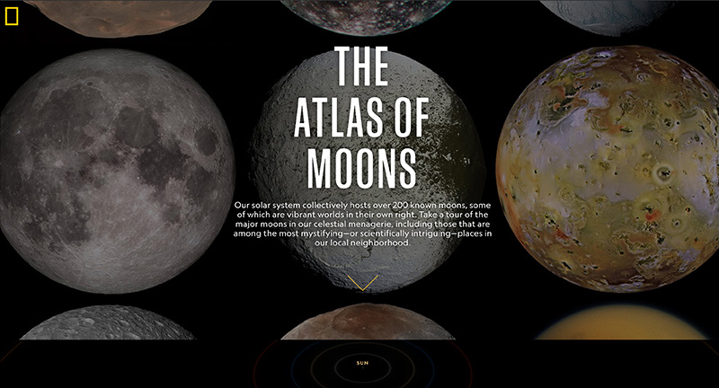
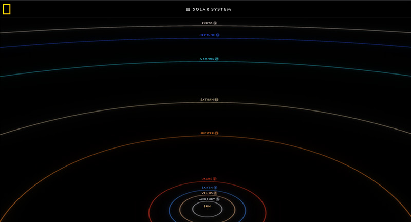
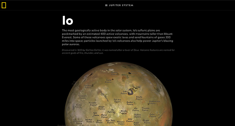
Beautiful experience “The Atlas of Moons” that offers an immersive and fascinating glimpse of the moons orbiting the planets in our solar system. The editorial experience parallels that of their magazines and reminds me of the fascinating book ‘Atlas of Remote Islands: Fifty Islands I Have Never Set Foot On and Never Will’. Love the use of 3D here to offer a draggable ‘map’ of each of the major moons, but to also highlight the orbit of the planets and moons. The level of detail is incredible – love the ability to map states in the US to see and relate the scale.
Created by National Geographic (@NatGeo).
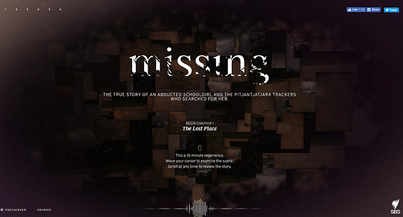
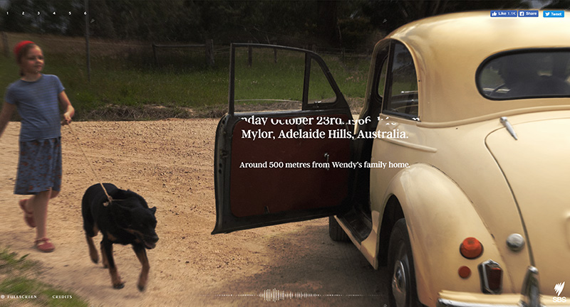
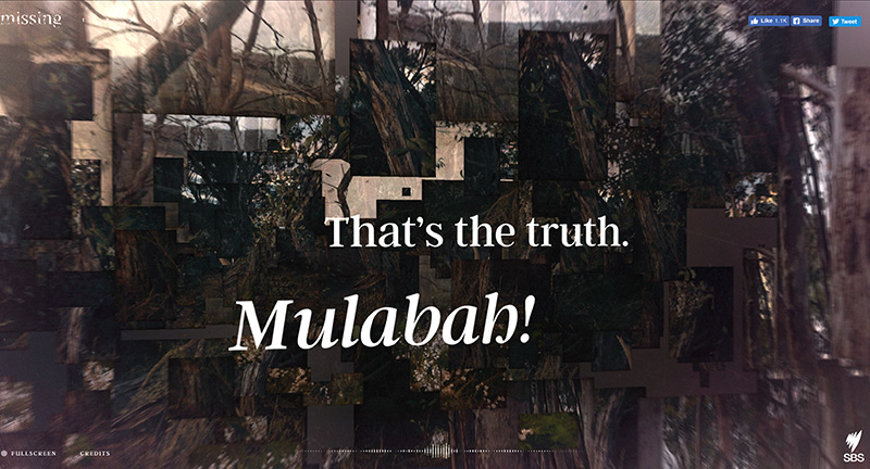
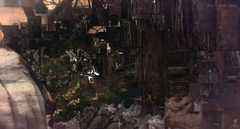
Interactive documentary telling the story of an abducted school girl and the trackers that searched for her. Beautifully crafted site that allows you to explore the scenes to uncover the story through the eyes of the trackers. Mix of video, 3D, typography, audio narrative and storytelling – great example of interactive storytelling.
Created by SBS Online (@SBS).
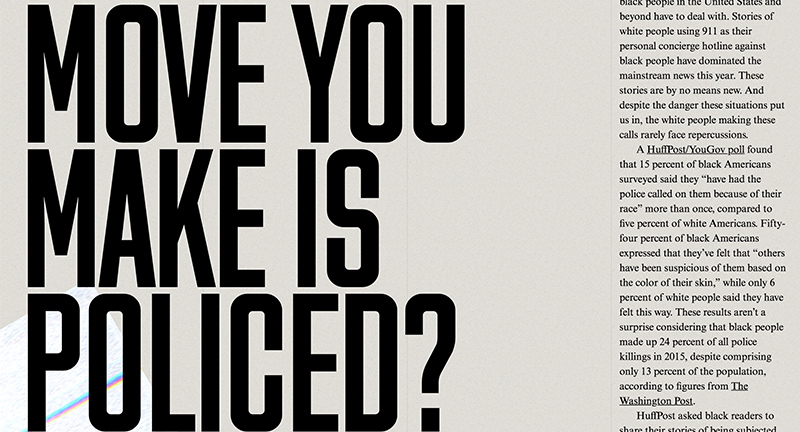
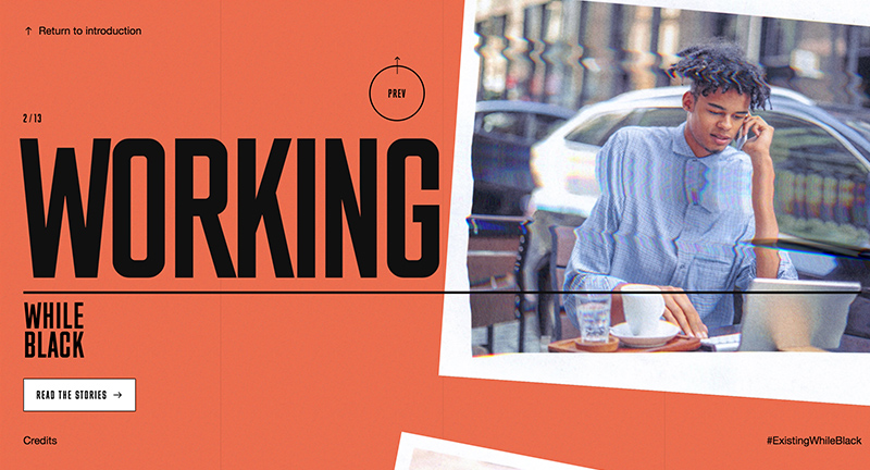
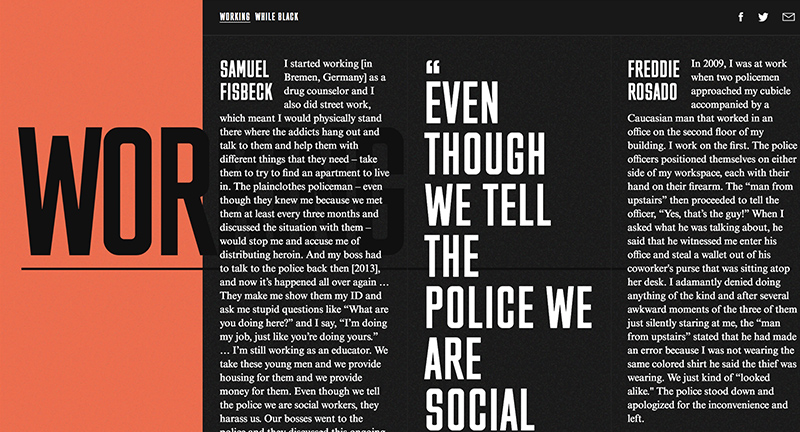
Interactive documentary about what it’s like to exist while black. A range of stories from people describing discrimination in everyday existence – shopping, driving, parenting. A bold type driven experience, full of heart wrenching stories, told through the eyes of those who are victim of everyday discrimination.
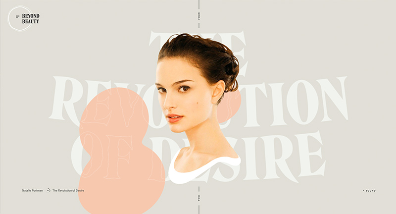
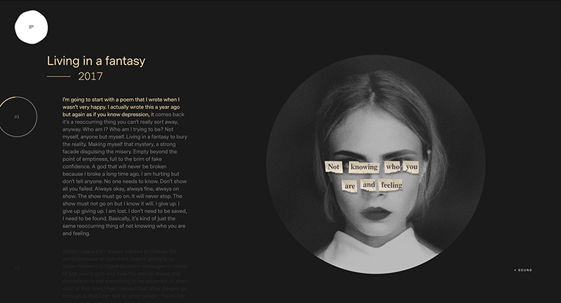
Site showcasing several female actresses that reveal hidden depths and go beyond what they are often known for. Beautifully designed, lots of imaginative and bold use of type, juxtaposed with all the fluid and dynamic visual flourishes. Love the speeches inside of the profiles that animate the text as spoken, lots of nice attention to detail such as the end of the profiles, menus and so on.
Created by Louis Ansa (@LouisAnsa) and team.
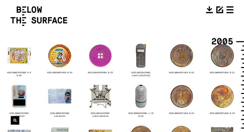
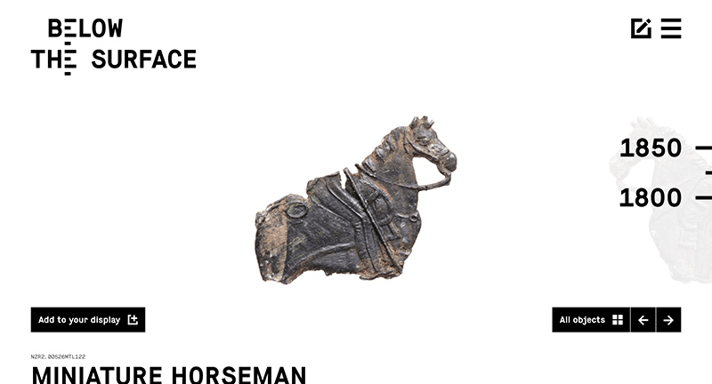
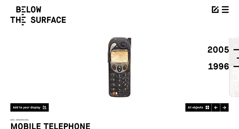
In Amsterdam they dredged the Rokin canal and uncovered a wealth of objects dating back from 1349. Each object uniformly photographed and documented – fascinating reveal of thousands of objects documenting human history in the city. Incredible overview of all of these items all in the same style. Love the minimal design and elegant site that lets you explore each item. Fantastic project beautifully realised.
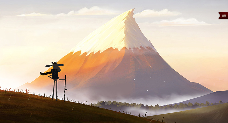
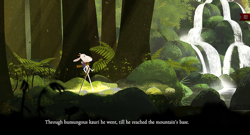
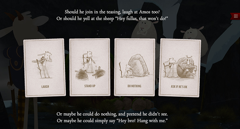
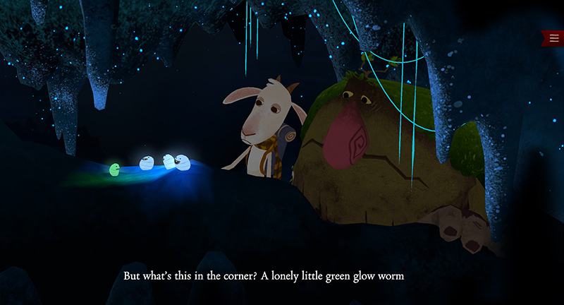
Interactive storybook featuring the adventures of Oat the Goat – tackling the topic of bullying. Beautifully crafted story and imagined 3D world – with simple tap based interactivity to make choices along the way. Love all the sound effects, music and dialogue – great attention to detail throughout. Nice way of broaching the topic of bullying through a wonderful and charming interactive story.
Created by Assembly (@_Assembly) & FCB New Zealand (@FCBNZ).
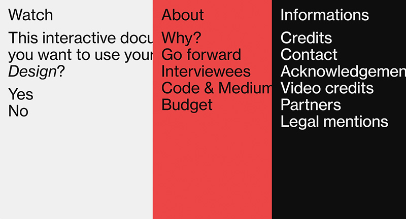
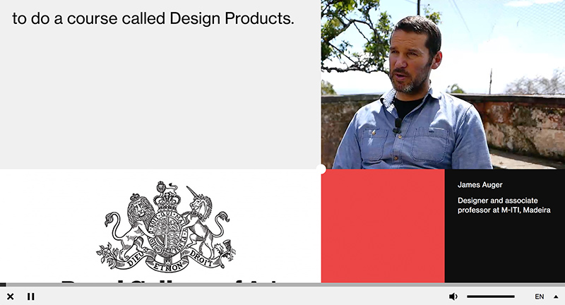
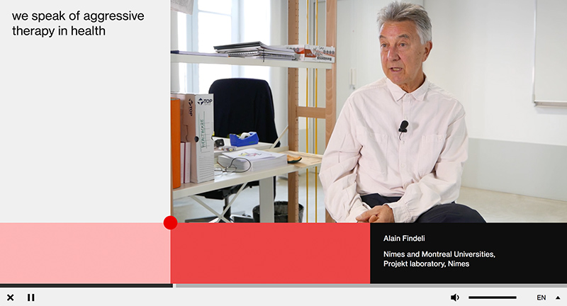
Interactive documentary about ethics in design. “Every day we use objects, services and applications designed by all kinds of designers. But does this mean that everything a designer conceives is done in our interest? Some interfaces are designed to get all of our attention and some products are designed to die prematurely.” This documentary aims to cover some of the interesting topics in design in a thoughtful and innovative way. Love the use of the pane mechanic to dynamically resize the windows.
Created by Design and Human (@designandhuman).
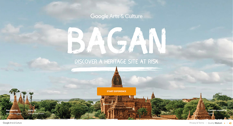
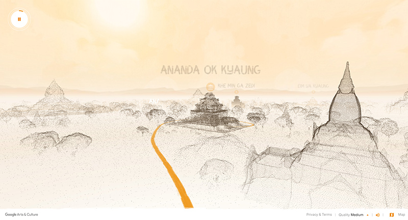
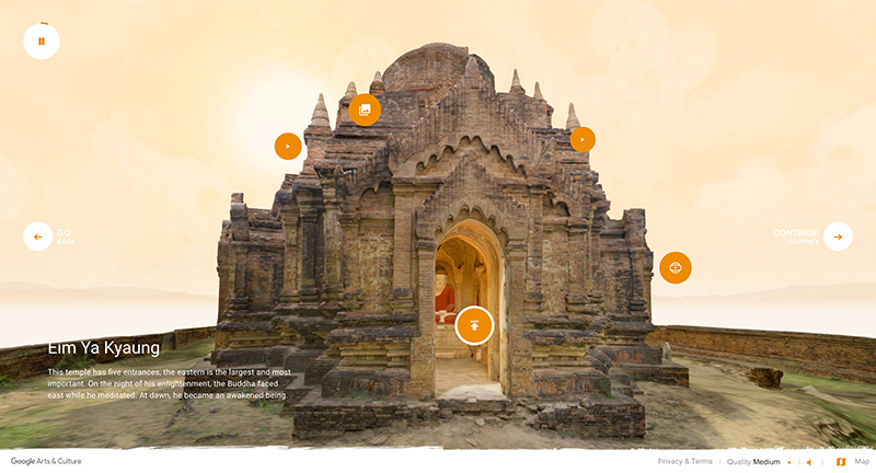
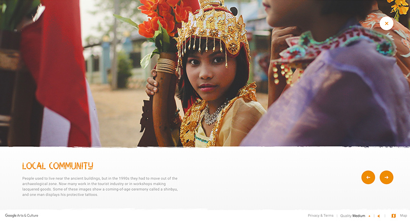
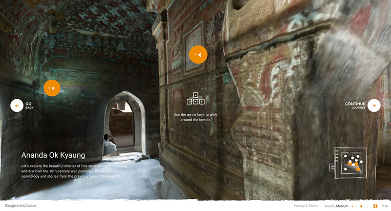
Site documenting the earthquake damaged temples of Bagan in full 3D and LiDAR visualisations. Beautifully crafted experience taking you on a journey through these stunning temples. Love the interactive documentary approach, with voice over and storyline bringing out the history and acting like virtual tour guide.
Created by Google Arts & Culture (@googlearts).
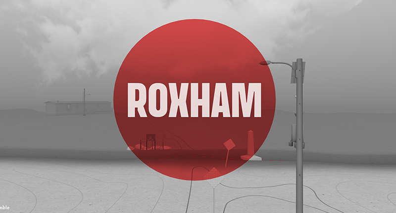
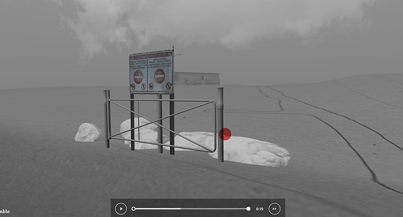
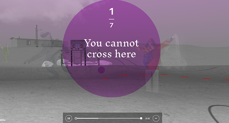
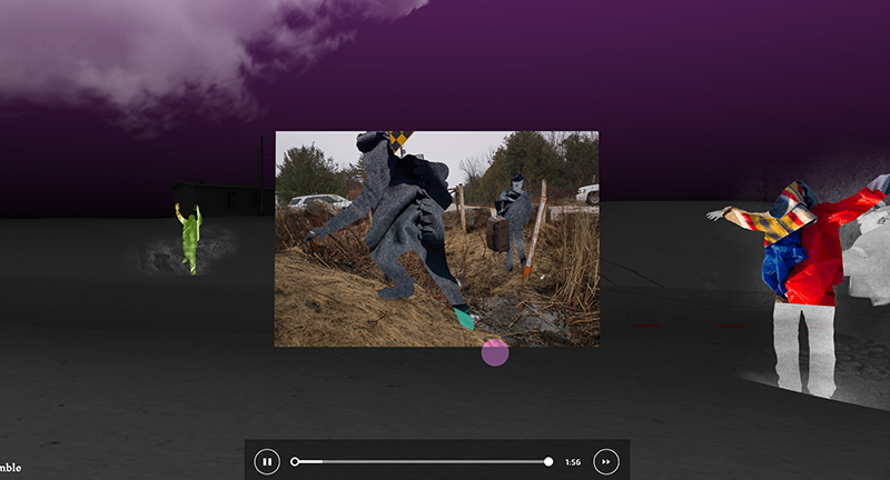
Site featuring an infamous stretch of road called Roxham, home to a border crossing into Canada. Photographer Michel Huneault captured various stories of the people looking for asylum crossing from the US, all presented in web VR and 3D. Really interesting approach to story telling, mixing audio, interviews, photography and 3D space.
Created by National Film Board of Canada (@thenfb) & DPT (@bonjourdpt).
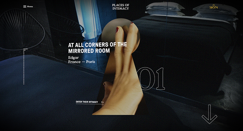
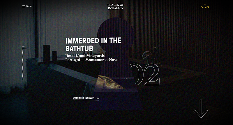
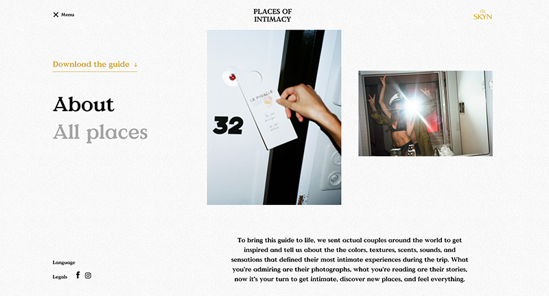
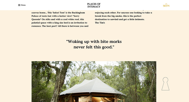
Promo site for Skyn and a look inside couples around the world and their ‘places of intimacy’. Nicely crafted experience with editorial style layout, large photography, and big type. Lots of subtle details, animations, and transitions that combine to lift the experience.
Created by Sid Lee Paris and Stink Studios (@stinkstudios).
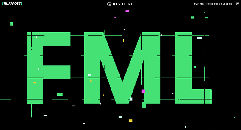
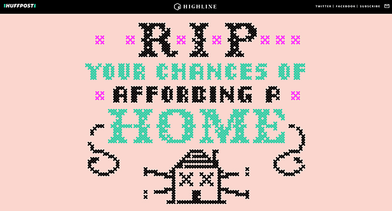
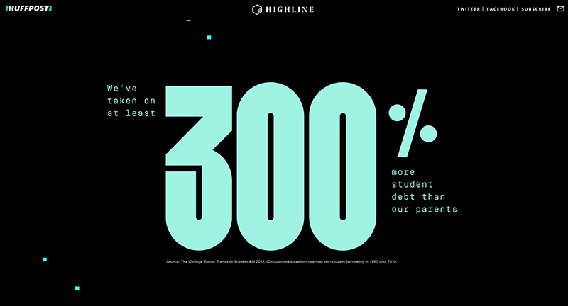
Long form interactive editorial piece from the Highline of Huffington post. A 8-month long reporting piece diving into the complexities millennials face today. Love the format of large data driven visuals brought to life through simple interactions such as scrolling. Nice use of typography and illustration to drive energy, which being a long read, still feels fun and informative. Nice work…
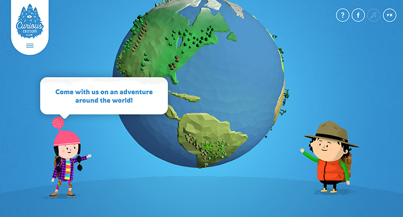
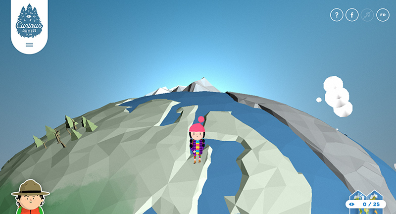
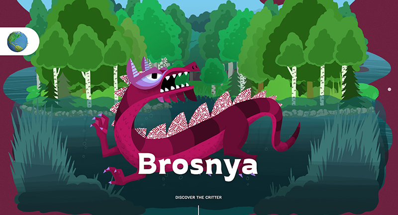
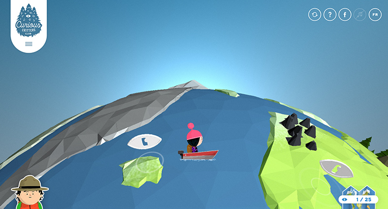
Lovely site for Curious Critters where you navigate a 3D world to find bizarre creatures. Involving three apps, a website, and an book, to provide an immersive world to explore. Lovely 3D implementation, and fun exploratory experience.
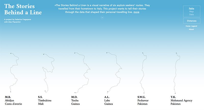
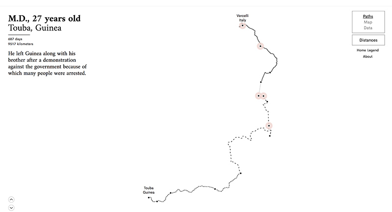
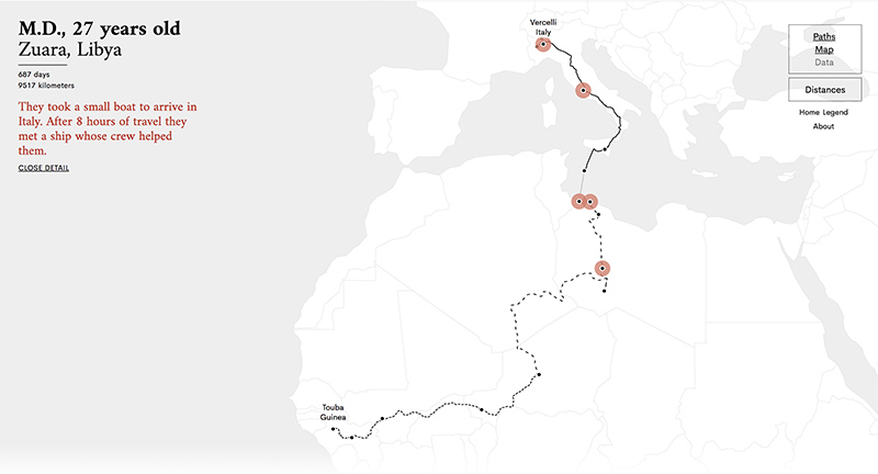
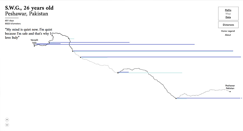
Site documenting several migrants journeys “is a visual narrative of six asylum seekers’ routes. They travelled from their hometown to Italy. This project wants to tell their stories through the data that shaped their personal travelling line.” Love the way you can toggle the various ways of representing their routes, from a data perspective, from a map, and from the lines.
Created by Federica Fragapane (@fedfragapane) and Alex Piacentini.

