detail

The Atlas of Moons

By | @NatGeo | No Comments


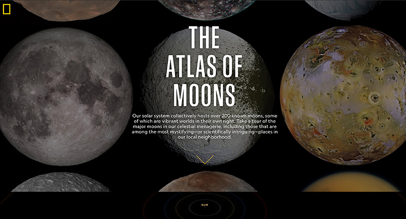
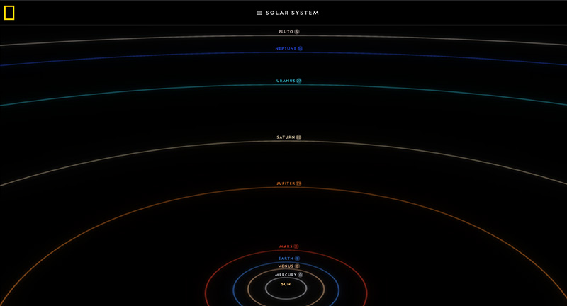
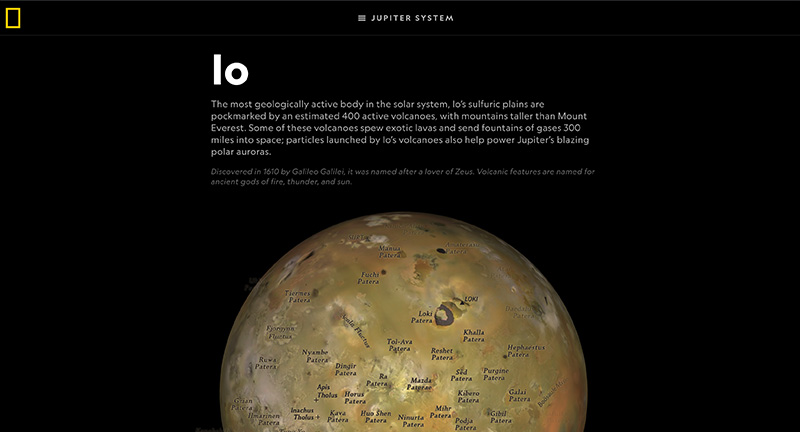
Beautiful experience “The Atlas of Moons” that offers an immersive and fascinating glimpse of the moons orbiting the planets in our solar system. The editorial experience parallels that of their magazines and reminds me of the fascinating book ‘Atlas of Remote Islands: Fifty Islands I Have Never Set Foot On and Never Will’. Love the use of 3D here to offer a draggable ‘map’ of each of the major moons, but to also highlight the orbit of the planets and moons. The level of detail is incredible – love the ability to map states in the US to see and relate the scale.

Created by National Geographic (@NatGeo).

Site here…

Zero is Two

By | @Zerostudiosnyc | No Comments


Playful celebration site of US agency Zero. Love the bold type set against inverted white on black styling, with parallax effect on the photography and type. Love the fun cursor replacement to explore the imagery. Lots of personality weaved into a fresh modern experience with an amazing feel of depth.

Created by Zero Studio (@Zerostudiosnyc).

Site here…

Kwok Yin Mak

By | @kwokidile | No Comments


Site of Kwok, US based designer, and a personal portfolio. Love the personality dotted all around this site, from the playful dot to dot represenation of distance from my ip to where he’s based, through to a guestbook where visitors leave their messages, it’s like going back to the fun websites of yesteryear. Lovely design and nice mix of type and languages, particularly like the transition from project thumbs to the detail page. Super cool and super fresh.

Created by Kwok Yin Mak (@kwokidile).

Site here…

Nuclear Dissent

By | @jam3 | No Comments


Interactive documentary chronicling the testing of nuclear weapons. Fascinating combination of first person simulated VR / 3D videos, first hand testimonies, and history as told by those who were there. Beautifully crafted experience that really takes you there, and gives a multimedia overview of the history of these world ending weapons.

Created by Jam3 (@jam3).

Site here…

Beyond Beauty

By | @LouisAnsa | No Comments


Site showcasing several female actresses that reveal hidden depths and go beyond what they are often known for. Beautifully designed, lots of imaginative and bold use of type, juxtaposed with all the fluid and dynamic visual flourishes. Love the speeches inside of the profiles that animate the text as spoken, lots of nice attention to detail such as the end of the profiles, menus and so on.

Created by Louis Ansa (@LouisAnsa) and team.

Site here…

Brontide

By | @ouiwillagency | No Comments


Site of Brontide a bioengineering company. Lovely horizontal scrolling home screen that animates on scroll – fluid and dynamically introducing what Brontide is all about. The corresponding pages are vertically parallax scrolling again with the same attention to detail for the home. Beautifully designed and executed site.

Created by Oui Will (@ouiwillagency).

Site here…

Convoy

By | @webdesign | No Comments


Site of creative agency based in Paris. Love the homepage with a slideshow-esque functionality, where the label is filled by time and jumps to the next project. Wonderful mix of photography and video, the project pages are sublime with transitions from full screen video to colour bg with imagery and type on multiple z-depths. Nice attention to detail – really dig the jumping ball to show where you are – injects some personality and playfulness – Love this site!

Created by Convoy.

Site here…

Concrete Rep

By | @intmagicgroup | No Comments


Site of Concrete Rep a UK based rep agency for artists working in the fashion, editorial, and advertising industries. Love the homescreen with the segmentation of the various artists scrolling down the page with locked elements such as title creates a wonderful sense of movement. Also love all the subtle patterns and interactions such as scrolling to the end of the project takes you back to the previous page. It looks beautiful too, elegant and clean, with dynamic colour palette and great use of typography.

Created by International Magic (@intmagicgroup).

Site here…

Phoenix

By | @phoenix_cool | No Comments


Site of Montreal based digital agency Phoenix. Love the homepage, with scrolling thumbnails and masked title transitions – when tapped transition nicely into the full project pages. Dynamic and lively project pages with lovely animated sections to bring the work to life, some with parallax details, beautifully designed and considered. Great example of a modern and lively agency folio.

Created by Pheonix (@phoenix_cool).

Site here…

Ladybird

By | @watsondg | No Comments


Promo site for the new movie Ladybird. Featuring a personality quiz with a fun gestural interface with a stack of cards you drag to denote choice. Beautifully design and art direction, full of transitions, animations, and fun interactions.

Created by Watson/DG (@watsondg).

Site here…

Air France Music

By | @betcdigital | No Comments


Fun branding site highlighting Air France’s seasonal playlist “a nod to our favourite Frenchies (Phoenix, Malik Djoudi or Postaal), as well as an opportunity to share our current top picks from around the world”. Love all the Material-esque transitions and animations that seamlessly move from section to section. Beautifully designed experience, love the sound reactive backdrops when you are playing a track. Fun way of extending the Air France brand into a music and digital design space.

Created by BETC Digital (@betcdigital).

Site here…

Henning Larsen

By | @weremagicpeople | No Comments


Site of Henning Larsen architects extraordinaire. Lovely site, homepage is a feed of latest projects, news and insights. Project detail pages are well designed, with a useful side nav, love the end of the page with the shelf revealing more information. Lots of details that improves the overall experience – from the menu to the clean and minimal design.

Created by Magic People Voodoo People (@weremagicpeople)

Site here…