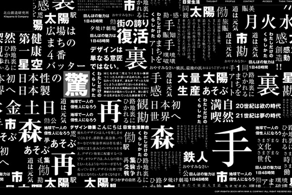
I’m not entirely sure what Kitayama & Company do exactly, but they have a nice website! It takes a while to load, but the preloader is pretty cool. Clicking on one of the thumbnail pictures reveals a timeline to show the work they have done over the years. Lots of nice animations and transitions, and I love the way the homepage transitions from text to photos.
Monthly Archives: January 2010
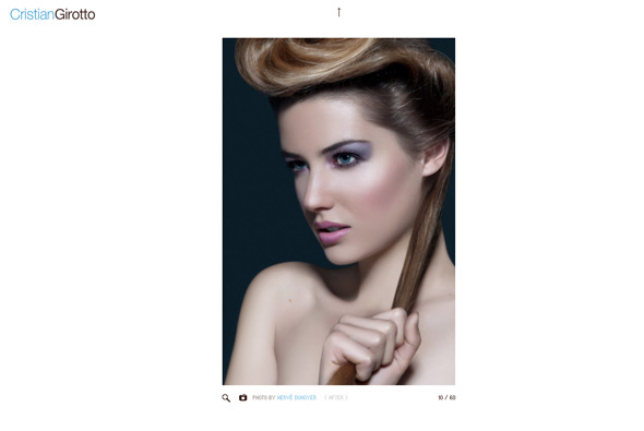
Portfolio of retoucher Cristian Girotto. Clean and simple, and really well made. WHen you click on a photo it shows the original version, click again to show the retouched version – simple and works really well. Love the zoom function too. It’s really interesting to see the difference between the original and the retouched version, to see the amount of work that went into it. The thumbnail menu at the top also is great. Fantastic portfolio site.
Created by Fabio Caccamo.
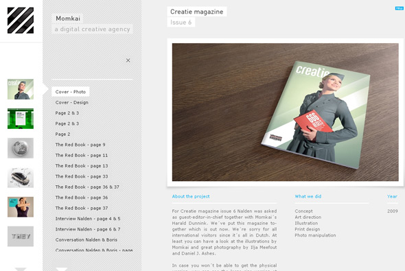
Portfolio of Amsterdam based digital agency Momkai. Very simple layout that works really nicely, they also show a vast amount of work, which you can choose to see if you wish – so it’s not presented in an intrusive way. Many little touches and cool animations that complete the whole package.
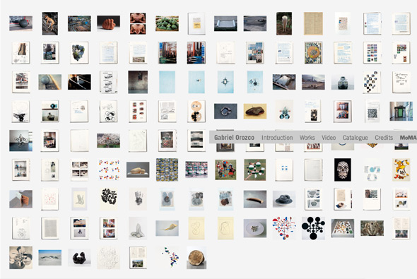
Site promoting the exhibition of Mexican artist, Gabriel Orozco at MoMA. Really nice example of a dynamic gallery that pans around with your mouse movement. I also like the way things move around when you click on one of the thumbnails, and the clear concise navigation and nice animations.
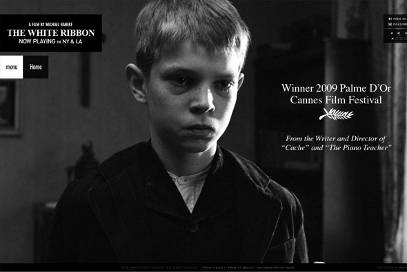
Simple, elegant site promoting the launch of ‘The White Ribbon’, a new film directed by Michael Haneke. A slideshow introduces the film via a few stills nicely animated along with quotes from the media. Overall a simple site that gives a nice ambience that suits the film well.
Created by Halo.
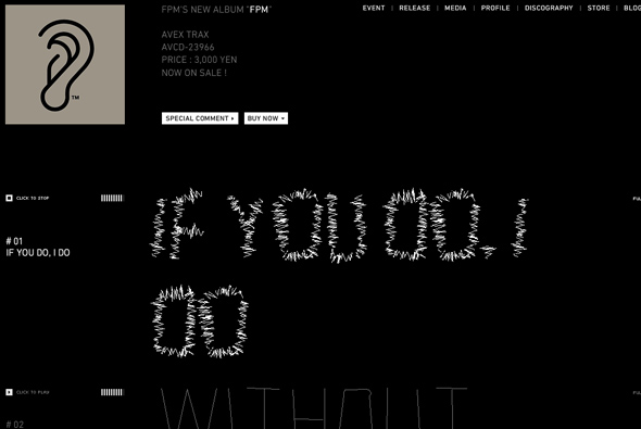
Awesome album teaser site for FPM (Fantastic Plastic Machine). Incredibly simple, and incredibly cool. With the track listing, when you preview one of the tracks the music then affects the track name, making it jump around in time to the music, the site then becomes alive – really nice idea. So minimal but brought to life by the music, that contrast is what makes this site so fun, effective, and cool!
Created by tha ltd.
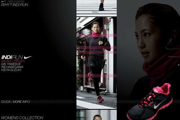
Site promoting Nike’s running collection in Japan. Slick and simple site centred around 4 Japanese celebrities and the products they are wearing. Loads of really nice animations and transitions – I also quite like the font treatment – and the way they highlight the various products.
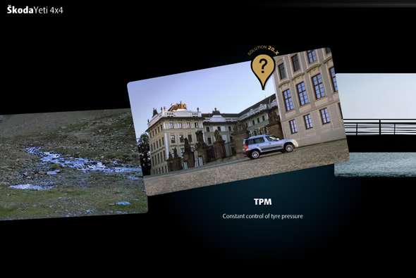
Simple, fun, and engaging site for the new Skoda Yeti. Incredibly simple idea, the car drives through a series of videos in various environments – cities, countryside, beaches, and so on. This all gives the impression of the car driving through one seamless scene – where the car is always centred in the screen, occasionally it stops to highlight some product info – where you can also find out more if you want. The beauty, for me, is in its simplicity – and the fact it is just fun! The way the videos work is great and overall it feels quite polished and all well thought out. Love it!
Created by Change Connections.
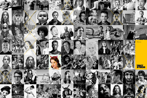
Slick portfolio of photographer Tony D’Orio. Focussed around his gallery of photos shown by thumbnails, that when clicked all slide over to reveal a larger version. Lots of nice features, I love the thumbnails – the way they work when the screen is resized, the rollovers. Even the way with the larger pictures either appear left or right of the screen. The whole site is well considered and well produced, a really nice portfolio site.
Created by hello monday and TODA.
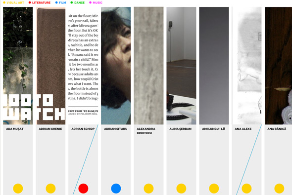
Site showcasing 100 artists, designers, writers and so on all from Romania, to highlight Romania’s cultural conribution to the world. Interesting strip based layout when clicked reveals that artist’s section, which you can then click and drag to navigate. I like the exploratory approach to the layout and the clean simple style of navigation.
Created by ItsEveryday.ro.

