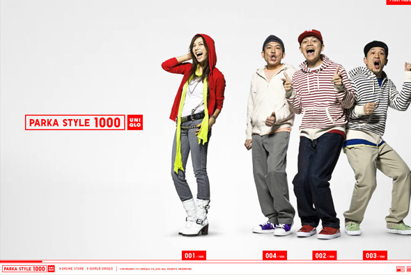
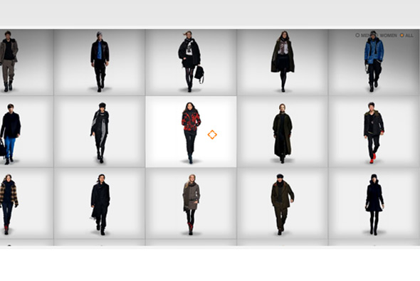
Very simple microsite promoting Uniqlo’s parka collection. Pretty cutesy and fun, but I really appreciate again Uniqlo’s simplicity – horizontal scrolling navigation highlighting the different styles of parka featuring a mix of Japanese celebrities and models. The whole thing just gives a positive impression of the brand, with clean and crisp interactivity, and a nice layout.
clothing
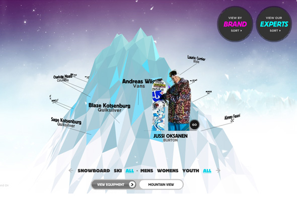
Site for Sport Chalet, promoting their range of snowboarding/skiing products. You are presented with a 3D mountain, you can rotate your perspective around it with each professional boarder/skiier name floating around it. By clicking on one of the names the mountain falls apart spectacularly to form up a new environment where you can see your selected boarder. In some there are videos, interviews, or multi perspective photos – each highlighting the gear they are wearing, where you can see the price and so on – these cool little rollovers follow the person around… I really like this site, from the way it looks, to the high production values (the keying is great), to the fun and engaging way of viewing products, so much better than the standard thumbails and product info – it’s also got some 3D! Awesome!
Created by Firstborn.
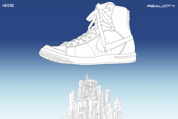
Very simple site promoting NIKEiD and it’s ‘blazer’ shoe in Japan. A short manga style film featuring characters who fly around and colour in a blank city – of course wearing the shoe in question – you are then presented with a blank shoe. By clicking on the different sections of the shoe you can create your own version of the shoe which when complete then colours in the city with your selected pallette. You can then click through to NIKEiD website where your creation can then be bought! I really like the simplicity of it all, the cool animation and most of all it’s fun…
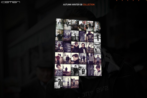
Website of Iceman denim of Denmark. What makes this different is the mechanism of viewing the products in the collection, it’s in 3D and and you can tilt/move your view – to see the next image you grab and ‘flip’ the photo – viola the image flips and the next one flips into view. It works really nicely and feels quite tactile, apart form that it is executed nicely with nice animations and video.
Created by JaHallo.
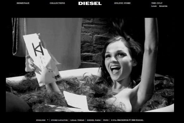
Latest site feature for Diesel – V. A bizarre, surreal suite of videos that show a woman bathing in other people’s hair (you can send some to her also), a puppet made of meat, and strange dance contests, amongst others. No slick designs or interactions, just these videos. Lots more background info from Creativity Online:
“The video content effort is the first from Swedish shop Farfar as Diesel’s AOR, after the much-awarded Heidies “15 MB of Fame” and a nine-shop pitch to win the business earlier this year, and consists of several shows. “Dance Party,” the aforementioned twisted reality show, brought a group of dancers into a basement studio and then forced them to dance, hooded, with a soulless voice directing them. “Corner Time” sees a series of various hucksters dispatch self-improvement methods, “Pete the Meat Puppet” chronicles one carne character’s rise, fall and rise again and “Hair Bath” sees a heavy-lidded hostess implore viewers to send their hair to a P.O. box in Hillsdale, New Jersey so she can lounge in the tub with it.
A team from Farfar joined Legs at Milk HQ as they shot elements of the campaign inside the gallery/fashion/casting/production hub, going for a black and white, vintage feel for the strange tales, which have a feel to them not unlike John Waters meeting Tay Zonday in a Toys-R-Us unisex bathroom. The brief, the collective writes, was “a black and white 30-page PDF with super ambitious ideas for content of all shapes and sizes from short films to propaganda pieces to live interactive shows, all making up this surreal and mysterious internet TV station.”
Nice to see Diesel continuing the trend to push the boundaries of interactive work, and work by FarFar is always good to see.
Created by FarFar.
Stylish site for the Y3 collection of Adidas clothing. Like it’s name sake the items are presented as if on a lightbox, you can zoom in to see the details on the clothes and scroll around to explore the video of the model walking, you can view the items from different angles too. Nice design, effects and transitions make this a simple and stylish microsite.
Made by Neue Digitale.
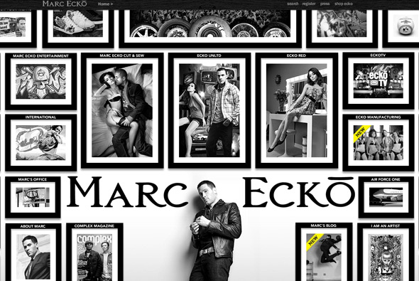
Very slick site of clothing label Ecko. Extensive website with a lot of content, presented in a really nice format, more like a magazine with nice visuals and lots of animation. I like that each section is slightly different to each other, and although it is a flash site, there is deep linking and so on. Very well crafted and thoughtout website of a large brand site.
Created by WDDG.
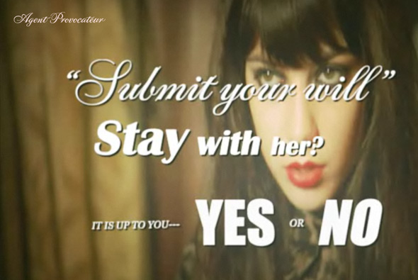
Interactive movie, showing the latest range of lingerie by Agent Provocateur. Very stylised interactive story that plays fullscreen and pauses to get your choice of direction by presenting questions at crossroads in the story. Quite an abstract plot but essentially its just a nice way of showing the lingerie in an intertactive video format that gets the audience’s attention. I really like the visual style and the simplicity of execution.
Created by one of my long time favourites Hi-Res.
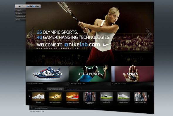
Nike’s site to promote their products for the olympics. This is a great example of good slick website design, lots of great touches and rollovers/animations. Full Flash site, with many sections, it is functional, easy to use, but with the addition of looking great and providing a good user experience – great attention to detail.
Created by AKQA.
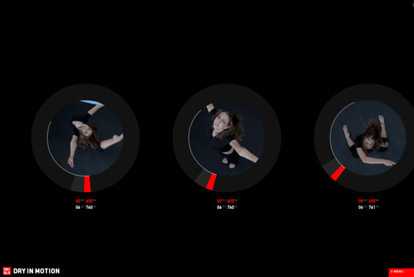
Another nice campaign site from Uniqlo. A series of slow motion videos with people dancing and moving, shown from various angles, play for short periods of time and change position on the site over time. There is a simple menu with links to the clothing, and thats it! I like the way the videos are in circles and the progress is displayed around this circle. Another nice minimal approach, nicely done, and strangely compelling to watch.
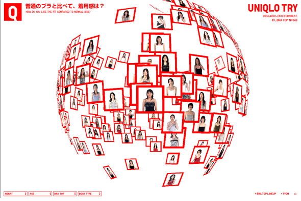
Wow, another amazing Japanese website for Uniqlo – the presentation of opinions of 343 customers to a bra Uniqlo make! The work created for Uniqlo has been consistently amazing, always technically brilliant backed up with a nice concept. This is another example of that, instead of producing something simple & boring, something that is essentially about a survey, a fantastic 3d representation of opinions has been created. Floating through the opinions the way the data is presented is constantly flowing from one state to another, making new 3d shapes, and morphing colours. I really like the crisp presentation coupled with the smooth transitions and fast performance of the site. Technically proficient and well executed to present a really enjoyable user experience.
I have long been a fan of Japanese web design and its really good to see so many amazing sites appearing. The mix of music, technical excellence, and simple layouts provide the fun, colourful, and enjoyable approach that is often common place in Japanese designs. So often the more imaginative, conceptual side of web design is ignored for the slicker, polished look and feel, it is so refreshing to see a different viewpoint.
Created by Simone Inc.
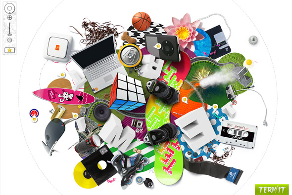
Interesting site for Russian clothing brand Term’it. The explorable interface has 3 main levels, where you can zoom in, rotate and pan around to see the clothing amongst other things. Technically it well accomplished, and works well – the rotation and zooming is smooth and feels good to use. Nice attention to detail and intelligent loading of sections means it all provides a good user experience. I like the thumbnails of the clothing and the playful way they are displayed.
Made by PARK Studio.
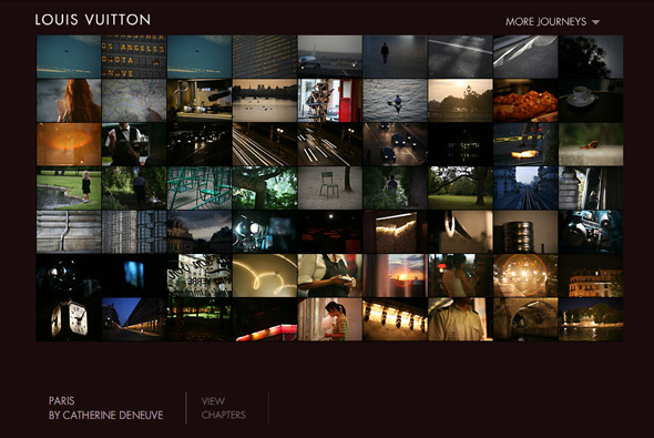
Website promoting the ‘jouneys’ campaign for Louis Vuitton. A very nice experiential site, with various people describing and painting a picture of their favourite cities for example London by Keith Richards. In each of the ‘journeys’ you experience images, videos, and sound from the various cities. It is a nice concept well executed – it is interesting to see ‘famous’ people give insight into their feelings about these places. With lots of nice little touches and details together it all provides a fairly cinematic montage of these amazing cities and inspires feelings to create your own ‘journey’.
Created by Ogilvy Interactive Paris.
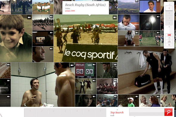
Nicely conceived site of adverts and so on for sports brand Le Coq Sportif. You can explore the various ads and other videos and media over the years by searching, scrolling around, or setting crieria. Well laid out and structured, its interesting to use and functional. I like the way the grid system works and particularly the vertical scrolling – nice idea.
Made by Uzik.

