clothing

Suite 23 – Nike

By | WEBSITES | No Comments

Suite 23

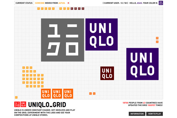
Real slick site, promoting the Nike Air Jordan XX3 basketball shoe. Really nice example of first person perspective 3D navigation – as 3D penetrates the latest websites we see it in the style of ‘Doom’! Apart from that its just a good looking, well performing microsite.

Created by Blast Radius.

Website here…

Nike – Melo M4

By | Loose | No Comments

m4

Nice slick website, promoting the Nike Jordan Melo M4 basketball trainer! Really smart art direction and great execution. A quasi 3D environment you can pan around the environment and view videos and see the shoe, download stuff and so on. Its a just a great experiential site, involving you and encouraging you to explore the website, really slick – I really like the simple & effective navigation, rollovers, it just so easy to use.

Created by Blast Radius.

Website here…

UNIQLO – Grid

By | WEBSITES | No Comments

UNIQLO Grid

Another cool UNIQLO website, this time in the guise of a grid ‘game’. I say game lightly as its more like a kind of interactive experiment with up the 50 people from all over the world interacting with cubes in a virtual space. You can create cubes, rotate them, divide them, move them and so on, everyone can edit your cubes and vice versa. It provides an interesting irreverant website, with cool sounds and great interactivity.

Created by the legend that is Yugo Nakamura of YUGOP.

Website here…

Nike ACG Sweetspots

By | WEBSITES | No Comments

Nike ACG Sweetspots

Another great example of a site integrating Papervision 3D, this is one of the best showcases of it I have seen to date. A globe highlighting ‘sweetspots’, i.e. a cool snowboarding area, is the main navigation – very easy to manipulate & use. The attention to detail and overall design & polish is really spot on, i.e. the motion blur whilst rotating, and lovely transitions.

Created by Duke, it is an inspiring, enjoyable example of a slick, usable, and cutting edge Flash site.

Website here…

Anteprima

By | WEBSITES | No Comments

Anteprima

Anteprima’s website for the autumn/winter range 2007. There are several nice touches – particularly the parallax style navigation – it just feels very fluid and intuitive.

Made by the famous Japanese agency FICC inc.

Website here…

Seibu – Autumn Collection

By | WEBSITES | No Comments

Seibu - Autumn Collection

Another slick Japanese website, quite confusing to navigate (I guess as I can’t read Japanese!) – however the way images are presented is really nice. Could do with a bit of image smoothing though! I like the way they have made it quick to load by using small thumbnails – utilising it in the gallery view to great effect. Looking pretty stylish when you are cycling through the collection, with the next/previous images all pixellated.

Website here…

Oakley – Riders

By | WEBSITES | No Comments

Oakely

Not particularly an amazing technical / design driven site, but caught my imagination in terms of concept and execution. A really nice site by Oakley just showing their sponsored european snowboarders/skaters/surfers off in a series of websites. The site is structured like in a fun laid back style and is a basically a bit of fun with diaries and photos and competitions and so on.

Vicci’s site here…
Scott & Tlyer here…
Oli’s here…
Ben’s here…