clothing

Banana Cafe

By | WEBSITES | No Comments

banana cafe

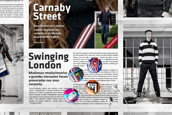
Brazilian site promoting Banana Cafe clothing. Using the newspaper visual metaphor to display the range of clothing and copy. The nice thing about this is that they have created it all in 3d, using the loading screen to give a brief tutorial on using the interface, you click and drag to move around – with the paper tilting and panning realistically. What I love about it is the level of detail – on top of the paper are 3d objects you can drag around and interact with, they even collide with each other. For example there is a London bus, you click it and then you can drive it around the newspaper, you can click and drag the individual headphones on the iPod, etc etc. When you view the photos they come out of the newspaper and enlarge so you can see them better. Love all the attention to detail and the interactivity, it also happens to look great, really cool site…

Created by Fábrica Do Design.

Website here…

Uniqlo Calendar

By | WEBSITES | No Comments

uniqlo calendar

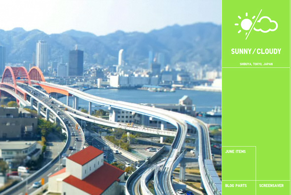
Nice little project for Uniqlo, this time in the shape of a calendar. Featuring tilt-shift photos in time-lapse video sequences of locations across Japan, when you click on the sequence a mosaic is produced – made up of Uniqlo products – which link through to the online store. Quite addictive just to watch the time-lapses showing the world going by, the tilt-shift technique adds a certain quality to the sequences. You can install a screen saver or embed it into your blog and set your local location to see local weather.

Website here…

Uniqlo Tokyo Fashion Map

By | WEBSITES | No Comments

uniqlo fashion map

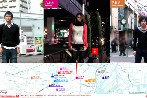
Part of the Uniqlo Parka Style 1000 series, another cool site promoting Uniqlo’s parkas. Similar to the ‘Pass the ball’ concept by Nike, in this case ‘pass the parka’, a series of videos & photos of real people from the streets of Tokyo all setup the same way, passing the parka to their left – this all makes a nice sequence of visuals which is interesting to watch it all passing by on screen. Nice addition of a map of Tokyo showing you where the person was ‘steet snapped’. Nicely executed as usual, with slick animations and cool transitions. Nice vibe from this project…

Created by Dentsu and Bascule inc.

Website here…

Uniqlo – Wire

By | WEBSITES | No Comments

uniqlo wired
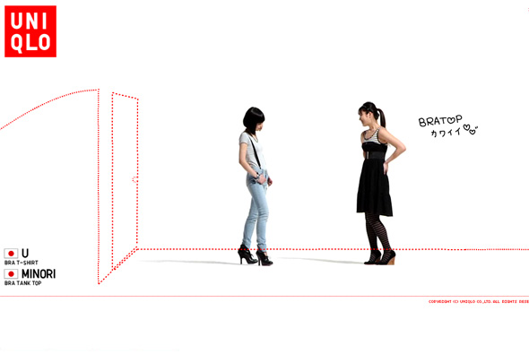
Site promoting Uniqlo’s range of bra tops. As usual Uniqlo provides another cool microsite promoting a new product, this time videos of 100 women talking about the bra tops. On top of this content is a layer of red dotted lines which draw things over the screen and ask simple questions about bra tops, at any time you can find out more about the products on display.  Presented in a slideshow type way, as with many of Uniqlo’s online work you can sit back and watch, it’s clean, cool, and so so simple.

Site here…

alice + olivia

By | WEBSITES | No Comments

alice olivia

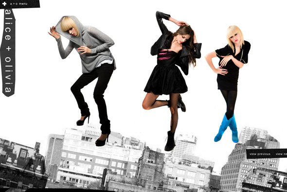
Cool playful site of clothing label alice + olivia. Really simple with a touch of surreal, each section of the site has objects which can be thrown around the screen, bouncing off the sides of the screen and each other. Even when viewing the collection you can pick up and throw around the models. Nice and clean and simple, to the point yet fun and playful.

Created by designedmemory.

Website here…

Only The Brave – Diesel

By | WEBSITES | No Comments

only the brave

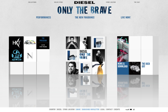
Site of Diesel’s new fragrance, ‘Only The Brave’. Based around a series of 3d cubes featuring ‘performances’ when opened show 3d rooms with video and designs featuring work by the likes of Mr Doob, Nico Stumpo, Eboy, and Hellohikimori, and many more to come over the next few months. You can also see the print ads and see the bottle the fragrance comes in. Yes another 3d site, this is quite nice though, it’s a cool idea to use modern digital artists to create the 3d rooms, the rooms themselves are pretty interesting, although unfortunately it just reminds me of the Absolut ‘In an Absolut World’, but essentially they have put their own spin on it. Also they have used a physics engine on the 3d blocks, so when each section loads the boxes interact with each other, overall a nice site!

Created by Hellohikimori.

Website here…

Tailoured by England – Umbro

By | WEBSITES | No Comments

Tailoured by England - Umbro

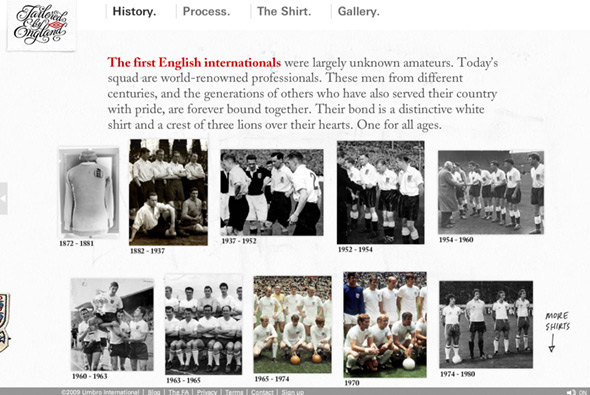
Site promoting the new England football shirt. This site goes for the angle of showing the craftsmanship and history of the England shirt, how the design has changed over the ages and how it is today. Nicely designed to reflect the shirt the site itself is well crafted – you move your view around a nice 3D area with the different sections of the site located in various places, your perspective changing swiftly through the scene. I like the rotating view of the new shirt with the different features highlighted – with a really nice panning detailed photo of each feature. The site also looks great, lots of nice touches and cool buttons, all with that ‘hand crafted’ look which the site is aiming for. Great animation and transitions and nice use of 3d, draws you into exploring all the different sections of the site, pretty cool…

Created by Perfect Fools and Anomaly.

Website here…

Uniqlo Zoom

By | WEBSITES | No Comments

uniqlo zoom

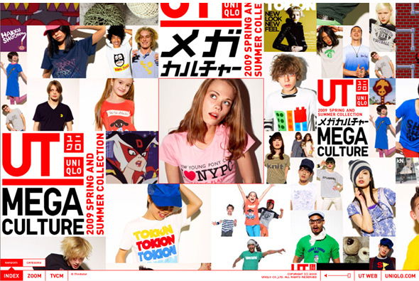
New Uniqlo website, best described by their incredible agency tha ltd, “A campaign website for Uniqlo’s 2009 UT Spring/Summer Collection has been launched. Just like the TVCM, the website features some of the main T-shirts of the collection in an endless zoom.” So we have a nice endless zoom feature, similar to the ‘zoom quilt’ of the past, except this time we zoom into Uniqlo’s range of t-shirts. Featuring photography and video, you use your mouse scroller to control your direction and speed (or let it scroll automatically). I like the fact when you view the videos your scroller controls the speed of the video – nice touch, also love the high resolution photos and the overall style. Also love the ‘homepage’, a constantly scrolling view of each of the photos, when clicked take you right to that item – also well integrated to the Japanese online shop. Again lots of nice animation and small touches – all set inside a simple interface which is clear and easy to use…  Cool!!

Created by tha ltd.

Website here…

Kikonashi Hoop

By | WEBSITES | No Comments

hoop clothing

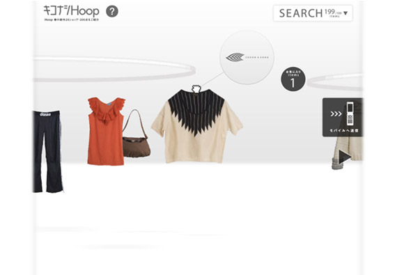
Site promoting Japanese online clothing store Hoop. What I like is the user interaction and unique way of browsing products, using a nice drag and drop metaphor for shopping in the real world, you can flow through the available products and pick and drag any item into your own shopping rack – for purchase later. But it’s the polish and interactivity that really makes it, feels very tactile and becomes quite fun to pick up items, which react to your mouse movement in a ‘realistic’ way.

Website here…

Reserved: Adventures of the Stardust Girl

By | WEBSITES | No Comments

reserved

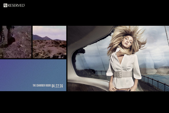
Site promoting Polish label Reserved. Resembling an interactive print ad, a sequence of nicely shot video and photos show off the latest clothing line. Laid out much like a magazine, when you click on a photo, it goes fullscreen, on a video it takes you to the next ‘scene’, this all provides a cool montage. There are other options from the menu, to see the collection, which again is laid out in a similar way.  Very simple interface, with nice visuals and a gentle style of animation and quite an intriguing story…

Created by huncwot.

Website here…

K Space – K Swiss

By | WEBSITES | No Comments

k swiss k space

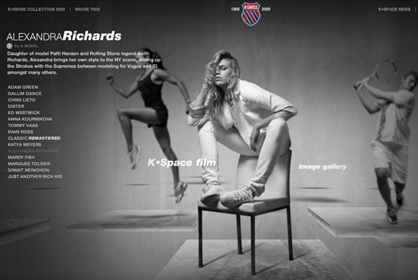
Very slick site promoting K Swiss products, asking the questions ‘who wears K Swiss now?’. With 14 celebrities each with short video clips and photos, talking about their lives, similar in format to the recent Nike site featured on this blog. What I like is the production value, nicely shot videos and photos, all in b&w, very slick interaction, and more 3d interfaces! Nice depth perception and depth of field effects on the gallery of the celebrities and their photographs. Nice design and interface, great animation and interactivity which all helps to bring it alive, particularly like the way the camera moves around the scene and the great design.

Created by Perfect Fools.

Website here…

Armani Jeans

By | WEBSITES | No Comments

armani jeans

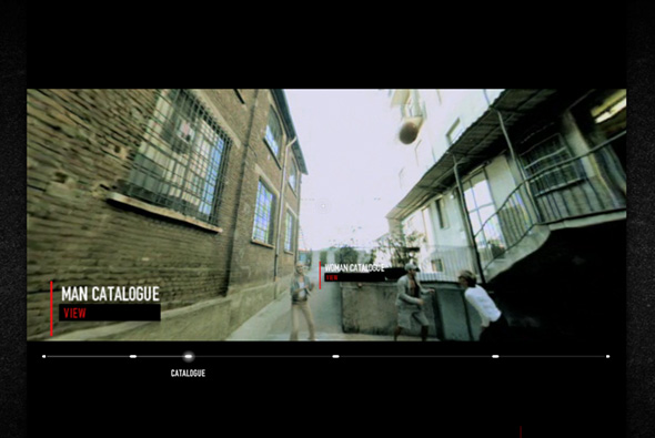
Interesting new site of Armani Jeans. Presented in a very cool way – from a first person perspective, you are given a 360 degree view as you run around with models wearing Armani Jeans clothing, with the action stopping at intervals so you can view the products and view the catalogue and so on. What I like is the way the ‘video’ is presented with you being able to look around as your view and the actors move through the environment. It’s a very simple site with an interesting way to show the product line ‘in situ’, with a very cool interface, very clever.

Created by Saatchi & Saatchi Rome.

Site here…

Beams

By | WEBSITES | No Comments

beams clothing

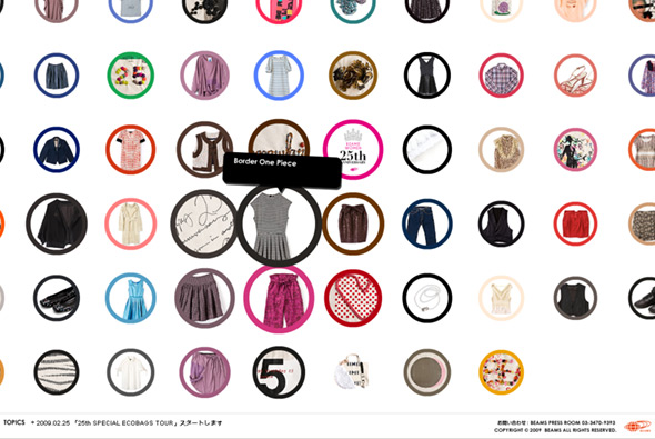
Site promoting Beams, specifically Women’s clothing 25th anniversary. A very simple interface showing thumbs of the items, when you click on an item they have used a really nice way of zooming in/out of the photo. You hold down your mouse button to zoom in / pan around (with the item slightly rotating on left/right movement) and let go to zoom out, complete with nice little sound fx. Again another typically Japanese site design, where the interface and interaction design is top notch, the site is fun and simple  to use.

Website here…

Nike Air Jordan 2009 – Beyond

By | WEBSITES | No Comments

jumpman 23 2009

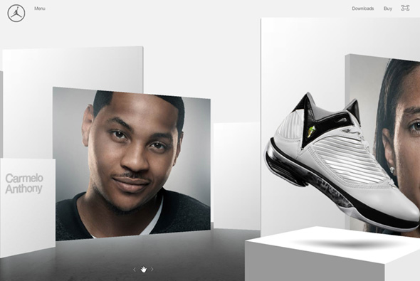
Damn cool website promoting the Nike Air Jordan 2009 shoe. 3D interface showing videos of Nike athletes and the shoe, you click and drag to pan the camera through the 3d scene, with nice lighting and visuals. I like the way by clicking a video moves the camera to the correct position, also love the camera panning on click and drag. Nicely polished, nice icons, VERY clean and simple, love the progression and lack of patronising the audience. So simple and clean, really appreciate the interface, very cool… 

Website here…