responsive

Lucas Hirata

By | @ramon_fritsch | No Comments

hirata-1
hirata-2
hirata-3

Portfolio of creative director Lucas Hirata. Nice background video and large tiles that link through to the individual project pages. Well thought out project pages that look great and offer a real sense of personality. Also love the ‘about’ section, which is really fun. Nice transitions between sections all in all a slick well designed portfolio site.

Created by Lucas Hirata and Ramon Fritsch (@ramon_fritsch).

Site here…

H6 Rapha Edition

By | @SprngSmmr | No Comments

h6-1
h6-2
h6-3

Lovely site for B&O Headphones, promoting their H6 Rapha Edition – a brand tie in with the cycling brand. Visualising how music can influence your ride, from preparation, hill climbs, racing, and all the emotions experienced whilst cycling. Lovely mix of videos, photography, hints of diagrams and descriptive and emotive copywriting.

Created by Spring/Summer (@SprngSmmr).

Site here…

Anton & Irene

By | @antonandirene | No Comments

anton-1 anton-2 anton-3

Site of new New York based creative duo & agency Anton & Irene. Lovely dynamic layout, combining nice typography, bold imagery and a playful elegance featuring the main protagonists Anton & Irene in a series of fun photographs. Nice showcase of what they are involved with from talks, conferences, and of course creating work. Love the in-depth case studies on their latest projects, where they talk about the process and the amount of thought and consideration that goes into each project. Love the feeling of energy in the layout and the personality which shines through, it is also responsive. Great example of a modern folio site.

Created by Anton & Irene (@antonandirene) and Oleg Chulakov Studio (@chulakov).

Site here…

Work & Co

By | @workandco | No Comments

work-1
work-2
work-3

Lovely site for digital agency Work & Co. Detailing their ethos, approach, and body of work in an elegant and effective way. Love the menu toggle – really fresh idea – to zoom out and see all the pages in a form of visual index. Love the splashes of colour here and there and the really nice typography used throughout the site – see the ‘facts’ page. It is responsive and reacts really nice to devices and screen size changes – works really well.

Created by Work & Co (@workandco).

Site here…

Do Amaral A

By | @oamaral | No Comments

andre-1
andre-2
andre-3

Slick portfolio of Brazilian Art Director and Designer Andre Do Amaral. Love the homepage with large bold typography and simple vertically scrolling carousel – click on a project and it transitions to full screen. Feels like a slick well crafted experience, which explains the projects in a very visual way – lots of nice transitions. Lots of very high quality work in there, and all wrapped up in this responsive, slick, and elegant portfolio.

Created by Andre Do Amaral (@oamaral).

Site here…

Mario Testino

By | @marckremers | No Comments

mario-1
mario-2
mario-3
mario-4
mario-5

Lovely new site for the famous photographer Mario Testino. Well thought out and considered, a fresh approach to the photographer’s portfolio. Love the news feed highlighting the latest projects, the project view, where scrolling down scrolls the photos horizontally, and at the end of the page – suggested next reading, and other useful links. There are loads on nice little details like these dotted all over the site. On top of this it all looks great, works really nicely and is responsive too, working great on mobile and tablet.

Created by Marc Kremers (@marckremers).

Site here…

The Great Discontent

By | @ryanessmaker | No Comments

gd-1
gd-2
gd-3

Site of design magazine The Great Discontent. Lovely editorial layout, large imagery and great fonts. Love the article pages, with all the various details that make it a pleasure to read. Nice considered use of white space and use of imagery. Feels super crisp and clean and well designed, with insightful and interesting content.

Created by Ryan Essmaker (@ryanessmaker).

Site here…

Species in Pieces

By | @wengerstoybus | No Comments

species-1
species-2
species-3

Lovely bit of work, highlighting the plight of 30 of the world’s most threatened animals. Nice project educating the world about these amazing animals – love the look and feel, the polygonal creatures morphing from one to another. Attention to detail is great, the animals subtly animate, so does the typeface! Pleasure to use and love the way each scene changes to the next – and on top of all of this it also works on mobile/tablet really well. Great to see more of this kind of work out there.

Created by Bryan James (@WengersToyBus).

Site here…

Penny Skateboards Customiser

By | @HelloEnjoy | No Comments

penny-1
penny-2
penny-3

3D configurator for Penny Skateboards. Amazingly detailed customising experience to create your own skateboard. One of the key features of the site is the fact it works amazingly well on mobile devices, fantastically smooth and love the way when you customise different parts of the board your view zooms and pans around. Really well thought out interactions and fun to play around with.

Created by HelloEnjoy (@HelloEnjoy).

Site here…

Hello Monday

By | @hellomondaycom | No Comments

monday-1
monday-2
monday-3

Lovely new portfolio for Danish digital agency Hello Monday. Vibrant and dynamic – I love the way colour plays a big part in each of the project case studies. The sliding panels for additional content and smooth animations all add to the slickness – the editorial style layout giving a great readable experience and looks fantastic. Nice little touches and attention to detail such as the mouseover effects that add a bit of personality and depth. Great example of a modern responsive agency folio.

Created by Hello Monday (@hellomondaycom).

Site here…

Bloomberg Business

By | @codeandtheory | No Comments

bloomberg-1
bloomberg-2
bloomberg-4

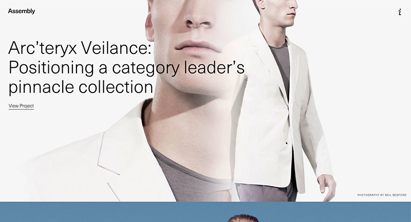
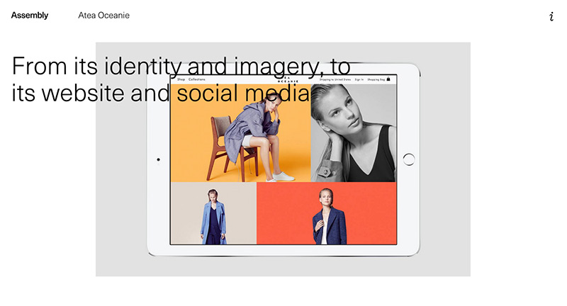
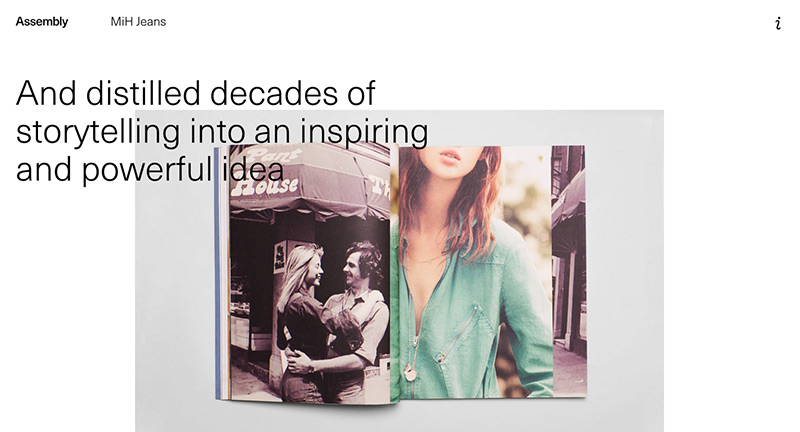
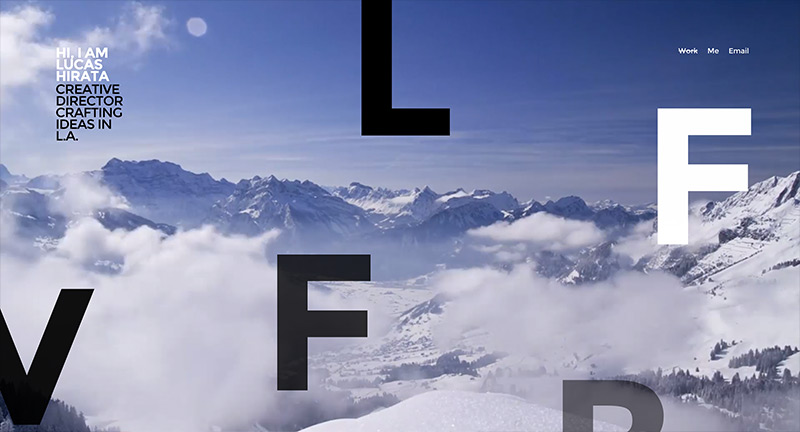
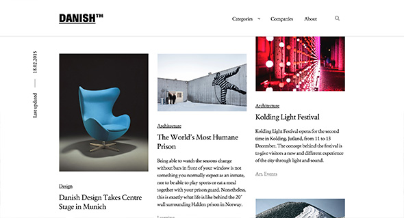
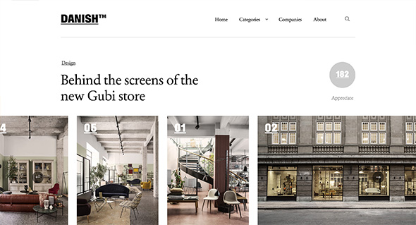
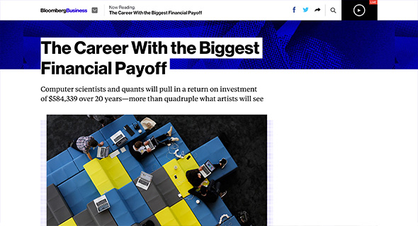
Nice example of a modern, fresh, responsive design solution for a complex site. Lots of really nice touches and features. Not only does it look great, with the bold typography, but they have injected elements of personality into the site. Love the way when you reading an article – a blue line simply indicates your progress which appears alongside the sticky nav. Also love that when you are reading an article, when you reach the end, it lazy loads the next article – really simple but thoroughly well thought out. Also like the full screen navigation that opens up really allows you to find what you might be after. On top of that it is all responsive – design is great for such a site, loads of nice touches – great stuff.

Created by Code and Theory (@codeandtheory).

Site here…

DANISH

By | @SprngSmmr | No Comments

danish-1
danish-2
danish-3

Simply put an online magazine highlighting Danish architecture and design. Love the editorial style and design, slick and simple and with nice typography. Really fresh feeling layout accentuated with neat touches – such as the Danish logo animating when the content is loading. The site works really well across different devices and responds well to layout changes. A good example of a modern, well crafted editorial style site.

Created by Spring/Summer (@SprngSmmr).

Site here…

Gogoro

By | @cincodesign | No Comments

gogoro-1gogoro-2
gogoro-3

Lovely informative and entertaining site promoting the Gogoro electric scooter. Highlighting the key characteristics of the scooter in a bold and engaging way – showing how fast it accelerates, how it corners, the key components – all the interesting things. What I like is the way they make it interactive – lots of little playful interactions – such as turning on the lights / carousels revealing nice animations and so on. Love the bold and streamlined approach to the layout – large imagery and bold typography. It is also responsive and works well across various devices – really nice example of a product site.

Created by Cinco Design (@cincodesign).

Site here…