responsive

Sailing With Greenpeace

By | @TODAYTHE12 | No Comments

green-1
green-2
green-3
green-4

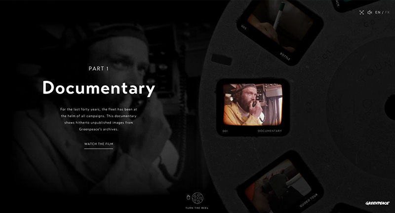
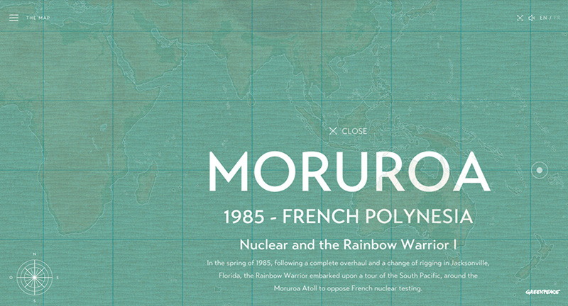
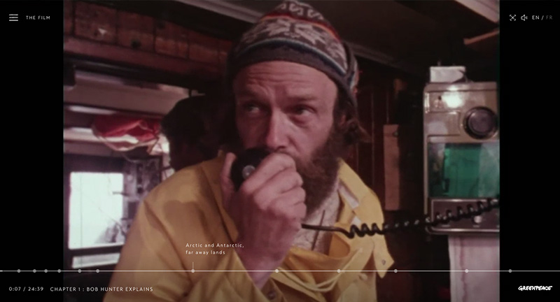
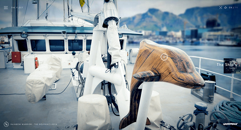
See the Greenpeace fleet and how they have tried to raise awareness for the ocean environment and the creatures affected by humans. Rich immersive audio and visual experience highlighting the vessels Greenpeace uses and has used over the past 40 years. Love the look and feel for the site, from the rotating reel acting as the menu to the technique used to show inside the ships – the site is full of delightful details. It works really nicely on mobile too, from the menu to the map view – all works and looks great.

Created by TWLVR (@TODAYTHE12) and Julien Renau (@julien_rno).

Site here…

Act of Love

By | @koichiroot | No Comments

actoflove-1
actoflove-2
actoflove-3

The digital accompaniment of a new book documenting various animals love rituals. Love the minimal pared down approach which highlights various movements and behaviors the animals have – shown simply through moving shapes. Click on the animation and a page split appears and more information is shown. Nice transitions and love the unifying way of displaying the simple animations to highlight the various weird and wonderful ‘acts of love’.

Created by Projector Japan (@koichiroot).

Site here…

Conde Nast 2015

By | @CondeNast | No Comments

condenast-1
condenast-2
condenast-3

Fantastic wrap up of events, moments, and stats for publisher Conde Nast. Featuring bold typographic approach with large imagery and horizontal scrolling mechanic that gives the timeline feel. Love the embedded videos and range of content from stats through to top moments, nicely wrapped in themes to give a more compelling experience. It looks lovely with an offset grid and bold type and large imagery, fantastic concept for end of year summary.

Created by Conde Nast (@CondeNast).

Site here…

Bonnemarque

By | @bonnemarque | No Comments

Bonnemarque-1
Bonnemarque-2
Bonnemarque-3
Bonnemarque-4

Site for Swedish agency Bonnemarque.Beautiful dark look and feel, love the seamless transitions from the homepage to the project details – nicely done with inline video. The project pages are full of detail and outline their approach and the work itself, love the sticky nav on the left ‘BEGIN’ which expands and contracts as you scroll. Menu transition is lovely and slick, lots of cool animations and nice transitions wrapped up in a beautiful responsive design.

Created by Bonnemarque (@bonnemarque).

Site here…

Year In Music – Spotify

By | @stinkdigital | No Comments

spotify-1
spotify-2
spotify-3
spotify-4

Spotify’s year of music in review – sign in and see the facts and stats about your musical tastes in 2015. Lovely bold, colourful art direction and clear uncluttered interface. Sweet transitions between the sections and love the gradient colour changes as you navigate between key topics. Not too overwhelming with the stats, with the content flowing nicely from big topics to more granular stats. Works great on mobile too with all the same cool transitions and animations.

Created by Stinkdigital (@stinkdigital).

Site here…

Mike Bloomberg

By | @webdesign | No Comments

bloomberg-1
bloomberg-2
bloomberg-3

Site of Mike Bloomberg the founder of Bloomberg and a NY mayor. Lots of nice UI moments, and transitions, that breathes life into some pretty dry content. Like the top nav, and the way it evolves depending on context, and the preloader bar with slide in page content. Some nice interactive modules and carousels – all wrapped up in a nice looking layout and design.

Site here…

Sam Skinner

By | @jakedowsmith | No Comments

skinner-1
skinner-2
skinner-3

Super cool and minimal portfolio for Sam Skinner an artist and designer based in the UK. Lovely emoticon based navigation – when you tap into a subject the element stays sticky. Nice offset grid and super simple interactions – feels very elegant and well thought out. Nice to see people still coming up with refreshing and thoughtful navigation and layout.

Created by Jake Dow-Smith (@jakedowsmith).

Site here…

Cryptaris

By | @ToolofNA | No Comments

cryptaris-1
cryptaris-2
cryptaris-3

Site promoting the US Army and recruitment for STEM capabilities (science, technology, engineering, math). With a futuristic 3D look and feel you can play a series of challenges that map back to STEM such as guiding a drone over a landscape, decrypting codes and so on. Execution is superb, with the whole world rendered in 3D – landscapes, details, and interactions – the ‘path clearing’ is a great example. Love the look and feel of the site – very impressive, and it also works nicely on mobile.

Created by Tool (@ToolofNA).

Site here…

Subaru and the Environment

By | @resn_has_no_i | No Comments

subaru-1
subaru-2
subaru-3

Highlighting Subaru’s CSR initiatives and relationship with the environment. Featuring a dynamic and fluid timeline that is first formed by tree rings – you can zoom in and out and the timeline unravels and populates with events. The execution sets this whole experience a level above, from the slick transitions, animations, and interactions. Fantastic attention to detail – great example of a timeline based experience.

Created by Resn (@resn_has_no_i).

Site here…

The Intercept – Drone Papers

By | @firstlook | No Comments

dron-1
dron-2
dron-3

Redesign of ‘The Intercept’ a platform for reporting on leaked documents and thought provoking stories. This example shows a series of stories about Drones and their use in covert operations. Love the mixture of full bleed video, large imagery, and editorial layout to create an impactful design. Some really nice UI touches such as the menu, the sticky nav on the left, and bookending of articles and pages. Well crafted with insightful content and well designed layout full of thoughtful details.

Created by First Look Media (@firstlook).

Site here…

Leap Second

By | @active_theory | No Comments

leap-1
leap-2
leap-3

2015 saw a ‘leap second’ – everyone on earth had an extra second to play with. Android asked people to capture those moments and share with the world. The site itself is really well executed, with a great visual interface that captures the moments and themes of the submissions – with a larger video which combines all these moments into one clip. Love the 3D on this too, from the way the images enlarge and the lovely drag around interface – really works great on mobile too! Full of details and incredibly polished.

Created by Active Theory (@active_theory) and Droga5 NY.

Site here…

Eginstill

By | @buildinams | No Comments

eginstill-1
eginstill-2
eginstill-3

Site of Eginstill – bespoke design kitchens. The site has a simple and elegant mechanic that scrolls through the case studies – love the little progress bar along the side of the project label. There is a great effect on the images as you scroll, the mask reveals more of the image inside and moves to give a lovely sense of depth. Slick and simple the site is well crafted – lots of small details come together to make this elegant site.

Created by Build in Amsterdam (@buildinams).

Site here…

Ge̤ Kendini РNike

By | Loose | No Comments

nikey-1
nikey-2
nikey-3
nikey-4

Summer promo site for Nike Women in Turkey. Featuring full screen video with small interactive moments, showcasing the range of summer Nike sportswear and short tips on exercising – I like the hotspots on the products which offer detail on the individual items – which then link through to where you can buy them. Short chapters let you jump around and see the how you might wear different pieces for different sports and circumstances – it also fully responsive and works nicely on smartphone / tablet too. Fresh and a bit of fun nicely done.

Created by -99 (@minus99ds).

Site here…

Jean Helfenstein

By | @jhelf | No Comments

jean-1
jean-2
jean-3

Site for French creative developer Jean Helfenstein. Separated into two main sections, personal and professional – focussing on his work in a slick and simple way. Nice layout brought to life with smooth animations and transitions that is an elegant example of a modern portfolio.

Created by Jean Helfenstein (@jhelf).

Site here…