film

Ryoji Yamada

By | @ryojiyamada | No Comments

r-1
r-2
r-3

Site of Japanese animator Ryoji Yamada. Love how the site starts, with flickering animations that spool up and represent the old zoetrope, eventually giving a vertically scrolling montage of the films. Click on a film and you see it in-situ. Love how the execution really reflects the medium.

Created by Ryoji Yamada (@ryojiyamada).

Site here…

Julien Belmonte

By | @jonathandc | No Comments

jule-1
jule-2
jule-3

Elegant site for Julien Belmonte, film director and designer. Featuring a simple and intuitive video scrubbing integration, which is simply your mouse cursor position. The homepage is just one long strip of videos, tap on one video and it expands. Nice transitions and smooth animation, with a really simple and elegant mechanic which lets the content do the talking.

Created by Johnathan de Costa (@jonathandc) and Make Me Pulse (@makemepulse).

Site here…

Amy

By | @watsondg | No Comments

amy-1
amy-2
amy-3
amy-4

Stunning site promoting a new movie about the musician Amy Winehouse. Divided into main themes about her life brought to life with full screen video and imagery. Love the typography and quotes, with a well designed layout – the menu also looks great. Full of little animations and transitions that ease you through each section. Really great example of a film site…

Created by Watson/DG (@watsondg).

Site here…

J. Hornig – Johos

By | @madebywild | No Comments

joho-1
joho-2
joho-3
joho-4

Beautiful site taking you on a journey through Brazil to find a certain coffee bean. The chapter based story depicts scenes from Brazil, photos and video – and simple small snippets of info brought to life through infographics and motion. Lovely layout and story telling really gives a flavour of what the coffee is all about, brought to life with simple and elegant animations and transitions.

Created by Wild (@madebywild).

Site here…

The Sim Tests

By | @webdesign | No Comments

divergent-3
divergent-2
divergent-1

Immersive site promoting the latest installment of the Divergent series of sci-fi films. Essentially mimicking the film – a series of tests designed to get you thinking, all rendered in 3D using a nice implementation of the virtual look around model. High production values and slick execution bring it all to life.

Created by Hybrid Studio.

Site here…

While We’re Young

By | @watsondg | No Comments

young-1
young-2
young-3

Promo site for the new film ‘While We’re Young’. Posing a few scenarios to the audience to watch a series of short clips from the film – all linking to the idea of things couples did when they were younger. Loads of nice touches, from pauses in the clips to reveal additional content, to nice animations and transitions. Love the full bleed videos and it looks lovely with great typography & layout – it looks great and really fits the feel of the film.

Created by Watson D/G (@watsondg).

Site here…

Matter Productions

By | @webdesign | No Comments

matter-1
matter-2
matter-3

Site for Matter Production agency in London. Slick, simple and elegant – the site highlights their film projects spanning fashion, luxury and music. Nice use of video in the main carousel and layout which frames the content well, and the elegant transitions which bring in sliding panels of information.

Site here…

Way to Go

By | @vmorisset | No Comments

way-1
way-2
way-3
way-4

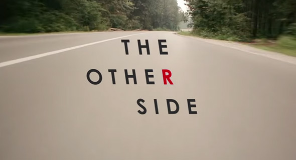
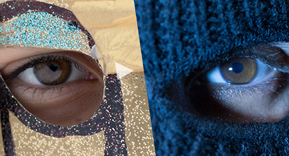
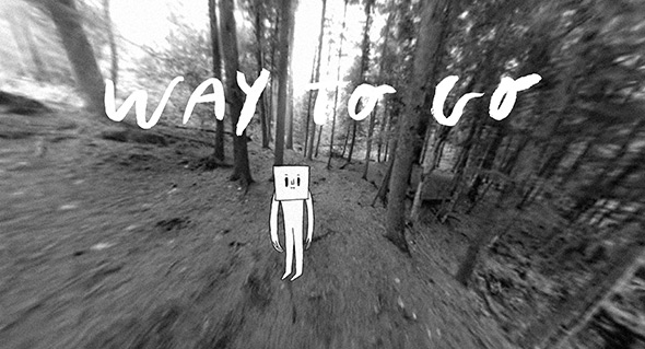
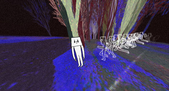
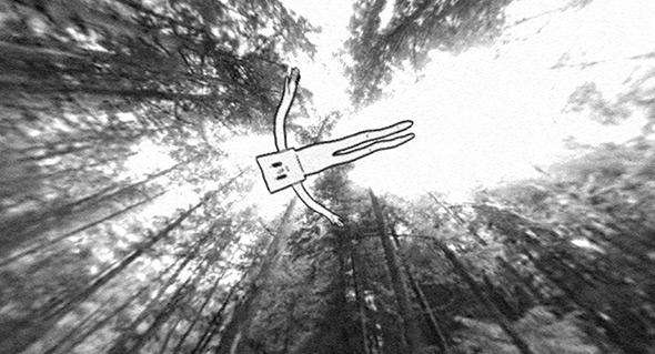
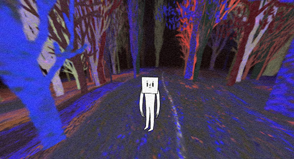
Surreal and beautiful – a ‘walking simulator’ – probably best described as an immersive interactive digital short film. Starting in the woods you guide your character along a path – you control your view from a 360 degree camera. You explore your environment, clicking brings your character to investigate a certain spot on the ground. It gets more surreal the further you explore, across various environments – a real feat in interactive storytelling. Love the way it totally immerses you into this strange world, drawing you in further and further. Beautifully executed and well crafted – nice to see more of this kind of thing that really highlights the potential of the interactive medium.

Created by Vincent Morisset and friends, AATOAA (@vmorisset).

Site here…

Rosewater

By | @watsondg | No Comments

rose-water-1
rose-water-2
rose-water-3

Site for Rosewater, a film about BBC documentary maker. Nicely designed with full screen video background and typographic overlays – offering insight into the film and the characters. Really nice transitions and text effects that bring a touch of movement and dynamism to the layout. I like the background music and the typographic heavy approach, the short clips and details for each theme works well too. Another lovely site from Watson D/G.

Created by Watson D/G (@watsondg).

Site here…

District 13

By | @watsondg | No Comments

mockingjay-1
mockingjay-2
mockingjay-3

Site promoting ‘Mocking Jay’ the latest film in the Hunger Games film/book saga. Hooking up your phone to the browser you can play some small puzzles on your phone to ‘hack’ content – games that uses your phones tilt and motion sensors – really nicely synchronised. You unlock key sections of content to reveal a larger picture of what the film is all about. Lovely glitch effects and again lovely design by Watson D/G, nice typography and futuristic look and feel. Nice bit of fun…

Created by Watson D/G (@watsondg).

Site here…

The Other Side

By | @stinkdigital, @W2Optimism | No Comments

honda-r-1 honda-r-2
honda-r-3

Really really simple and enjoyable execution of a nice idea – for Honda Type R. Hold down the ‘R’ key on your keyboard while watching the film, it will show the same story and scene from the other side. In this case switching between a dad picking his kids up from school vs picking up his partners in crime fleeing a burglary! Very addictive to switch between the scenes – to see ‘the other side’. Had to include it for its simplicity and elegance, can’t help but smile at this one – and it’s just a car ad!

Created by W+K London (@W2Optimism), and Stink Digital (@stinkdigital).

Site here…

Tokyo Mild Foundation

By | @LIG_J | No Comments

tokyo-1
tokyo-2
tokyo-3

Site of Tokyo Mild Foundation, Japanese film producers. Minimal layout and dark look and feel shows the projects on offer – stripped back and simple. Some nice transitions and some cute details bring it all to life, I like the slide out menu from the left and the ‘member’ section is nicely done.

Created by LIG Inc. (@LIG_J).

Site here…

Waterloo

By | @Dogstudio | No Comments

waterloo-1 waterloo-2 waterloo-3

Site for French film ‘Waterloo’, telling the story of the famous battle of Waterloo. Focussing on the two sides pitted against each other, Napoleon and Wellington – and describing through iconography the differences between the English and French forces. Nice experience with sounds, full bleed imagery and video – all in a tight layout, with modern interaction design with sliding panels and menus. It looks great too, with the muted colours and distressed overlay.

Created by Dog Studio (@Dogstudio).

Site here…