europe

Citroen Origins

By | @WerkstattParis | No Comments

citroen-1
citroen-2
citroen-3
citroen-4
citroen-5

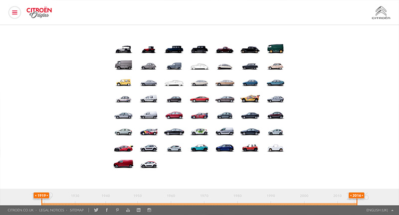
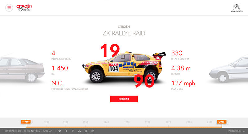
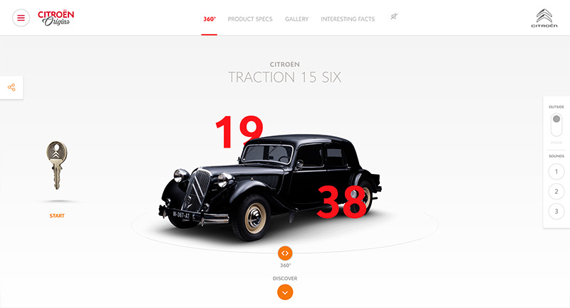
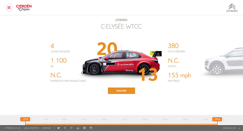
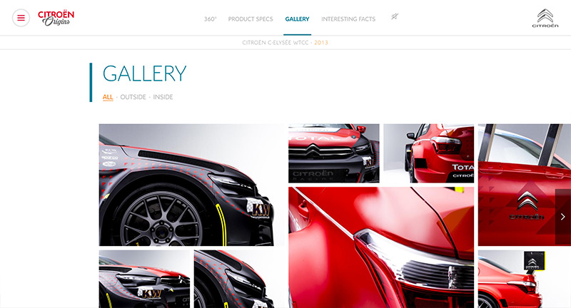
Site documenting some of Citroen’s most iconic cars. Love the immersive app like approach – with an exploratory interface that encourages deep dives into the content. Lots of great content, sounds of the cars starting, brochures, posters, photography and specs. Nice use of 360 renders – from both the exterior and the interior. A lovingly crafted and in-depth experience that looks great and works well.

Created by Werkstatt (@WerkstattParis).

Site here…

Vincent Tavano

By | @webdesign | No Comments

vincent-1
vincent-2
vincent-3
vincent-4

Site for freelance Art Director & Designer. Simple type based home screen, on rollover large imagery represents the project. Slide in panel appears on click reveals nice layouts and designs for each project. Nice body of work, wrapped up in a slick and nicely designed site.

Site here…

Bello

By | @adoratorio_cc | No Comments

bello-1
bello-2
bello-3

Site of Italian design firm specializing in 3D renders and animation. Dark and simple – love the layers of the hero images slightly moving and the nice text transitions. Nice thoughtful project pages that inject a sense of movement and show the work in a simple way. Lots of nice little details that lift the experience and add some personality.

Created by Adoratorio (@adoratorio_cc).

Site here…

Maison Ullens

By | @WeArePeriod | No Comments

nullens-1
nullens-2
nullens-3

Lovely site for label Maison Ullens. Beautifully designed with an elegant scrolling mechanic to discover the labels range. Love all the seamless transitions from one page to the other and the detail view for each item, that lets you cycle through the range easily. Lots of small and thoughtful animations, transitions and interactions that provide a sophisticated and refined experience.

Created by We Are Period (@WeArePeriod).

Site here…

Anna Morosini

By | @GustoIDS | No Comments

anna-1
anna-2
anna-3
anna-4

Site of Italian photographer Anna Morosini. Nicely crafted portfolio divided by category of work, love the offset grid and minimal layout reliant on slivers of imagery which expand with interaction. Love the whitespace and feeling of calm the layout offers, nice transitions between imagery. Some interesting interaction models dotted throughout, love the scroll to close image in the portrait section.

Created by Studio Gusto (@GustoIDS).

Site here…

Femme Fatale

By | @HiFemmeFatale | No Comments

femmefatale-1
femmefatale-2
femmefatale-3
femmefatale-4

Site for French agency Femme Fatale. List of projects that as you cycle through they transition nicely between one another – text splits, and image inside mask slides. Simple layout and case studies that highlight the motion design from the projects with inline video. It looks great too, with nice bold type and large imagery.

Created by Femme Fatale (@HiFemmeFatale).

Site here…

21 Dimes

By | @TamTamNL | No Comments

jazz-1
jazz-2
jazz-3
jazz-4

Site promoting some of the artists for the North Sea Jazz Festival – through the idea of stories from the early stages of their careers. Love the integration of sound reactive elements that respond to the music as you cycle through the artists. Fun colour accent and bold type juxtaposed with b&w photography – nice feeling and attitude – and love the integration of music.

Created by TamTam (@TamTamNL).

Site here…

Lynn Schmidt

By | @webdesign | No Comments

schmidt-1
schmidt-2
schmidt-3
schmidt-4

Ultra minimal and stylish site for fashion photography stylist Lynn Schmidt. Love the elegant simplicity and offset grid – so simple – tap on the image to cycle through images for that project. Simple slide out menu, easy to use, and works great on mobile too.

Created by OFF.

Site here…

You are Watching

By | Loose | No Comments

watching-1
watching-2
watching-3

Site that generates a never ending film composed of live web camera footage, the soundtrack is also found footage. Really interesting idea – it strikes an interesting note about security and privacy in this modern age. Like the way it mixes video and sounds in an algorithmic way so no two viewings are the same.

Created by Null.

Site here…

Belligerent Eyes

By | @webdesign | No Comments

b-eyes-1
b-eyes-2
b-eyes-3

A digital art piece that in their own words “Through a chat-bot, contents are imported in realtime by a custom AI censoring algorithm, displaying itself in an infinte loop of hyper-medial elements. Visitors will experience the flow changes in realtime, exploring contents and features of this new media.” The end result is a 3D stream of modified visuals floating in space. Interesting experimentation with the concept of censorship.

Created by display.

Site here…

Tank Magazine

By | @tankmagazine | No Comments

tank-1
tank-2
tank-3

Site for Tank magazine, UK independant quarterly on contemporary culture, design, art and so on. Love the 3D panels showing the latest issues content outline – some interesting interaction, where the entire paragraph splits and reveals imagery. Minimal design makes a nice juxtaposition with the content and imagery from the magazine.

Created by Tank Magazine (@tankmagazine).

Site here…

Humans & Machines

By | @humans_machines | No Comments

humansmachines-1
humansmachines-2
humansmachines-3
humansmachines-4

Site for German digital agency Humans & Machines. Elegant and minimal site for a body of work spanning identity to app design. Lots of nice transitions from section to section, with gorgeous seamless animations – that give a feel of polish and simplicity. The case studies for each of the projects are well considered and include inline videos, animations, and wireframes even to describe their process and pull out the nice features. Such a lovely, modern and fresh experience.

Created by Humans & Machines (@humans_machines).

Site here…

Ortiz Leon

By | @Veinti2Gra2 | No Comments

ortis-1
ortis-2
ortis-4
ortis-3

Gorgeous site for famous Spanish architects Ortiz Leon. Beautiful photography paired lovely type and interactivity. Love the seamless transitions, to the level of interactivity and detail on the project pages. So much detail, for example on the case study pages – the carousel arrows have a small timer that rotates around the circle to auto cycle, each image also appears in a slightly different size – keeps it interesting and looks great. Love the grid style overlays and boxes that brings the theme to life.

Created by 22 Degrees (@Veinti2Gra2).

Site here…

Jeremy Vitte

By | @TristanBagot | No Comments

jeremy-1
jeremy-2
jeremy-3

Site of Jeremy Vitte art director and designer for magazines, books and identity. Simple folio site that shows the range of work in a minimal way, love the way the screen splits to show the open project down the right side of the screen. Nice range of work displayed in an elegant and complimentary way.

Created by Tristan Bagot (@TristanBagot).

Site here…