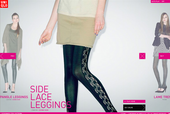
Site promoting Uniqlo’s range of women’s leggings. Another cool uniqlo site – interactive slideshow of leggings beginning with a zoomed in pan then with a video of a model walking in them. Colourful and fun it is also nicely integrated with online shop too, very smart. Love the panning feature, and slideshow, and the video is a nice touch too, cool animation and transitions.
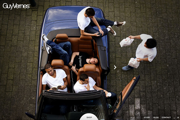
Website of Dutch apparel brand Guy Vernes. Nice and simple slideshow of lifestyle photography twinned with a product section where you can buy what you see. Love the slight movement on the images and the use of icons, the online shop is integrated really well linking to the product you see in the photo. Really nicely developed, slick and fun to use – pretty smart website for a small label.
Created by Niek Dekker.
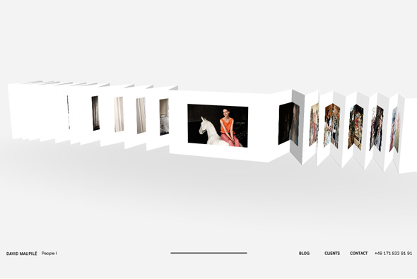
Website of photographer David Maupilé. Based around a long sheet of folded paper in 3D, with each photograph folded – when clicked camera zooms in and displays photo bigger. Very clean and minimal with a nice navigational interface, well made and looks great! Very cool…
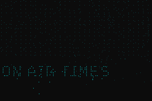
Beautifully simple portfolio of ‘Full Size Image’. Using pixels of light that move around to form text and thumbnails – each project scrolling past and regenerated by pixels on the homepage. Love the movement of all the pixels and simplicity of it all.
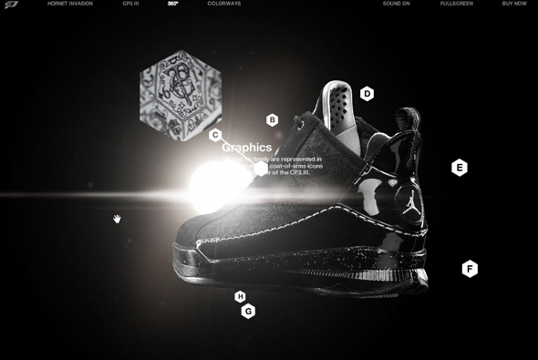
Site promoting the new Nike CP3.III basketball trainers with the help of Chris Paul – basketball player. Slick dark interface, which offers the option to watch Chris Paul in action or check out the trainers. Lots of nice parallax visual effects to give a really cool feeling of depth, love the lens flare effect behind it all – bleaching out your view slightly. Really cool 360 of the shoe and 3d effects on the details. Very slick…
Created by Academy.
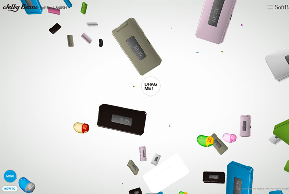
Mega cool, and mega mental promotional site for SoftBank, and what seems like promotional Jelly Beans edition phones! Featuring a 3d environment where jelly beans and the phones float around to music, making up shapes and animating around everywhere. By clicking and dragging a phone, you drag the phone towards you and the rest of the phones carry on doing their own thing. By dragging more you reveal different information about the phone. Really fun and captivating, I really love the drag interactivity, and sitting back to watch all the animation! Really cool…
Created by Dentsu.
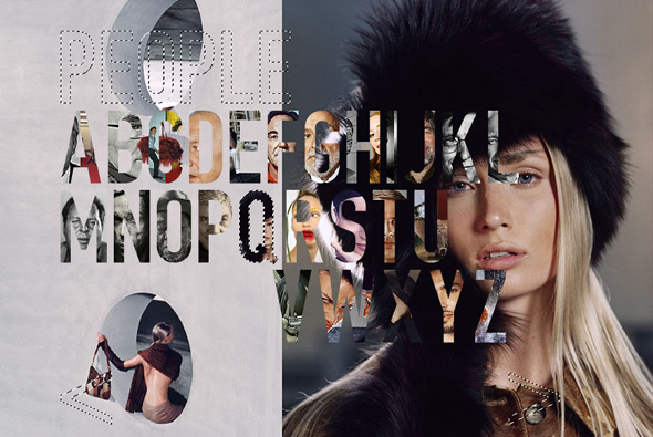
Portfolio of photographer Uli Heckmann. Unique photoshop inspired portfolio, featuring the mask tool everywhere! I love the way the alphabet is used as thumbnails for the photographs – filling once you have seen that picture. Nice transitions and interactivity, very cool.
Created by Less Rain.
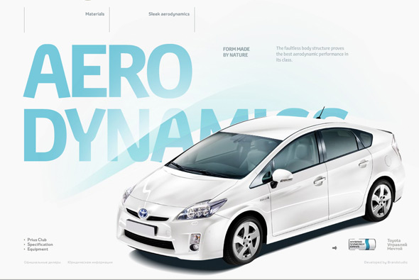
Website for the Toyota Prius for the Russian market. Really nice motion graphics and videos to introduce features of the car – followed by nicely designed info screens highlighting the specifics. Loads of really cool animations and a massive attention to detail – really like the way the car appears in the info screens and the sleek well considered design. Sound design is also great, all in all a pleasure to use and a very informative, fun consumer site.
Created by BrandStudio.
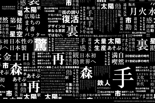
I’m not entirely sure what Kitayama & Company do exactly, but they have a nice website! It takes a while to load, but the preloader is pretty cool. Clicking on one of the thumbnail pictures reveals a timeline to show the work they have done over the years. Lots of nice animations and transitions, and I love the way the homepage transitions from text to photos.
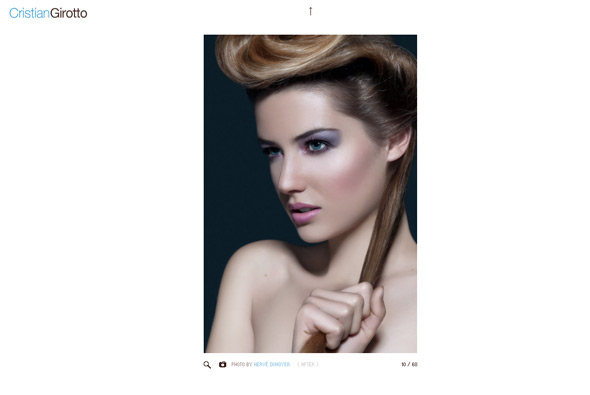
Portfolio of retoucher Cristian Girotto. Clean and simple, and really well made. WHen you click on a photo it shows the original version, click again to show the retouched version – simple and works really well. Love the zoom function too. It’s really interesting to see the difference between the original and the retouched version, to see the amount of work that went into it. The thumbnail menu at the top also is great. Fantastic portfolio site.
Created by Fabio Caccamo.
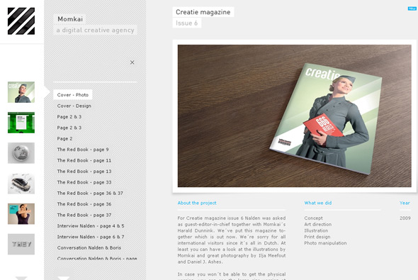
Portfolio of Amsterdam based digital agency Momkai. Very simple layout that works really nicely, they also show a vast amount of work, which you can choose to see if you wish – so it’s not presented in an intrusive way. Many little touches and cool animations that complete the whole package.
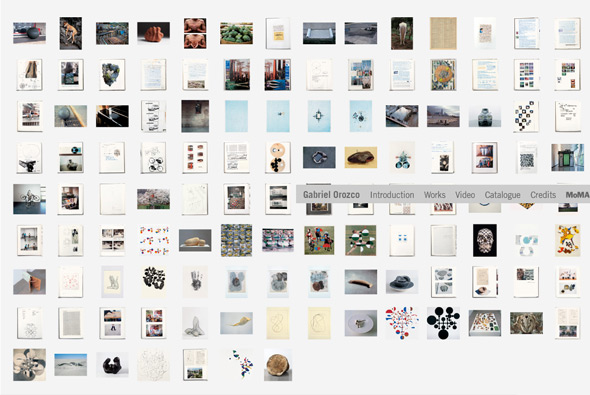
Site promoting the exhibition of Mexican artist, Gabriel Orozco at MoMA. Really nice example of a dynamic gallery that pans around with your mouse movement. I also like the way things move around when you click on one of the thumbnails, and the clear concise navigation and nice animations.
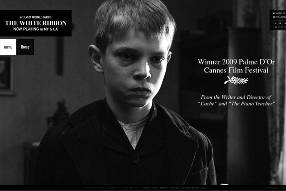
Simple, elegant site promoting the launch of ‘The White Ribbon’, a new film directed by Michael Haneke. A slideshow introduces the film via a few stills nicely animated along with quotes from the media. Overall a simple site that gives a nice ambience that suits the film well.
Created by Halo.
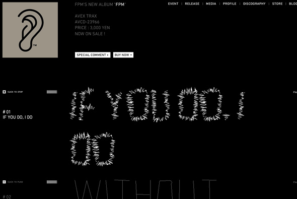
Awesome album teaser site for FPM (Fantastic Plastic Machine). Incredibly simple, and incredibly cool. With the track listing, when you preview one of the tracks the music then affects the track name, making it jump around in time to the music, the site then becomes alive – really nice idea. So minimal but brought to life by the music, that contrast is what makes this site so fun, effective, and cool!
Created by tha ltd.

