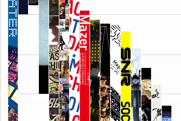
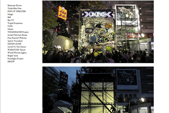
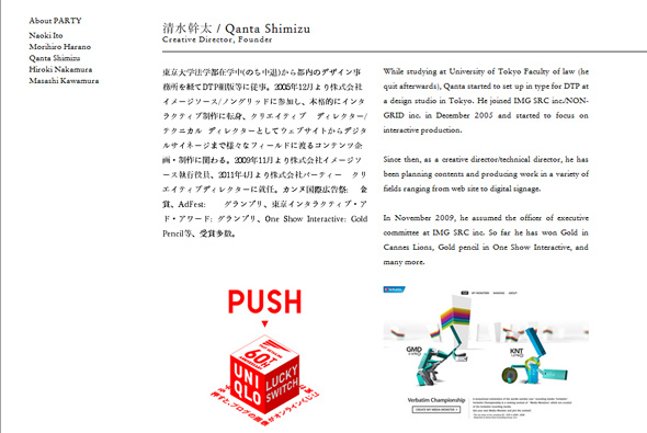
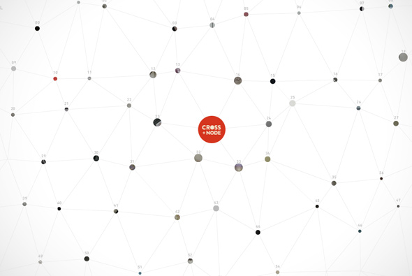
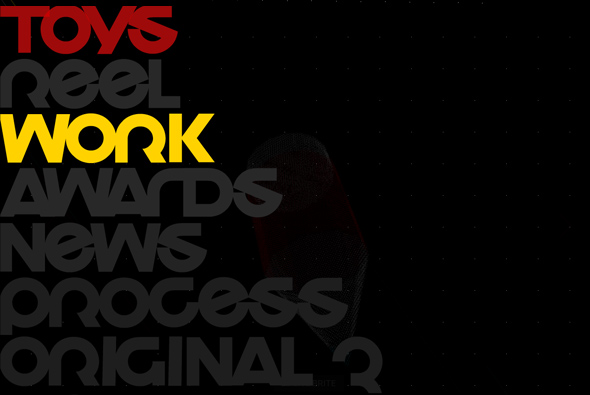
Best described by their website – ‘PARTY is a “Creative Lab” based in Tokyo and New York, founded by 5 Creative Directors, Naoki Ito, Morihiro Harano, Qanta Shimizu, Hiroki Nakamura, and Masashi Kawamura.’ Essentially 5 really talented creative directors working on some really nice, innovative projects. I like the strips on the homepage representing their projects – stretched over time, nice visually strong idea. For the rest they have some really nice projects and its well worth taking a look, definitely one to watch.
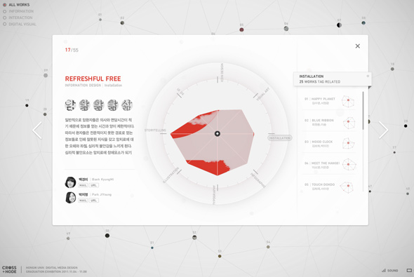
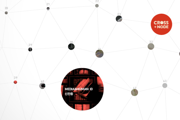
A collection of students work from the Hong Kong University – Digital Media Design graduate show. An explorative approach to viewing the pieces, lots of projects moving around with your mouse. I like the infographic chart approach to highlighting the key attributes of the project, nice attention to detail and a fun way to explore without too much detail. All in all it looks great and has really nice subtle animations to bring it all to life.
Created by Ahn Jiyong and Sanghun Heo.
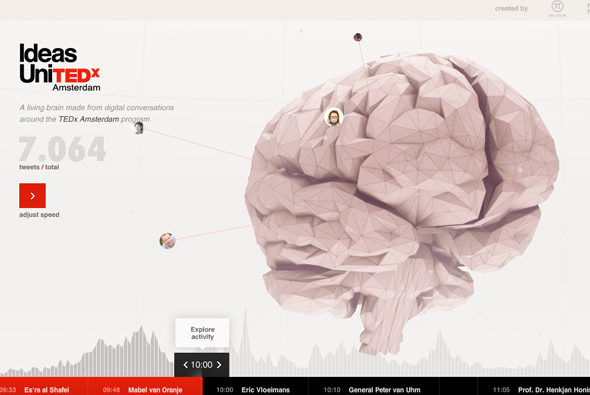
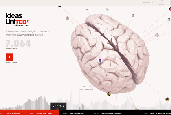
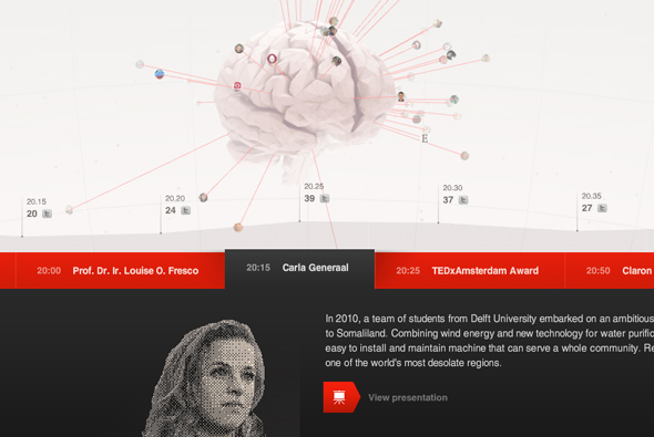
Really nice site, highlighting the talks and ideas of TEDx Amsterdam. Using a cool 3d interface to map twitter conversations coming out over time from a brain. The camera changes over time to alloy a ‘slideshow’ view, so when you are not interacting you can simply watch the tweets appear. What I also really like is the attention to detail and the info graphic approach to the design of information – the chart of times and the really nice rising panel which stretches the timescales and so on. Every little interaction and touch is well though out and designed. It is great just to interact and play with, but also shows all the info in an intelligent and useable way – on top of all this it also looks good!
Created by WE ARE Pi and Media Monks.
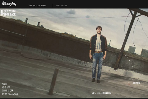
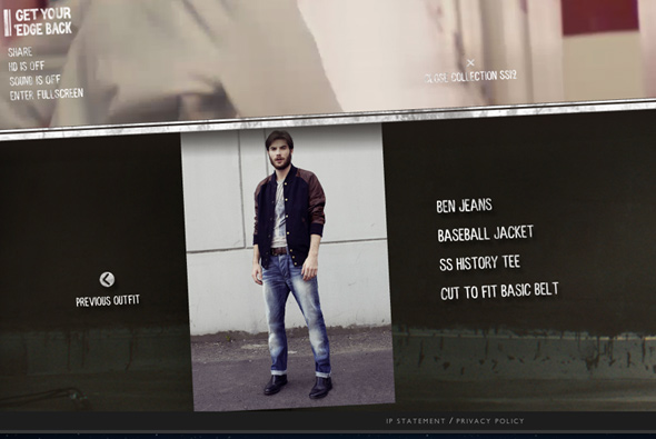
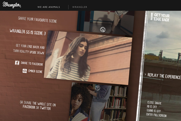
Spring / Summer 2012 collection from Wrangler – wrapped up in a fun microsite. Inviting you to drag and release the characters at key moments in the video – triggering a cool transition between scenes where the character flies through the wall / floor / something. Makes something static relatively interactive, I also like the usage of the ‘edge’ and the position of your mouse to affect the rotation of the screen – nice attention to detail. For something that is essentially a video they have made it fun to play with and explore.
Created by Stinkdigital.
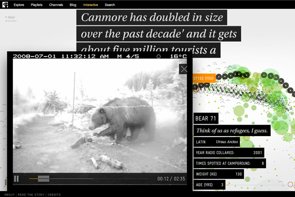
Bear 71 is a stunning interactive documentary about a female bear’s movements over 8 years, after she was caught in 2001 by wildlife officers in the Banff National park, Canada. Explained by Creative Review, “The project’s co-creators Leanne Allison and Jeremy Mendes decided to turn the 1m photos taken during the time of Bear71’s monitoring into an interactive project with the help of the National Film Board of Canada’s digital studio, NFB Interactive, and have Bear71 herself as the narrator of the story (she is voiced brilliantly by actress Mia Kirshner)”, link.
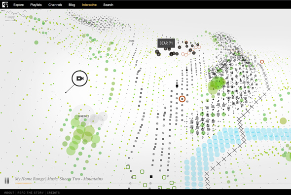
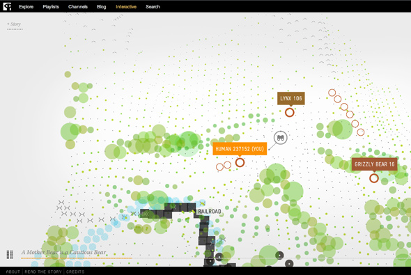
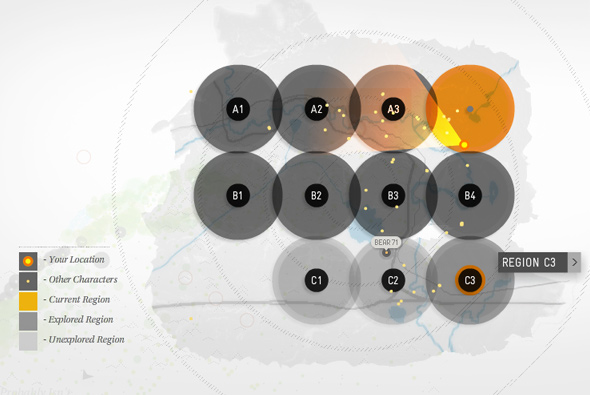
I love the execution, a lot of thought has gone into how best to present this wealth of information in an interesting and interactive way. Featuring a 3d map you explore made of dots that represent the terrain, trees, rivers, roads, hills and so on – you get a real feeling of depth. Bear 71 can be seen walking around the environment, triggering video events and so on, there are also all the other ‘characters’ in the park, golden eagles, lynx, deer, cougars, wolfs, other people (shown by a webcam snapshot when you start the site) which roam the park. It really is a fascinating experience offering a unique insight to the life of a bear in a human world, the trials they face, the dangers and how we affect their world. All presented in an innovative, beautiful and interesting way. Really great work…
Created by NFB Interactive.
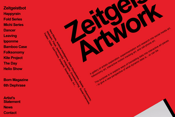
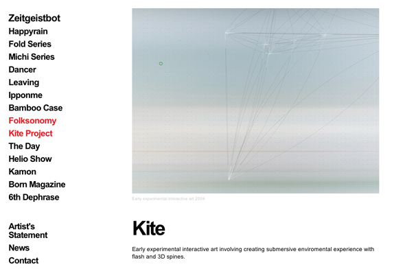
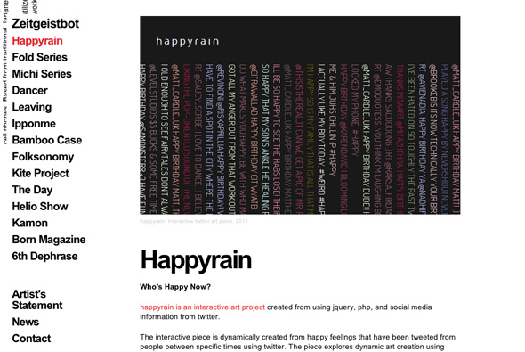
Site of Zeitgeist “A gallery of artistic exploration, experimentation and research into social media art, folksonomy art, interactive motion tracking art, and cell phone art.” What I like is the way you navigate the site, your view rotates and moves around the screen, I like even that you can scroll around the canvas too. The clean and minimal design accentuates the nice transitions between the sections and adds an element of movement which is really nice – it is also a very modern non-Flash site which also works well on iPads.
Created by variousways.
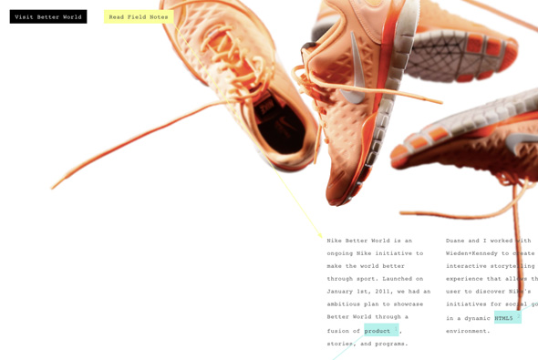
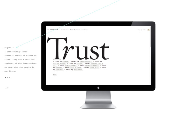
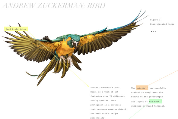
Portfolio of Creative Director and designer Ian Coyle the man behind projects such as Andrew Zuckerman: Bird and Nike Better World. Really nice way of presenting work and breaking the norm – using a notation style highlighting interesting parts of the project, from snippets of code to snapshots of navigation, and the things that made the project special. It takes an exploratory approach and is nice to scroll around and find the details. Very cool, modern and fresh portfolio with great work…
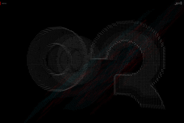
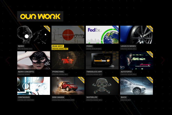
Wicked portfolio of Toronto based digital agency JAM3. Using very cool transitions and an interesting particle based 3d effect, every part of this site is slick and smooth. All the interactions have been carefully designed and animated, I love the transition between the projects and section with your view zooming around and the interface building and disappearing, all so detailed. Really great, modern and fresh portfolio showing what Flash can do.
Created by JAM3.
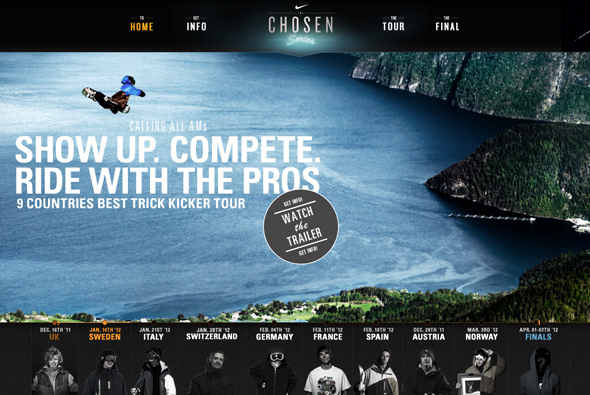
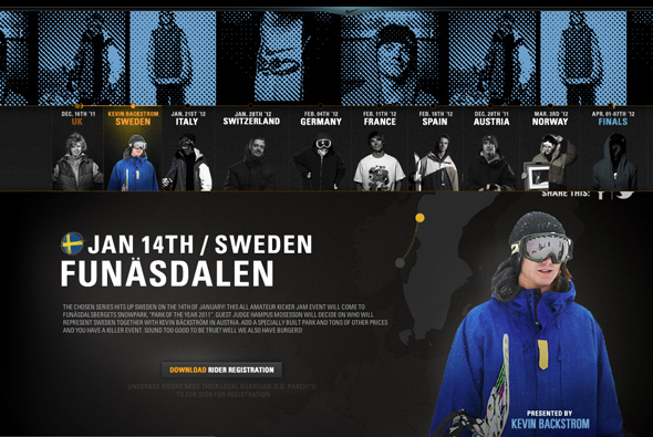
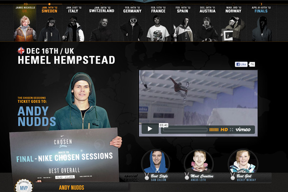
Great site promoting Nike’s competition ‘Chosen Series’ a competition for amateur snowboarders spread across various resorts in Europe. Using a hybrid Flash template for the homepage and I love the very cool transitions between the stages. Nice layout and attention to detail, looks great and fantastic animation. Great to see a blend of the best technologies used in such a good way.
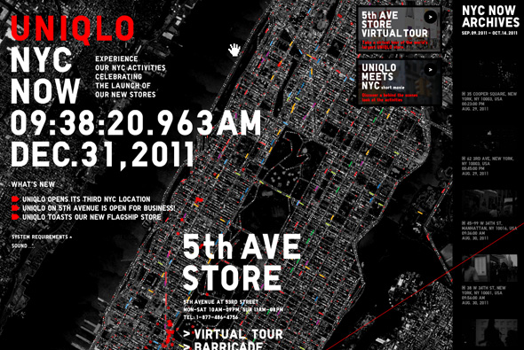
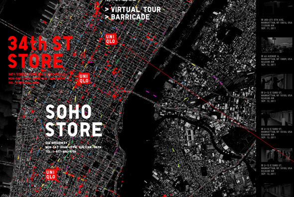
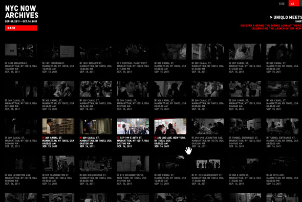
Interesting site for Uniqlo – showing what has been happening in NYC to promote Uniqlo’s presence in NYC. Featuring a large scrollable map full of activity with short videos highlighting what has been happening in the city. You can also see videos of each store and explore a grid of all the videos. Really like the map and the activity it shows, all set in time to a drum like beat, again I like the sit back and watch quality of this kind of thing – it is interesting just to watch. Nice transitions and animation – all in all very cool.
Created by mount inc.
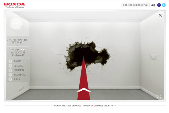
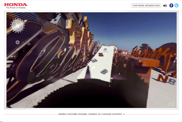
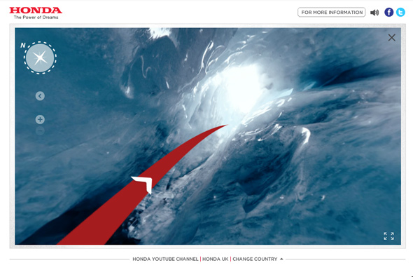
Site for Honda supporting launch of the new Civic. A play on Google’s street view, except for exploring the streets you explore ‘off the grid’ locations – such as canyons, underwater art galleries, and so on. All filmed from a 360 degree camera system walking – you can click and drag to change your view as the scene unfolds – very cool. The scenes are magical and sound, music, and voiceover all adds to the ambience, really nice.
Created by Wieden + Kennedy London.
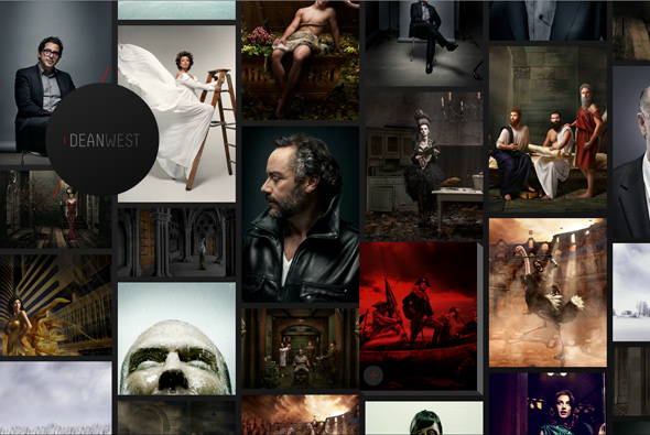
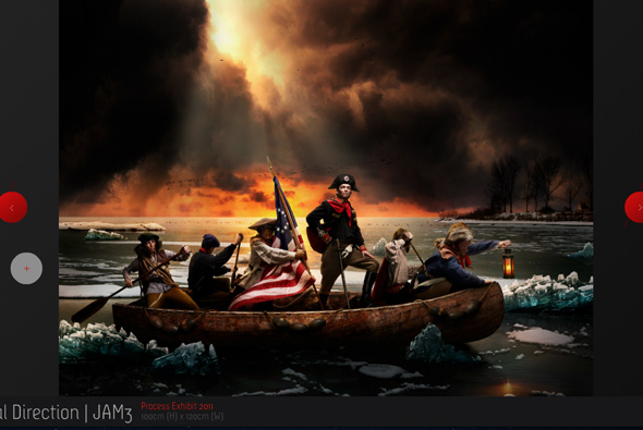
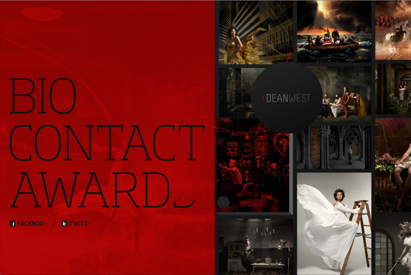
Portfolio for photographer Dean West with a slick interface. Love the scrolling through the thumbnails, a rich tapestry of photographs scrolling at different speeds gives a great feeling of depth and movement. A really nice portfolio site, well made and easy to use, slick, and fantastic transitions.
Created by Jam3.
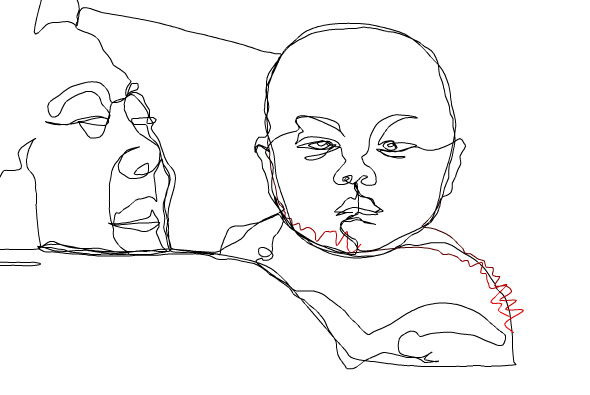

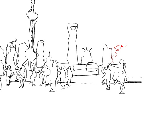
Beautiful site combining drawn scenes and jazz, the music animating the drawing scenes of China – promoting a jazz album ‘Chinese Soul’. The lines vibrate with the music in turn drawing the lines with the scene panning as the lines are drawn. I love the thought that music can draw a scene in your mind and give a mood, a feeling – very simple and beautifully made. Fantastic.
Created by Motiondraw.
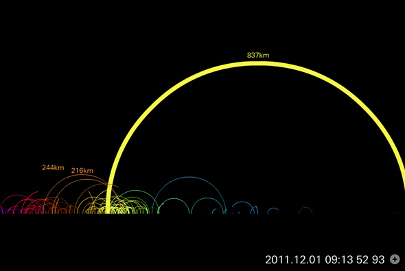
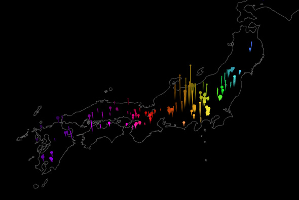
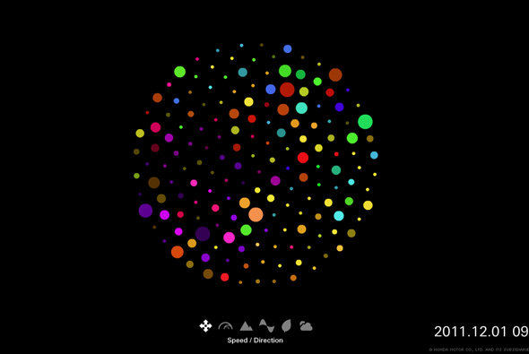
Site for Honda Japan featuring info graphics and data about road journeys in Japan. These are all visualised using coloured dots and smoothly animated and shown like a slideshow. Information such as current traffic and weather conditions is shown all in an informative and interesting way. Love the way the dots all move around to form the visuals. Minimal layout and look and feel but the animations and slideshow are really nice, great way of showing information in an dynamic and visually interesting way.

