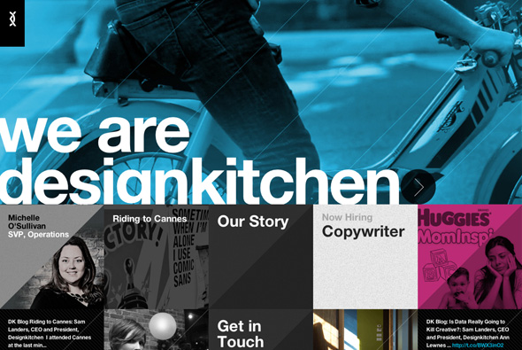
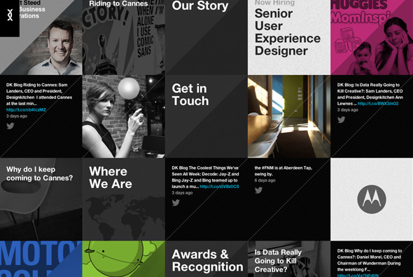
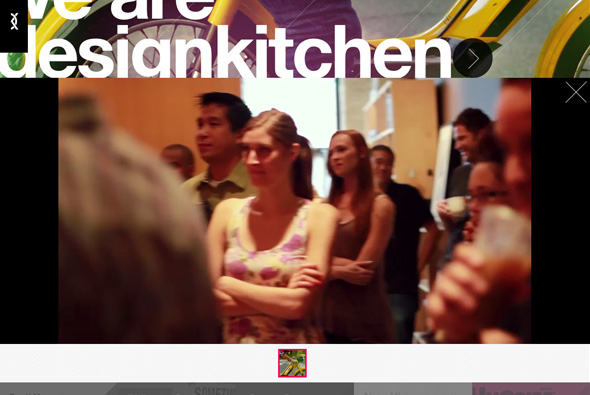
Nice site of global agency Designktichen. Really simple, essentially a news feed of items (news, twitter, images) and latest projects that when pressed split the layout to reveal the content – in a really nice smooth way. Nicely designed and bold typography – thoroughly modern site.
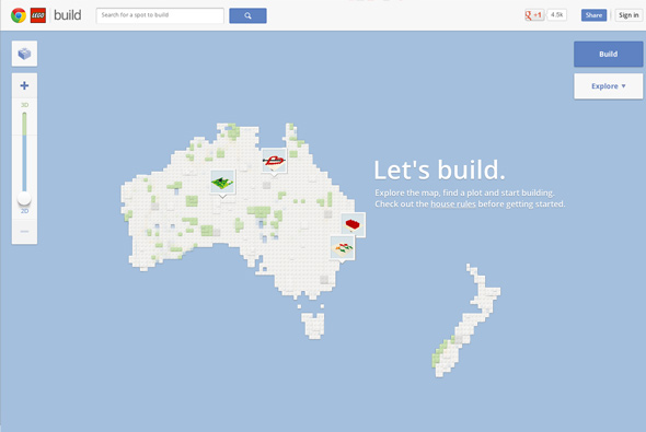
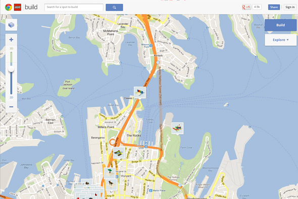
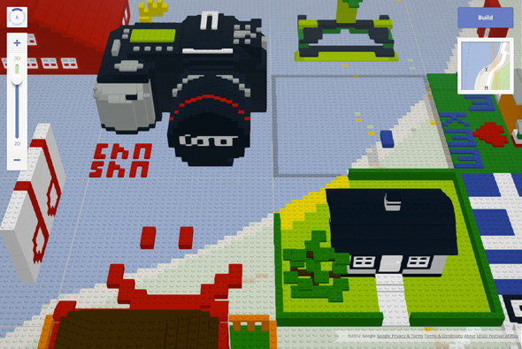
Nice site promoting Google Chrome – a tie-in with Lego, a large Google map of Australia dotted with grids made up of lego bricks. As you zoom into the map you end up in a 3d view of places where people have created their own blocks and shapes which you can view from various angles. A bit of fun, clean integration and nice 3d effects.
Created by Mark and North Kingdom.
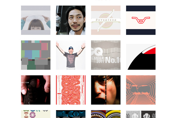
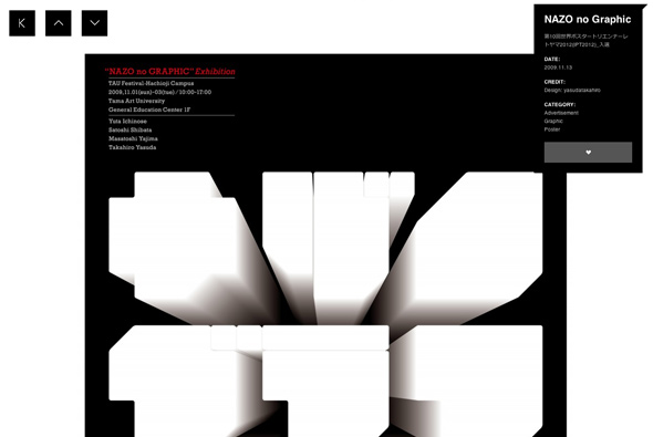
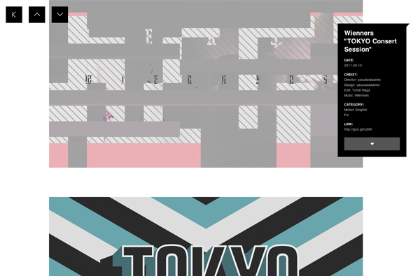
Lovely site from Japanese designer Yasuda Takahiro. Very minimal interace nicely spiced up with transitions and smart features. Love it the small details in this site, when you are scrolling down the info panel scrolls with you with the overlay tracking exactly the scroll bar position – it changes colour when you scroll to another section – nice small details. Really nice work too – very cool.
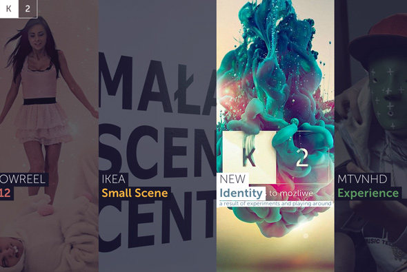
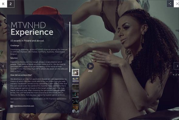
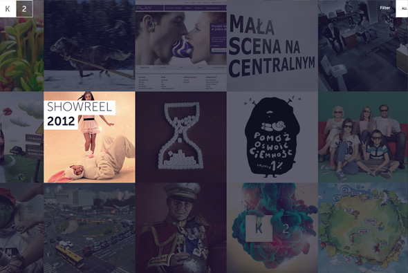
Portfolio of Polish agency K2. Really slick site highlight their best work, with plenty of nice transitions and effects. Like the simplicity of layout and large imagery, the open / close transitions on the work section are great, and it all feels well polished. And all in a non-Flash site…
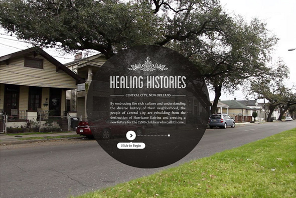
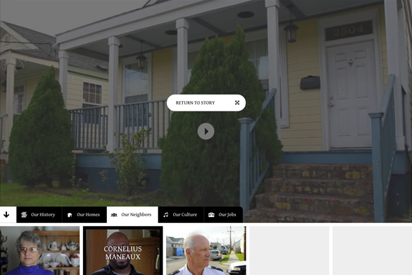
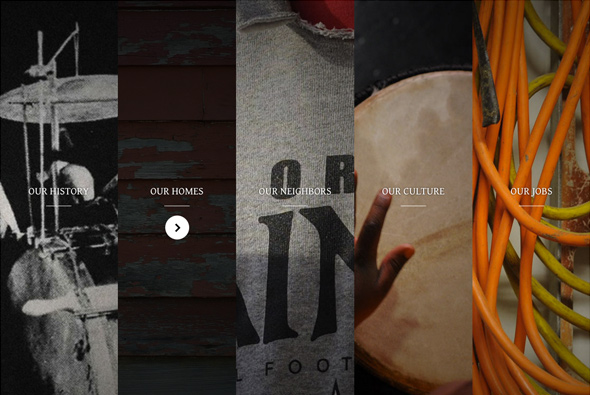
Healing Histories is an interactive documentary highlighting New Orleans recovery from the hurricane Katrina that destroyed much of the area. Love the simple interace with rich assets and imagery, the transitions and animations are very much ‘app’ esque with smooth movement and useful metaphors. Really nice site looks like it was designed for ‘touch first’.
Created by Legwork Studio.
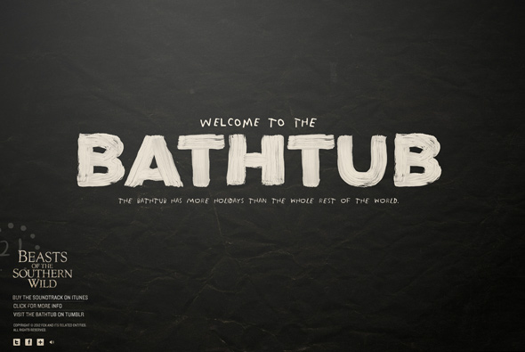
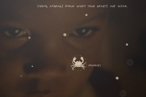
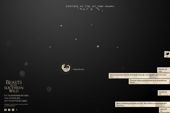
Site promoting the film ‘Beasts of the Southern Wild’, showing short clips of viewpoints from a character from the film and streaming latest tweets about the film. Beautifully simple, lovely full screen video and transitions, fun innovative menu a more exploratory site experience – really well crafted filmic site.
Created by WatsonDG.
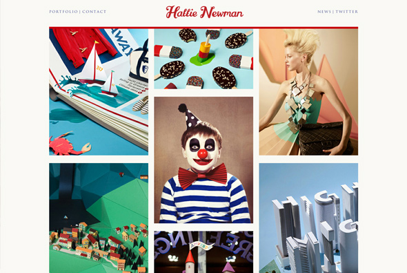
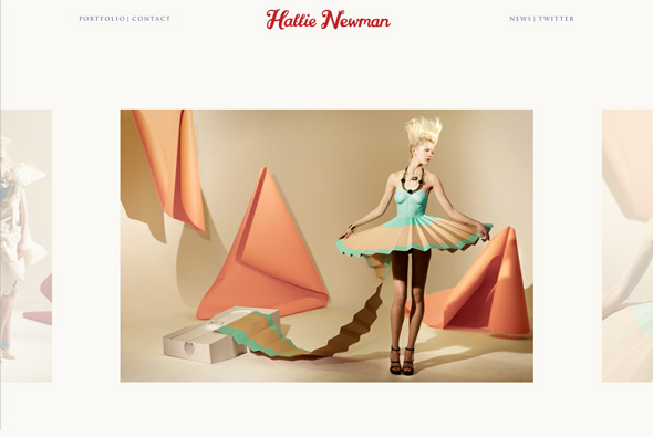
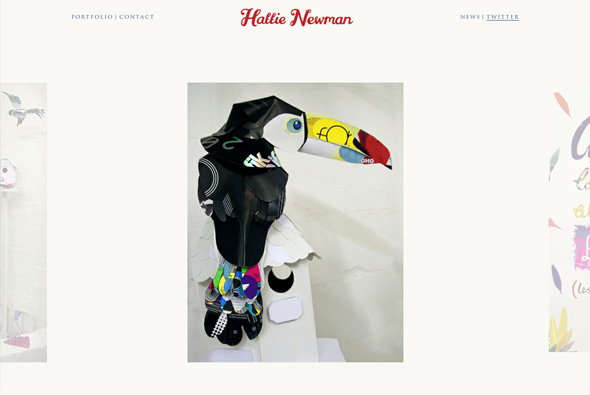
Hattie Newman is a set designer and image maker based in London. This site showcases her work in a wonderfully simple way, click on a project – the top slides down to reveal the image set, smooth quick transitions and a joy to use. Minimal design and layout, letting the colourful work do the talking.
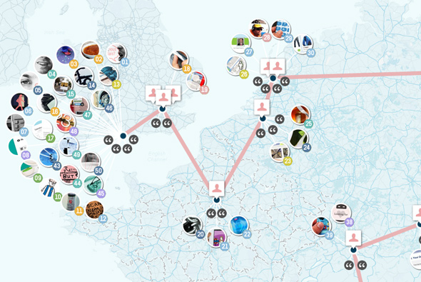
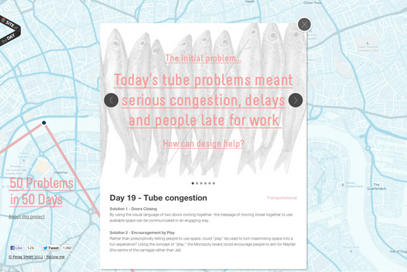
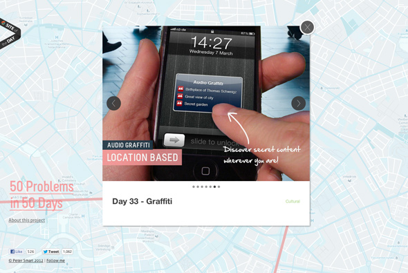
Website showing Peter Smart’s trip through Europe solving design problems from tube congestion, pick pocketing, graffiti as he went – nice idea. Interesting map based interface, clean simple interface, some nice ideas in there too.
Created by Peter Smart.
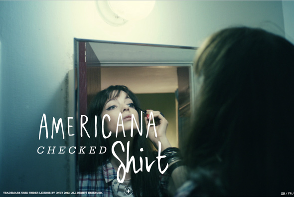
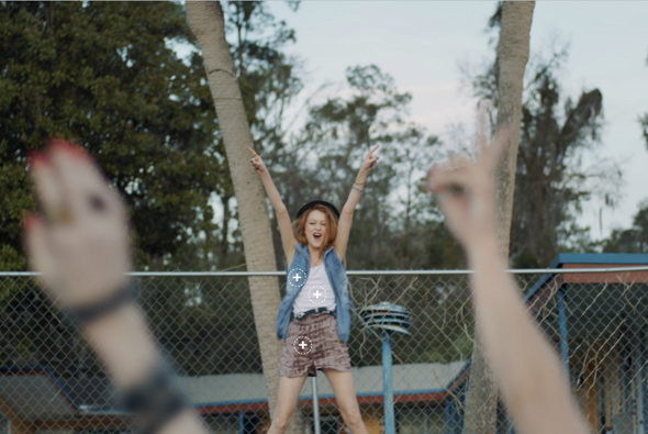
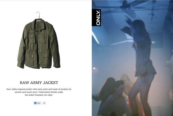
Site for high European street label ‘ONLY’. Essentially quite a long video catalogue featuring clothes from the label, when you click the video stops and hotspots appear – when you click on of these the item is highlighted. Simple, but the transitions and small details such as nice transitions and animations just life it all a little. Nicely made and a slick experience.
Created by North Kingdom & Uncle Grey.
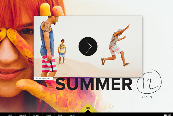
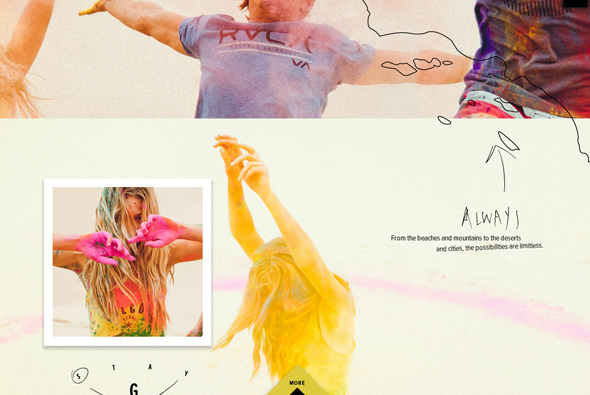
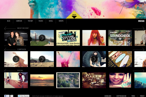
Fun, bold, and colourful site for Pacific Sunwear of California. Large photography, bold colours, and parallax scrolling (this time vertically), but all combined make a very graphic presence – very simple in it’s execution but works wonderfully. Love the easing on the scroll – which makes such a difference on a site like this – makes for smooth scrolling experience.
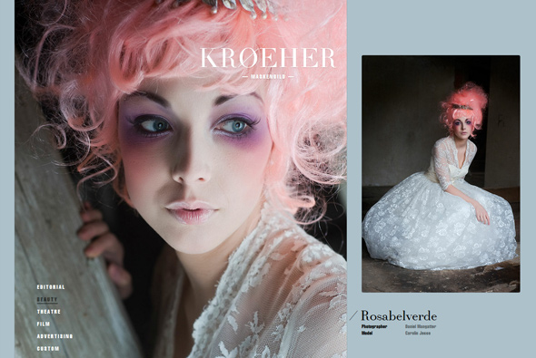
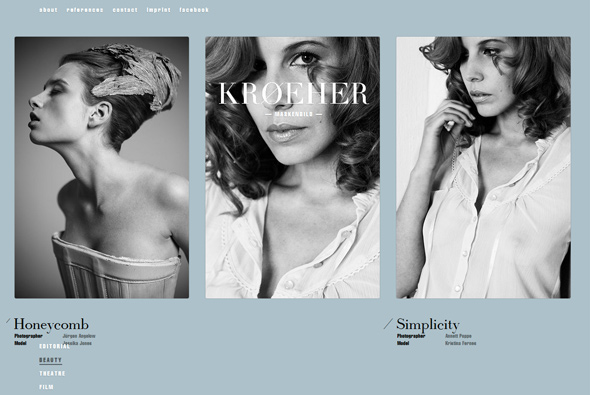
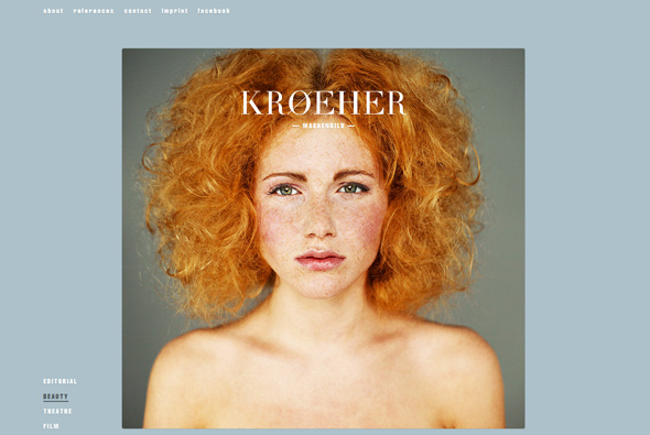
Portfolio of freelance makeup artist Judith Kröher. Really like the layout and the simplicity of the site, nicely considered grid and design. Colours of the background enhance the photographs well and a I like the large logo overlaid onto the site. Nice, minimal, and simple…
Created Markus Lange & Marcus Blättermann.
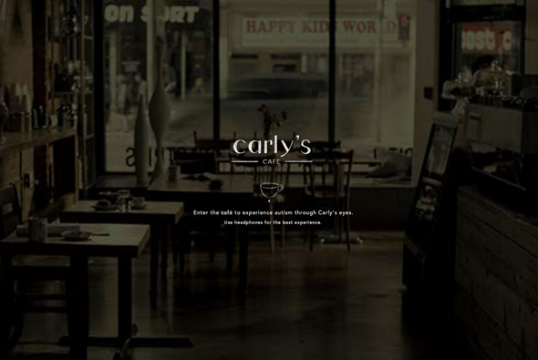
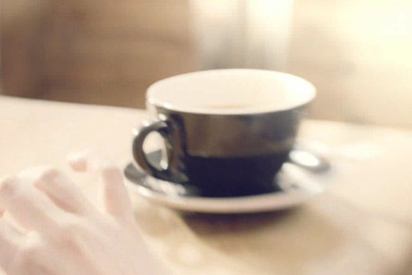
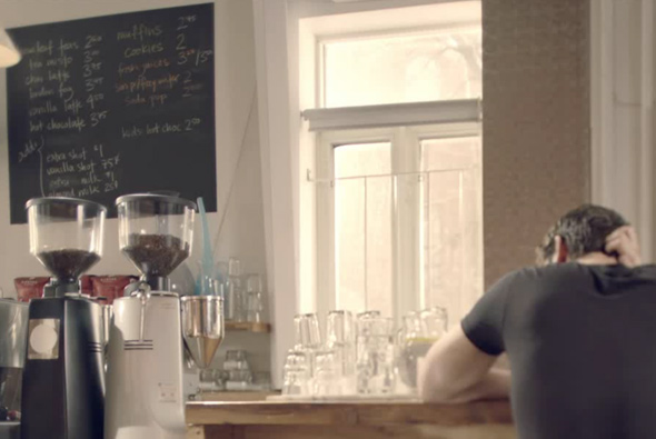
Site allowing you to experience situations through Carly’s eyes – she is autistic. It shows for example meeting someone for coffee and all the distractions she witnesses all in an interactive way – moving your mouse around changes focus. Simple, tasteful and interesting way for people to experience what it might be like to be autistic.
Created by john st.
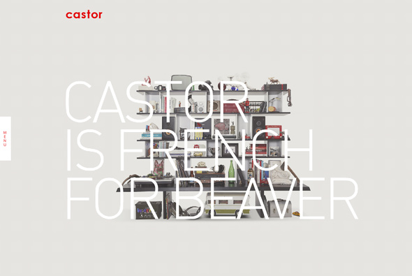
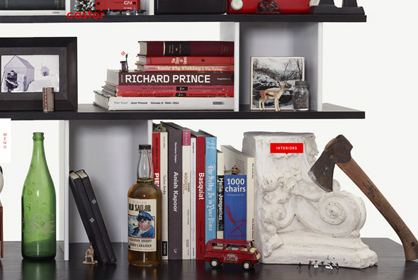
Fun site for Castor Design a Canadian design firm. Love the high res image of shelf’s that you have to zoom in/out of – akin to Google Maps. Clean crisp design and interactivity – nice little touches and animations bring an element of playfulness to the site, lots of hidden content. Smooth animation and transitions – all good.
Created by TAXI.
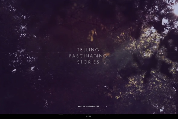
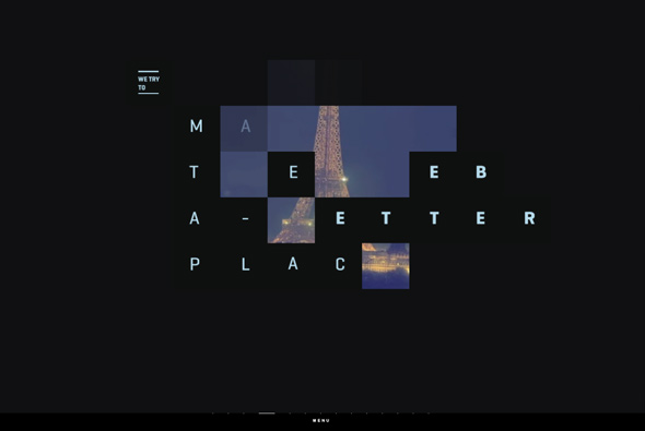
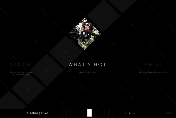
Beautifully crafted site for French agency blacknegative. Adopting a style of navigation similar to an iPad app you click and drag between sections to see what blacknegative is all about and see their projects. Full of well considered animations and transitions, and most insterestingly it is all in HTML5/Javascript, the smoothness of the animations and style of transition is incredible. The integration with the minimal design and layout is fantastic – a top notch site.
Created by Sylvain Tran & Dilshan Arukatti.

