Site of CROWD, a Barcelona and London based studio that have a diverse body of work. Very colourful and bold styling, and a very simple site that links out to Behance projects or has embedded Vimeo videos. Nice to see something a bit different for a agency portfolio.
Site promoting the new film ‘The Quiet Ones’. Essentially an interactive trailer that takes you through the premise of the film, through short interactive scenes – i.e. opening the door, turning on the lights etc. Lots of ambient sound fx, full bleed videos and imagery really provide an immersive experience – much better than a basic site with the cast / stills / trailer and so on.
Created by Hybrid Studio.
Site showing the genealogy of Nike Free trainers through intricate 3d models of key Nike free models. The detail on the model is incredible, with each part of the shoe rendered with Web GL. Attention to detail is great, the noise layer and colour hues at different edges of the Y axis. Nice to see something a bit different to show off some shoes.
Portfolio site of 3D Artist & Illustator Benoit Challand. Really nice portfolio of work wrapped up in a responsive site sprinkled with elements of delight. Love the main screen with the bold typographic layout highlighting latest project with the remainder of the projects sitting below in a fun multi layer layout. Really nice palette of colour highlights for the projects and I love the transitions to and from the various sections. Really fresh, modern, and well executed example of a portfolio site.
Created by Jerome Bodin (@hermetikstudio) and Leo Cheron (@mrgnou).
Site of artist management firm JR & Associee. Nicely stripped back and laid out like a magazine, really simple – just a nice way of seeing the work of the photographers and so on. Like on the homepage, where you rollover the thumbnail you get to see the range of images within that section.
Created by Wet Willy and Bruno Simon (@bruno_simon).
Site to raise awareness and funds for Alzheimer’s disease. The idea is a landscape of memories that you can explore – represented by an undulating sea of twinkling lights. The execution is fantastic, really slick and filmic – from the grain, the transitions and camera views to the letterbox viewport. The premise is that if people stop submitting memories to the site – it will disappear, which I guess will inevitably happen, again tying back into Alzheimer’s.
Created by Werkstatt Paris (@WerkstattParis).
Short and sweet look book for Jack Jones Explore Core range. Nice little mechanic for comparing the looks you can get with certain items like jeans and jackets – you rollover the model and see the change. Lots of nice transitions and animations – like the way you carousel through the looks – really nice.
Created by Bacon de Czar (@bacondeczar).
Site of Active Theory a digital production house in Venice, CA. Their body of work is impressive and is wrapped up in a nicely done, nicely animated site. Love the labs section – where you can see their dabbling in Web GL / Javascript experiments – also nicely shown on the homepage with the undulating interactive circles.
Created by Active Theory (@active_theory).
Site of John Iacoviello a software developer based in Canada. Based around a 3d box that represents the different sections of the site when clicked performs the ol’ glitch effect – nice to see it done in Javascript / Canvas. Some nice touches here and there and good to see a portfolio not adhering to the standard template.
Created by John Iacoviello (@mystaticself).
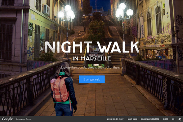
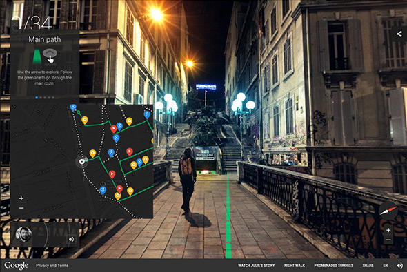
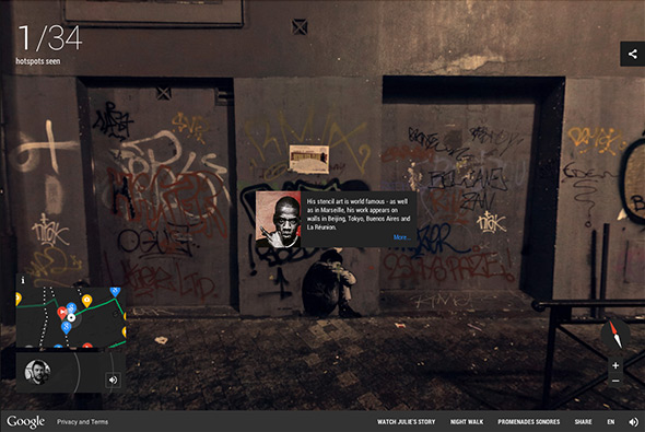
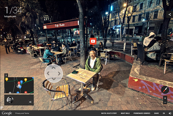
Lovely site for Google Street view, best explained on the site: “an immersive journey through lively Cours Julien, a neighbourhood of Marseille famous for its unique atmosphere and street art. Listening to your guides Julie and Christophe, you can wander around the vibrant streets as if you were really there, thanks to 360-degree panoramas that we captured at night.” Really nicely realised and crafted, like the streetview you are used to but with the the additional hotspots and tools to really explore the neighbourhood. Love the sound design too, as you pass bars you hear the business and the autoplay commentary really adds a nice dimension to the experience.
Created by 72andSunny Amsterdam (@72andsunny) and Media Monks (@mediamonks).
Site for French TV Channel ‘France 2’ – and their programmes about France in WW1. Set like an encyclopedia of important events centred around a map (which like the old school Flash days curls up when you visit events). A very rich interactive site full of videos, images, and transitions – which feels like an old school rich Flash site – when in fact it isn’t – great to see sites like this which aren’t a standard parallax site.
Created by Ultranoir (@ultranoir).
Fun site for Bolthouse Farms to promote healthy eating by tracking how little people post socially about fruit & vegetables. Interesting way of showing this by loads of fun experiments such as clouds of grapes, a row of fruit you can squish, a carrot keyboard and so on! Fun way of highlighting the difference in healthy vs unhealthy food in a non educational / boring way.
Created by Tiny Rebellion (@Tiny_Rebellion).
Site celebrating 10 years of electronic music label Size. Through a 3d grid of records that you can listen to and explore. Nice and slick animations and transitions to see the records – also like the way they have organised the records in different views i.e. timeline view / grid view – all in all a nice little slick site.
Created by Your Majesty Co (@yourmajestyco) and Rebels Studios.
Micro site to promote the new game ‘Watch Dogs’ through a psuedo real site of the city wide security operating system shown in the game. Brought to life through animated info graphics, animation, and transitions. In a similar vein to the Meet Your MX site where a whole world is created around a product or service. Looks good and is a nice use of animation and an interesting approach to promoting a new computer game.
Created by Ignition Creative (@igntn).