All posts by Dan

Dexter Navy

By | @YESstudio | No Comments


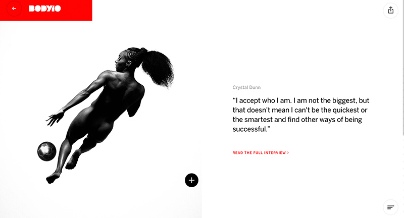
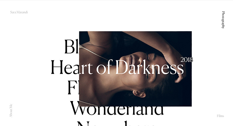
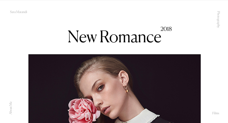
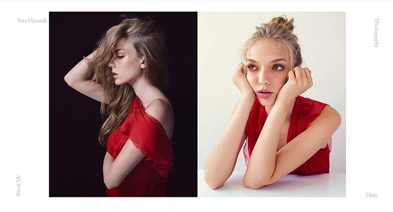
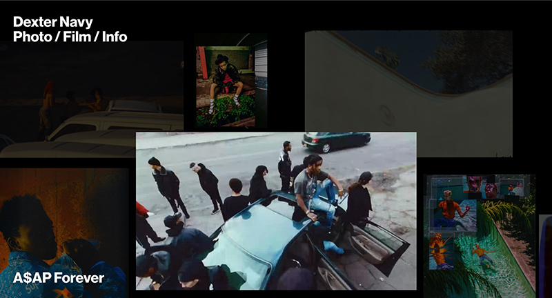
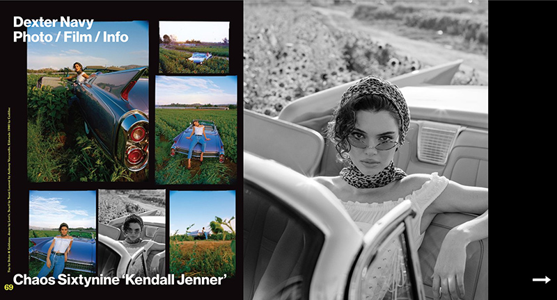
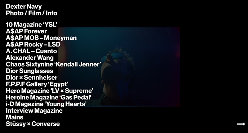
Site of European photography and film studio. Featuring a range of commercial and musical clients wrapped in an immersive experience. Love the homescreen, with large vibrant thumbnails of videos and imagery set against at stark background, inviting you in to explore the projects within.

Created by YES (@yesstudio).

Site here…

Stine Goya

By | @SprngSmmr | No Comments


Site of Danish fashion label. Featuring the latest range of clothing, look books, social media, together in an offset grid layout. Love the colour palette and the way the accents transition between sections to compliment the photography. Lots of nice details and attention to detail throughout, beautifully crafted and realised site.

Created by Spring/Summer (@SprngSmmr).

Site here…

Emergence

By | @emergence_zine | No Comments


Site of Emergence magazine a quarterly online publication with an annual printed edition with stories that explore the threads connecting ecology, culture, and spirituality. Beautifully crafted articles and innovate interactive pieces that draw you in engage with you. Love the art direction of the site – lovely large type and nice photography throughout.

Created by Emergence (@emergence_zine) and Studio Airport.

Site here…

Beyond Beauty

By | @LouisAnsa | No Comments


Site showcasing several female actresses that reveal hidden depths and go beyond what they are often known for. Beautifully designed, lots of imaginative and bold use of type, juxtaposed with all the fluid and dynamic visual flourishes. Love the speeches inside of the profiles that animate the text as spoken, lots of nice attention to detail such as the end of the profiles, menus and so on.

Created by Louis Ansa (@LouisAnsa) and team.

Site here…

ESPN Body 10

By | @stinkstudios | No Comments


Site of ESPNs 10th Body issue – celebrating the physical prowess of male and female athletes. Beautifully designed with bold type and strong photography, great transitions between the homepage and profiles, and lots of subtle animations on each page.

Created by Stink Studios (@stinkstudios).

Site here…

Below the Surface

By | @fabrique | No Comments


In Amsterdam they dredged the Rokin canal and uncovered a wealth of objects dating back from 1349. Each object uniformly photographed and documented – fascinating reveal of thousands of objects documenting human history in the city. Incredible overview of all of these items all in the same style. Love the minimal design and elegant site that lets you explore each item. Fantastic project beautifully realised.

Created by Fabrique (@fabrique).

Site here…

Oat the Goat

By | @FCBNZ, @_Assembly | No Comments


Interactive storybook featuring the adventures of Oat the Goat – tackling the topic of bullying. Beautifully crafted story and imagined 3D world – with simple tap based interactivity to make choices along the way. Love all the sound effects, music and dialogue – great attention to detail throughout. Nice way of broaching the topic of bullying through a wonderful and charming interactive story.

Created by Assembly (@_Assembly) & FCB New Zealand (@FCBNZ).

Site here…

Ethics for design

By | @designandhuman | No Comments


Interactive documentary about ethics in design. “Every day we use objects, services and applications designed by all kinds of designers. But does this mean that everything a designer conceives is done in our interest? Some interfaces are designed to get all of our attention and some products are designed to die prematurely.” This documentary aims to cover some of the interesting topics in design in a thoughtful and innovative way. Love the use of the pane mechanic to dynamically resize the windows.

Created by Design and Human (@designandhuman).

Site here…

Sara Mandi

By | @martinsilvestre, @rhold_a | No Comments


Site of photographer Sara Mandi and her collection of fashion and luxury photography. Lovely homepage showing a large type driven menu which on rollover reveal thumbnails from the project below, love that the horizontal axis shows other imagery. Nice seamless transitions to the project detail pages, clean aesthetic and nice typography throughout site.

Created by Martin Silvestre (@martinsilvestre) and Harold Urcun (@rhold_a).

Site here…

Studio Björk

By | @studiobjork | No Comments


Site of Studio Björk a digital design & development studio in Stockholm. Bold black and white minimal design with horizontal folio scrolling. Love the side scrolling that allows you to open up projects and then browse additional projects on either side, nice seamless transitions to the project details. Cool, modern agency site.

Created by Studio Björk (@studiobjork).

Site here…

Logram

By | @anan, @onopko | No Comments


Site of Logram branding and creative agency based in Japan. Looking like a mash up of an early 2000s graphic design experiment and Photoshop layer this site is a medly of type, colours, and gradients. Lovely interactions, where sections of the site are in in separate spaces with sections of colour transitioning to the new pages. Love the dynamic colour palette too, along with the moving layers it feels as though the site is never the same from one moment to another. Very refreshing, lively and bold agency site.

Created by Keigo Anan (@anan) and Takehiko Ono (@onopko).

Site here…

World Draw

By | @active_theory | No Comments


Fun multi-player drawing game, where quick doodles are turned into 3D objects placed into a co-created 3D world. Created for Google’s i/o 2018 in Mountain View as the fun follow up to the Paper planes from the previous i/o. First of all the doodle recognition to a range of objects is great, and love the lively and fresh transformation to the 3D shape. Once created your doodle goes into the co-created world for you to explore in a rich 3D world.

Created by Active Theory (@active_theory).

Site here…

Prince Estate

By | @base_design | No Comments


Interactive and annotated discography of Prince from the Prince Estate. Showing all the major releases, collaborations, recordings from Prince, each with an annotated history. Really simple and minimal layout that allows you to focus on the music and info – love all the small details such as the cursor replacement, minimal menu thats simply a purple dot that is attracted to cursor movement. Love the large type driven layouts and the personality dotted throughout.

Created by Base Design (@base_design).

Site here…