Yearly Archives: 2015

Revelator

By | @hellomondaycom | No Comments

revelator-1
revelator-2
revelator-3

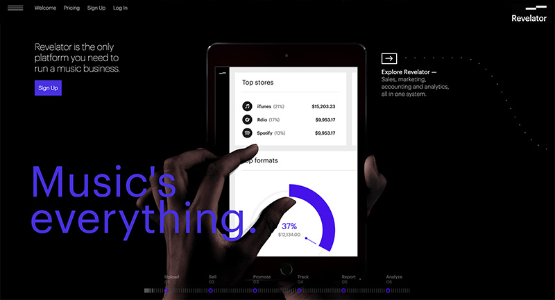
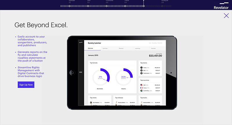
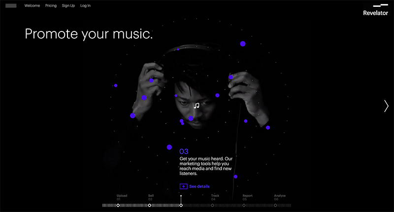
Site for Revelator a new online service that helps music businesses streamline their revenue online. I like the horizontal scrolling layout, with a nice blue and black look and feel, videos and animated graphics to highlight the key features. Slick animations and transitions to the individual sections of the site, with sliding panels and so on pulling it all together.

Created by Hello Monday (@hellomondaycom).

Site here…

Namale

By | @__ThePhoenix | No Comments

namale-1
namale-2
namale-3

Site for Namale jewellery, and a short and sweet look book for their collection. Nicely styled site showcasing Namale’s range of jewellery – like the way the image splits and each segment scrolls to create the complete image. Also like the way the image goes full screen when you zoom into a specific product, small details help lift the experience. It looks lovely, with nice tone and grading throughout the site to help make it look premium.

Created by Phoenix The Creative Studio (@__ThePhoenix).

Site here…

Anton & Irene

By | @antonandirene | No Comments

anton-1 anton-2 anton-3

Site of new New York based creative duo & agency Anton & Irene. Lovely dynamic layout, combining nice typography, bold imagery and a playful elegance featuring the main protagonists Anton & Irene in a series of fun photographs. Nice showcase of what they are involved with from talks, conferences, and of course creating work. Love the in-depth case studies on their latest projects, where they talk about the process and the amount of thought and consideration that goes into each project. Love the feeling of energy in the layout and the personality which shines through, it is also responsive. Great example of a modern folio site.

Created by Anton & Irene (@antonandirene) and Oleg Chulakov Studio (@chulakov).

Site here…

BBQ Cultures

By | @mediamonks | No Comments

weber-1
weber-2
weber-3

Site promoting Weber BBQs – through showing the world of BBQs and how they are used all over the globe. This is shown through a series of linked videos and locations, from smoking salmon in the woods to a BBQ whilst watch football in Germany. Nice alternating grid layout at each location, allowing you to explore hints and tips on how to make the perfect BBQ, such as how to sharpen your tools properly, how to look for the right kinds of meat and so on. This is all created in an informative way that is actually useful. All in all a nice branding piece lifted by a dynamic interface that lets you explore the world of BBQ cultures.

Created by UncleGrey (@uncle_grey) and MediaMonks (@mediamonks).

Site here…

Work & Co

By | @workandco | No Comments

work-1
work-2
work-3

Lovely site for digital agency Work & Co. Detailing their ethos, approach, and body of work in an elegant and effective way. Love the menu toggle – really fresh idea – to zoom out and see all the pages in a form of visual index. Love the splashes of colour here and there and the really nice typography used throughout the site – see the ‘facts’ page. It is responsive and reacts really nice to devices and screen size changes – works really well.

Created by Work & Co (@workandco).

Site here…

The Great Human Odyssey

By | @overhaulmedia | No Comments

human-1
human-2
human-3
human-4

Online interactive documentary highlighting nomads and their environment. Featuring first person walkthroughs of nomadic people, through their camps, where they hunt and live. Prompts to see videos and imagery pop up allowing you to see more when you want to dive into the detail – a sliding panel arrives with photos, film etc. There is a lot of detail, such as ambient sounds, conversations and insights into these people and their world. Lots of nice transitions, animations, icons and so on – it also looks great and provides an immersive experience.

Created by Overhaul Media (@overhaulmedia).

Site here…

ANA Flight Connections

By | @firstborn_nyc | No Comments

ana-1
ana-2
ana-3

Branding site for ANA Japanese airline that allows you to visualise your LinkedIn connections and their locations across the world – alongside the routes ANA flies. Love the 3D implementation here, the globe and routes visualised in a really nice way – love the way you zoom into a city and see all of your connections floating around. Nice dashboard features too summarising your connections and LinkedIn profile – lots of nice infographics and attention to detail. It looks great and is well crafted with a host of nice animations, transitions and effects.

Created by Dentsu and Firstborn (@firstborn_nyc).

Site here…

House of Borel

By | @Immersive_g, @_blacknegative | No Comments

borel-1
borel-2
borel-3

Promo site for fashion brand House of Borel. Featuring a mysterious video walkthrough of small details, clicking on each ‘chapter’ reveals a secret layer behind the video highlighting details about the brand and their range of leather goods. Beautifully crafted, with 3D elements, love the dragging mechanism to scroll through the video – very cool and looks fantastic. Loads of attention to detail, nice sound and music, and really like the layout in the detail pages, full of video, depth and nice content – it all looks and works really great – really well crafted.

Created by blacknegative (@_blacknegative) and Immersive Garden (@Immersive_g).

Site here…

Do Amaral A

By | @oamaral | No Comments

andre-1
andre-2
andre-3

Slick portfolio of Brazilian Art Director and Designer Andre Do Amaral. Love the homepage with large bold typography and simple vertically scrolling carousel – click on a project and it transitions to full screen. Feels like a slick well crafted experience, which explains the projects in a very visual way – lots of nice transitions. Lots of very high quality work in there, and all wrapped up in this responsive, slick, and elegant portfolio.

Created by Andre Do Amaral (@oamaral).

Site here…

Inside Abbey Road

By | @google | No Comments

abbey-rd-1
abbey-rd-2
abbey-rd-3
abbey-rd-4
abbey-rd-5

Take an interactive journey through the iconic recording studio Abbey Road. Using a custom photo shoot and Google Streetview technology to show the insides of the famous studio. The amount of detail is incredible, from historic photos mapped to your viewpoint, inline videos of musicians, and even an interactive mixing studio. They used high res cameras to take ultra high detail of each panorama – if you read the about page you will really see the amount of detail and technical craftsmanship that has gone into this project. You can get lost exploring the studios and all the different views and snippets of information – it is a real feat and a real pleasure to explore – great piece of work.

Created by Google Creative Lab (@google).

Site here…

Fornasetti

By | @random_studio | No Comments

fornasetti-1
fornasetti-2
fornasetti-3

Fun site for Fornasetti, Italian design house from Milan. Love the intro and the playful animations and interactivity which are dotted throughout the site. Full of personality, which is great to see – from the product slideshows where the items float past peacefully through to the animations and interactions – all injecting a sense of fun. It looks good too, love the changing colours of the background, simple and elegant layout and typography.

Created by POMO and Random (@random_studio).

Site here…

While We’re Young

By | @watsondg | No Comments

young-1
young-2
young-3

Promo site for the new film ‘While We’re Young’. Posing a few scenarios to the audience to watch a series of short clips from the film – all linking to the idea of things couples did when they were younger. Loads of nice touches, from pauses in the clips to reveal additional content, to nice animations and transitions. Love the full bleed videos and it looks lovely with great typography & layout – it looks great and really fits the feel of the film.

Created by Watson D/G (@watsondg).

Site here…

St. Louis Brown’s Historical Society

By | @HLKagency | No Comments

browns-1
browns-2
browns-3

Lovingly crafted site for baseball team The St. Louis Browns, and their history. Feels very much like an app, with rich photos and video, all with nice typography. Loads of detail and interesting nuggets of info, from photos, balls, and history. Look and feel is nicely grained and with hint of nostalgia – it looks great with accented orange colour – all nicely designed and all in all a rich, interactive, encyclopaedic experience.

Created by HLK (@HLKagency).

Site here…