portfolio

DVEIN

By | WEBSITES | No Comments

Dvein

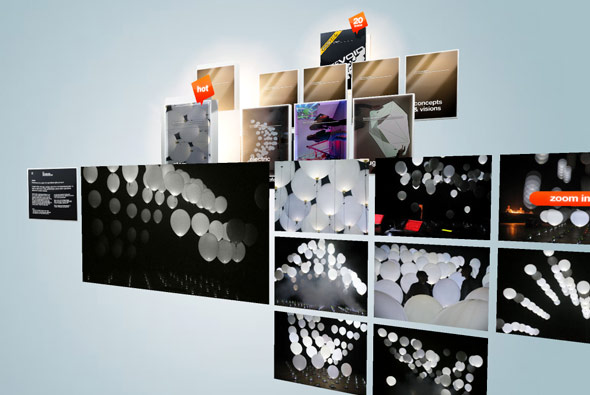
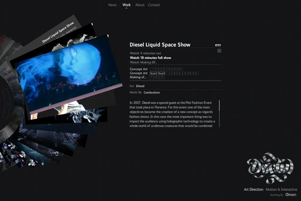
DVEIN – an art direction, motion & interactive studio. This is their site, using a nice navigational concept whereby the work is displayed via a rotating stack of images and videos. I like the way the work is presented and just the general ‘to the point’ approach adopted, clean and stylish it shows their best work well. There are some really great pieces of work too – I remember seeing the tocame work before and being very impressed. Check it out…

Site here…

The Vacuum Design

By | WEBSITES | No Comments

The Vacuum Design

Really cool website for The Vacuum Design. You float around their portfolio in 3D, demonstrating their style of work. There are some really great sites and motion design showcased here. A great 3D website where the form really adds to the design – nice concept and nice design.

Website here…

Whitevoid

By | WEBSITES | No Comments

Whitevoid

Website of Whitevoid Art & Design, an agency that specialises in various interactive disciplines. A really clean, fluid 3d interface; very simple and enjoyable to use. I really like the concept – and feel its a really nice use of 3d – kept simple and to the point.

Website here…

Switch Mediaworks

By | WEBSITES | No Comments

Switch Mediaworks

Pretty nice portfolio website of Switch Mediaworks. I’ve included this due to the amount of innovative rollovers and basic interactions that have been re-thought – its refreshing to see conventions of user interactions have been questioned. Nice slick animations and transitions. Particularly like the way rollovers are highlighted and the videos are introduced.

Website here…

U Pleat

By | WEBSITES | No Comments

U Pleat

Website of a design & innovation consultancy. Slick 3D navigation interface, and lots of nice touches. In particular the way you navigate images and drill down into the various sections. Text appears in a unique way with lots of movement and nice attention to detail.

Created by Kakarod.

Website here…

Sean Kennedy Santos

By | WEBSITES | No Comments

Sean Kennedy Santos

Photographer’s website, using black as the concept – a whole host of transitions and effects are in full effect, revealing the content. There are some really nice touches in here, in particular the way text is revealed and images are transitioned – I really like the simplicity of the site. There is nothing over the top in terms of navigation and it remains easy to use.

Created by Artificial Duck.

Website here…

Javier Ferrer Vidal

By | WEBSITES | No Comments

Javier Ferrer Vidal

Winner of the Flashforward2007 Boston Film Festival in the Typography category – again it’s been around for a while. But it is really well executed, not just down to the typography – but also in terms of navigation and style. Using 3D esque parallax navigation it is a joy to use and at times jaw dropping. It remains simple and easy to use but also the animation and transitions are amazing.

Website here…

Digitaria

By | WEBSITES | No Comments

Digitaria

Very nice and appropriate use of Papervision 3D! A kind of parallax environment which is cool to use. The rest of the site is pretty nice too, good use of Flash for a agency portfolio website…

Website here…

Simon Rasmussen

By | WEBSITES | No Comments

Simon Rasmussen

Good portfolio website of Simon Rasmussen, a Danish stylist and creative director. Made by Danish agency Flexmotion it is a well conceived concept.

I wanted to use the whole ‘contact sheet’ navigation on a recent website, as I feel it works very well when navigating a visual website such as this. Scrolling left and right to see more pictures as if sliding the negatives just feels intuitive. Nice to see it looking so well integrated…

Website here…