north america

The Great Human Odyssey

By | @overhaulmedia | No Comments

human-1
human-2
human-3
human-4

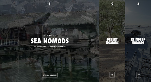
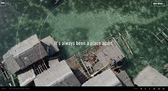
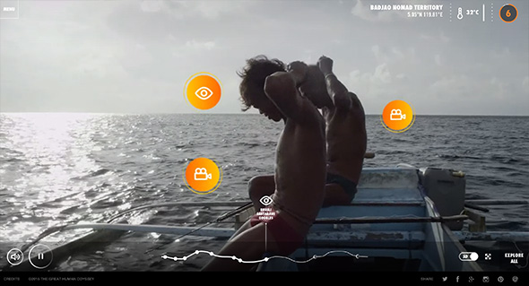
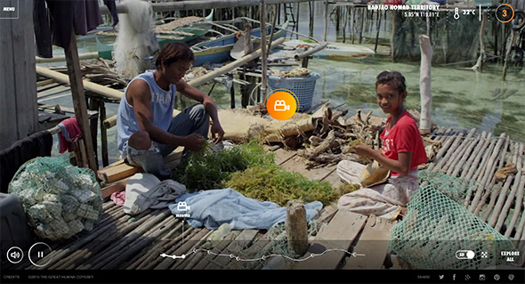
Online interactive documentary highlighting nomads and their environment. Featuring first person walkthroughs of nomadic people, through their camps, where they hunt and live. Prompts to see videos and imagery pop up allowing you to see more when you want to dive into the detail – a sliding panel arrives with photos, film etc. There is a lot of detail, such as ambient sounds, conversations and insights into these people and their world. Lots of nice transitions, animations, icons and so on – it also looks great and provides an immersive experience.

Created by Overhaul Media (@overhaulmedia).

Site here…

ANA Flight Connections

By | @firstborn_nyc | No Comments

ana-1
ana-2
ana-3

Branding site for ANA Japanese airline that allows you to visualise your LinkedIn connections and their locations across the world – alongside the routes ANA flies. Love the 3D implementation here, the globe and routes visualised in a really nice way – love the way you zoom into a city and see all of your connections floating around. Nice dashboard features too summarising your connections and LinkedIn profile – lots of nice infographics and attention to detail. It looks great and is well crafted with a host of nice animations, transitions and effects.

Created by Dentsu and Firstborn (@firstborn_nyc).

Site here…

While We’re Young

By | @watsondg | No Comments

young-1
young-2
young-3

Promo site for the new film ‘While We’re Young’. Posing a few scenarios to the audience to watch a series of short clips from the film – all linking to the idea of things couples did when they were younger. Loads of nice touches, from pauses in the clips to reveal additional content, to nice animations and transitions. Love the full bleed videos and it looks lovely with great typography & layout – it looks great and really fits the feel of the film.

Created by Watson D/G (@watsondg).

Site here…

St. Louis Brown’s Historical Society

By | @HLKagency | No Comments

browns-1
browns-2
browns-3

Lovingly crafted site for baseball team The St. Louis Browns, and their history. Feels very much like an app, with rich photos and video, all with nice typography. Loads of detail and interesting nuggets of info, from photos, balls, and history. Look and feel is nicely grained and with hint of nostalgia – it looks great with accented orange colour – all nicely designed and all in all a rich, interactive, encyclopaedic experience.

Created by HLK (@HLKagency).

Site here…

I Will What I Want

By | @active_theory | No Comments

gisele-1
gisele-2
gisele-3

Interesting site for sports wear brand Under Armour. Featuring model Gisele Bundchen working out with real time comments posted on social media projected on the walls around her. Love the circular interface element allowing you to jump ahead to various parts of the video. The comments section is executed with finesse – love all the comments bubbles and the way it all transitions in. The whole site is really well crafted with good attention to detail, a slick experience.

Created by Droga5 (@droga5) and Active Theory (@active_theory).

Site here…

The Great Discontent

By | @ryanessmaker | No Comments

gd-1
gd-2
gd-3

Site of design magazine The Great Discontent. Lovely editorial layout, large imagery and great fonts. Love the article pages, with all the various details that make it a pleasure to read. Nice considered use of white space and use of imagery. Feels super crisp and clean and well designed, with insightful and interesting content.

Created by Ryan Essmaker (@ryanessmaker).

Site here…

Lincoln Musical Selfie

By | @jam3 | No Comments

musical-selfie-1
musical-selfie-2
musical-selfie-3

Interesting site for Lincoln cars, using the contours and shape of your face to make a ‘musical selfie’. Simply upload your image / take a snapshot or view the gallery – the site will pick up key features of your face and arrange a song. The main thing I like here is the execution, it looks great – from the sliding mechanic in the gallery to the small animations and attention to detail. They have really made it feel alive and dynamic, and even tried to treat the uncertainty of user generated content, by making sure the imagery looks good, like the 3D moving shapes around the corner of the images.

Created by Jam3 (@jam3) and Hudson Rouge (@HudsonRouge).

Site here…

Well Storied

By | @ToolofNA | No Comments

well-storied-1
well-storied-2
well-storied-3

Collating social media posts from Land Rover owners and drivers, mapping it and classifying it into an exploratory interface. Love the visual treatment of the map and minimal interface, filter by tag or just explore all the posts. Nicely crafted with interactions and transitions that add to the experience.

Created by Tool (@ToolofNA) and Y&R (@YRNY).

Site here…

1000 Google Experiments

By | @google | No Comments

1000-1
1000-2
1000-3

Nice site celebrating 1000 Chrome Experiments – containing all the various Chrome Experiments published over the years. Love the fun exploratory interface, that is just fun to play with and explore. The way it loads in the experiments without pushing you out to the various sites is also well thought out, preloading the content and making it easy to go back to the homepage. Like the way you can visualise the grid in various ways, and even a mini script editor so you can play around with it yourself!

Created by Google Creative Labs (@google).

Site here…

Bloomberg Business

By | @codeandtheory | No Comments

bloomberg-1
bloomberg-2
bloomberg-4

Nice example of a modern, fresh, responsive design solution for a complex site. Lots of really nice touches and features. Not only does it look great, with the bold typography, but they have injected elements of personality into the site. Love the way when you reading an article – a blue line simply indicates your progress which appears alongside the sticky nav. Also love that when you are reading an article, when you reach the end, it lazy loads the next article – really simple but thoroughly well thought out. Also like the full screen navigation that opens up really allows you to find what you might be after. On top of that it is all responsive – design is great for such a site, loads of nice touches – great stuff.

Created by Code and Theory (@codeandtheory).

Site here…

Blitz

By | @BLITZagency | No Comments

blitz-1
blitz-2
blitz-3

New site for Blitz, digital agency in California. Nice and refreshing approach to an agency site – with a quasi-3d scrolling interface. Bold and bright, each section is full of information about the agency – like their approach to the project showcase – which feels like a slick presentation of videos and visuals. Lots of nice little details such as the menu to the left, really fresh agency site.

Created by BLITZ (@BLITZagency).

Site here…

Gogoro

By | @cincodesign | No Comments

gogoro-1gogoro-2
gogoro-3

Lovely informative and entertaining site promoting the Gogoro electric scooter. Highlighting the key characteristics of the scooter in a bold and engaging way – showing how fast it accelerates, how it corners, the key components – all the interesting things. What I like is the way they make it interactive – lots of little playful interactions – such as turning on the lights / carousels revealing nice animations and so on. Love the bold and streamlined approach to the layout – large imagery and bold typography. It is also responsive and works well across various devices – really nice example of a product site.

Created by Cinco Design (@cincodesign).

Site here…

Rockwell Group

By | @codeandtheory | No Comments

rockwell-1
rockwell-2
rockwell-3

Stunning site for Rockwell Group – cross-disciplinary architecture and design practice. Bold and beautiful design feels like reading a top end design magazine. Love the energy in the layouts and movement created by the offset grid and the various templates making up the pages. Projects are presented in a really dynamic way, with bold typography and large imagery and some intelligent sticky elements when scrolling to reveal details about each project. Not only does the site look great, but it also responsive and looks great also on mobile devices – one of the best responsive sites i’ve ever seen. This is what modern web design is all about, beautiful layouts, great functionality, simplicity and elegance.

Created by Code and Theory (@codeandtheory).

Site here…

Priestly

By | @campquiet | No Comments

priest-1
priest-2
priest-3

Site for Priestly, creative agency based in Oregon. Stripped back web site with typography led layout, pared back to the essentials. Really simple and effective, and nicely considered – really like the typographic approach and the sticky elements when reading the content.

Created by Camp Quiet (@campquiet).

Site here…