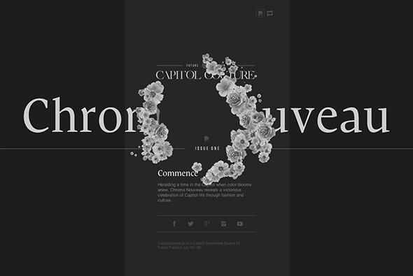
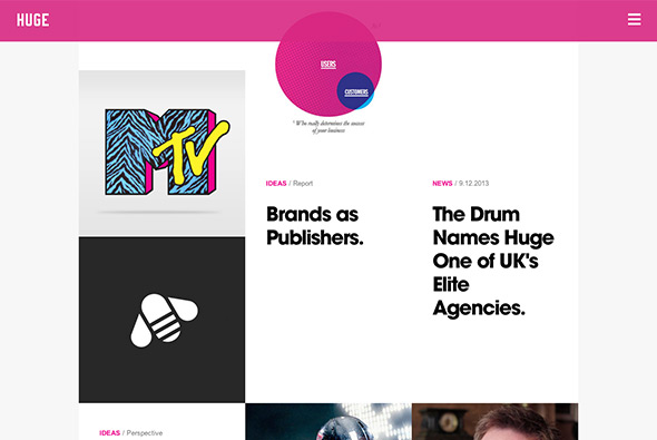
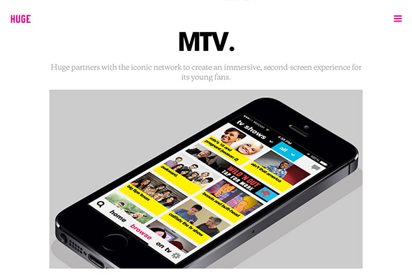
New responsive portfolio site of agency Huge Inc. Really stripped back and to the point, I like the homepage where the 3 best / latest projects are shown – all within or featured around a giant ‘H’. The featured projects give across a hint of the work and the process, like the key stats section. Love the menu – large overlay with big typography and a pink overlay – really cool.
north america
Site of photographer Rod McLean. Slick site, with several nice interactions, animations, with a nice intro and homepage. Really simple, but executed nicely – black backgrounds let the photos stand out, and the smooth transitions that reveal the images make exploring them fun. Nice example of a responsive, photography portfolio.
Created by Canvas Group (@CanvasGroup).
Site promoting the new Range Rover Sport in the USA. Your mission is to ‘race the sun’, an interactive film, where you can change the gear, choose the right wheel for traction, either using your keyboard or syncing up with a device. Nicely done, with well shot video, and some nice touches. Like that the experience ends on a mini-visualiser allowing you to change the colour and wheels, all in a nice draggable 360 of the car.
Created by Y&R New York (@yrny) and Stink Digital (@stinkdigital).
New responsive site for agency Goodby Silverstein & Partners. Featuring a huge grid of their latest work, and simple, minimal project pages to find out more. Nice features and touches, like the video rollovers, the off canvas menu, all wrapped up in a nicely responsive, and well considered layout.
Created by Huncwot (@huncwotdigital).
Promotional site for new TV show ‘Almost Human’ a cop show set in the future. Featuring a ‘realistic’ look at the ‘MX’ model of the cybernetic cop. Love all of the little details, such as the animated movie hotspots and the nice page navigation. Cool little info-graphics and little interactive touches and things to explore. Really like the layout and although it’s another example of scrolling page design – it’s a really good one!
Created by Watson /DG (@watsondg).
Portfolio of digital creative Sang Han. Nice, simple, responsive portfolio site, with a lot of work to explore. Direct and to the point, the wrapper lets the work do the talking, with nicely selected pieces of work highlighted. Nice to see some personality come through with the ‘life’ section too. Good example of a modern, clean, portfolio site.
Site promoting Stephen King’s new book ‘Doctor Sleep’, the sequel to the Shining. Lots of windows revealing different scenes from the book, quite a cinematic experience – from doors animating down corridors, driving scenes – to hacked javascript glitching – it all creates a tense mood. Its been a while since i’ve seen multi-windowed story telling – and this is a great example. If you hook up your phone to the same network you can have a dual-screen experience – use your mobile screen to unlock a door and so on, it adds an extra layer of interactivity and story telling. Really nice, interactive, and unexpected execution of a promo site for a book.
Created by Domani Studios (@domanistudios).
Music video of Pharrell Williams – Happy. Really simple and elegant – 24 hours of people dancing to the track – all throughout the various periods of the day. You can click and drag around the wheel to jump to different times – with the keyframes sliding around behind the time wheel. Love the interface, really useful, intuitive and looks great – I also love the concept – just a great idea and a great execution of digital work – no one is going to sit through a 24 hour long music video, but interactive makes this easy.
Created by We are from L.A. (@wearefromLA) & Iconoclast Interactive (@iconoclast_i).
Lovely site ‘This Place’, described as “Everyone has a special place–a spot on earth you hold close to your heart. Like the town where you grew up or met the one you love. The cove where you learned to surf. The secret mountain hideaway where you go to find yourself.” In this first version, the coast of Oregon is explored through quotes and photography. Lots of lovely videos and photography – and a unique way of going through the photos as you scroll down – it all happens within the mask of the image – a really nice touch. Lovely typography and layout – really nicely designed and lots of nice touches, animations and transitions. And its even responsive as well!
Created by Instrument (@instrument).
Nice site for GREATS a sneaker brand from the US. Really simple, with a grid of their shoes – clicking through takes you to the details where a nicely laid out page tells you all about the shoe. Love the fun 360 drag at the top and the exploded, military style view of all of the components that make up the shoe – bit like a stripped down gun! Minimal design and some nice little touches like the menu and in-page content reveals.
Created by Wondersauce (@wondersauce).
Stunning immersive site about the decline and changes to the glaciers in the Himalayas. Featuring a documentary style explorative interface, using ultra high resolution photography to zoom in – try zooming in on the camp at base camp – and see the landscape of the region around Mt Everest. A wealth of well considered content from videos in the lower towns through to sherpas stories in base camp. There is a great interactive 3d map of Everest and a documented trek to Everest base camp. A really in-depth, thoughtful interactive documentary on this amazing region. Brought to life by beautiful photography and a nice blend of technology.
Created by Pixel Lab (@thinkpixellab) and Microsoft.
The 2013 version of Summer Under the Stars, a campaign site promoting TV movie channel TCM’s summer schedule. Focussing on the range of famous movie stars of a time gone by. Love the homepage carousel of profiles of the stars, scrolling goes into their respective bios, with a nicely designed scene summarising the actor. Nice little section on what makes that person legendary too. Overall really slick transitions and animations from section to section, nice art direction and fun to play around with.
Created by 1 Trick Pony (@1trickpony).
A short series of video portraits of Mountain Dew’s sponsored sportsmen. Love the animations and transitions on the landing page, and seamless transition which leads you into the looping video portraits – which are beautifully put together and well conceived. Little hotspots allow you to find out more about the individual components of the portrait, and panning around adds some element of exploration to the scenes.
Created by BBDO New York (@BBDONY).
New interactive magazine highlighting future fashion. Really nice typography and layout throughout – love the simple animations and transitions between sections, subtle and understated. For such a content heavy site the use of white space and grid is well thought out. The mobile version of the layout is nice too – responding nicely to changes in layout. Nice example of a modern magazine style responsive layout.