minimal
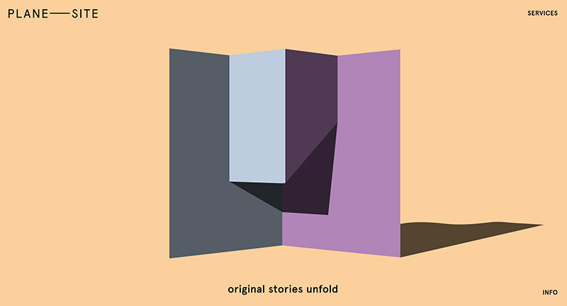
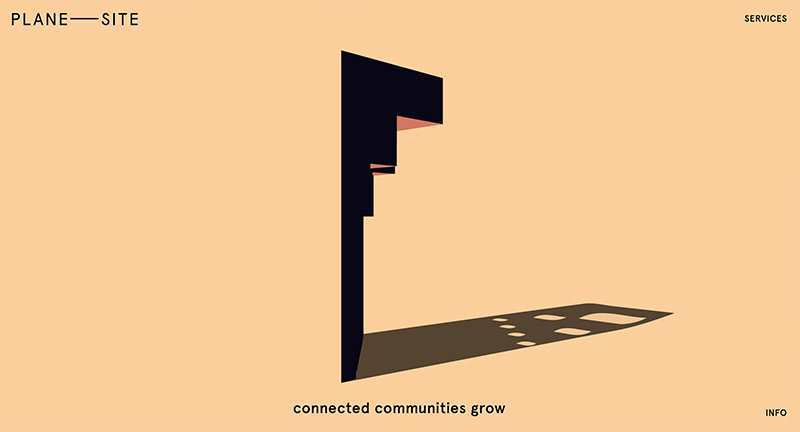
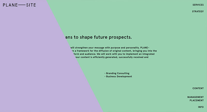
Site for Berlin based agency that specialise in content creation. Love the visual metaphor of the piece of paper that rotates and moves as you scroll to reveal new patterns and color, very elegant and interesting way of presenting a concept of what they do. Nice nav along the right hand side that appears when you get into the more detailed sections.
Created by Plane Site (@plane_site), Ben Roth, and Owen Hoskins (@owenhoskins)
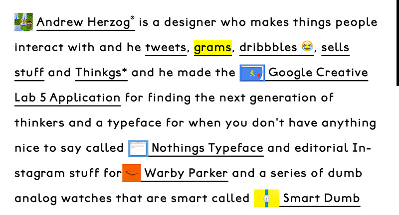
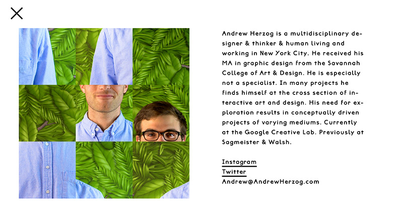
Site for creative Andrew Herzog. Love the statement based approach, with his projects shown inline. Really fun layout full with interesting and creative ideas, love the bold design.
Created by Andrew Herzog (@Andrew_Herzog).
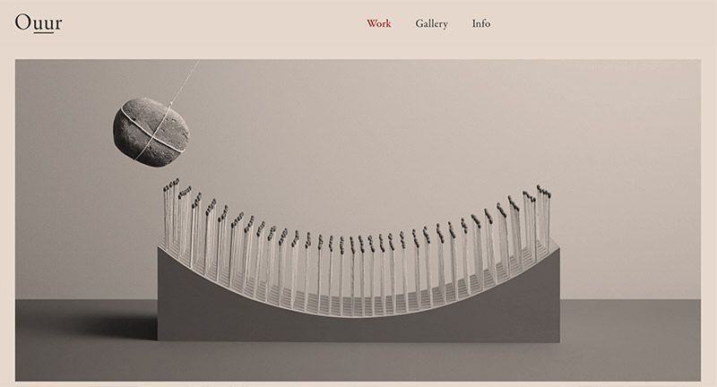
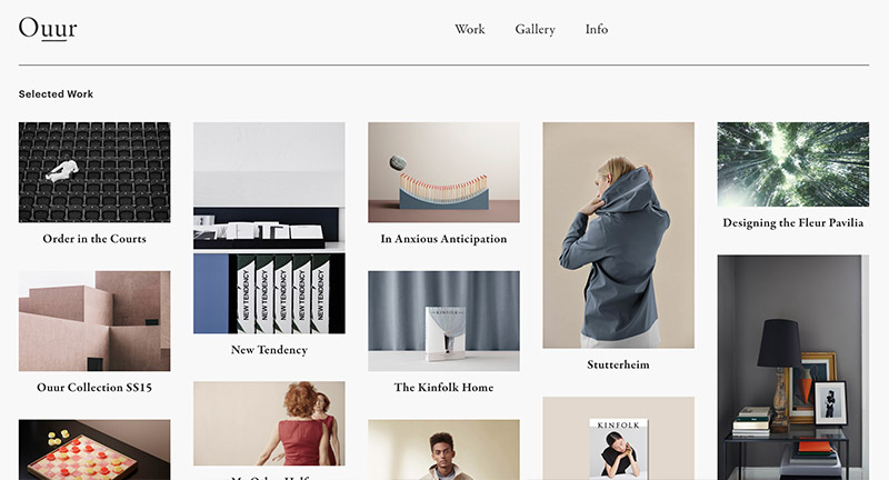
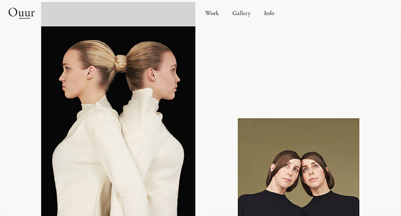
Site for Danish creative agency Ouur. Lovely clean and elegant portfolio of work featuring photography, digital, and editorial work. Love the calm colour wash on the homepage and the offset layout featured throughout the site. The animated gifs add a nice dynamic element to liven it up, combined with the staggered layout it all adds a feeling of energy in the layout.
Created by Ouur & Mario Depicolzuane (@studio8585).
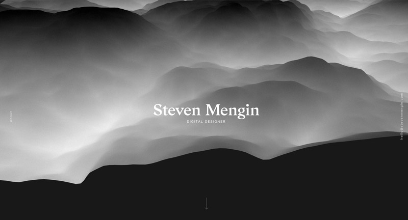
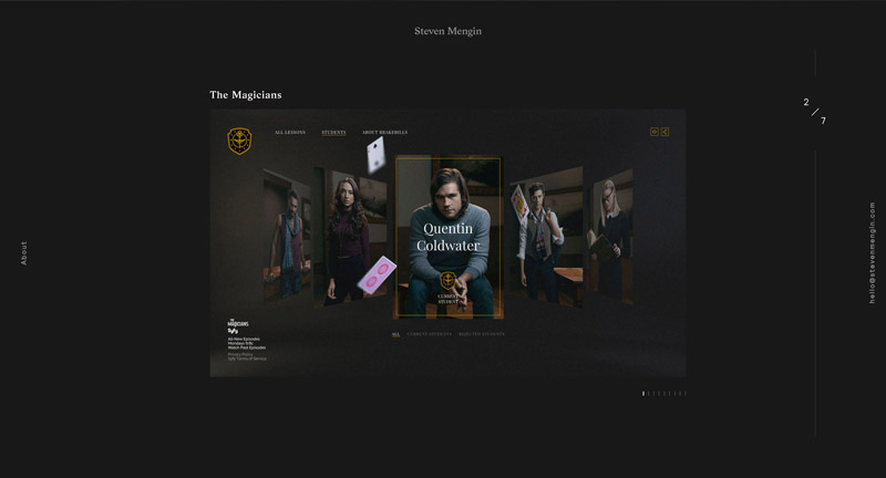
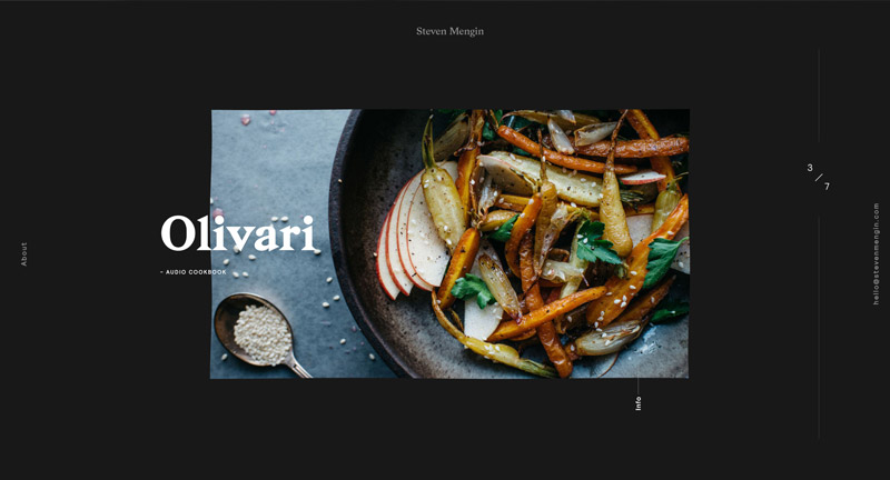
Slick and simple site for designer Steven Mengin. Love the initial undulating 3D landscape that goes into an editorial style layout. Nice 3D touches here and there that add a certain flare to the interactions. Nice dark look and feel brought to life with subtle touches and nice details.
Created by Steven Mengin (@steven_mengin) and Samsy (@Samsyyyy).
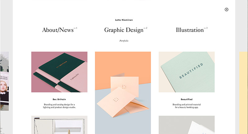
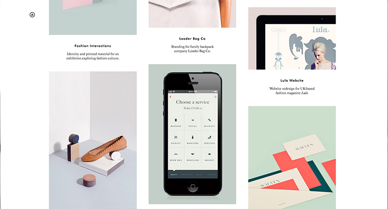
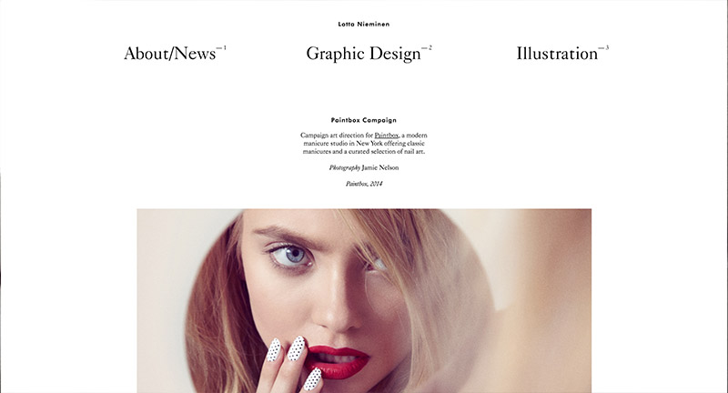
Gorgeous site for Lotta Nieminen, Finnish illustrator and designer. Love the peeking pages on the left and right edges of the site that allows you to cycle through the pages as much as you want. Elegant and simple, the folio does a great job of letting the work shine, everything looks and feels so cohesive with matching colour palettes and styles on the thumbnails. Lovely work.
Created by Lotta Nieminen (@lottanieminen) and Jonatan Erikksson.
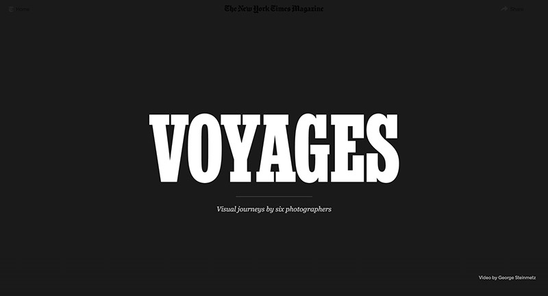
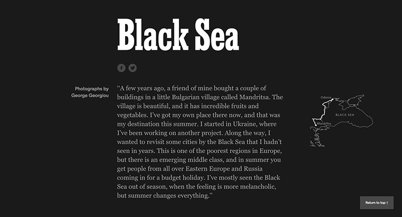
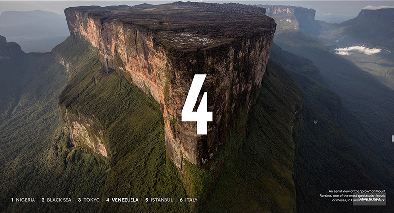
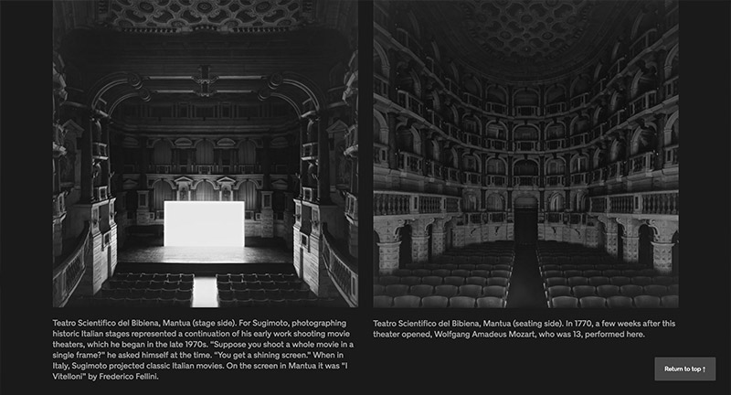
Lovely photo journalism piece documenting six visual journeys in Nigeria, Black Sea, Tokyo, Venezuela, Istanbul, and Italy. Lovely full bleed imagery and video mixed with simple introductions and background to each story. Simple and elegant – really nice bit of interactive storytelling.
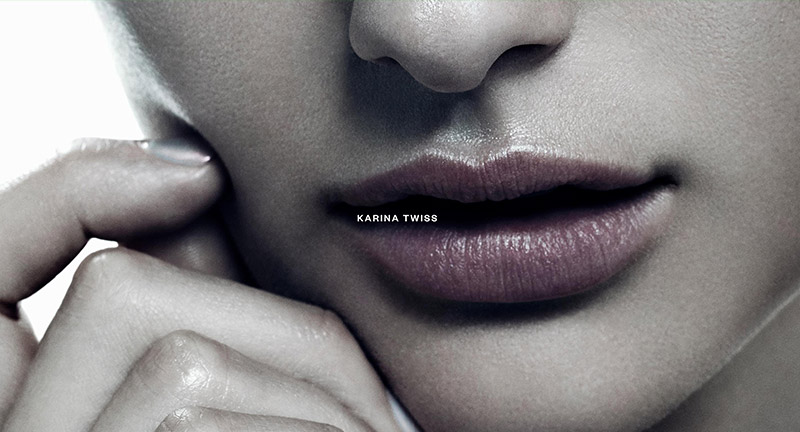
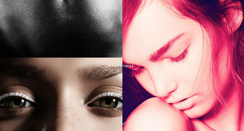
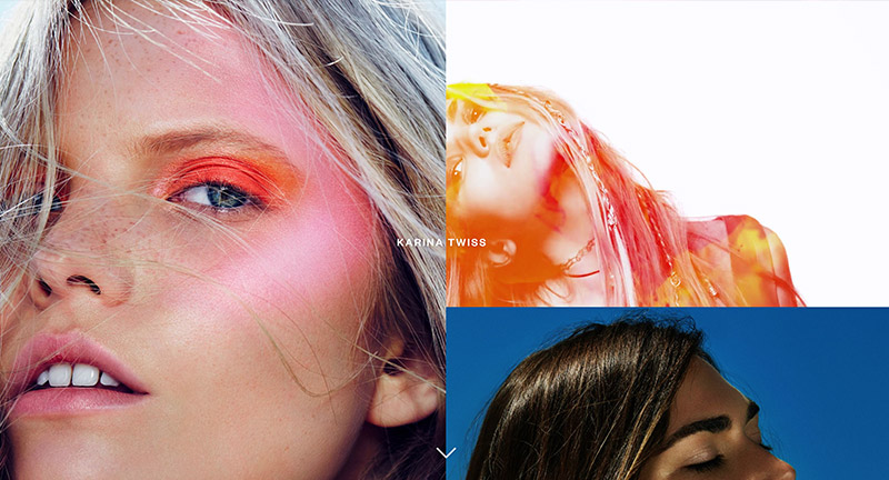
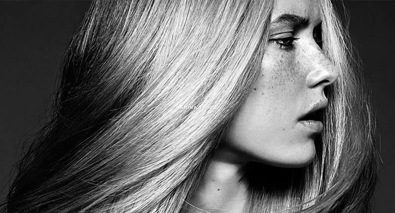
Lovely portfolio of London based photographer Karina Twiss. Love the ultra high res photos that form the background and let you explore the quality of the shots. Love the grid of images, with a mix of animations and videos forming a stunning pastiche of beautiful photography. Nice details such as the minimal menu and zoom out on an image to bring up a carousel. Stunning example of letting the content do the talking.
Created by Studio Thomas (@StudioThomas).
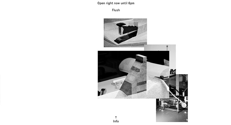
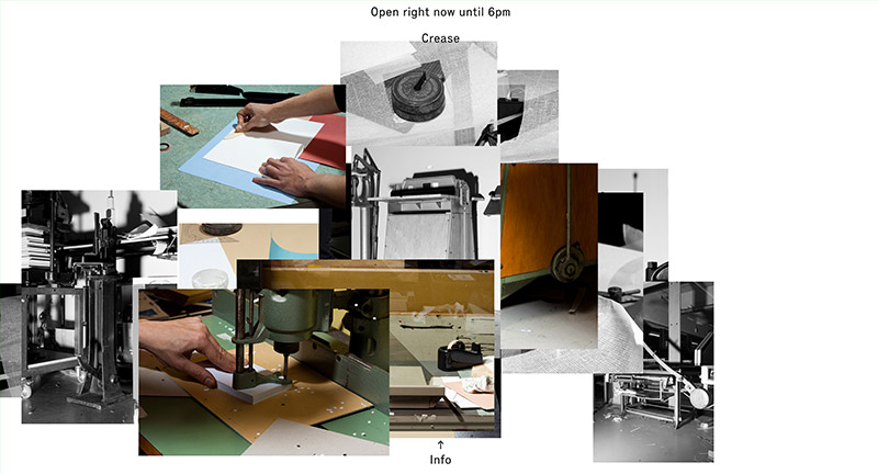
Site for a book bindery workshop in Amsterdam. Love the simple scrolling narrative mechanic, with a little sticky marker showing the stage of the process with images sliding up and sticking. Such an elegant and minimal solution and interesting way of telling a story.
Created by Sebastian Ly Serena (@s_ly_serena) and Rosen Tomov.
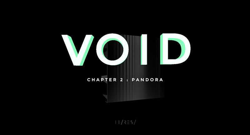
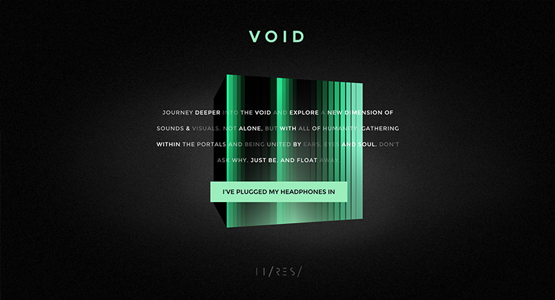
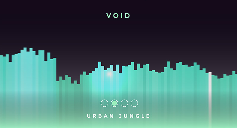

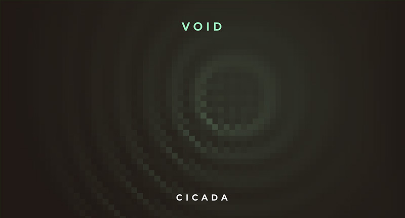
The next installation of interactive art piece VOID. A cube with rooms to explore in 3D space, each room with it’s own interactive element, from music sequencing, to ripple pools – music and sound plays a large part of the experience. Love the detail and mood – from the design through to the audio design – the exploratory/surreal feel is drenched in atmosphere. Great to see work like this.
Created by Hi-Res (@hireslondon) and IVXVIXVIII (@ivxvixviii).
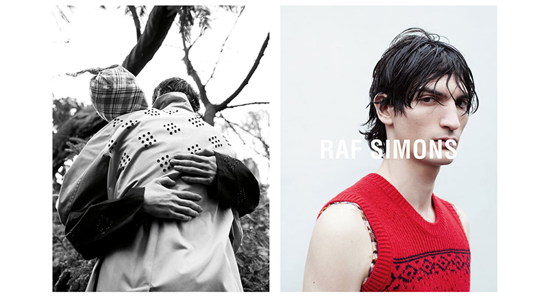
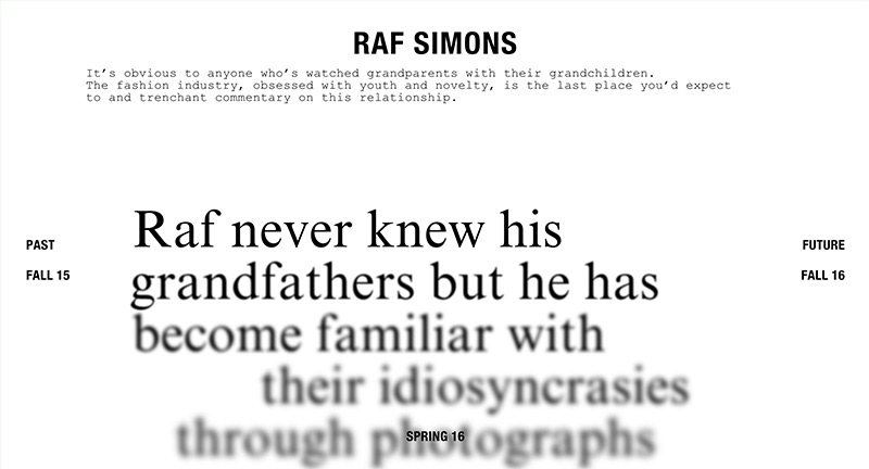
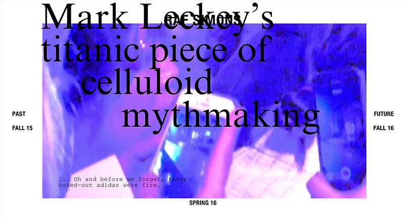
Site for label Raf Simons. Love the one directional scroll which brings in passages of text, which blurs in and out as you scroll. Also love the way the soundtrack muffles when you open the menu. Nice to see something a bit different that stands out from the crowd.
Created by Random Studio (@random_studio).

Site of Paris based production agency who specialise in music and commercial videos. Elegant and minimal interface, love the sliding menu to the left slips underneath the video nicely. Smooth transitions and nice clean design that lets the content do the talking.
Created by Anonymous (@anonymous_paris).
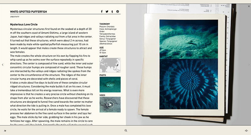
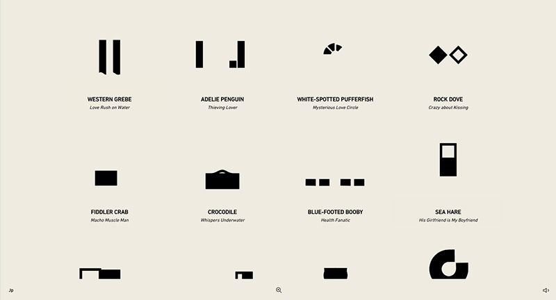
The digital accompaniment of a new book documenting various animals love rituals. Love the minimal pared down approach which highlights various movements and behaviors the animals have – shown simply through moving shapes. Click on the animation and a page split appears and more information is shown. Nice transitions and love the unifying way of displaying the simple animations to highlight the various weird and wonderful ‘acts of love’.
Created by Projector Japan (@koichiroot).
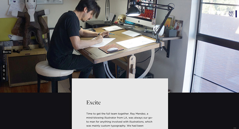
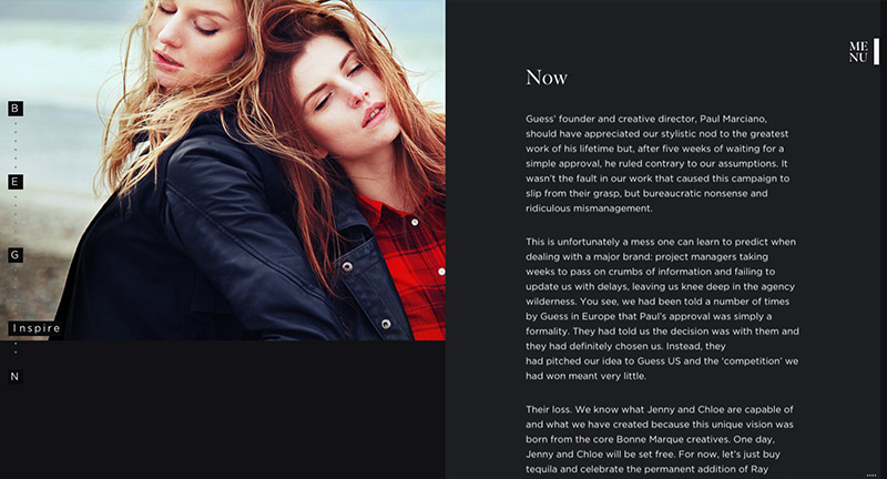
Site for Swedish agency Bonnemarque.Beautiful dark look and feel, love the seamless transitions from the homepage to the project details – nicely done with inline video. The project pages are full of detail and outline their approach and the work itself, love the sticky nav on the left ‘BEGIN’ which expands and contracts as you scroll. Menu transition is lovely and slick, lots of cool animations and nice transitions wrapped up in a beautiful responsive design.
Created by Bonnemarque (@bonnemarque).