minimal

Carrera

By | @random_studio | No Comments

carrera-1

carrera-2

carrera-3


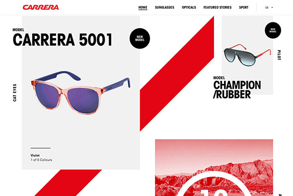
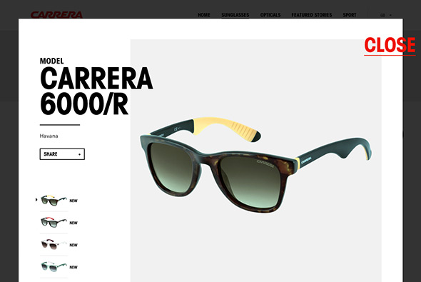
Great site for Carrera sunglasses. Super modern, fresh design – with sticky navigation element, sliding interface, overlays and so on – and its responsive looks good on mobile too. Really nice typography, well considered layout and design – love the offset grid and red highlight colour throughout. Loads of nice touches, including mini-campaign style pages telling the story of their history and so on. Great example of a responsive, modern & fresh site with parallax, great typography and loads of interactivity.

Created by Random Studio (@random_studio).

Site here…

Kajimai

By | @webdesign | No Comments

kajimai-1 kajimai-2 kajimai-3


Site promoting Yomitan village in Japan. Loads of nice interactions, animations, and transitions – all wrapped up in a minimal interface with large photography. Love the automatic scrolling – and the way scrolling occurs within the image masks – the way you you enlarge the images to view the detail. Loads of nice little touches.

Site here… 

Ringle 39

By | @Monkeys_Sydney | No Comments

ringle39-2

ringle39-3

ringle39-1

Elegant site for the Ringle 39 sailing boat. Essentially a scrolling brochure site – with the distinct vertical sections highlighting specific features of the boat. Like the effect of depth this site offers – with the descriptive text appearing higher up and linked to the vertical navigation. The slow gentle scrolling is fluid and feels great to navigate through and read through the content. Nice large full bleed imagery wrapped up in a minimal and elegant interface.

Created by The Monkeys (@Monkeys_Sydney).

Site here…

OWL

By | @wearefellows | No Comments

owl-1

owl-2

owl-3

Site of OWL optics, makers of glasses and sunglasses aimed at the trend conscious. Nice modern, offset grid, minimal layout – looks like a crafted magazine layout. Very simple but the grid looks nice and piques your interest as your scroll through the frames on offer. The sticky elements of the nav work well and gives you some ground in sections where you might want to buy the glasses.

Created by We Are Fellows (@wearefellows).

Site here…

Cheval Blanc Randheli

By | @davidbasso | No Comments

cheval-1

cheval-2

cheval-3

Site promoting ‘Randheli’ a luxury villa in The Maldives. Long page of large full bleed imagery and panels of masked off text – revealing the bright photography. The menu is accessible from the side and slides across the page allowing you to explore the sections. It is also responsive and looks great on mobile devices too. Essentially a very slick brochure style site with some nice transitions and touches.

Created by Uzik (@davidbasso).

Site here…

Kerber

By | @emilolsson | No Comments

kerber-1 kerber-2 kerber-3

Site of Kerber, swedish fashion label. Sleek and minimal design, with large imagery and adaptive layout – elegant concept of large image followed by details for each item, like the rollover state which shows the rear of the item – and the enticing grid of thumbnails at the bottom to see other items in the collection.

Created by Emil Olsson (@emilolsson).

Site here…


Diesel Black Gold

By | @hellomondaycom | No Comments

diesel-black-gold-1

diesel-black-gold-2

diesel-black-gold-3 

Nice site for the Diesel – Black Gold collection. Explore Diesel’s latest catwalk photos and videos for the range. Love the offset grid of images and cool transition to full view, like the way the image resizes and moves. Really interesting method of navigation which unfolds out across the screen – then is ever present transparent and centred in the screen.

Created by hello monday (@hellomondaycom).

Site here…

Assembly London

By | @assemblylondon | No Comments

Assembly Assembly Assembly


Portfolio site of Assembly a branding agency in London. Super simple and elegant layout, scrolling takes you through their projects with big bold typography and relevant images. Nicely laid out grid and cool typography – the execution is direct and to the point – you get an essence of the agency and what they have done in a really elegant way.

Created by Assembly (@assemblylondon).

Site here…

Anonymous

By | @anonymous_paris | No Comments

AnonymousAnonymous Anonymous 

Portfolio site of Anonymous, Paris based digital production agency. Really cool site, fresh and modern – with lots of nice touches. Love the masking of the thumbnails and the splitting of the page to reveal the project detail inline – clicking and dragging through the images – gives it all an ‘appy’ feel. Really like the way they have arranged the projects chronologically and scrolling reveals a sticky element showing year following the scroll bar. Some amazing work in there too, all presented in an interesting way in a cool interface.

Created by Anonymous (@anonymous_paris).

Site here…

Control Films

By | @anonymous_paris | No Comments

control-1control-2control-3  

Simple and clean portfolio site of Control Films a boutique commercial / music video production agency based in Paris. Minimal layout and elegant concept – thumbnails play when interacted with, and when pressed scrolls you back to the top of the page where the video splits the page and begins playing. Clean and minimal and does the job well.

Created by Anonymous (@anonymous_paris).

Site here…

YCN Studio

By | @webdesign | No Comments

YCN Studio YCN Studio YCN Studio


Portfolio site of London based design shop YCN Studio. Minimal & clean site which does the job really well in a quick and effective way. Really like the way the information linked to the project scrolls with the visuals, and the next project fades in from below. Incredibly simple and elegant.

Site here…

WeLoveNoise

By | @welovenoise | No Comments

WeLoveNoise WeLoveNoise WeLoveNoise


New portfolio site for Luke Finch, interactive Art Director. Nice offset grid with well considered imagery, clean and minimal layout – with accompanying visuals to explain responsive behaviour and so on. Like the homepage where you pan your view based on mouse position, and the clear transition to view the project. A really diverse body of too, from snowboard graphics to responsive website design. Great example of modern polished portfolio site…

Created by WeLoveNoise (@welovenoise).

Site here…

Rollin’

By | @webdesign | No Comments

Rollin' Rollin' Rollin'


Japanese site of label Rollin’, described as “Creative director Daisuke Iwashita presents his collection for the label and offers backstage video, accessories gallery, and stockist information”. Not 100% sure about the product but the site is pretty cool. Love the simple, minimal design and the transitions and animation – particularly on the section ‘collection’ – when pressed it scrolls at speed through all of the images. I also like the off-canvas style transition to reveal product info, again all wrapped up in a simple design with cool animation.

Site here…