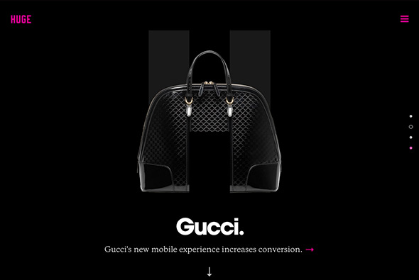
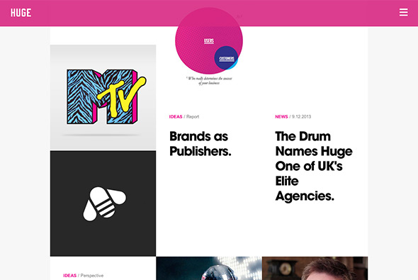
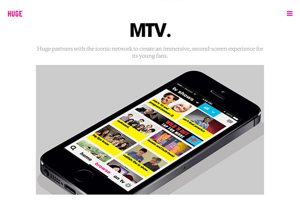
New responsive portfolio site of agency Huge Inc. Really stripped back and to the point, I like the homepage where the 3 best / latest projects are shown – all within or featured around a giant ‘H’. The featured projects give across a hint of the work and the process, like the key stats section. Love the menu – large overlay with big typography and a pink overlay – really cool.
minimal
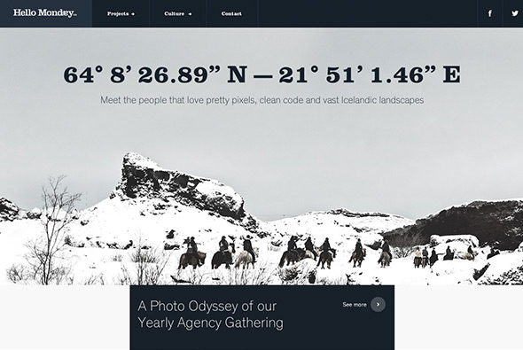
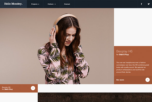
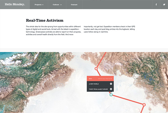
New site of agency Hello Monday. Really simple and minimal, and responds nicely to layout changes. Simple animations add a nice element of movement when you visit the different projects, and the story told for each project is interesting. Nice images and nicely flowing design create the pages, all in all a nice example of an agency portfolio.
Created by Hello Monday (@hellomondaycom).
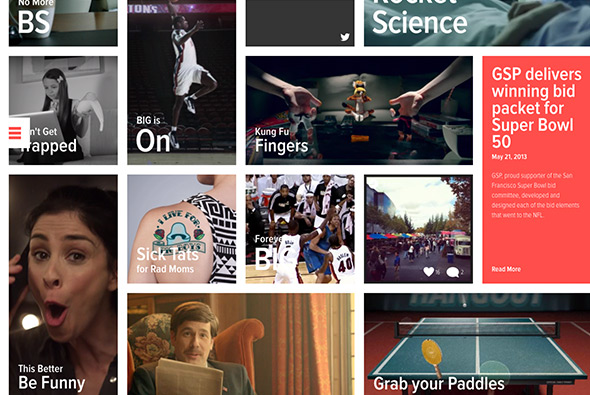
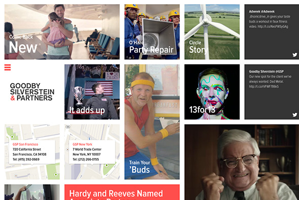
New responsive site for agency Goodby Silverstein & Partners. Featuring a huge grid of their latest work, and simple, minimal project pages to find out more. Nice features and touches, like the video rollovers, the off canvas menu, all wrapped up in a nicely responsive, and well considered layout.
Created by Huncwot (@huncwotdigital).
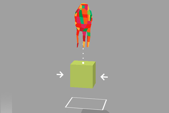
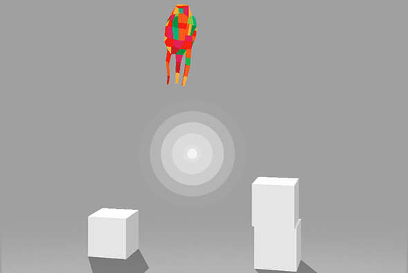
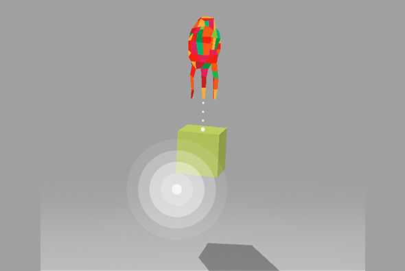
Nice little promo for a game available on the app store. Physics based, multiplayer, drag and drop game – using a bizarre multi coloured character! Click on the box to connect it to the character, and drag around to carry the box to open a trap door. Really intuitive and fun to play around with.
Created by Etter Studio (@etterstudio).
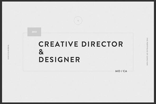
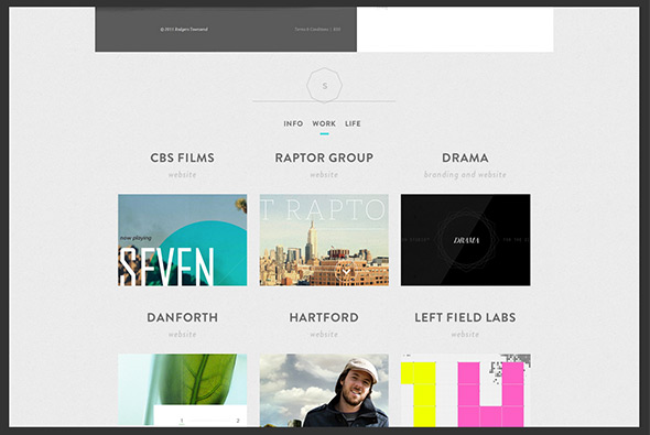
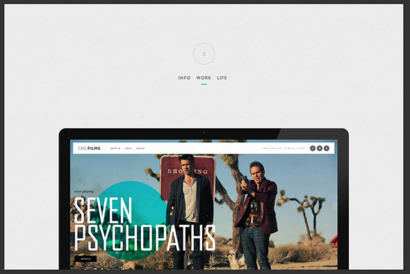
Portfolio of digital creative Sang Han. Nice, simple, responsive portfolio site, with a lot of work to explore. Direct and to the point, the wrapper lets the work do the talking, with nicely selected pieces of work highlighted. Nice to see some personality come through with the ‘life’ section too. Good example of a modern, clean, portfolio site.
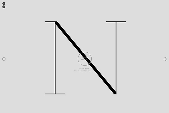
Site of creative developer Santi Grau, showcasing his portfolio. Lovely range of work from ‘sonic typefaces’, to 3d avatar generators, to commercial sites. A developer with a very keen creative eye, the projects are neatly wrapped up in minimal interface and explained very simply, like the mechanic on the project level navigation – when you scroll the circle scrolls with you. Really nice set of experimental work mixed in with some nice commercial projects.
Created by Santi Grau.
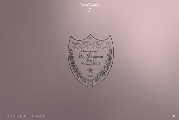
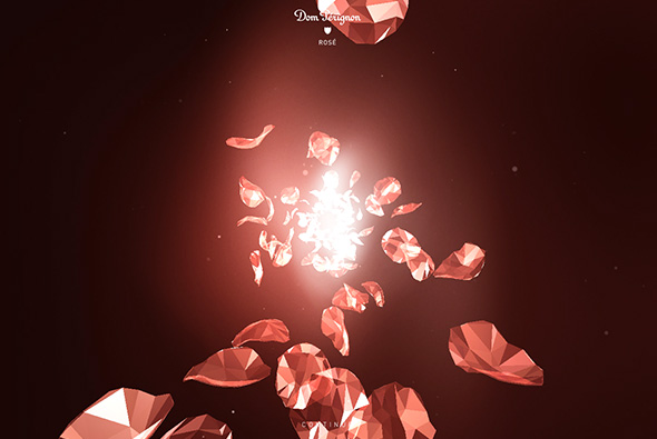
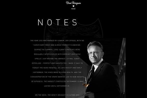
Simple and elegant site promoting Dom Perignon’s Rose 2002. Beautiful 3d Flash visualisations highlighting sensations, tastes, and feelings you might experience whilst drinking the champagne. Some really nice layouts and lovely visualisations in the sequences – love the rose petals rotating! Wrapped up in an ultra minimal interface to let the content shine.
Created by Random Studio (@random_studio).
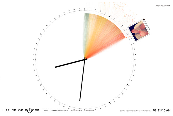
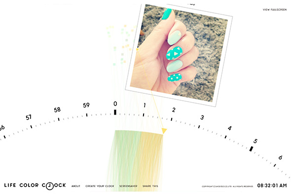
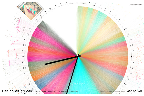
The ‘life color clock’ is a clock which pulls in images from Facebook and Instagram and takes pixel colour values from random places on the image and draws lines from these into the centre of the clock. All brought to you by Shiseido, a Japanese cosmetics brand, really minimal branding and typically Japanese style. The whole experience is really simple and elegant, you can sit back and just watch the whole thing draw out – the screen saver is pretty cool too.
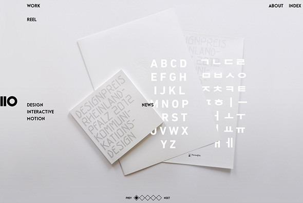
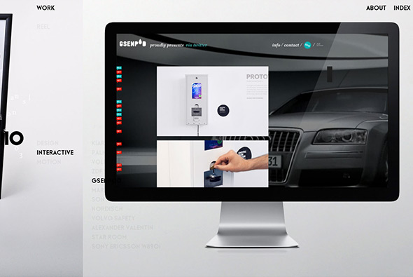
Site of Berlin based freelance art director / designer Il-Ho Jung. Nice and simple layout – looking somewhat like a graphic design magazine – with some nice transitions and animations. Like the rollover effect on the sub menu that scrolls to the relevant thumbnail. All in all a nice example of a modern portfolio site with a minimal stripped back look and feel.
Created by Il-Ho Jung.
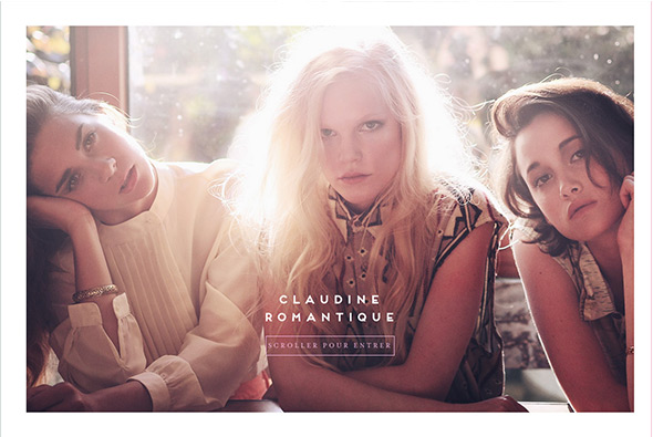
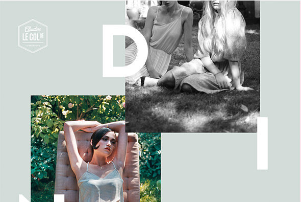
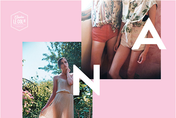
Short and sweet site for French label Le Col de Claudine. Simply a nicely laid out page with subtle parallax style effect, with nice photography and large type. Love the way the background colour changes on scroll and reflects the colour in the items on the models, really subtle and a nice way to tie it all together. Sweet and simple.
Created by Benjamin Guedj (@benguedj).
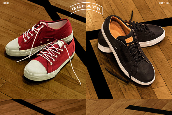
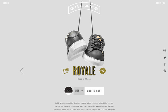
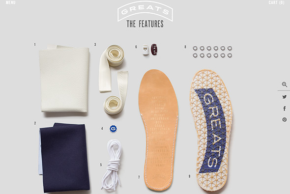
Nice site for GREATS a sneaker brand from the US. Really simple, with a grid of their shoes – clicking through takes you to the details where a nicely laid out page tells you all about the shoe. Love the fun 360 drag at the top and the exploded, military style view of all of the components that make up the shoe – bit like a stripped down gun! Minimal design and some nice little touches like the menu and in-page content reveals.
Created by Wondersauce (@wondersauce).
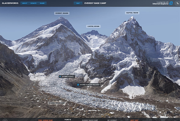
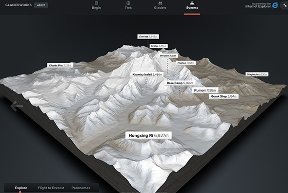
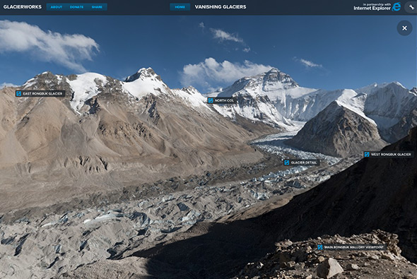
Stunning immersive site about the decline and changes to the glaciers in the Himalayas. Featuring a documentary style explorative interface, using ultra high resolution photography to zoom in – try zooming in on the camp at base camp – and see the landscape of the region around Mt Everest. A wealth of well considered content from videos in the lower towns through to sherpas stories in base camp. There is a great interactive 3d map of Everest and a documented trek to Everest base camp. A really in-depth, thoughtful interactive documentary on this amazing region. Brought to life by beautiful photography and a nice blend of technology.
Created by Pixel Lab (@thinkpixellab) and Microsoft.
Site of designer & art director Anthony Goodwin. Really minimal and focussed – a carousel of colour coded projects, scrolling down you get into the details for each project. I like the full screen intro to each project, and the full screen visuals – and nice combination of designs on phones and tablet – all in a super minimal way that focusses on the work. Some nice attention to detail – some nice transitions – all in all a nice example of a portfolio.
Created by Anthony Goodwin (@DesignEmbraced).
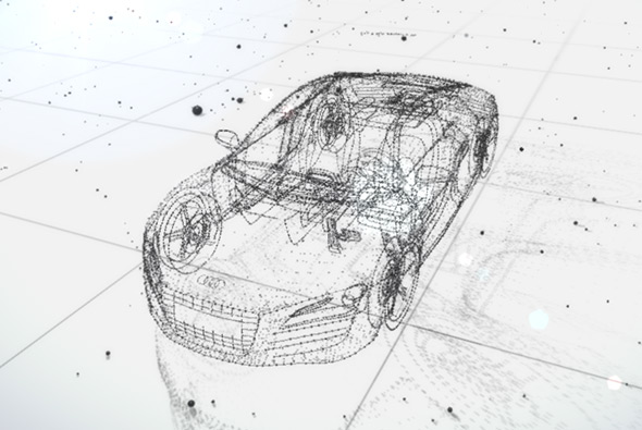
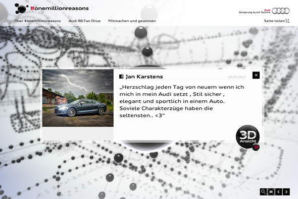
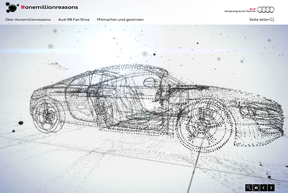
Incredible campaign microsite for Audi and #onemillionreasons. Essentially a model of their R8 car made up of spheres, which people can ‘own’ through social media, clicking on one of the spheres shows the statement, which then also when the “3d ansicht” button is clicked – totally destroys the car and rebuilds it in front of your eyes – and turns it into the photo or statement – absolutely incredible! All built in Web GL, it allows you to rotate your view, zoom in, and interact with the various spheres. Love the attention to detail too, with the spheres moving around based on position of your cursor, and watching the light source cast shadows dynamically. It really is incredibly well made.
Created by Minivegas (@minivegas) and Razorfish Germany (@razorfish_de).

