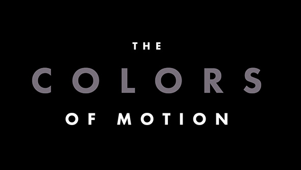
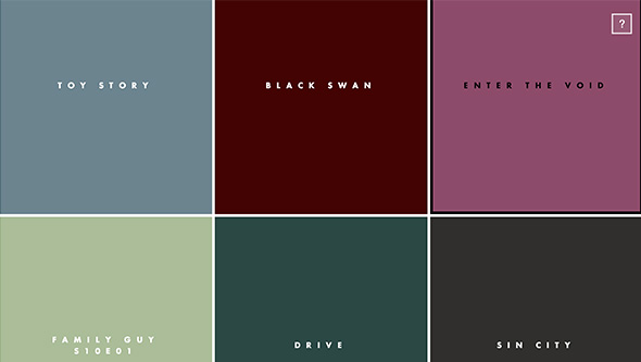
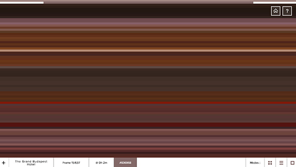
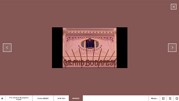
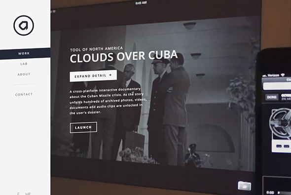
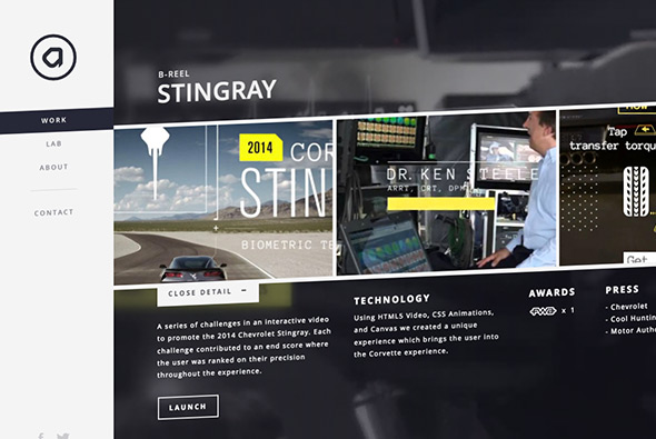
Site of Tokyo Mild Foundation, Japanese film producers. Minimal layout and dark look and feel shows the projects on offer – stripped back and simple. Some nice transitions and some cute details bring it all to life, I like the slide out menu from the left and the ‘member’ section is nicely done.
minimal
Unique site for photographer Enrico Floriddia. Love the CV-esque approach that explains the work through writing rather than simple thumbnails, click on one of the projects and viola thumbnails appear, click on them and see how it all expands. Really nice, unexpected, original execution of a portfolio website.
Created by Raphael Bastide (@raphaelbastide).
Great site that explores the use of colour in films. Displays the average colour of a set of frames from the films, even allowing you to see that individual frame – love the way you can see the whole strip of colours and navigate through the frames. Really interesting results, great idea and well crafted.
Created by Charlie Clark (@clarkcharlie03).
Nice and simple site for Look Films who create films for the fashion industry. Such a simple premise, choose a film – based on a whole strip of keyframes – you can even navigate all the video content on the site from the same video scrubber. Nice, slick, and simple user experience which lets the content do the talking.
Created by Marc Kremers (@marckremers) and Theo & Tillberg (@theo_t).
Site from Chris Wang, a designer & art director, created to showcase his photography. Looks great and is full of elegant animations and transitions, love the typographic masking on the homepage. Lot of nice touches that bring to life the photography, love the preloader for each of the sections while the images in the set load, and again the transitions between the photos. Top class stuff…
Created by Chris Wang (@__chriswang).
Portfolio of ‘Zulu’ a creative developer. Super simple and minimal, brought to life with slick animations and transitions. Love the way the projects appear and you can cycle through each of them, he has got a keen eye for animation and it all feels very polished.
Created by Zulfeekar (@zulfeekar).
Site of artist management firm JR & Associee. Nicely stripped back and laid out like a magazine, really simple – just a nice way of seeing the work of the photographers and so on. Like on the homepage, where you rollover the thumbnail you get to see the range of images within that section.
Created by Wet Willy and Bruno Simon (@bruno_simon).
Short and sweet look book for Jack Jones Explore Core range. Nice little mechanic for comparing the looks you can get with certain items like jeans and jackets – you rollover the model and see the change. Lots of nice transitions and animations – like the way you carousel through the looks – really nice.
Created by Bacon de Czar (@bacondeczar).
Site of Active Theory a digital production house in Venice, CA. Their body of work is impressive and is wrapped up in a nicely done, nicely animated site. Love the labs section – where you can see their dabbling in Web GL / Javascript experiments – also nicely shown on the homepage with the undulating interactive circles.
Created by Active Theory (@active_theory).
Site celebrating 10 years of electronic music label Size. Through a 3d grid of records that you can listen to and explore. Nice and slick animations and transitions to see the records – also like the way they have organised the records in different views i.e. timeline view / grid view – all in all a nice little slick site.
Created by Your Majesty Co (@yourmajestyco) and Rebels Studios.
Site of data visualisation agency Dataveyes. In their words “We translate data into experiences, to share narratives, support new uses, and make sense of a world increasingly shaped by algorithms. We design useful, relevant interfaces through our workflow, which revolves around both data and user needs.” They have brought to life some nice animations and particle effects and tried to simplify what data is and how you can visualise it. Some really nice touches and it looks great.
Created by Dataveyes (@dataveyes).
Lovely site for the photography of Thomas Ciszewski. Love the large typography and large photography – loads of slick transitions and a lovely feeling of consideration. The minimal layout lets the photos pop, and the fullscreen mode is fantastic. There is also a quick view for the projects offering a more zoomed out view of the work. Very slick.
Created by Thomas Ciszewski (@coc6) and Jean-Christophe Suzanne.
Portfolio of German photographer and film maker Ramon Haindl. Nice offset grid and nice use of video thumbnails as you scroll down. Really simple and minimal look and feel, which really makes the images pop – simple and minimal.
Created by Thomas Müller, and Ramon Haindl.
Another great piece of work for Sonia Rykiel, this time revealing their pre Spring / Summer 2014 collection. Loads of super slick animations and transitions and details, especially like the little preloaders in different styles and positions – never overlaid across the visuals. The transitions from the grid to the detail view are pretty cool, and the way you see more tiles on the grid is great.
Created by 84 Paris (@84Paris_live).


