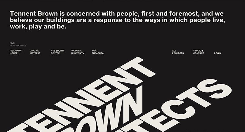
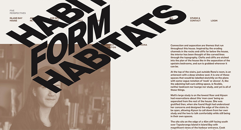
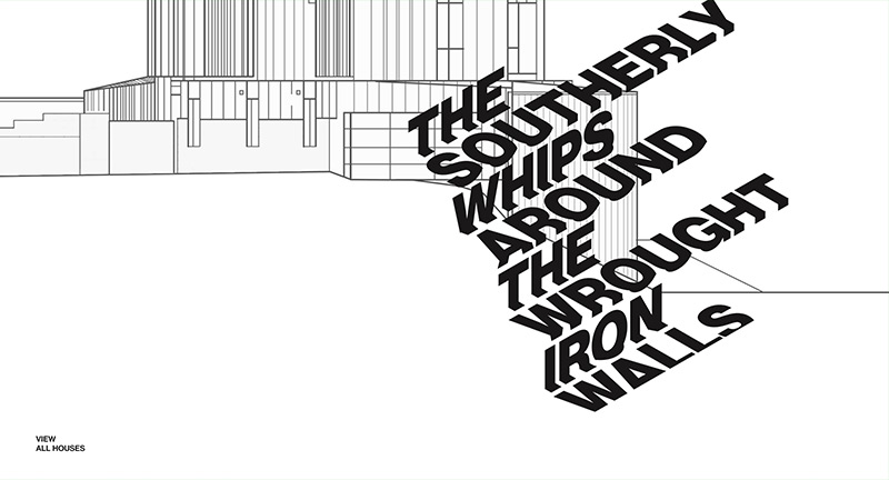
minimal

Libertine Libertine

By | @webdesign | No Comments

libertine-1
libertine-2
libertine-3
libertine-4

Danish fashion label’s AW 2015 collection. Love the homepage – scroll and the photos become distorted and lead either to the men or women’s collection. Nice use of 3D and parallax in the deeper view, looks great too. Sweet transitions and subtle use of UI.

Created by e-Types.

Site here…

Sam Skinner

By | @jakedowsmith | No Comments

skinner-1
skinner-2
skinner-3

Super cool and minimal portfolio for Sam Skinner an artist and designer based in the UK. Lovely emoticon based navigation – when you tap into a subject the element stays sticky. Nice offset grid and super simple interactions – feels very elegant and well thought out. Nice to see people still coming up with refreshing and thoughtful navigation and layout.

Created by Jake Dow-Smith (@jakedowsmith).

Site here…

The Gift Department

By | @drxlr | No Comments

gift-1
gift-2
gift-3

Pop up shop site, promoting the partnership with a creative agency and local designers / shops etc. Nice bit of parallax with imagery, nice type, nice small interactions. Love the way the layout is broken up with interesting segments, circles, and when you scroll to the bottom you get a nice segway then it places you at the top of the site again.

Created by Drexler (@drxlr).

Site here…

Younus Abdalla

By | @younusabdalla | No Comments

y-1
y-2
y-3

Fantastic portfolio by creative developer Younus Abdalla. Super simple, featuring screen captures of his work in an elegant minimal interface. Love the slide out nav and the personality in the animation and interactions. It is also beautifully designed, with nice attention to detail – love the feeling of energy and movement in the layout. Great example of a modern portfolio.

Created by Younus Abdalla (@younusabdalla).

Site here…

Kid. Studio

By | @fifty6studio | No Comments

kid-1
kid-2
kid-3

Site of Toronto based creative agency Kid. Studio. Fun homepage with nicely treated visuals that rotate around in 3D space linking to the relevant project with nicely implemented parallax effect on scroll. Minimal layout and monotone styling with nice details, like the Ken preloader, finish this agencies folio.

Created by 56 (@fifty6studio).

Site here…

Code Doodles

By | @nexuslondon | No Comments

code-1
code-2
code-3

Lovely site containing many ‘code doodles’ short and sweet interactive experiments, that are also a Chrome plugin. Real simple layout making it easy to dip in and out of the doodles. Love the breadth of doodles available, all from a range of different coders and artists. Nice wrapper for the doodles with lots of slick transitions and animations, and nice UI details too.

Created by Nexus Interactive Arts (@nexuslondon).

Site here…

Julien Belmonte

By | @jonathandc | No Comments

jule-1
jule-2
jule-3

Elegant site for Julien Belmonte, film director and designer. Featuring a simple and intuitive video scrubbing integration, which is simply your mouse cursor position. The homepage is just one long strip of videos, tap on one video and it expands. Nice transitions and smooth animation, with a really simple and elegant mechanic which lets the content do the talking.

Created by Johnathan de Costa (@jonathandc) and Make Me Pulse (@makemepulse).

Site here…

YUME

By | @whitevinyluk | No Comments

yume-1
yume-2
yume-3

Beautiful 3D musical experience for band Helios and their new album Yume. Drag around the various 3D shapes to mix various elements from the tracks in the album. Different scenes have different music, love the way when you add bass or drums the landscape reacts – either in a sound reactive vibration or adding new 3D shapes into the mix. Site is minimal and simple which allows the music to take centre stage, a really beautiful and thoughtful site.

Created by WhiteVinyl (@whitevinyluk).

Site here…

Silenzia

By | @webdesign | No Comments

silenzia-1
silenzia-2
silenzia-3

Site for Italian lingerie brand Silenzia. Featuring nicely shot full screen black and white video which places you in the lead female character. Prompting small moments of interactivity, choosing how to spend the day, or dragging the bra closure system – helps carry the story along and draw you in. The site design is minimal and elegant, whilst letting the content and story telling speak for itself.

Created by Fedoriv.

Site here…

Kotelett

By | @basics_09 | No Comments

k-1
k-2
k-3

Simple site for Kotelett underwear, that grabs your attention by dripping green paste over Ryvita crackers, then shows the models. Strange intro to reveal a very simple nav, that allows you to see the items in more detail – love that the models are a part of the site – full screen, framing the navigation. Such a simple mechanic, with the full bleed looping video just adding that extra dimension.

Created by Basics09 (@basics_09).

Site here…

Boegli

By | @anonymous_paris | No Comments

shadow-1
shadow-2
shadow-3

Sounds strange but this is the site for Swiss embossing specialty company Boegli. Execution is superb, with super slick and restrained transitions and animations – love the timeline, transitions between the pages, and the scroll down mechanic where the visual masks off and shrinks to a portal. So well crafted and elegant with a splash of colour from the vibrant photography.

Created by Anonymous (@anonymous_paris).

Site here…

Pal Zileri

By | @id_aquest | No Comments

pal-1
pal-2
pal-3

Site for Italian label Pal Zileri. Slick, simple, and elegant is a good way to describe the site – it feels very well crafted and seamless with the video playing full bleed and images zooming to full screen. The attention to detail is thorough, with lots of nice touches the preloader bar at the top, the menu, the cursor changes, the zooming. It looks great too, nice layout with well considered use of images and type.

Created by AQuest (@id_aquest).

Site here…