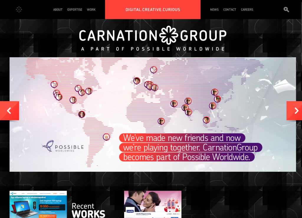
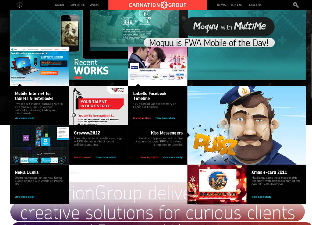
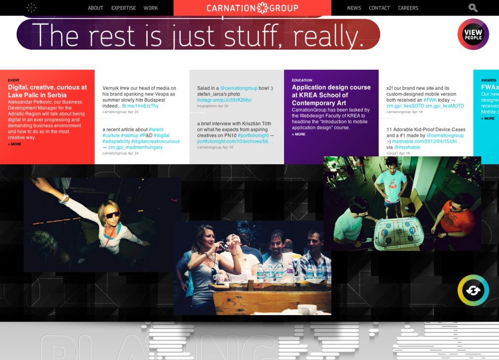
Site of Hungarian based agency Carnation Group. Nice design, slick transitions (non Flash), and lots of interesting interaction ideas. Done to death with the vertical scrolling and parallax but I think this is a nice example, particularly with the animation and smooth transitions.
europe
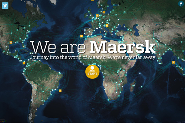
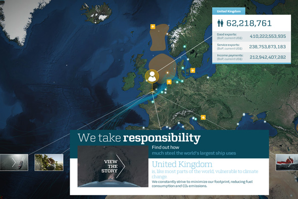
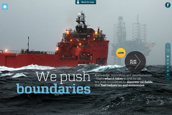
Site of Maersk global shipping company. Nicely designed promo site showing stories from around the world highlighting Maersk’s story. Featuring lots of really nice transitions and animations and with a lot of detail, from preloaders telling you about how many tonnes of good shipped since you have been online, to nice animated boats. Some nice layout in there too…
Created by LBi Denmark.
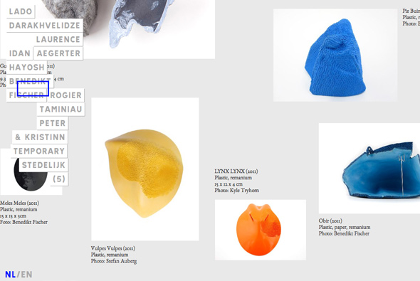
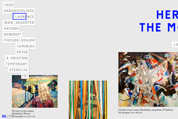
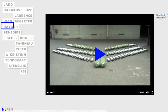
Interesting site showing the latest modern art on offer from Holland, lacking a building for young innovative artists to display Amber van den Enden and Kalle Mattsson decided to offer a website refreshed often showcasing new art. The site itself is minimal and really allows you the chance to explore the art works rather like a large draggable magazine with videos and images. I particularly like the click and drag navigation, shortcut on the left, smartly arranged like we see on the site, I like the grey dashed line leading you through the exhibits. Pretty cool…
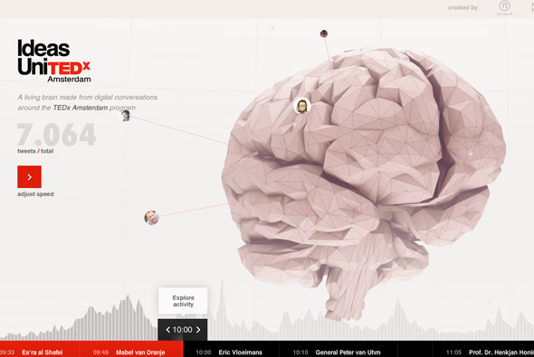
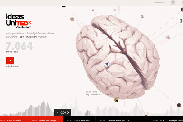
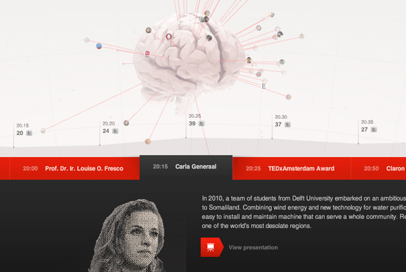
Really nice site, highlighting the talks and ideas of TEDx Amsterdam. Using a cool 3d interface to map twitter conversations coming out over time from a brain. The camera changes over time to alloy a ‘slideshow’ view, so when you are not interacting you can simply watch the tweets appear. What I also really like is the attention to detail and the info graphic approach to the design of information – the chart of times and the really nice rising panel which stretches the timescales and so on. Every little interaction and touch is well though out and designed. It is great just to interact and play with, but also shows all the info in an intelligent and useable way – on top of all this it also looks good!
Created by WE ARE Pi and Media Monks.
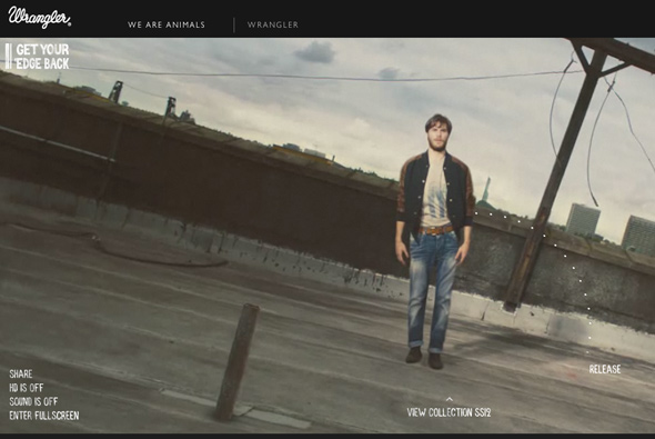
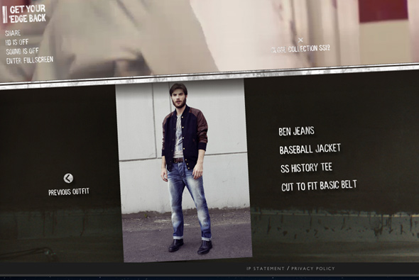
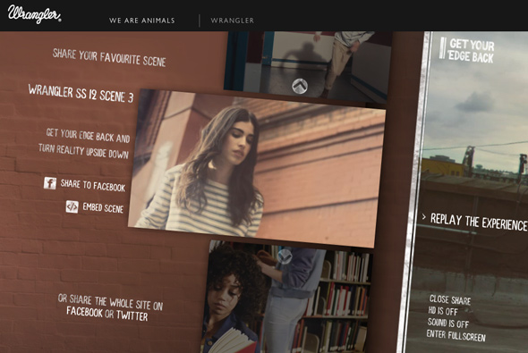
Spring / Summer 2012 collection from Wrangler – wrapped up in a fun microsite. Inviting you to drag and release the characters at key moments in the video – triggering a cool transition between scenes where the character flies through the wall / floor / something. Makes something static relatively interactive, I also like the usage of the ‘edge’ and the position of your mouse to affect the rotation of the screen – nice attention to detail. For something that is essentially a video they have made it fun to play with and explore.
Created by Stinkdigital.
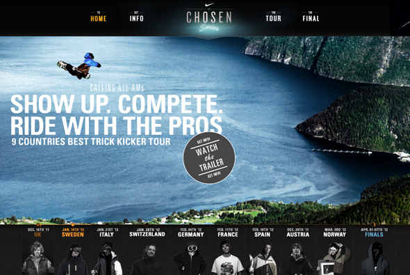
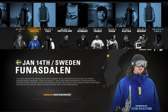
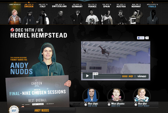
Great site promoting Nike’s competition ‘Chosen Series’ a competition for amateur snowboarders spread across various resorts in Europe. Using a hybrid Flash template for the homepage and I love the very cool transitions between the stages. Nice layout and attention to detail, looks great and fantastic animation. Great to see a blend of the best technologies used in such a good way.
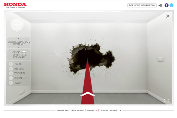
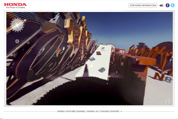
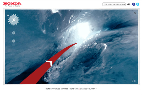
Site for Honda supporting launch of the new Civic. A play on Google’s street view, except for exploring the streets you explore ‘off the grid’ locations – such as canyons, underwater art galleries, and so on. All filmed from a 360 degree camera system walking – you can click and drag to change your view as the scene unfolds – very cool. The scenes are magical and sound, music, and voiceover all adds to the ambience, really nice.
Created by Wieden + Kennedy London.
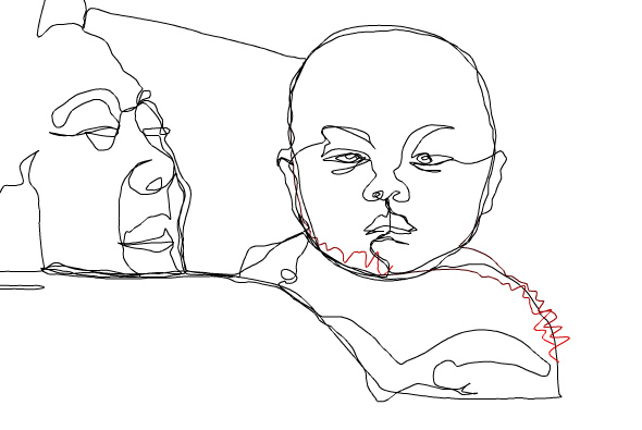

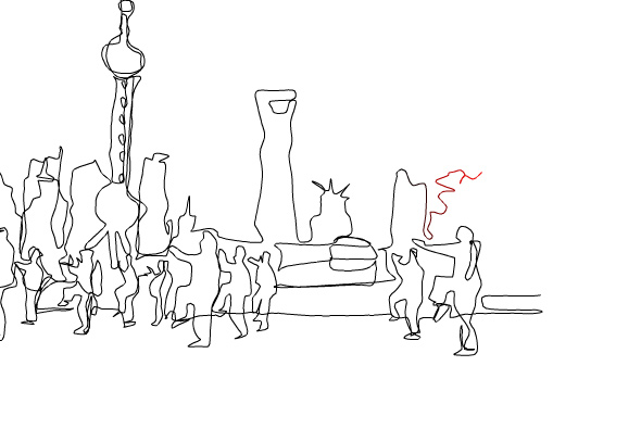
Beautiful site combining drawn scenes and jazz, the music animating the drawing scenes of China – promoting a jazz album ‘Chinese Soul’. The lines vibrate with the music in turn drawing the lines with the scene panning as the lines are drawn. I love the thought that music can draw a scene in your mind and give a mood, a feeling – very simple and beautifully made. Fantastic.
Created by Motiondraw.
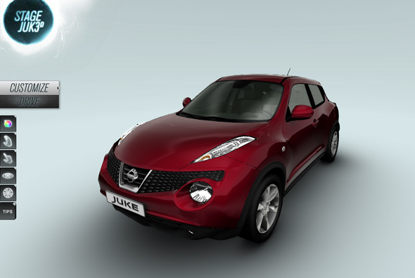
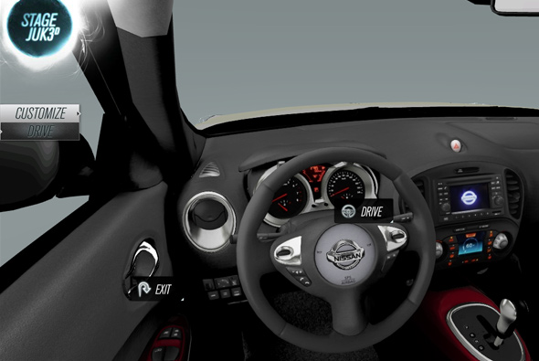
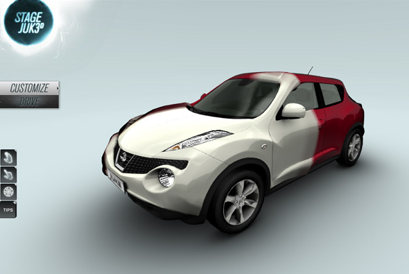
A simple micro site giving people the chance to explore the new Nissan JUKE. Using the latest Flash 11 hardware accelerated 3D effects, you are presented with a detailed 3d model of the car – placed in a neutral setting you can walk around the car, change colour, get in and out of the car – all from first person perspective. Very simple and fun, I love the way the colour of the car changes and the simplicity of interaction with the car and the environment – dragging the doors open and sitting inside the car – all incredibly immersive. Very well executed, the 3d is fast and smooth and the site is polished – very very cool.
Created by Digitas.
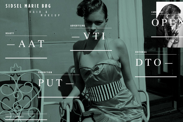
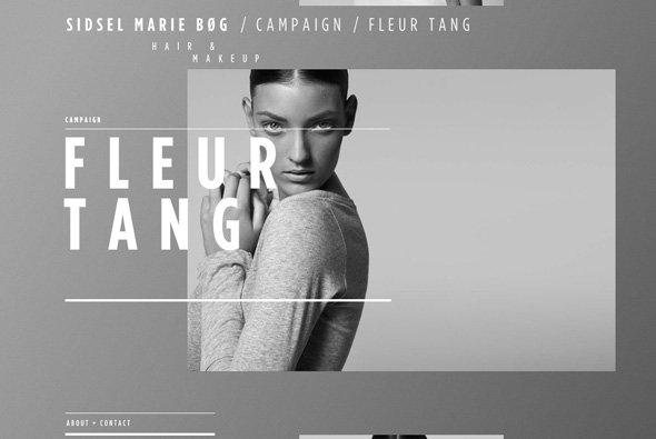
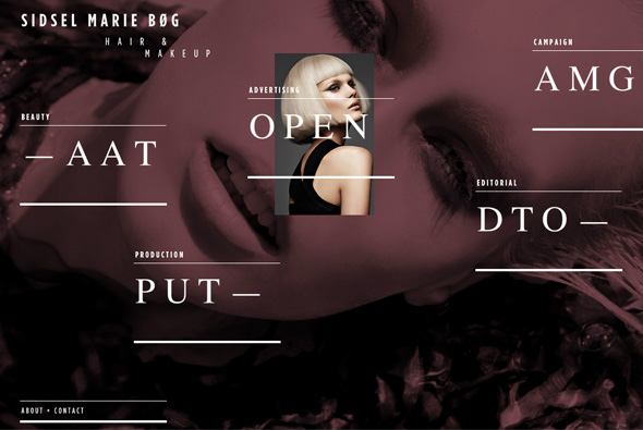
Beautiful site for the Danish Hair & Makeup artist Sidsel Marie Bøg. Featuring a fresh and crisp layout and navigation I haven’t seen before. Nice slideshow fullscreen imagery fills the background, love the rollovers on the sections, where images appear for that section. The section where you view the images utilises a really nice scrolling system. Overall a stunning site that really shows how to showcase a great creative portfolio of imagery. Fantastic…
Created by Morten Wibrand and Marcus Fuchs.
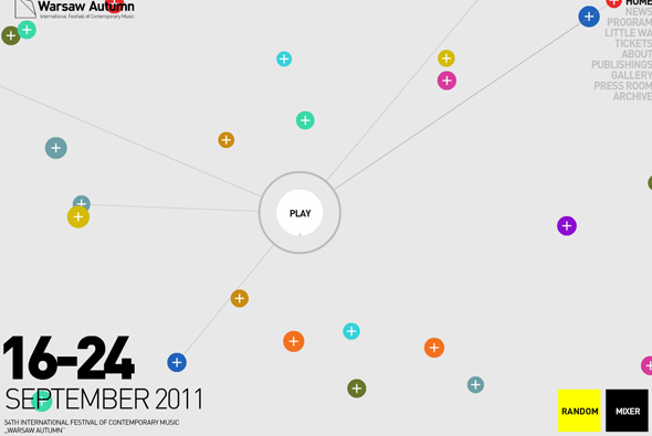
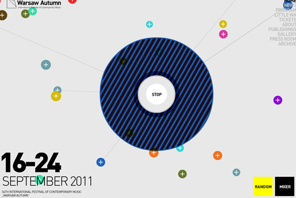
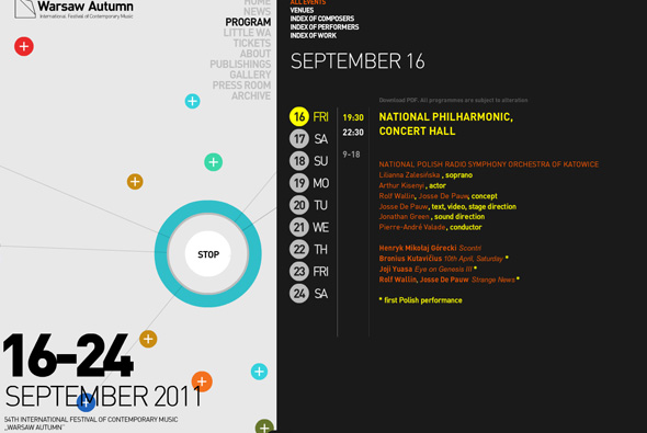
Site for the 54th International Festival of Contemporary Music held in Warsaw. Love the way you can make your own composition from the various sounds of the homepage, when it plays shapes and colours appear around the centre responding to the sound waves made – very cool. Nicely minimal lay out and look and feel, with a fun interface, nice.
Created by Rytm.org Interactive.
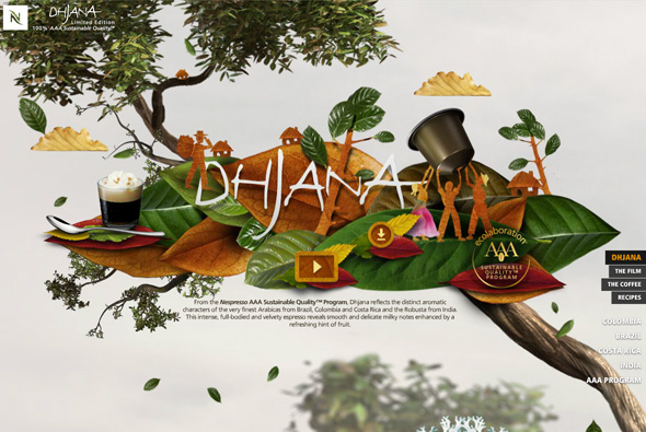
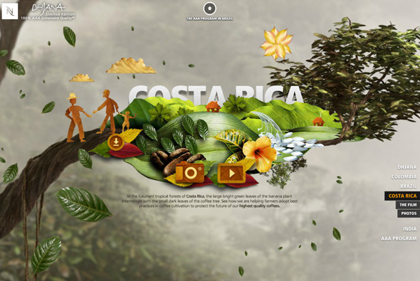
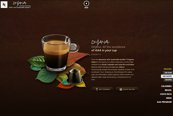
Beautiful site promoting Nespresso’s new Dhjana coffee blend from sustainable sources. You discover the sources of the coffee panning around the scene. Full of stunning animations and smooth transitions, the site is brought to life. It looks fantastic, full of polish and well designed, amount of detail is incredible from the smallest of animations to buttons and so on. There is also a great soundtrack – it is full of sound – which really ties it all together. Really beautiful…
Crafted by Soleil Noir and Lowe Stratus.
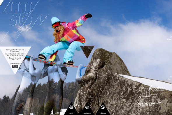
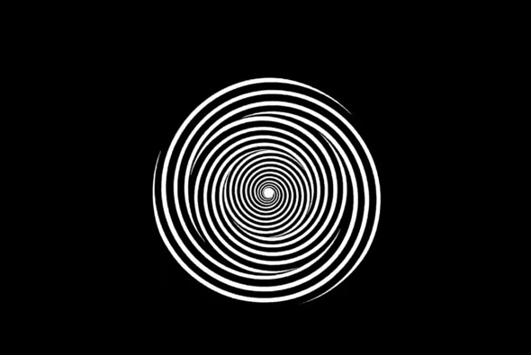
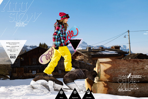
Site promoting O’Neill’s Women’s range for a/w 2011. Centred around the concept of ‘illusion’, before seeing the clothing small optical illusions are shown – they didn’t really work for me but hey it’s a fun idea. Nice transitons and look and feel, nice play on the scrolling theme – overall pretty slick and fun to use.
Created by Achtung! and thispagecannotbefound.com.
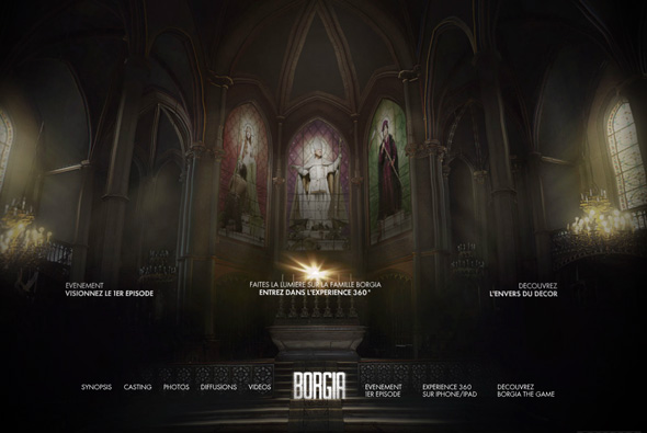
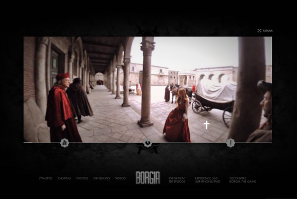
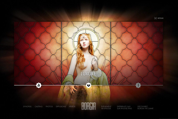
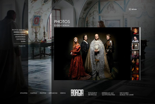
Site promoting the new TV show “Borgia” by Canal+ in France. Incredibly well produced and created immersive site, one of the main features an interactive trailer allowing you to pan around the video 360 degrees and watch the scene almost like a video game. I love the way this 360 video works, so you can pan around and get a real feel for the scene they have created. This is all wrapped up in a nice interface, the other sections such as photos all look great and work. Really nice detailed and well crafted site.

