europe

Staring is Caring

By | @weareachtung | No Comments

staring-caring-1

staring-caring-2

staring-caring-3


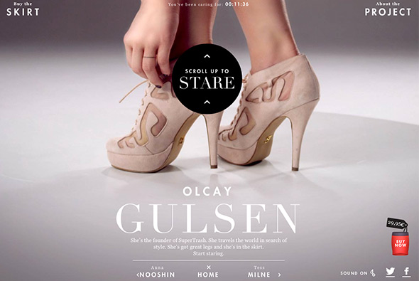
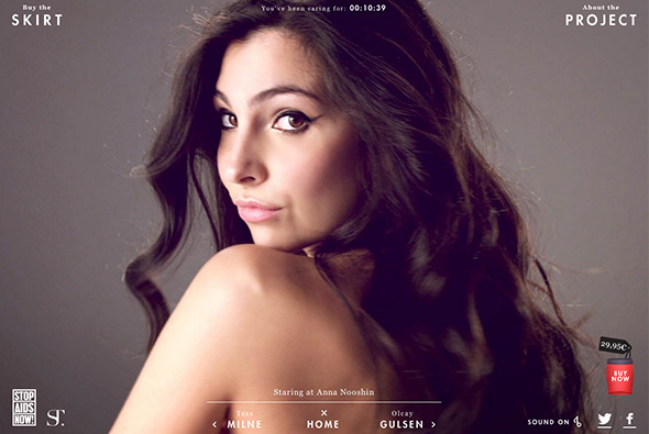
Nice idea to educate people about HIV in Africa. You are presented with three models – scrolling up reveals more skin – until you are greeted with the message to tweet to continue – thus spreading the message before seeing more. You can then scroll up and see the model (nothing explicit!) and learn a little about AIDS. Really nicely executed idea thats a bit of fun and educational – nice scrolling interface with some cool transitions.

Created by Achtung! (@weareachtung) and Superhero Cheesecake (@tastysuperhero).

Site here…

Ranger Rover

By | @blastradius | No Comments

range-rover-1

range-rover-3

range-rover-2


Site promoting the all-new Range Rover. Essentially a video with annotations – showing the key features of the car – highlighted by small hints – the side panel slides out when pressed to reveal more info. Lots of little transitions add to the overall experience, the minimal design and animations make it feel like a modern tablet app.

Created by Blast Radius (@blastradius).

Site here…


Rezo Zero

By | @rezo_zero | No Comments

reso-zero-1

reso-zero-2

reso-zero-3


Portfolio site of French agency Rezo Zero. Nicely considered layout and subtle animations bring the design to life, with a modern and fresh look and feel. Really like the transitions from section to section and the way the images filter through and the layout for the individual case studies – telling the story in an interesting way. Nice example of a modern agency portfolio.

Created by Rezo Zero (@rezo_zero).

Site here…

Ed Banger Room

By | @anonymous_paris | No Comments

ed-banger-1

ed-banger-3

ed-banger-2

Site celebrating the 10th year anniversary and showing the history of the Ed Banger music label. A simple site – scrolling downwards reveals animations and shows key moments in the label’s history. Lots of detail – from dragging around music covers to interactive keyboards – it’s fun to explore and play. Love the history summary panel where you can see the entire page and navigate around. Just a nice example of a timeline based design which fun to explore.

Created by Anonymous (@anonymous_paris).

Site here…

Carrera

By | @random_studio | No Comments

carrera-1

carrera-2

carrera-3


Great site for Carrera sunglasses. Super modern, fresh design – with sticky navigation element, sliding interface, overlays and so on – and its responsive looks good on mobile too. Really nice typography, well considered layout and design – love the offset grid and red highlight colour throughout. Loads of nice touches, including mini-campaign style pages telling the story of their history and so on. Great example of a responsive, modern & fresh site with parallax, great typography and loads of interactivity.

Created by Random Studio (@random_studio).

Site here…

Escape Flight

By | @b__reel | No Comments

escape-flight-1

escape-flight-2

escape-flight-3


Lovely site for Escape Flight – a search engine for last minute weekend flights for trips abroad. With useful filters such as ‘weather’, ‘culture’, ‘food’, and ‘hidden-gem’ – all aimed at making this a really simple, intuitive way of finding a flight. Really slick animations and transitions everywhere, and lovely design – and great typography. Easy to use and very visual, very modern, very slick.

Created by B-Reel (@b__reel), and Dog Studio (@Dogstudio).

Site here…

Into the Arctic

By | @hellomondaycom | No Comments

into-the-arctic-1

into-the-arctic-2

into-the-arctic-3


Lovely site for Greenpeace documenting their effort to claim the North Pole for nature – and highlighting peoples attempts to exploit the Arctic for resources. The story centres around a 3d map of the region which zooms and pans as you explore the timeline. There is lots of information about the animals in the area and the companies responsible for exploiting the region. All tied together with well considered typography and ‘app’ like design with sliding panels and large touchable buttons and icons. Really informative and loads of animations and transitions – all wrapped up in a great interface.

Created by hellomonday (@hellomondaycom).

Site here…

Perrier Secret Place

By | @Ogilvy_Paris | No Comments

perrier-1

perrier-2

perrier-3

perrier-4

Perrier’s epic narrative ‘Secret Place’ – an immersive interactive film, where you choose your perspective featuring 60 people – you then see the story unfold through their eyes. The idea is to find the ‘secret bottle’ to enter a draw to win a holiday. There are lots of different scenarios from cutting a ladies dress off to reveal clues, to a game of poker, to flirting bar men – all with a sexy / weird twist. It is a lot of fun to explore the various story lines and characters – with their being a time limit to find the bottle it encourages you to replay time and time again. Great production value, and art direction – it apparently took Ogilvy Paris 18 months to create all the different scenes and characters. Also really like the summary of the characters and the journey you took through the site – again it makes you want to explore again and again.

Created by Ogilvy Paris (@Ogilvy_Paris) and Fighting Fish (@Fighting_Fish).

Site here…

OWL

By | @wearefellows | No Comments

owl-1

owl-2

owl-3

Site of OWL optics, makers of glasses and sunglasses aimed at the trend conscious. Nice modern, offset grid, minimal layout – looks like a crafted magazine layout. Very simple but the grid looks nice and piques your interest as your scroll through the frames on offer. The sticky elements of the nav work well and gives you some ground in sections where you might want to buy the glasses.

Created by We Are Fellows (@wearefellows).

Site here…

Cheval Blanc Randheli

By | @davidbasso | No Comments

cheval-1

cheval-2

cheval-3

Site promoting ‘Randheli’ a luxury villa in The Maldives. Long page of large full bleed imagery and panels of masked off text – revealing the bright photography. The menu is accessible from the side and slides across the page allowing you to explore the sections. It is also responsive and looks great on mobile devices too. Essentially a very slick brochure style site with some nice transitions and touches.

Created by Uzik (@davidbasso).

Site here…

Florilege – Vacheron Constantin

By | @webdesign | No Comments

constantin-1constantin-2constantin-3


Promotional site for a range of 3 special watches from swiss maker Vacheron Constantin. The watches are inspired by botanical illustration in the 18th Century, and that theme runs through the site. Essentially a long page with sections of detail off to the side – you scroll and animations are triggered as you go. I like the way the text fades in and the illustrations fade in as you go down, each watch has a slick video highlighting the dial – then prompting you to read about the details which are presented in a more editorial way. Really like the style and the execution which feels like a premium magazine feature.

Created by blue-infinity.

Site here…

Kerber

By | @emilolsson | No Comments

kerber-1 kerber-2 kerber-3

Site of Kerber, swedish fashion label. Sleek and minimal design, with large imagery and adaptive layout – elegant concept of large image followed by details for each item, like the rollover state which shows the rear of the item – and the enticing grid of thumbnails at the bottom to see other items in the collection.

Created by Emil Olsson (@emilolsson).

Site here…


Diesel Black Gold

By | @hellomondaycom | No Comments

diesel-black-gold-1

diesel-black-gold-2

diesel-black-gold-3 

Nice site for the Diesel – Black Gold collection. Explore Diesel’s latest catwalk photos and videos for the range. Love the offset grid of images and cool transition to full view, like the way the image resizes and moves. Really interesting method of navigation which unfolds out across the screen – then is ever present transparent and centred in the screen.

Created by hello monday (@hellomondaycom).

Site here…

Assembly London

By | @assemblylondon | No Comments

Assembly Assembly Assembly


Portfolio site of Assembly a branding agency in London. Super simple and elegant layout, scrolling takes you through their projects with big bold typography and relevant images. Nicely laid out grid and cool typography – the execution is direct and to the point – you get an essence of the agency and what they have done in a really elegant way.

Created by Assembly (@assemblylondon).

Site here…