europe

Dream and Reach

By | @mediamonks | No Comments

d1
d2
d3
d4

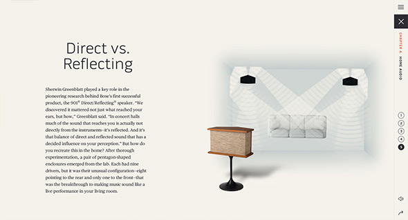
Site for Bose the speaker and electronics creators. Focussing on what makes up Bose, from their history through to their innovations. Presented in an interesting almost encyclopaedic way, with individual chapters with an app like appearance. Lots of nice little transitions and animations which lift the content and make it feel so much more dynamic. Love all the diagrams and the short snippets of video that really illustrate the content well. Nice work.

Created by MediaMonks (@mediamonks).

Site here…

The DNA Project

By | @hellomondaycom | No Comments

dna-1
dna-2
dna-3
dna-4

Fascinating site for j.views, documenting the creation of the new album. Brilliant insight into how the artist creates new music, from sources of inspiration to soundbites and video clips. Not only a great idea, but executed beautifully – a very exploratory interface with elements animating i.e. waveforms in a hexagonal pattern to represent sound recordings, and a timeline approach. Love the look and feel and all of the small details that breathe in life and dynamism. The DNA view is mental! But harks back to the day of more experimental interfaces and experiences – which ties in hand in hand with the concept.

Created by Hello Monday (@hellomondaycom).

Site here…

Maaemo

By | @bielkeyang | No Comments

maamo-1
maamo-2
maamo-3

Site for Maaemo a 2 Michelin star restaurant in Norway. Really stripped bak site allowing the photography and personality of the surroundings and the people do the talking. Lovely photography and interesting stories really make the personality quite unique, a taste of Norway.

Created by Bielke+Yang (@bielkeyang).

Site here…

Destiny Planet View

By | @72andsunny, @mediamonks | No Comments

destiny-1 destiny-2 destiny-3 destiny-4

Fun site for new video game ‘Destiny’ – game set in the future with a sci-fi interplanetary edge. Starting from a Google Earth view of where you are and zooming out to space – allowing you to choose which planet to explore. Love the streetview-esque spin on the scenes where you explore the kind of people you might find on each planet, all a nice bit of fun. Nice way to bring to life the game a little – and provides way more engagement and excitement than the atypical long scrolling page.

Created by 72andSunny (@72andsunny) and MediaMonks (@mediamonks).

Site here…

The Other Side

By | @stinkdigital, @W2Optimism | No Comments

honda-r-1 honda-r-2
honda-r-3

Really really simple and enjoyable execution of a nice idea – for Honda Type R. Hold down the ‘R’ key on your keyboard while watching the film, it will show the same story and scene from the other side. In this case switching between a dad picking his kids up from school vs picking up his partners in crime fleeing a burglary! Very addictive to switch between the scenes – to see ‘the other side’. Had to include it for its simplicity and elegance, can’t help but smile at this one – and it’s just a car ad!

Created by W+K London (@W2Optimism), and Stink Digital (@stinkdigital).

Site here…

Guillame Bouvet

By | @rezo_zero | No Comments

gb-1
gb-3
gb-2

Lovely site for Guillame Bouvet, French industrial designer. Modern and fresh the editorial layout combined with transitions and animations brings out the details in his creations. Love the way you zoom into images – all within the white frame. It looks great and all the small details, rollovers – animations and so on bring it all to life.

Created by Rezo Zero (@rezo_zero).

Site here…

Take Your Pulse

By | @_blacknegative | No Comments

pulse-1
pulse-2
pulse-3

Site promoting the wearable tech product ‘Withings Pulse’. Set from the perspective of three people wearing the product in their daily lives, a short film shows what the product does in-situ – sliding panels appear and you can explore in more detail about the product. I like the flow of the journey and the additional info appearing in a nicely designed way, it also looks great, nice palette of colours and fresh design.

Created by Black Negative (@_blacknegative) and Dilshan Arrukati.

Site here…

Slanted

By | @raphaelbastide | No Comments

slanted-1
slanted-2
slanted-3

Unique site for photographer Enrico Floriddia. Love the CV-esque approach that explains the work through writing rather than simple thumbnails, click on one of the projects and viola thumbnails appear, click on them and see how it all expands. Really nice, unexpected, original execution of a portfolio website.

Created by Raphael Bastide (@raphaelbastide).

Site here…

Brice Darmon

By | @BonhommeParis | No Comments

brice-1 brice-2 brice-3

Fantastic portfolio of Parisian photographer Brice Darmon. The homepage shows a multi-layered layout that shows some highlights from each project – click on a project fills the screen with a cool transition that shows an interesting approach – the background image is the next image and the photo in the centre can be enlarged. Love all the cool interaction and transitions, roll over the right or left and the next or previous photo peeks, even the top and bottom peeks to show the next or previous projects. Also love all the masking transitions, looks and feels so slick – the animations are well considered and bring the static shots to life. Great example of modern photography portfolio site.

Created by Bonhomme (@BonhommeParis).

Site here…

KENZO Fall 2014

By | @kimbouti | No Comments

kenzo-1
kenzo-2
kenzo-3
kenzo-4

Lovely site promoting Kenzo’s Fall 2014 range – aiming to replicate a gallery experience from the browser and in 3D! You can connect your mobile device to use it as a trackpad to navigate the 3D gallery or use your mouse to move around the space. On the walls of the galleries are video pieces and images which you can peruse at your leisure. The exploratory nature of the interface is crafted well, and looks great, nice clean lines and moody lighting – I love that you exit through the shop where you can see the items from the gallery!

Created by DVDTKM (@kimbouti) and Cyril Agosta.

Site here…

Waterloo

By | @Dogstudio | No Comments

waterloo-1 waterloo-2 waterloo-3

Site for French film ‘Waterloo’, telling the story of the famous battle of Waterloo. Focussing on the two sides pitted against each other, Napoleon and Wellington – and describing through iconography the differences between the English and French forces. Nice experience with sounds, full bleed imagery and video – all in a tight layout, with modern interaction design with sliding panels and menus. It looks great too, with the muted colours and distressed overlay.

Created by Dog Studio (@Dogstudio).

Site here…

Cafe Society – Chanel

By | @transylvain | No Comments

chanel-cafe-1
chanel-cafe-2
chanel-cafe-3

Site promoting Chanel’s jewellery inspired by the cafe society in the 1920s. Featuring video, music, and photography to paint a scene via one long scrolling page. Love the time stamp as you scroll reflecting the time, and the ambience provided by the montage of sounds and images. Simple, beautiful, and elegant, it offers a much more interesting pastiche of the jewellery than simple product shots and much more inspiring story.

Created by 60fps (@transylvain).

Site here…

Do Dots

By | @tomvdv | No Comments

dosdots-1
dosdots-2
dosdots-3

Site promoting Dos Dots – a unisex children’s clothing label from Brooklyn, NY. Nice bold typography and style harking back to Japan, where the denim in the clothing is from. The interaction model is simple and easy to use, getting to the details of the items all from sliding panels from the homepage. It looks great, and is also responsive too.

Created by Tom van de Welde (@tomvdv).

Site here…