Nice little project for Uniqlo, this time in the shape of a calendar. Featuring tilt-shift photos in time-lapse video sequences of locations across Japan, when you click on the sequence a mosaic is produced – made up of Uniqlo products – which link through to the online store. Quite addictive just to watch the time-lapses showing the world going by, the tilt-shift technique adds a certain quality to the sequences. You can install a screen saver or embed it into your blog and set your local location to see local weather.
Category Archives: WEBSITES
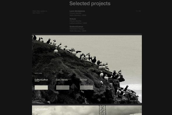
Portfolio site of Art Director / Graphic Designer Sebastian Gram. Very nice and simple vertical scrolling website showing his work, you click on an item and the area expands to show screengrabs of the projects. Nicely structured and clean crisp design, to the point!
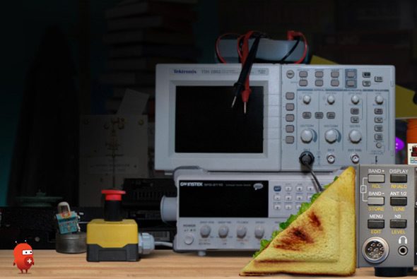
Site promoting the Museum of Science and Industry in Chicago. Designed to teach children basic physics, the whole experience is played out via ‘Twitch’ a little character who you interact with to complete physics challenges. Really nice puzzle games that are well designed and polished, with great animations, cool music & sfx and a nice physics engine – all together combine an ideal fun and engaging site for kids (and adults!) to learn about physics.
Created by Unit9.
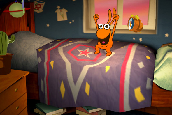
Entertaining site accompanying the BBC kids show ‘Big & Small’ – designed for children aged 3-6 and their parents. The site is a playground, with little interactive games and experiences such as hand painting, music, videos and so on. But what makes this so remarkable is the depth and polish of the site itself. Set within a detailed 3d environment you explore the setting via the interactive experiences, with your mouse affecting your view. But it isn’t just the way it looks, the interactive sections are really a lot of fun, each of them highly polished, with great animations and sound fx – it’s been a while since i’ve interacted with a site like this for so long! For example there is a small game where you have to try and brush the teeth of one of the characters and the toothpaste spreads all over the 3d items in the bathroom, the sink, the mirror etc. Another where one of the characters jumps on the bed and the bed surface reacts to his movement. The little touches all add up to make a fantastic website with incredible use of Papervision – really detailed environments, highly interactive, and really well designed.
Created by Plug-in Media. Really nice write up from Seb Lee-Delisle one of the team members that helped shape Papervision.
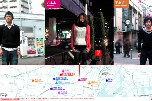
Part of the Uniqlo Parka Style 1000 series, another cool site promoting Uniqlo’s parkas. Similar to the ‘Pass the ball’ concept by Nike, in this case ‘pass the parka’, a series of videos & photos of real people from the streets of Tokyo all setup the same way, passing the parka to their left – this all makes a nice sequence of visuals which is interesting to watch it all passing by on screen. Nice addition of a map of Tokyo showing you where the person was ‘steet snapped’. Nicely executed as usual, with slick animations and cool transitions. Nice vibe from this project…
Created by Dentsu and Bascule inc.
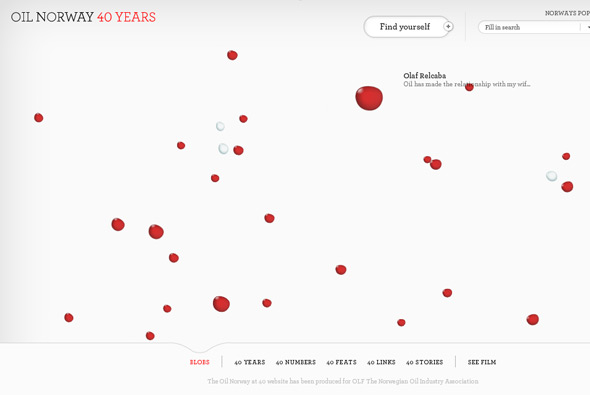
Website showing the relationship the Norwegian people have with oil. ”The Norwegian oil story written by Norwegians’, the site allows each of Norway’s 5 million citizens to share how oil has affected their lives, and their country. Interesting way of presenting the thoughts and stories of people through bubbles, oil if you like, floating around in water. Love how the bubbles fill the screen and become slightly transparent – with the inside showing pictures and text mapped to the surface of the bubble, with your mouse moving around your view. Each of the sections of the site are very interactive and fun to play around with, where you can pick up and drag around bubbles and so on. Well designed and all the Flash is well produced with a high level of detail. Very cool!
Created by Fi.
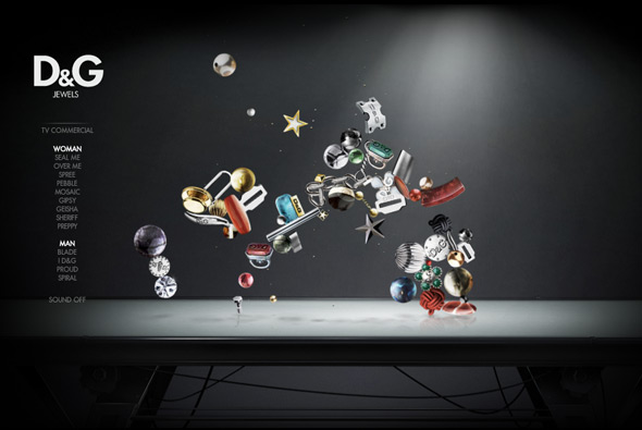
Site promoting D&G’s range of jewellery. Very simple but engaging – the ‘jewels’ float around and interact with each other – when you rollover them they glow and other objects cannot go near them. It’s quite nice just to watch them bouncing around, when you click on one you zoom in and can see the object in more detail. Well designed and fun to use, nice!
Created by Hi-Res!
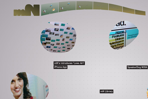
New portfolio site of British digital agency magneticNorth. Nice approach, using gesture recognition i.e. draw a line and you see news, draw a circle and we see a project. We’ve seen gesture recognition before but what I like about this one is the slickness & simplicity of it all – it just works. When drawing a circle to get a project the shape you draw becomes the mask for the content, where the video / screen grabs then appear in that area.
Created by themselves, Brendan Dawes is the creative director – that kinda helps getting visual concepts like this working!
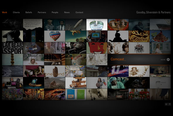
New site of agency Goodby, Silverstein & Partners. Pretty cool site of successful digital agency GS&P, this site is a nice example of an agency portfolio, lately a lot of agencies are opting for the html/blog style – but this is full Flash with videos and slick transitions. I like the main landing page with it’s plethora of videos, the search function is really cool, you can search for say a client name i.e. HP and all the projects featuring HP will be highlighted – this search mechanism also works in other sections of the site such as ‘people’ and ‘news’. The ‘people’ section of the site is actually really cool too. Well coded with lots of cool transitions and animation – worth checking out.
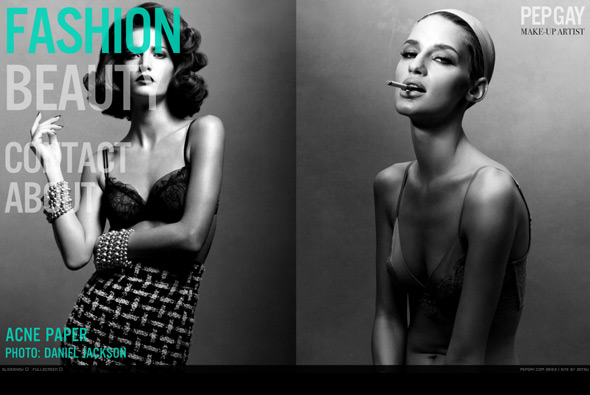
Site of make up artist Pepgay. Nice fullscreen Flash site with some beautiful photography, I like the way two images at a time are displayed – many really full of colour and depth. Nice bold typography and bottom thumbnail scroller, also like the way when you mouse over to the left the menu fades up – so when your mouse isn’t active you can see the images in all of their glory. A good example of a portfolio which is slick, stylish, and to the point.
Created by 2otsu – Oriol Bedia.
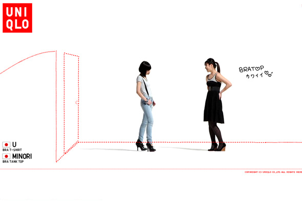
Site promoting Uniqlo’s range of bra tops. As usual Uniqlo provides another cool microsite promoting a new product, this time videos of 100 women talking about the bra tops. On top of this content is a layer of red dotted lines which draw things over the screen and ask simple questions about bra tops, at any time you can find out more about the products on display. Presented in a slideshow type way, as with many of Uniqlo’s online work you can sit back and watch, it’s clean, cool, and so so simple.
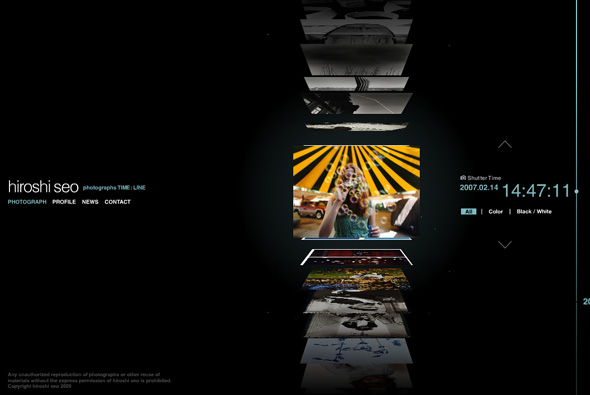
Portfolio site of photographer Hiroshi Seo. Slick timeline based interface which allows you to quickly scroll through thumbnails of his photos. Each of the thumbnails are 3d and flip upwards, much like a vertical coverflow interface, and organised upon time – on click the photo enlarges. Really like the scrolling interface, and the whole minimal slick look & feel. All in all a very nicely made photographers portfolio with some really nice touches with smooth fluid animation, nice interface that fits the content well.
Created by Murakami Design.
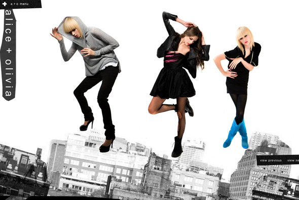
Cool playful site of clothing label alice + olivia. Really simple with a touch of surreal, each section of the site has objects which can be thrown around the screen, bouncing off the sides of the screen and each other. Even when viewing the collection you can pick up and throw around the models. Nice and clean and simple, to the point yet fun and playful.
Created by designedmemory.
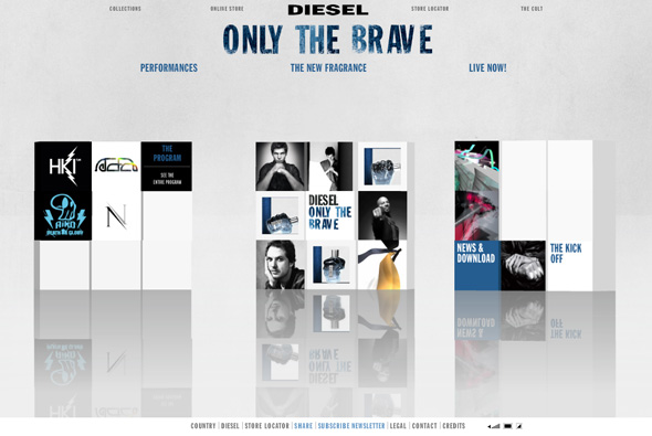
Site of Diesel’s new fragrance, ‘Only The Brave’. Based around a series of 3d cubes featuring ‘performances’ when opened show 3d rooms with video and designs featuring work by the likes of Mr Doob, Nico Stumpo, Eboy, and Hellohikimori, and many more to come over the next few months. You can also see the print ads and see the bottle the fragrance comes in. Yes another 3d site, this is quite nice though, it’s a cool idea to use modern digital artists to create the 3d rooms, the rooms themselves are pretty interesting, although unfortunately it just reminds me of the Absolut ‘In an Absolut World’, but essentially they have put their own spin on it. Also they have used a physics engine on the 3d blocks, so when each section loads the boxes interact with each other, overall a nice site!
Created by Hellohikimori.


