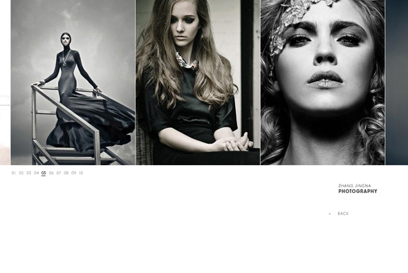
Portfolio of photographer Zhang Jingna. Clean, elegant design with beautiful photography, set in an interface that suits the work well. Simple interactivity, easy to use and nice simple, elegant animation.
Created by do not design.

Portfolio of photographer Zhang Jingna. Clean, elegant design with beautiful photography, set in an interface that suits the work well. Simple interactivity, easy to use and nice simple, elegant animation.
Created by do not design.
Another fantastic website from Uniqlo, promoting their 2009 collection. Presented with a full screen video with models walking on a giant cross, wearing Uniqlo clothing, with numbers and markers highlighting the style number following their movements. When you click on a style another video loads with the model walking alone along the giant cross, allowing you to see in detail what they are wearing. Cool music and nicely shot video assets, love the transition from the main video to the individual videos… very cool.
Website promoting Nestlé ‘Born Better’ bottled water range. Placing you in 3d panoramas where you scroll around to pan your view of mountain vistas. Nicely designed with a great drag and pan mechanism, slick animation and a pretty good attention to detail.
Created by Your Majesty & McCann Worldgroup.
Site promoting Sprite’s ‘Step Off’ competition across the USA. Fresh, fun modern design, with a clean interface – full with loads of animations, transitions, interactions and effects.
Created by Juxt Interactive.
Site of the Fall Winter 2009 collection of Filippa K. Posing the question ‘What inspires you?’, and offering a floating sea of tags, once you click a tag a series of photographs are arranged highlighting the range with some hotspots appearing. In each of the hotspots certain aspects are displayed, i.e. the item, or videos showing the ocean and so on. It is good to see a site showing a personality and a considered style when presenting the range and indeed the label, interesting way of navigating too.
Created by Daytona.
Site showcasing SAAB, it’s history and philosophy, with the aim to show the audience SAAB’s perspective. Nicely designed and produced beautifully this simple site has several small interactive experiences highlighting certain features of the car. I really appreciate the minimal design, well considered layout, with fantastic assets and playful interactivity, one of the best examples of the ‘desktop’ interface I have seen – great attention to detail.
Created by Acne Digital.
Promotional site of the Bubblewood concept store in Paris. The main focus is on the ‘bubble’ menu which in the centre of the site is the fun element in a bold and typographic based interface. When clicking on a section your view zooms in with typography composing the background, each section different from the next. Nice looking and fun site.
Created by Vertu.
Video site of band Fat Freddys Drop. Very simple site allowing you to view videos and compose sequences from the clips dropped onto the table. I really like the polish of the site, it looks great and there is a nice attention to detail, in particular the rollovers on the videos and dragging action…
Created by Resn.
Site of Zeebee, a self declared ‘one man studio’ a talented Flash guy. Slick and nicely animated and well coded this site showcases the guy’s professional and personal work. Lovely sense of 3d and great 3d animation and transitions. The circle of his work is great fun just to play with and interactive with.
Portfolio site of Art Director Chris Bartsch. Simple nicely formatted and designed portfolio with some clever touches – I like the option to download viewed projects as a pdf also.
Simple site promoting the NSW Collection Fall 2009 from Nike. Very minimal and focusing on video and photographic details of the clothing. Love the slow motion of the models running and then the transtion between full motion and slow, nice visual effects too. Cool rollovers on the full shot of the items, and nice art direction, with new videos released monthly.
Created by OrdinaryKids and Dual Forces.
Site of clothing shop Daffy’s. Makes use of bold typography and imagery to maximise impact. I like the animation and transitions between sections, feels very fresh and modern.
Created by Freedom + Partners.
Portfolio website of photographer Andreas Smetana. Nice and simple layout with fluid animation, using your mouse scroller you can flow through the thumbnails – when you click on one you get a full screen image which you can scroll around. I like the fluid movement and the little animated touches which gives it something more. Some nice photos in here…
Created by Cassius Clay and Canvas Group.
Website with a great little game which warns you not to ‘touch’ the bottle, promoting from what I can tell a new deoderant. When you click on the bottle it explodes, you then have 5 minutes to put it back together via an ingenious game, similar to the recent 3d game for Pearl Jam. By clicking and dragging a peice of the bottle you can rotate around and find the place it should be in. Really like the intro and the section before you click on the bottle, nice art direction and fantastic execution, great fun.
Created by GrupoW and Papervision creator’s new agency HelloEnjoy.