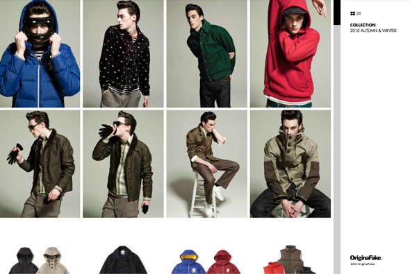
Nice little site for Japanese label Original Fake. Very slick and fast animation bringing to life a minimal interface. You can view the collection or look at the newest additions to the set, view by grid or by full screen. The zoom function is well implemented, and the fast smooth transitions are really nice.
All posts by Dan
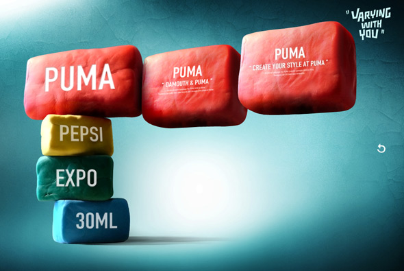
Portfolio of Chinese interactive art director Yong. Using hand made clay models to form the basis of his work it is beautifully realised, from fantastic clay animation to his work realistically modelled onto blocks of clay. Amazing animations, design, and style all coming together to make a fun, beautiful website.
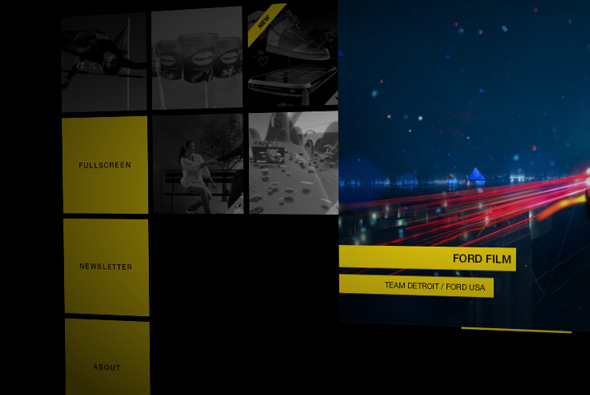
Site of Scandinavian agency hellodave! Set in a slick dark interface with 3d panels flying around moving with your cursor. By clicking on the thumbnails all of the panels reorganise to show a video player for that project. Really nice animations and transitions – love the camera movement with your mouse – it is very very smooth, and the shading and lighting is well executed. Very nice…
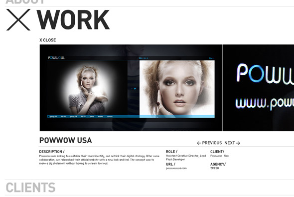
Clean, slick, and simple website of Brazilian Creative Director Taua Baccarin. Showcasing his best work in a nicely laid out grid, highlighted by the smooth animation that really brings it all to life. The work is presented nicely in a sideways scrolling contact sheet style. Great combination of nice layout and great animation – good example of portfolio site.
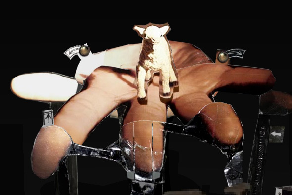
Beautiful website promoting the release of an album collaboration of Dangermouse, Sparklehorse, and David Lynch. Set in a dark 3d world, where exploration is the key, a card pop up interface unfolds before you. By dragging parts of the cardboard world you reveal content, new imagery, video, and sounds from the album. I love the way you explore, clicking and dragging forwards zooms in/out, and dragging left / right pans around. The lighting also changes with the depth of your viewpoint, and it changes on the cardboard pieces that you drag around – really incredible attention to detail. The feeling of depth is incredible, giving a great sense of ambience and setting a fascinating scene. The setting is fantastic, it works like a charm, and it looks stunning, really refreshing work…
Created by WEFAIL.
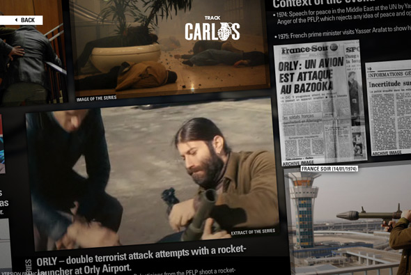
Site promoting the new TV series about ‘Carlos’ a terrorist. Follow the trail of Carlos throughout the world and see where key events happened. Really slick site with incredible execution throughout. Love the 3d globe, clicking zooms in to various locations, similar to Google Earth, to give a montage of material about the event with press clippings, video clips, and so on. The montage itself is nicely laid out and you can pan your view around to reveal more items giving each location a back story. The level of detail is quite incredible, with seamless transitions from the 3d globe to the end scene, well designed, amazing animation and polish, really great work…
Created by BETC Euro RSCG, Douny, and Circus.
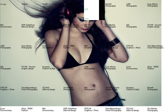
Very cool site of photographer & art director Jaoa Sousa. Set within a grid of labelled projects, the preloading itself is very cool, is a sea of work Le-Joy has created. Rolling over each thumbnail instantly displays that project and changes the thumbnail to navigation buttons, keeping your mouse still for a few seconds hides all the navigation and grid. When each image appears it is mapped to a 3d surface and animates nicely into view. A superb, stylish portfolio of really nice work, different but familiar, really cool…
Created by Pacifica, Netexpect, and Pedro Lima.
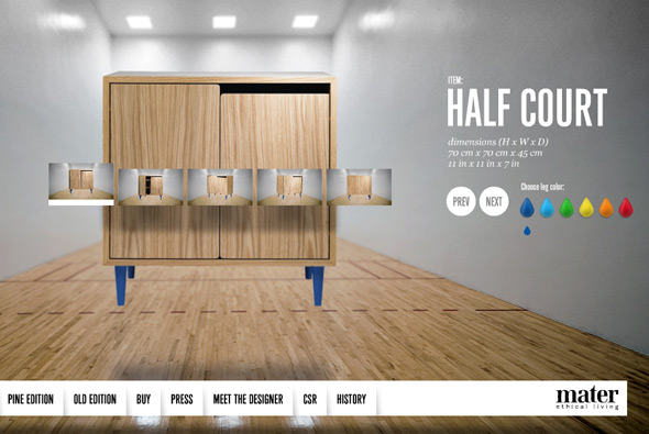
Interesting site for Mater furniture promoting their ‘gymnasium’ range of furniture. Very simple, but fun exectuion, brought to life with slick animation. Set in a large gallery-esque space with a nice layout and fun interactivity. The animations are really cool with lots of polish throughout.
Created by Pelle Martin and relax, we are the good guys.
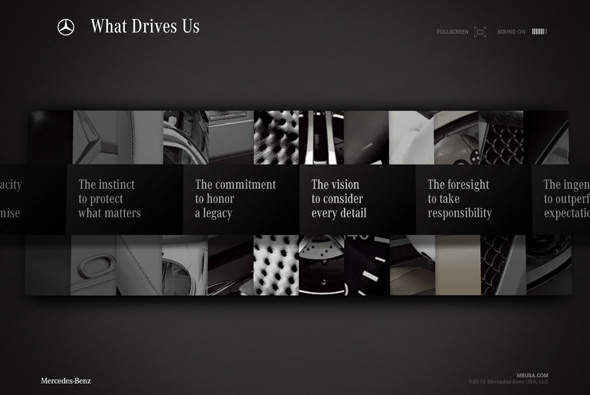
Simple & slick branding site from Mercedes Benz USA. Featuring an array of videos and images wrapped around a smart 3d interface. I really like the 3d menu system that is very modern and sleek but remaining easy and fun to use. Some nice content here too, all with a thick layer of polish.
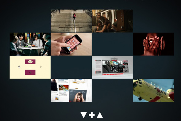
Slick portfolio of the Danish Villads + Ammentorp. Very simple layout, brought to life by the fast and smooth animation and interactivity. Highlighting the duos best work in a really effective way – straight to point with a bit of polish.
Created by I Like To Play…
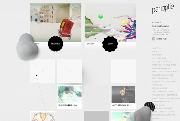
Website of French agency Panolie. Pretty interesting, standard layout but all with a twist and some injected personality. The scrolling up and down also brings weird blobs and interactive things onto screen, all adding a nice feeling of depth. Clicking on a project and clicking left/right shows a really cool 3d cloth effect. Nice attention to detail and a bit different.
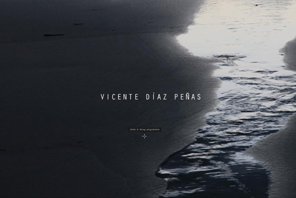
Website of photographer Vicente Diaz Penas. Quite normal, until you click and drag, then you see that the photos are mapped to a 3d surface to give the impression of depth. On some images it works really well, a very interesting effect, a nice concept…
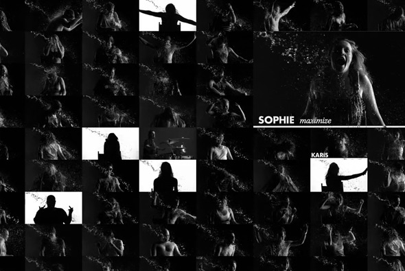
Really cool interactive music video from Shihad with their latest single. 100 Shihad fans were invited to take part in a music video, and were filmed in slow motion whilst being ‘tortured’. The results are a wall of individual videos which you can watch and interact with. Beautifully shot and fun to watch, very stylish with black and white. I love the way the video flips from silhoutte to detail, white and then reverse, you find yourself watching it again and again!
Created by Oktobor and Sam Peacocke.
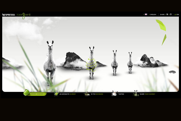
Site of Nespresso’s newest flavour ‘Tanzaru’. Essentially an interactive musical slideshow – really interesting style, with parallax scrolling and depth of field, giving a feeling of the kind of flavours and influences the coffee has. When rolling over the various items in the scene they play different sounds – so along with the background music a fun interactive composition is created. Really nice visual style and great animations and interactivity, very cool.
Created by Soleil Noir.

