Yearly Archives: 2014

VW.com

By | @deutschinc | No Comments

vw-1
vw-3
vw-2

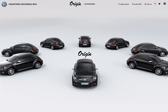
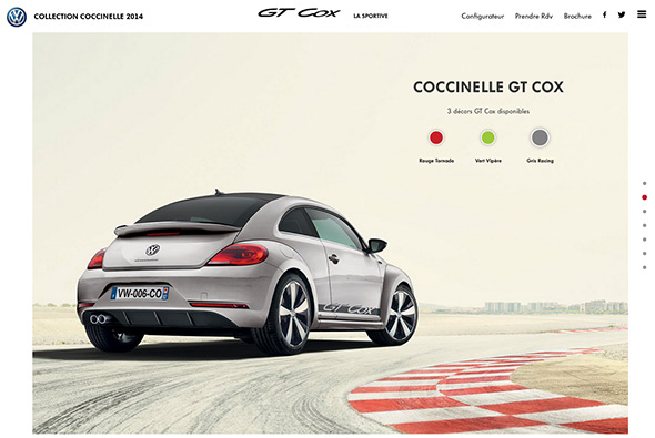
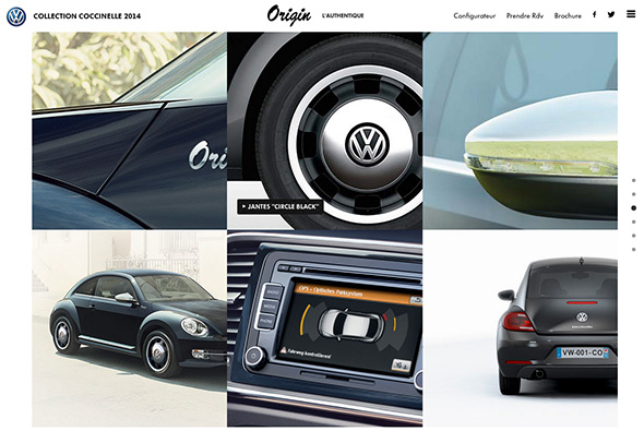
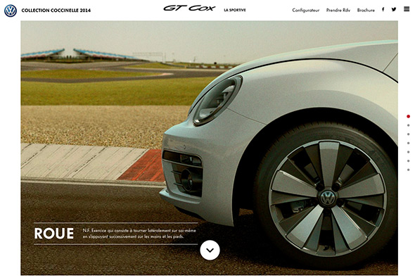
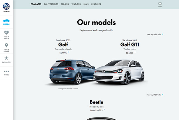
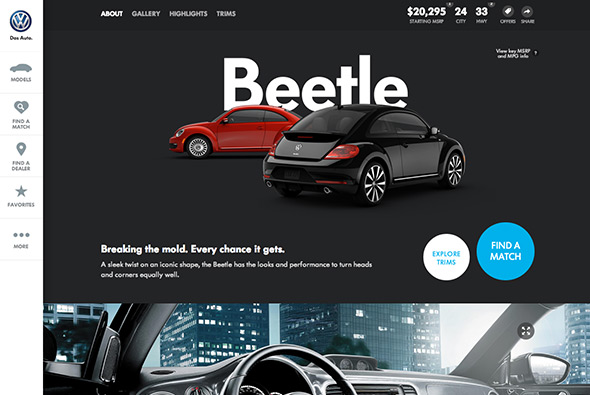
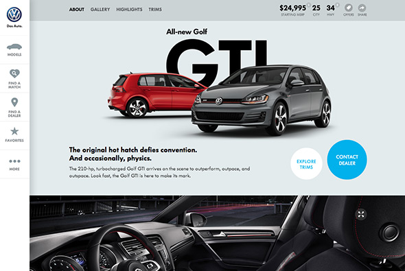
New responsive site for Volkswagen. So many small details to admire, the simplified navigation – to the side – expanding on pressing ‘more’ – so it remains elegant and does not over clutter the screen. Ultra stripped back models page, with the dynamic angles of the cars keeps it interesting. The full screen find a dealer feature – the real time stock inventory – the ‘find a match’ feature – the preloader that runs across the top of the page – the small legal disclaimers that slide up from the bottom of the viewport. Admittedly the site is for the US market, but still car sites are incredibly complicated and this site is really at the modern edge end of the spectrum. It looks lovely and stripped back as much as possible and responds well to different devices.

Created by Deutsch Inc (@deutschinc).

Site here…

VW Beetle – Collection Coccinelle

By | @BonhommeParis, @DDBParis | No Comments

vw-collection-1

vw-collection-2

vw-collection-3

vw-collection-4

Site for the Coccinelle Collection of VW Beetle’s. Full of videos and interactive content – lovely homepage carousel – a bit different to usual – in this case a 3d rendering of the cars in their natural habitat. The detail pages are lovely – a bit of subtle parallax along with interactive elements such as allowing you to change the colour and so on / 360 degree sliders etc. Elegant design and layout, brought to life with nice animations and transitions.

Created by DDB Paris (@DDBParis) and Bonhomme (@BonhommeParis).

Site here…

OK Kid

By | @LafondBenoit | No Comments

grundlos-1

grundlos-2

grundlos-3

New EP from German band OK Kid. Love the way the video grid builds up, bringing in one video at a time, and the cool little transitions that reveal text and so on. Lovely transition to the track playing and so on, nicely thought out. For a bonus – it’s also responsive – nice work.

Created by Benoit Lafond (@LafondBenoit).

Site here…

McColl Center

By | @studiobanks | No Comments

mccoll-1
mccoll-2
mccoll-3

Lovely responsive site for the McColl Center, which is a center “for Art + Innovation empowers artists to advance community through the creative process.” this is their site. Looking more like a design magazine it is beautifully designed – from the typography to the layout and photography, all feeling very fresh. Proof that responsive design does not have to be boring and boxy.

Created by Studiobanks (@studiobanks).

Site here…

Stylepit S/S14

By | @uncle_grey | No Comments

stylepit-1
stylepit-2
stylepit-3

Short and sweet lookbook of Danish fashion brand Stylepit. A slow motion video scene of a train pulling into station, your view looking onto the platform and seeing a diverse range of people wearing the products. You can click and drag the scene to change your view – and see more people and clothing. Really nice simple idea and fun execution and it looks great.

Created by UncleGrey (@uncle_grey) and B-Reel (@B__REEL).

Site here…

Jam3

By | @jam3 | No Comments

jam3-1
jam3-2
jam3-3

Lovely new site for Jam3, Toronto based digital agency. Fully responsive, but the desktop variant is alive with lots of animations and transitions that bring to life a lot of the work. So much attention to detail and craft has gone into and it shows! The project pages are interesting and well formatted, and the animations bring it life. Lovely, dynamic example of a responsive agency site.

Created by Jam3 (@jam3).

Site here…

Quechua – S/S 2014

By | @Akaru_Agency | No Comments

quechua-1
quechua-2
quechua-3

Site for Quechua and a lookbook for their S/S collection 2014 of outdoor clothing. Shown from a video perspective in different locations in New Zealand, watching the videos heroes the clothing and equipment on offer – clicking at any time shows the list of equipment on offer. Love all the transitions and attention to detail and so on, such as the homepage and the slide out menu everything feels slick and well put together.

Created by Akaru (@Akaru_Agency).

Site here…

Photomap

By | @__chriswang | No Comments

photomap-1
photomap-2
photomap-3

Site from Chris Wang, a designer & art director, created to showcase his photography. Looks great and is full of elegant animations and transitions, love the typographic masking on the homepage. Lot of nice touches that bring to life the photography, love the preloader for each of the sections while the images in the set load, and again the transitions between the photos. Top class stuff…

Created by Chris Wang (@__chriswang).

Site here…

Zulu

By | @zulfeekar | No Comments

zulu-1

zulu-2

zulu-3

Portfolio of ‘Zulu’ a creative developer. Super simple and minimal, brought to life with slick animations and transitions. Love the way the projects appear and you can cycle through each of them, he has got a keen eye for animation and it all feels very polished.

Created by Zulfeekar (@zulfeekar).

Site here…

CROWD

By | @webdesign | No Comments

crowd-1

crowd-2

crowd-3

Site of CROWD, a Barcelona and London based studio that have a diverse body of work. Very colourful and bold styling, and a very simple site that links out to Behance projects or has embedded Vimeo videos. Nice to see something a bit different for a agency portfolio.

Site here…

Welcome To The Experiment

By | @webdesign | No Comments

quiet-ones-1
quiet-ones-2
quiet-ones-3

Site promoting the new film ‘The Quiet Ones’. Essentially an interactive trailer that takes you through the premise of the film, through short interactive scenes – i.e. opening the door, turning on the lights etc. Lots of ambient sound fx, full bleed videos and imagery really provide an immersive experience – much better than a basic site with the cast / stills / trailer and so on.

Created by Hybrid Studio.

Site here…

Genealogy of Nike Free

By | @SEHSUCHT | No Comments

nike-free-1
nike-free-2
nike-free-3

Site showing the genealogy of Nike Free trainers through intricate 3d models of key Nike free models. The detail on the model is incredible, with each part of the shoe rendered with Web GL. Attention to detail is great, the noise layer and colour hues at different edges of the Y axis. Nice to see something a bit different to show off some shoes.

Created by SEHSUCHT (@SEHSUCHT).

Site here…

Benoit Challand

By | @hermetikstudio | No Comments

challand-1
challand-2
challand-3

Portfolio site of 3D Artist & Illustator Benoit Challand. Really nice portfolio of work wrapped up in a responsive site sprinkled with elements of delight. Love the main screen with the bold typographic layout highlighting latest project with the remainder of the projects sitting below in a fun multi layer layout. Really nice palette of colour highlights for the projects and I love the transitions to and from the various sections. Really fresh, modern, and well executed example of a portfolio site.

Created by Jerome Bodin (@hermetikstudio) and Leo Cheron (@mrgnou).

Site here…