Yearly Archives: 2008

Diesel V

By | WEBSITES | No Comments

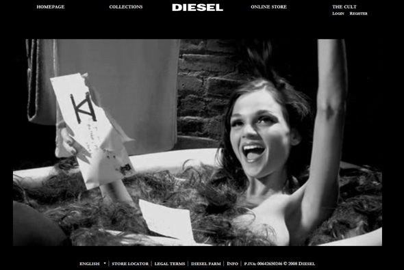
Latest site feature for Diesel – V. A bizarre, surreal suite of videos that show a woman bathing in other people’s hair (you can send some to her also), a puppet made of meat, and strange dance contests, amongst others. No slick designs or interactions, just these videos. Lots more background info from Creativity Online:

“The video content effort is the first from Swedish shop Farfar as Diesel’s AOR, after the much-awarded Heidies “15 MB of Fame” and a nine-shop pitch to win the business earlier this year, and consists of several shows. “Dance Party,” the aforementioned twisted reality show, brought a group of dancers into a basement studio and then forced them to dance, hooded, with a soulless voice directing them. “Corner Time” sees a series of various hucksters dispatch self-improvement methods, “Pete the Meat Puppet” chronicles one carne character’s rise, fall and rise again and “Hair Bath” sees a heavy-lidded hostess implore viewers to send their hair to a P.O. box in Hillsdale, New Jersey so she can lounge in the tub with it.

A team from Farfar joined Legs at Milk HQ as they shot elements of the campaign inside the gallery/fashion/casting/production hub, going for a black and white, vintage feel for the strange tales, which have a feel to them not unlike John Waters meeting Tay Zonday in a Toys-R-Us unisex bathroom. The brief, the collective writes, was “a black and white 30-page PDF with super ambitious ideas for content of all shapes and sizes from short films to propaganda pieces to live interactive shows, all making up this surreal and mysterious internet TV station.”

Nice to see Diesel continuing the trend to push the boundaries of interactive work, and work by FarFar is always good to see.

Created by FarFar.

Website here…

Hipopotam Studio

By | WEBSITES | No Comments

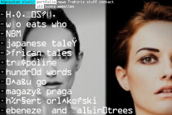
Website of Polish agency Hipopotam Studio. Heavily pixellated full screen video forms the backdrop for a stylish interface that is like an old video game menu. When interacting with the menu items screen grabs & videos of the portfolio fills the screen – nice interaction and interface, and a stylish look and feel.

Site here…

Oliver Daxenbichler

By | WEBSITES | No Comments

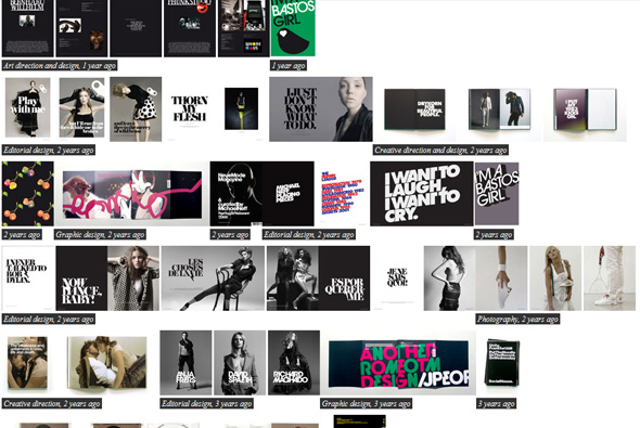
Portfolio of creative director and designer Oliver Daxenbichler. Nothing ground breaking in terms of site navigation and design – just a nice, really simple, minimal site that shows off his work quickly, cleanly and with great effect. Nice work too… 

Site here…

Mille et un Reves

By | WEBSITES | No Comments

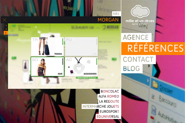
Portfolio of French studio Mille et un Reves. Formulaic but still – it’s nice! Large images of the studio form the backdrop, nice menu system and transparent text, videos and screen grabs show off their projects. Nice animation and easy to use and slick navigation.

Site here…

Audi – Vorsprung durch Technik

By | WEBSITES | No Comments

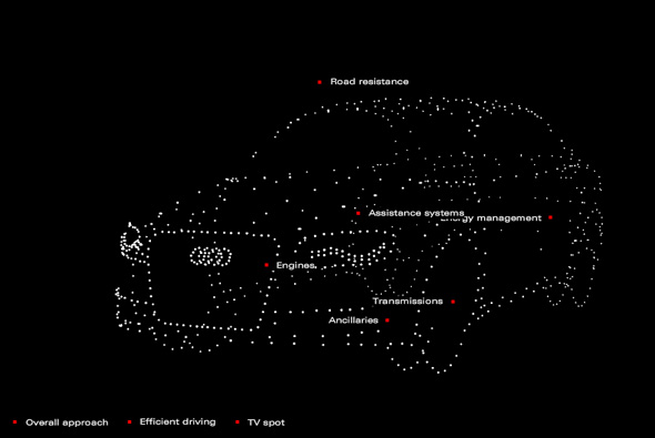
Incredible Flash 3d particle execution promoting Audi and their efficiency. A series of mesh like structures make up various shapes to visually represent a 3d model, which you can interact with and move around, i.e. when you click on ‘engines’ the dots form up a model engine. Presented in a very simple black and white minimal interface the particles are well presented. Looks a lot like scatter radar, and similar to the 3d interactive Radiohead video. I have been loving the boundaries Audi and their digital agencies are breaking with their creative work, inspirational and bold. Very nice…

Created by Neue Digitale.

Website here…

Toshiba – The Journey of Innovation

By | WEBSITES | No Comments

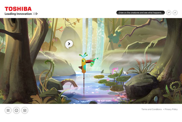
Lovely site promoting the latest Toshiba range of electronics, laptops, cameras and so on. Best explained by Unit 9, ‘An experiential website engaging users through gesture navigation allowing them to spend time with Toshiba’s innovations and products in a new and innovative way. The website detects patterns. Interact by drawing.’

Really like the illustrations and the adventurous approach to navigation and interaction, it works quite nicely, for example you draw a swirl around one of the fish and it changes shape, or draw a zig zag over the characters playing music and the soundtrack changes. It looks great and a nice, positive, non-techy approach to an electronics brand.

Made by Unit9.

Site here…

Vodafone Racing

By | WEBSITES | No Comments

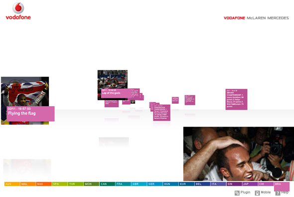
Site showing the 2008 season of Formula 1 team McLaren Mercedes. Nice clean crisp interface that displays photographs and key moments of the season, navigated via a 3D parallax system. You can jump back and forth between the various circuits from Australia to Brazil, with the camera flying through the scene. A nice way of displaying chronological information in a graphic, well structured way. Like the way the camera flies with great speed to the various circuits.

Created by Dare Digital.

Website here…

Bio Bak

By | WEBSITES | No Comments

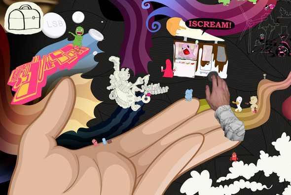
I remember seeing the first version of this site a while back and being very impressed, now v2 is out and it is awesome. Essentially it’s Coen Grift’s portfolio – navigating via a drag interface, zoom in and out with the mouse scroller, you can view the basic information such as biography, contact, etc, but the most interesting part of the site is the little games and puzzles you discover in the ‘explore’ mode. It is a huge canvas – 1000 megapixels – full of great illustrations and characters. Really great attention to detail and very stylish, you really feel that he is not restraining himself and it’s so refreshing to see a totally ‘different’ portfolio. Nicely coded and really intuitive, fantastic!

Site here…

Thoughtpile

By | WEBSITES | No Comments

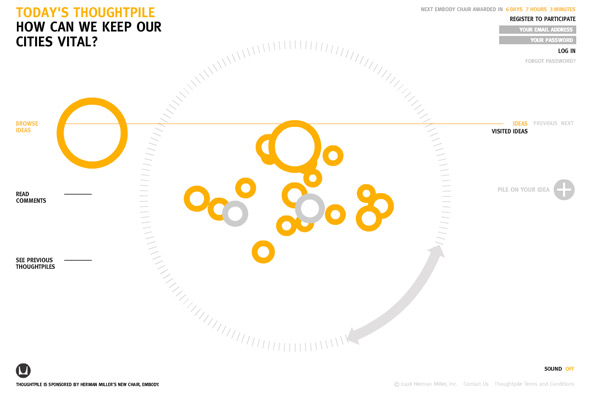
Nice site that presents thought provoking questions and asks the audience to contribute and rate ideas – the best is awarded a Herman Miller chair. Created in a 3d floating interface that allows you to fly through the responses and see how they are rated. A clean crisp interface makes navigation simple and an interesting rotation ‘wheel’ can be dragged around to zoom in/out and rotate the scene. Nicely crafted, simple and effective.

Made by Freedom & Partners.

Site here…

Coca Cola Zero & Nokia

By | WEBSITES | No Comments

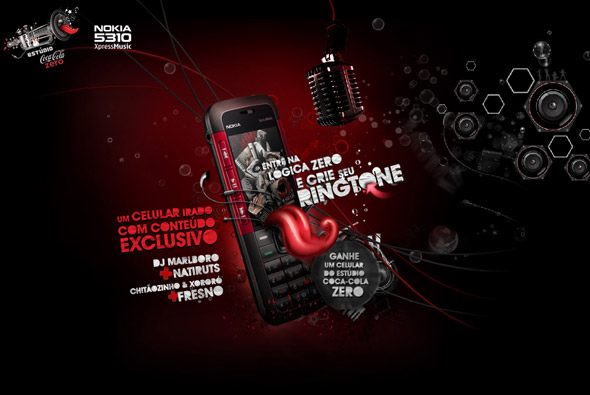
Nice site from Brazil – ‘Estúdio Coca-Cola Zero’. You can record your own message and apply effects to it and send the recording to a friend or download it to your phone to use as you please. Nice parallax scrolling effects and nicely designed and well coded – pretty slick.

Made by Gringo.

Site here…

Offlohi

By | WEBSITES | No Comments

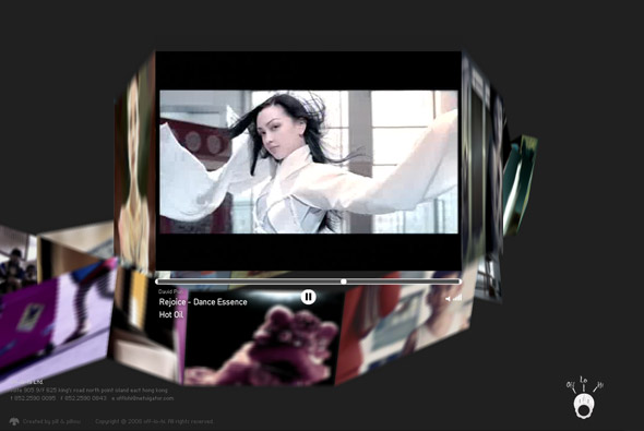
Very cool site of a group of talented directors based in Hong Kong. Their videos are presented in an 3D anamorphic ‘ribbon’ of thumbnails, you can zoom in and pan around, and click on any part of the ribbon to view the videos. Really like the fluid ribbon, and the unique way the videos are presented, its a nice mechanism to play with – cool.

Created by pill & pillow.

Site here…

Samsung Music

By | WEBSITES | No Comments

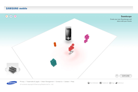
Interesting site promoting Samsung’s music phones. You can create your own 3D ‘soundscape’, the closer various colourful blocks are to the phone the louder their respective sounds are. There is a wide selection of sounds, which you drag around in the 3D space, you can save it and share it and so on, the gallery is quite nice too. I like the idea and the way you can drag the blocks of sound to create a virtual space which you can then explore also in first person perspective, pretty cool.

Made by unit9.

Site here…

Nokia – Somebody Else’s Phone

By | WEBSITES | No Comments

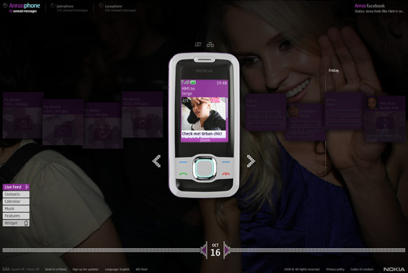
Interesting concept for Nokia – Somebody Else’s Phone. The idea is that 3 people’s phones are on display on the site, you can go through their messages, videos, pictures, contacts, calendar and so on. Each character has a storyline that you can follow in real time across the span of the campaign, even with ‘real’ phonecalls that you can listen to online. They each have a facebook page, some characters have flickr pages and some are interlinked. In typical advertising fashion they are aspirational, i.e. models, good looking, etc etc, their stories are relatively compelling – for example Anna the swedish student moving to London to get money for her studies, she has to model, so we see her going to castings and making friends, sending videos to her boyfriend back home and so on. Of course all at the same time as showing the features of the phone and being the primary tool to view the content.

There is a lot of detail and a lot of content, it’s quite incredible, all well produced and thought out. Not sure how effective it will be as a campaign, with some of the comments shown on this page, it will remain to be seen – but I quite like the concept. Its a good example of using online media to provide storytelling in a digital age, through the use of the very tools we use to communicate. The site looks cool and I like the attention to detail in the execution, interesting…

Made by W+K London and B-Reel.

Site here…

Hotel 626

By | WEBSITES | No Comments

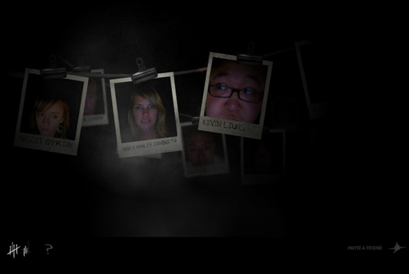
Immersive site, open only from 6 PM to 6 AM, set in a haunted hotel and presented in a first person perspective. The story starts as you awaken and try to escape the hotel, you must complete a series of tasks to get out. These tasks range from clicking on doorways whilst navigating the hotel’s hallways to taking pictures of a ‘thing’ to blind it, to trying not to wake the baby from hell. It all has high production value and is very well crafted, from the sound design to the animation to the video. I particularly like the 3d video and the interactivity (although limited) whilst moving through the hotel, the movement it provides feels relatively realistic.

Its quite intriguing as it’s all for Doritos, under the guise of the ‘Snack Strong Productions’, who just make nice sites and games like this one. There is really little branding involved – just the concept that Doritos the brand is providing enjoyable experiences like ‘The Quest’ that was earlier in 2008.

Made by Goodby Silverstein & Partners, the people behind the famous ‘Milkatraz’ game that was so popular last year.

Site here…