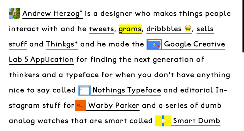
Site for creative Andrew Herzog. Love the statement based approach, with his projects shown inline. Really fun layout full with interesting and creative ideas, love the bold design.
Created by Andrew Herzog (@Andrew_Herzog).
Site for creative Andrew Herzog. Love the statement based approach, with his projects shown inline. Really fun layout full with interesting and creative ideas, love the bold design.
Created by Andrew Herzog (@Andrew_Herzog).
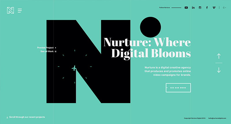
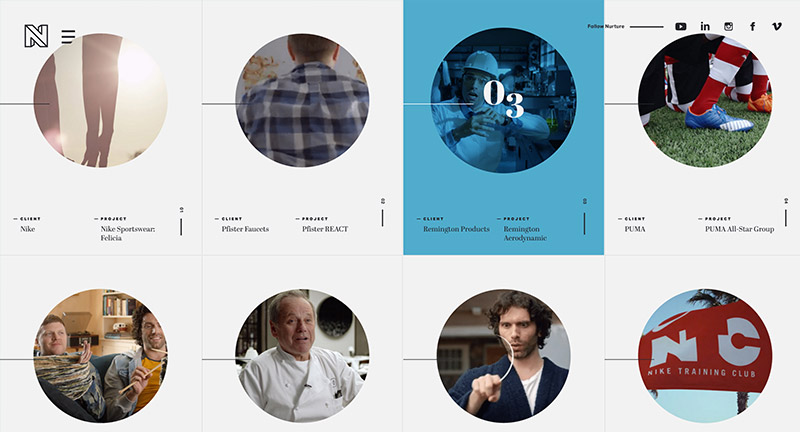
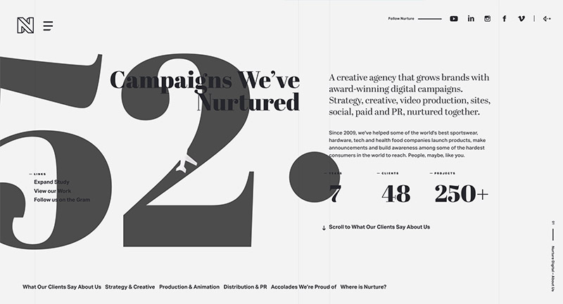
Site for US based digital and video production agency Nurture Digital. Love the masked showreel in the background as you scroll through the background changes with colour and animation – highlighting that project. It is beautifully designed, nice bold typography and full of great detail and animations – love the way the transitions on the homepage to see individual projects. The project view looks great, love the intro panel which transitions to full screen video then detailed panel down the side appears as you scroll. One of the nicest agency folio sites i’ve seen for a while.
Created by Bryan James (@wengerstoybus).
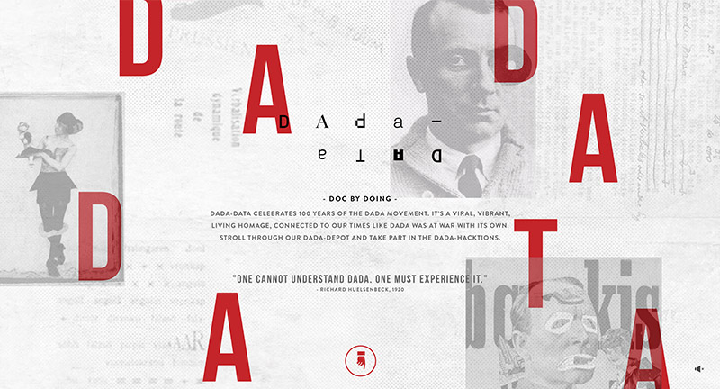
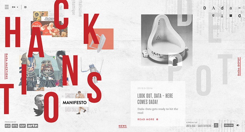
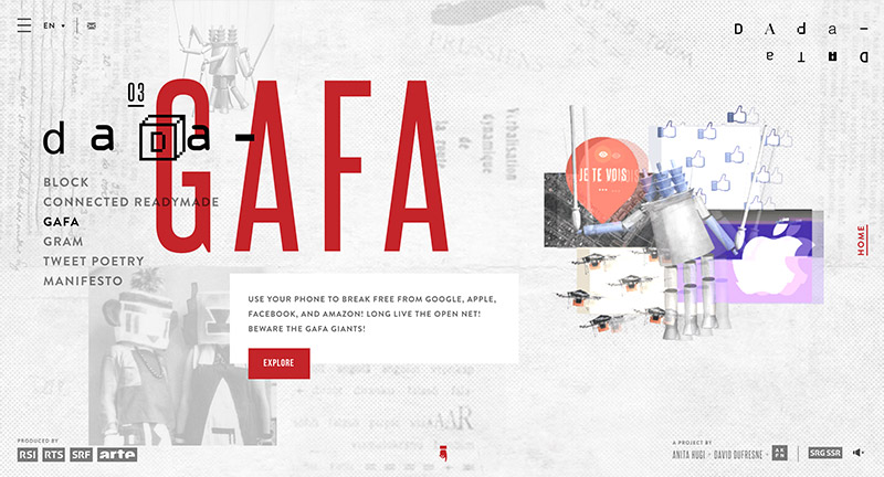
Lovely site celebrating 100 years of the Dada movement. Love the singular large canvas type execution, with multiple layers, imagery, and type – when navigation you scroll your viewport to another part of the canvas. There is a lot of depth to the site, from bizarre interactive games pairing up with your phone through to explorative profiles on artists and history. Beautifully executed and a lot of fun to explore.
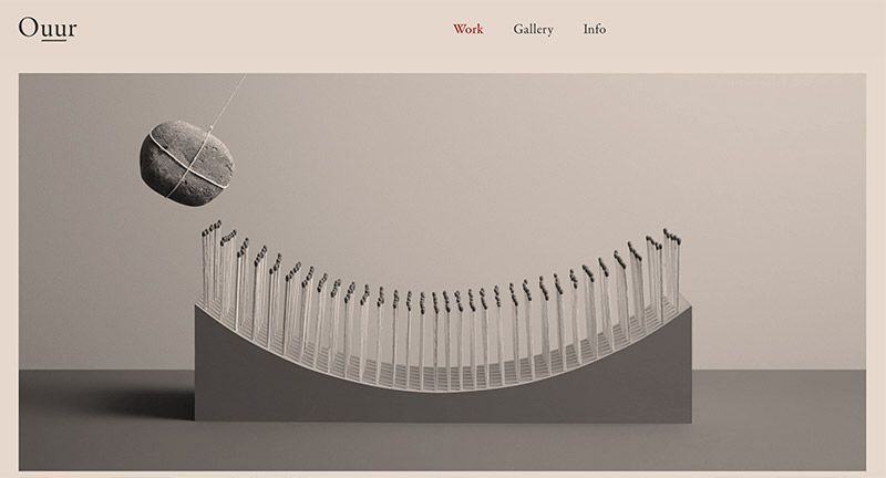
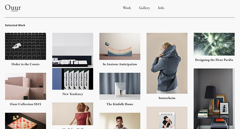
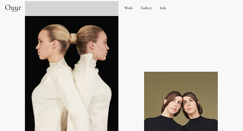
Site for Danish creative agency Ouur. Lovely clean and elegant portfolio of work featuring photography, digital, and editorial work. Love the calm colour wash on the homepage and the offset layout featured throughout the site. The animated gifs add a nice dynamic element to liven it up, combined with the staggered layout it all adds a feeling of energy in the layout.
Created by Ouur & Mario Depicolzuane (@studio8585).
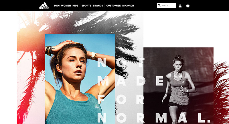
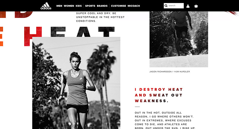
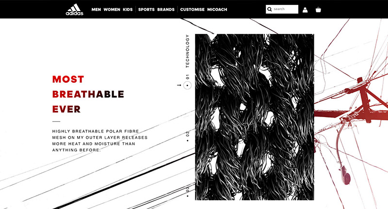
Site promoting Adidas Climazone range of clothing. Nicely designed long scrolling page, lovely use of texture and typography and lots of depth with the subtle parallax effect. Love use of photography, and love the simplicity of the carousels. It looks great on mobile too.
Created by Resn (@resn_has_no_i).
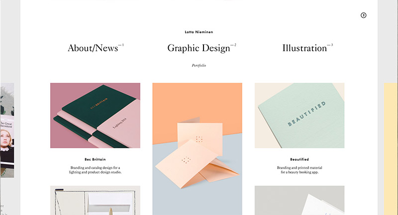
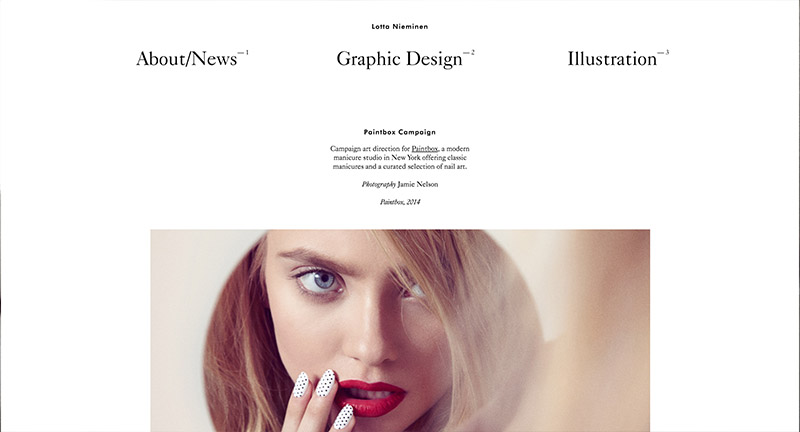
Gorgeous site for Lotta Nieminen, Finnish illustrator and designer. Love the peeking pages on the left and right edges of the site that allows you to cycle through the pages as much as you want. Elegant and simple, the folio does a great job of letting the work shine, everything looks and feels so cohesive with matching colour palettes and styles on the thumbnails. Lovely work.
Created by Lotta Nieminen (@lottanieminen) and Jonatan Erikksson.
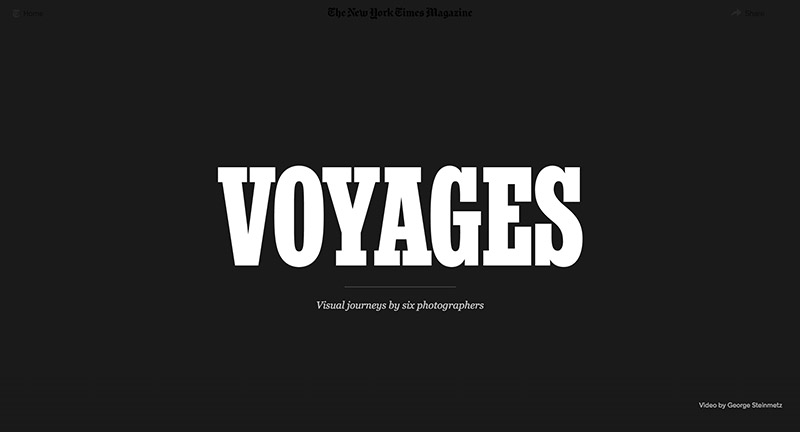
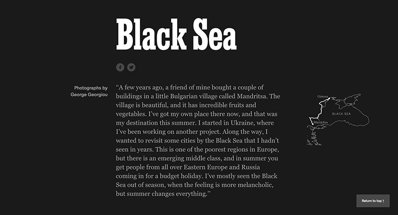
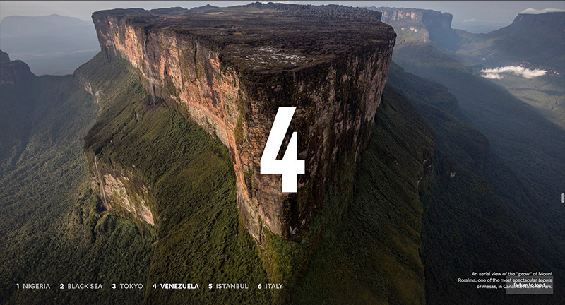
Lovely photo journalism piece documenting six visual journeys in Nigeria, Black Sea, Tokyo, Venezuela, Istanbul, and Italy. Lovely full bleed imagery and video mixed with simple introductions and background to each story. Simple and elegant – really nice bit of interactive storytelling.
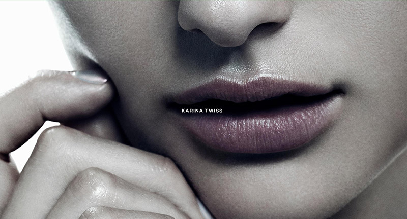
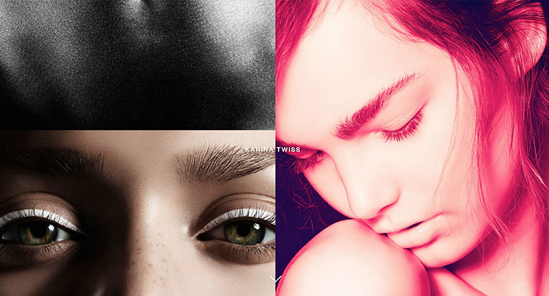
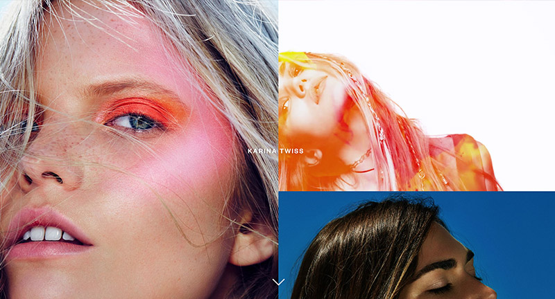

Lovely portfolio of London based photographer Karina Twiss. Love the ultra high res photos that form the background and let you explore the quality of the shots. Love the grid of images, with a mix of animations and videos forming a stunning pastiche of beautiful photography. Nice details such as the minimal menu and zoom out on an image to bring up a carousel. Stunning example of letting the content do the talking.
Created by Studio Thomas (@StudioThomas).
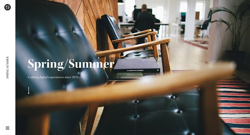
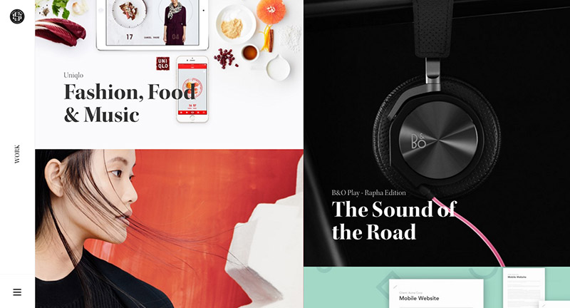
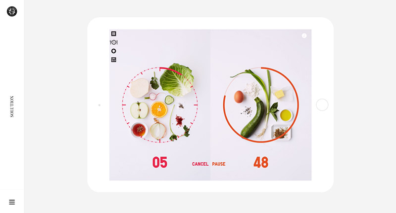
Lovely site of Spring/Summer Danish digital agency. Refined and elegant is a good way to summarise this site – so many beautiful details in here, and with next-level of polish. Love the work section, when you tap on a project the mask and image stretches to fit full screen with a colour hit from the project fills the preloader along the left side of the screen. Nice and subtle transitions for text and interesting integration of a sticky nav on left side of page – which also shows section in page. Love the way the pages transition – and each project case study is really nicely considered, with in-situ videos / animations / sketches to illustrate their process. It translates beautifully on mobile too with an equal level of polish. A fantastic example of a modern agency portfolio site.
Created by Spring/Summer (@SprngSmmr).
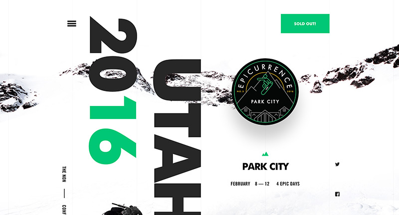
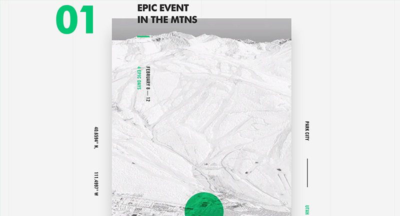
Site of Epicurrence conference of inspirational creative speakers set in Park City, Utah. Great example of a simple one pager site – elevated through stunning design and nice considered use of parallax. Love the bold colour, large imagery, and big type – lots of small nice details – nice.
Created by Rally Interactive (@letsgorally).
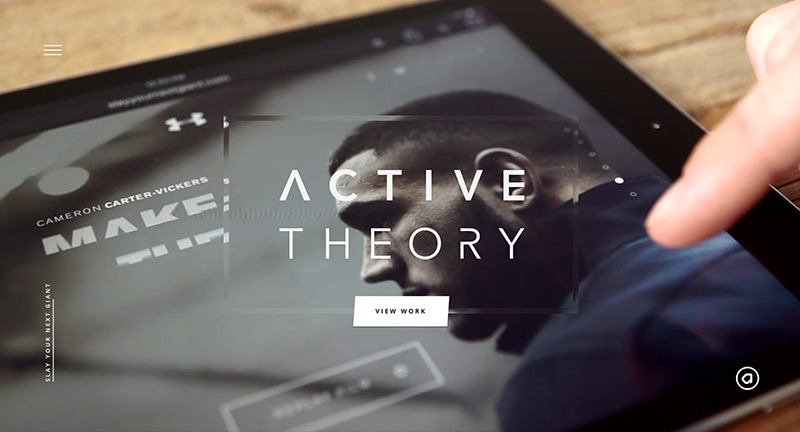
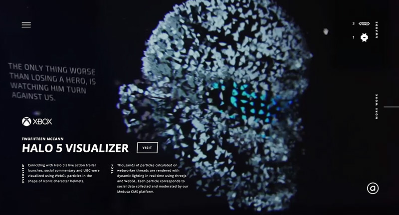
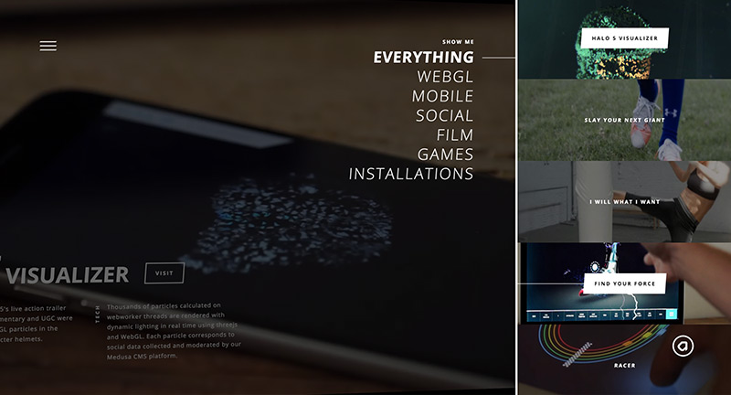
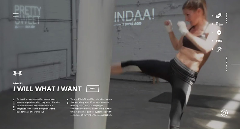
Lovely update to digital agency Active Theory. Nice approach to the homepage – full screen case study video clips cycle through their latest projects. Dive into the work and find a similar setup – screen captures and videos – letting you see the magic. Love the slide out projects menu on the right, fantastic scrolling effect where the mask moves quicker over the underlaying image. The site is full of detail and great interactions, animations, and transitions – love the peeking strips on projects on the project view – the main menu features a cool 3D logo – lots of cool particle rollover effects. Great attention to detail and a fantastic example of a modern, fresh and beautifully executed site.
Created by Active Theory (@active_theory).
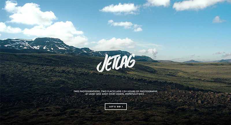
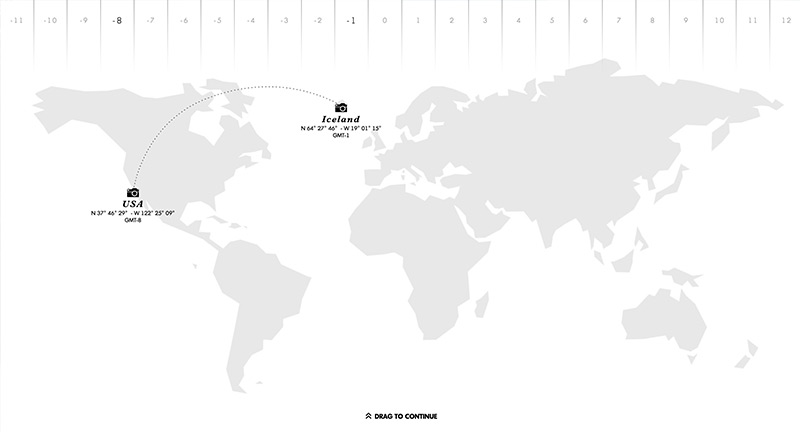
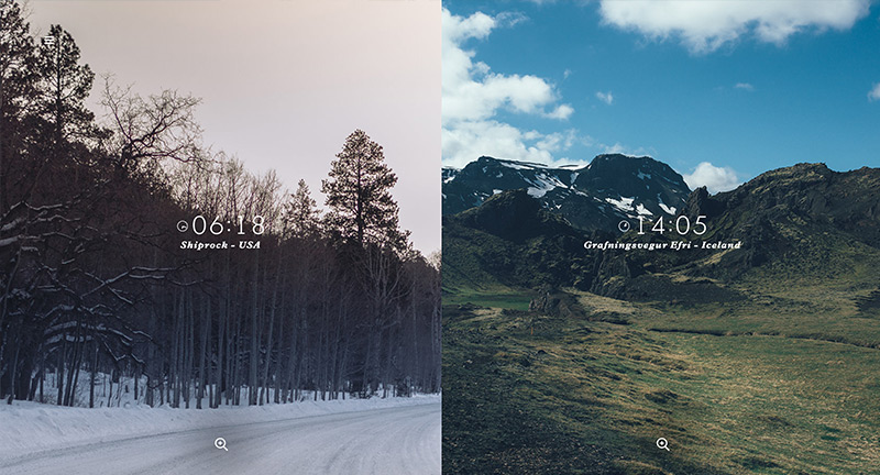
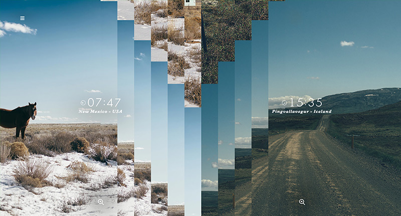
Lovely photography site with the interesting idea of having two photographers shooting at the same time over 12 hours in two different places in the world. The results are wrapped up in a beautifully designed and executed site full of nice details. At it’s heart is beautiful photography – love the dynamic time stamp and the juxtaposition of the photos – love the slices which transition into one another. All so elegant and simple, and these small interactions are what really brings it to life.
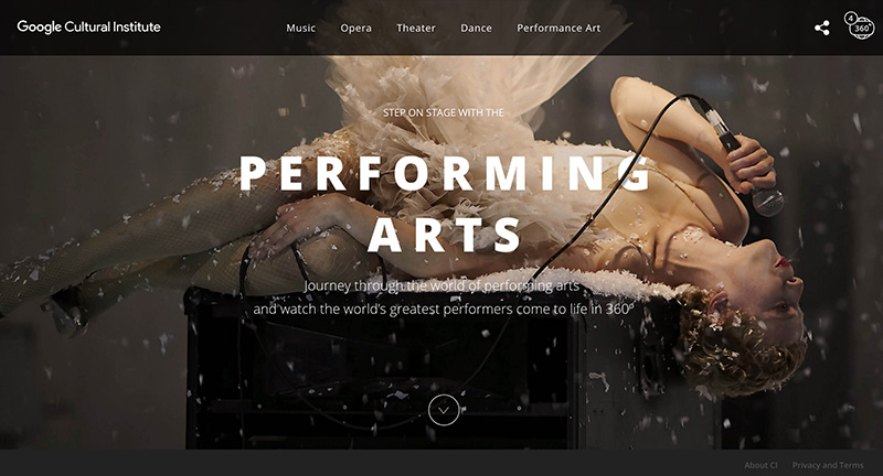
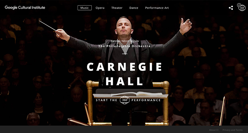
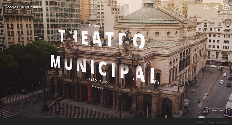
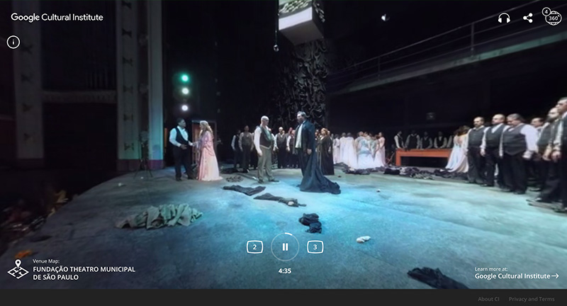
Site for Google’s Cultural Institute. Teaming up with some of the worlds most iconic venues and performances experience these moments from the stage in 360 video. Lovely type treatment and nice bold imagery, love the 360 video which really dives you into the experience. One of the things I love about it is how nicely it works on mobile, with an option to use your gyro or swipe to scan around the environment. Nice work.
Created by Google Brand Studio (@google).
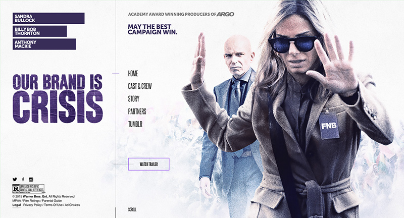
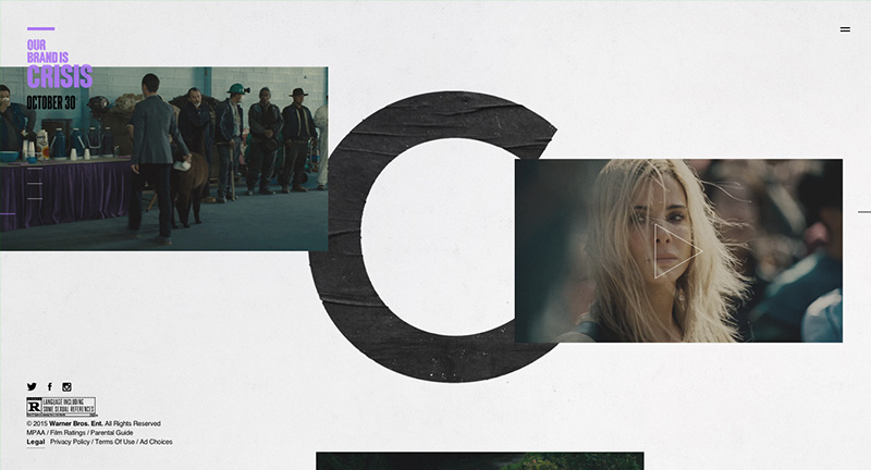
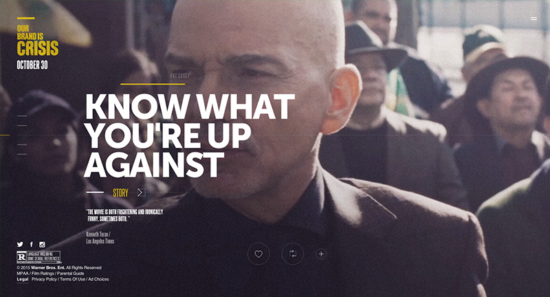
Site promoting the new film Our Brand is Crisis. Beautifully designed, with a cool navigation mechanic – sliding panels bring in more info when needed. Love the full screen video and bold type driven layout. Cool integration of a Tumblr blog too – fun and great looking site.