
Interesting game where you direct particles to fill sound bars – making a nice melody along the way. Variety of different levels, nice idea which is crafted well in Flash.
By Cipher Prime.
Interesting game where you direct particles to fill sound bars – making a nice melody along the way. Variety of different levels, nice idea which is crafted well in Flash.
By Cipher Prime.

Incredible website that emulates the Roland set of synthesisers, drum machines, effects pedals and so on. You can control everything from which components you use to the tempo, rhythm, to effects – all to make compositions and sound effects. You can create a profile and save your creations and even download 5 minutes worth of material. Incredible amount of detail – you control all of the individual knobs and buttons, drag leads into mixers and boxes – and it looks great too. An example of how complex you can make Flash 10 applications…

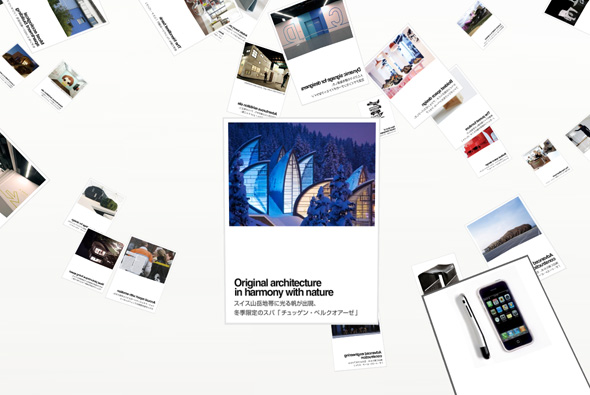
Portfolio of creative director and designer Oliver Daxenbichler. Nothing ground breaking in terms of site navigation and design – just a nice, really simple, minimal site that shows off his work quickly, cleanly and with great effect. Nice work too…

Incredible Flash 3d particle execution promoting Audi and their efficiency. A series of mesh like structures make up various shapes to visually represent a 3d model, which you can interact with and move around, i.e. when you click on ‘engines’ the dots form up a model engine. Presented in a very simple black and white minimal interface the particles are well presented. Looks a lot like scatter radar, and similar to the 3d interactive Radiohead video. I have been loving the boundaries Audi and their digital agencies are breaking with their creative work, inspirational and bold. Very nice…
Created by Neue Digitale.

Site showing the 2008 season of Formula 1 team McLaren Mercedes. Nice clean crisp interface that displays photographs and key moments of the season, navigated via a 3D parallax system. You can jump back and forth between the various circuits from Australia to Brazil, with the camera flying through the scene. A nice way of displaying chronological information in a graphic, well structured way. Like the way the camera flies with great speed to the various circuits.
Created by Dare Digital.

Nice site that presents thought provoking questions and asks the audience to contribute and rate ideas – the best is awarded a Herman Miller chair. Created in a 3d floating interface that allows you to fly through the responses and see how they are rated. A clean crisp interface makes navigation simple and an interesting rotation ‘wheel’ can be dragged around to zoom in/out and rotate the scene. Nicely crafted, simple and effective.
Made by Freedom & Partners.

Photography portfolio site showcasing photographs in a 3D environment. Clean and simple interface allows the photographs to speak for themselves, drag and rotate to view the photos from different directions. I particularly like the way you rotate the camera to get different angles, it gives the site a lot of depth and allows you to see the images in a fun way.
Made by Kinetic Singapore.

Campaign site promoting the new IKEA catalogue in Germany, released in September, as the name suggests: ‘Waiting for September’. It followed the days leading up to the release, where Nils sits in his flat and is visited by friends, does things, answers phone calls from the public, interacts with users on his laptop, and so on. Over the days we see the room change when finally the new cataloge is released and we see his flat tranformed with IKEA products.
Presented in a full screen format you see the live camera footage from a choice of 2 angles, you could also embed the live feed into your blog and so on. Very similar to the Diesel Heides campaign site but taken a few steps further. Its effectiveness lies in its simplicity, and the way the content has been thought out, in the end you can see the difference the furniture makes and it provided a sense of anticipation and buzz about IKEA. Nice idea well executed!
Really interesting site, showcasing the creative awards of Pen. A very simple, minimal site where you control the panning and movement of the camera whilst images appear and float from bottom to top, pausing when you rollover them, the camera zooms in when you click. Nice.
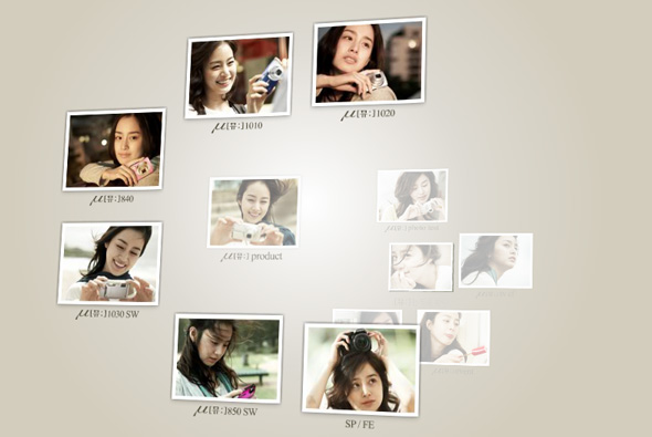
Site promoting the Olympus MJU camera in Korea. Navigating via an intuitive 3d multi depth picture based menu, you can explore the sections of the site. A minimal look and feel emphasize the smooth transitions, it is just really nice to navigate to the various features of the camera and play around with your perspective – making it enjoyable to use – a nice, minimal and elegant website.
Another nice campaign site from Uniqlo. A series of slow motion videos with people dancing and moving, shown from various angles, play for short periods of time and change position on the site over time. There is a simple menu with links to the clothing, and thats it! I like the way the videos are in circles and the progress is displayed around this circle. Another nice minimal approach, nicely done, and strangely compelling to watch.
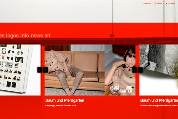
Nice site of Danish design company DesignBolaget. Presented in an interesting way, the items of work are scrolled along, and enlarged – nothing ground breaking but fun, structured well and it looks good. Nice rollovers, navigation and style.
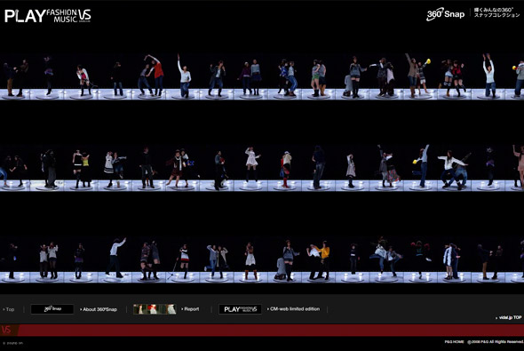
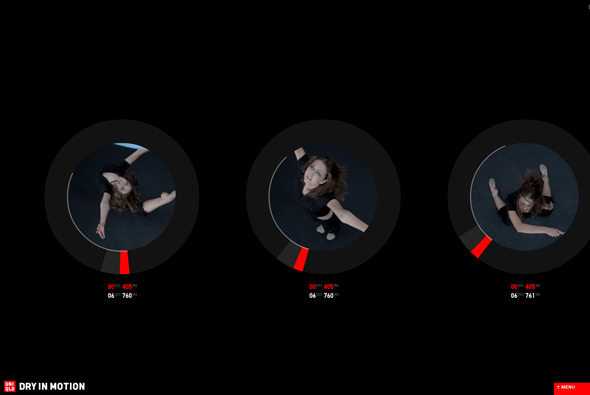
Nice idea for Vidal Sassoon in Japan, a booth that takes 360 degree photos of people has been setup for a new promotion. This has resulted in a nice set of photographs which can be seen in this interactive gallery. Each photo can be enlarged and there are some nice results that provide a quirky slow motion experience. Would have been really cool to be able to rotate each picture!
Made by Imaginative Inc.
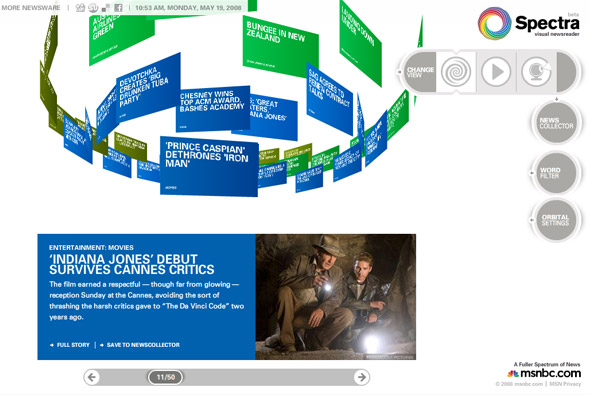
Very interesting way of presenting news, Spectra ‘visual newsreader’ for msnbc. You selected the channels to view, which then appear in a rotating ‘cloud’ of news items. The news items can be explored, saved, or you can click through to the full story. Your 3D view of the items can be changed and even interacted with a connected webcam – which is fantastic – as it works on the premise of colour. Each channel of news is a different colour i.e. blue for entertainment, hold up something blue to the camera and blue items will appear. What I really like is the attention to detail and the host of options and customisation available, your choices are saved, you can search – etc. Its a really nice concept and its always great to see new ways of presenting data in an interesting way.