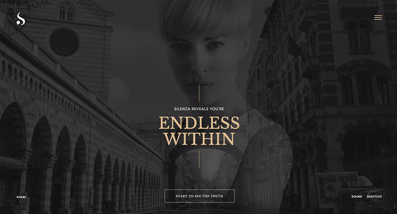
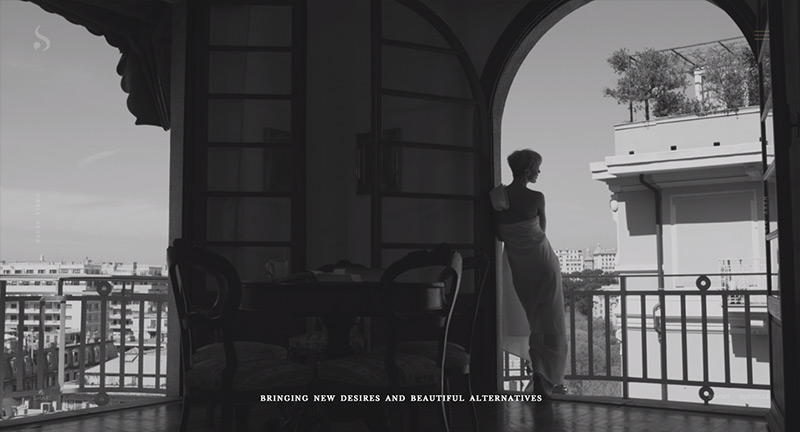
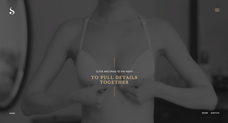
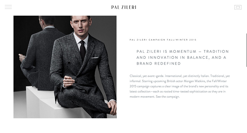
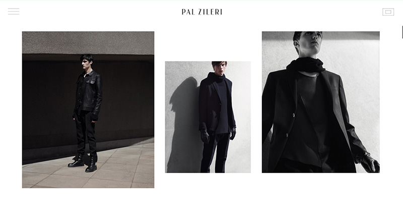
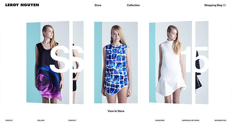
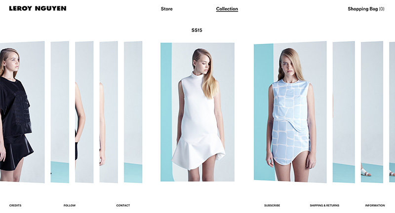
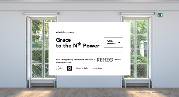
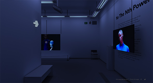
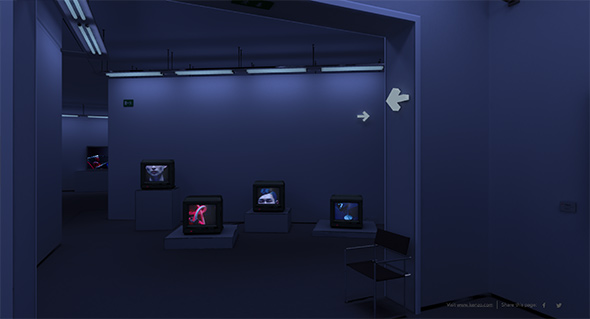
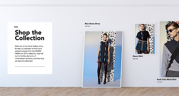
fashion

Silenzia

By | @webdesign | No Comments

silenzia-1
silenzia-2
silenzia-3

Site for Italian lingerie brand Silenzia. Featuring nicely shot full screen black and white video which places you in the lead female character. Prompting small moments of interactivity, choosing how to spend the day, or dragging the bra closure system – helps carry the story along and draw you in. The site design is minimal and elegant, whilst letting the content and story telling speak for itself.

Created by Fedoriv.

Site here…

Pal Zileri

By | @id_aquest | No Comments

pal-1
pal-2
pal-3

Site for Italian label Pal Zileri. Slick, simple, and elegant is a good way to describe the site – it feels very well crafted and seamless with the video playing full bleed and images zooming to full screen. The attention to detail is thorough, with lots of nice touches the preloader bar at the top, the menu, the cursor changes, the zooming. It looks great too, nice layout with well considered use of images and type.

Created by AQuest (@id_aquest).

Site here…

Namale

By | @__ThePhoenix | No Comments

namale-1
namale-2
namale-3

Site for Namale jewellery, and a short and sweet look book for their collection. Nicely styled site showcasing Namale’s range of jewellery – like the way the image splits and each segment scrolls to create the complete image. Also like the way the image goes full screen when you zoom into a specific product, small details help lift the experience. It looks lovely, with nice tone and grading throughout the site to help make it look premium.

Created by Phoenix The Creative Studio (@__ThePhoenix).

Site here…

House of Borel

By | @Immersive_g, @_blacknegative | No Comments

borel-1
borel-2
borel-3

Promo site for fashion brand House of Borel. Featuring a mysterious video walkthrough of small details, clicking on each ‘chapter’ reveals a secret layer behind the video highlighting details about the brand and their range of leather goods. Beautifully crafted, with 3D elements, love the dragging mechanism to scroll through the video – very cool and looks fantastic. Loads of attention to detail, nice sound and music, and really like the layout in the detail pages, full of video, depth and nice content – it all looks and works really great – really well crafted.

Created by blacknegative (@_blacknegative) and Immersive Garden (@Immersive_g).

Site here…

Fornasetti

By | @random_studio | No Comments

fornasetti-1
fornasetti-2
fornasetti-3

Fun site for Fornasetti, Italian design house from Milan. Love the intro and the playful animations and interactivity which are dotted throughout the site. Full of personality, which is great to see – from the product slideshows where the items float past peacefully through to the animations and interactions – all injecting a sense of fun. It looks good too, love the changing colours of the background, simple and elegant layout and typography.

Created by POMO and Random (@random_studio).

Site here…

Matter Productions

By | @webdesign | No Comments

matter-1
matter-2
matter-3

Site for Matter Production agency in London. Slick, simple and elegant – the site highlights their film projects spanning fashion, luxury and music. Nice use of video in the main carousel and layout which frames the content well, and the elegant transitions which bring in sliding panels of information.

Site here…

Elite Model France

By | @verde_io | No Comments

elite-1
elite-2
elite-3

Nice site for Elite Models in France. Slick and simple, love the offset grid for all the models and bold photographic approach. Lots of nice transitions for the various panels and interface, which creates an elegant and professional experience. It looks great, with nice use of white space and allowing the imagery to do the talking.

Created by Verde (@verde_io).

Site here…

Mélanie F

By | @wmnvm | No Comments

mel-1
mel-2
mel-3

Sweet and simple site for M̩lanie F Рa lookbook for their slippers range. Like the products themselves, the site is fun and colourful Рlove the elegant layout and smooth scrolling parallax decoration elements. Absolutely love the simple animated elements that really lift the experience Рand make it feel that more dynamic.

Created by Lionel Durimel (@wmnvm) and Julien Renau (@julien_rno).

Site here…

Priestly

By | @campquiet | No Comments

priest-1
priest-2
priest-3

Site for Priestly, creative agency based in Oregon. Stripped back web site with typography led layout, pared back to the essentials. Really simple and effective, and nicely considered – really like the typographic approach and the sticky elements when reading the content.

Created by Camp Quiet (@campquiet).

Site here…

The Great Discontent

By | @greatdiscontent | No Comments

discontent-1
discontent-2
discontent-3
discontent-4

Nice refresh of the The Great Discontent website, a magazine about creativity, entrepreneurship, and risk taking. The online version is a beautifully laid out variant of the printed magazine, with lovely typography and nice photography. Nicely considered for the screen, with nice big copy for reading the interviews and the pull out quotes – nicely structured too, easy to find other articles and browse around. And it is responsive too, nicely done…

Created by The Great Discontent (@greatdiscontent).

Site here…

R+Co

By | @webdesign | No Comments

rco-1
rco-2
rco-3
rco-4

Gorgeous site highlighting R+Co beauty and hair products. Love the layout, more akin to a fashion magazine – nice ever changing accent colour – and the offset titles and copy. The bold typography really accentuates the beautiful photography and fun layout. I love the ‘lookbook’ pages that show you all the products needed and styling tips – it looks fantastic, and all the subtle parallax style transitions gives the flat design some depth. Really nice looking site.

Site here…

KENZO Fall 2014

By | @kimbouti | No Comments

kenzo-1
kenzo-2
kenzo-3
kenzo-4

Lovely site promoting Kenzo’s Fall 2014 range – aiming to replicate a gallery experience from the browser and in 3D! You can connect your mobile device to use it as a trackpad to navigate the 3D gallery or use your mouse to move around the space. On the walls of the galleries are video pieces and images which you can peruse at your leisure. The exploratory nature of the interface is crafted well, and looks great, nice clean lines and moody lighting – I love that you exit through the shop where you can see the items from the gallery!

Created by DVDTKM (@kimbouti) and Cyril Agosta.

Site here…