Gyre

By | WEBSITES | No Comments

Gyre

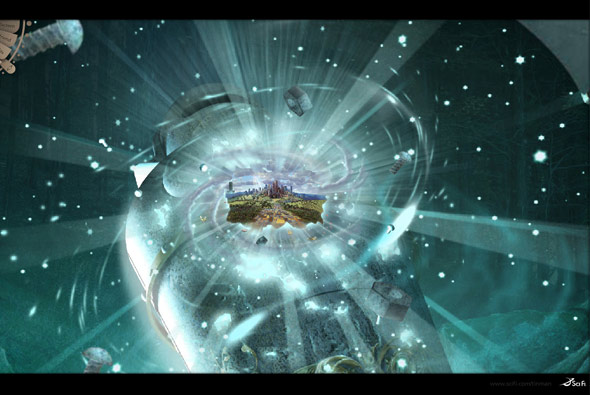
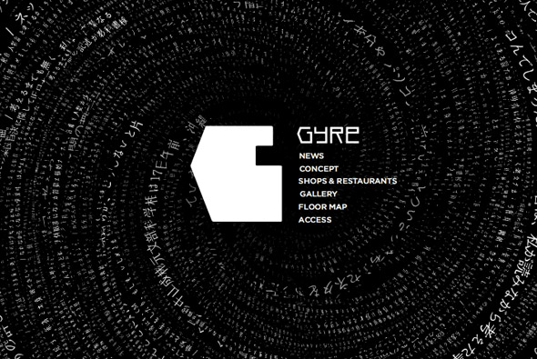
Beautiful website, promoting a new shopping centre in Japan. Set to a piano soundtrack sentances are formed in different patterns – giving an ethereal atmosphere, more akin to an art display. ‘Gyre’ means swirl, and as such the information displayed is always being updated and swirled around. This can be seen from inside the Gyre building, on your phone and on the website.

A wonderful simple idea – in terms of art direction and style – it just works really well and is a nice way to promote a concept. Created by one of my favourites tha ltd.

Website here…

Playground – Canon EOS

By | WEBSITES | No Comments

Playground - Canon EOS

Amazing site – powered by Papervision 3D – again!! Promoting the new Canon EOS 400D camera.

Really lovely style of interaction – you pan around and explore 3 different scenes each with interlocking pictures which move around in a 3D environment. This has got to be my favourite example of Papervision so far, the execution is really accomplished.

Created by Mediacatalyst.

Website here…

Feel Something

By | WEBSITES | No Comments

Feel Something

Very simple idea and execution demonstrating a nice concept to promote Foxtel, an Australian tv service. Short videos of people watching a selection of different tv channels set alongside a nice soundtrack. I really like its simplicity & concept – overall a nice little site.

Created by SOAP.

Website here…

RECYOU.

By | WEBSITES | No Comments

recyou.

Japanese Sony Walkman promotional site, using Papervision 3D to provide an enjoyable visual and audio feast! Explore faces mapped to 3D objects that dance in time to music, see them displayed in landscapes and mapped to various different shapes. An extremely well executed and fun Flash site, its so great to see experiential sites like this, just good fun and promoting a positive image for the Sony Walkman.

Created by NON-GRID, and more specifically developed by Keita a very talented flasher.

Website here…

The Infinite Oz

By | WEBSITES | No Comments

The Infinite Oz

Inspired by the classic Zoomquilt which has been around for years, ‘Infinite Oz’ is based on the SciFi Channel’s new mini series ‘Tin Man’ – a new take on the classic Oz tale. Nine artists have collaborated to make an endless journey where the viewer explores mystical scenes with ambient music and sounds. Like Zoomquilt you can control the direction of travel.

I am amazed that there hasn’t been many more examples of this style of navigation/user experience in the commercial world. I have always loved Zoomquilt, and its good to see people paying credit to its origins and getting good artists to make the scenes. A really nicely polished experiential website, created by B-Reel and Fallon.

Website here…

Nike ACG Sweetspots

By | WEBSITES | No Comments

Nike ACG Sweetspots

Another great example of a site integrating Papervision 3D, this is one of the best showcases of it I have seen to date. A globe highlighting ‘sweetspots’, i.e. a cool snowboarding area, is the main navigation – very easy to manipulate & use. The attention to detail and overall design & polish is really spot on, i.e. the motion blur whilst rotating, and lovely transitions.

Created by Duke, it is an inspiring, enjoyable example of a slick, usable, and cutting edge Flash site.

Website here…

Red Bull Mediamix

By | WEBSITES | No Comments

Red Bull Mediamix

Innovative Flash site providing video content in an interesting layout, really like the design and fantastic transitions. he way a mass of information is organised and displayed is really nice, with good use of rollovers and fades – its also very easy to use.

Made by Less Rain, they explain it best: “The purpose of the Mediamix is to bring media content – in particular video content – to the foreground and make existing media content more accessible through an innovative channel interface.One of the main goals has been the cross linking of all media with related content. Additionally all media items are downloadable, linkable and can be embedded on 3rd party sites with the branded Red Bull player you can see below.”

Website here…

Javier Ferrer Vidal

By | WEBSITES | No Comments

Javier Ferrer Vidal

Winner of the Flashforward2007 Boston Film Festival in the Typography category – again it’s been around for a while. But it is really well executed, not just down to the typography – but also in terms of navigation and style. Using 3D esque parallax navigation it is a joy to use and at times jaw dropping. It remains simple and easy to use but also the animation and transitions are amazing.

Website here…

Anteprima

By | WEBSITES | No Comments

Anteprima

Anteprima’s website for the autumn/winter range 2007. There are several nice touches – particularly the parallax style navigation – it just feels very fluid and intuitive.

Made by the famous Japanese agency FICC inc.

Website here…

Digitaria

By | WEBSITES | No Comments

Digitaria

Very nice and appropriate use of Papervision 3D! A kind of parallax environment which is cool to use. The rest of the site is pretty nice too, good use of Flash for a agency portfolio website…

Website here…

Seibu – Autumn Collection

By | WEBSITES | No Comments

Seibu - Autumn Collection

Another slick Japanese website, quite confusing to navigate (I guess as I can’t read Japanese!) – however the way images are presented is really nice. Could do with a bit of image smoothing though! I like the way they have made it quick to load by using small thumbnails – utilising it in the gallery view to great effect. Looking pretty stylish when you are cycling through the collection, with the next/previous images all pixellated.

Website here…

Honda – Inside Elysion

By | WEBSITES | No Comments

Honda - Elysion

Slick website promoting Honda’s new car ‘Elysion’ in Japan. Showing a series of photos taken every hour for 24 hours a day, all week, from the viewpoint of owning the car. It’s strength is the way it shows the photos – it is fun to navigate and use. The images zoom up to the full screen size, and I like the way they have restricted the user’s control of the size of the page, so they can’t resize the page once opened in fullscreen – always a bane for Flash designers!

Created by Simon Inc in Japan, make sure you view the ‘full screen’ mode.

Website here…

Oakley – Riders

By | WEBSITES | No Comments

Oakely

Not particularly an amazing technical / design driven site, but caught my imagination in terms of concept and execution. A really nice site by Oakley just showing their sponsored european snowboarders/skaters/surfers off in a series of websites. The site is structured like in a fun laid back style and is a basically a bit of fun with diaries and photos and competitions and so on.

Vicci’s site here…
Scott & Tlyer here…
Oli’s here…
Ben’s here…