Wanted

By | WEBSITES | No Comments

Wanted movie website

Pretty cool website of the movie ‘Wanted’. What I like about this site is the smooth slick navigation and the full screen layout, and the way the camera moves in and out to reveal the sections for each character. Might have been even better if the interface was not pre-rendered and more dynamic.

Made by projectc.net.

Website here…

Cristof Echard

By | WEBSITES | No Comments

Photography portfolio of Cristof Echard. Full of movement and a using a quasi 3d interface this website is a good example of a modern, slick portfolio. I like the way the images move around in 3d space and the many touches and high attention to detail, i.e. the tumbnails and the way images are loaded in. Nice!

Made by Creaktif.

Website here…

Font Park

By | WEBSITES | No Comments

font park

The Morisawa Font Park 2.0 is a playground for creating images from characters. By dragging characters onto the stage you can then scale, rotate, break apart and move the various letters. This is all done via a really intuitive interface that is very fluid and easy to use. You can also view a gallery of images other people have made, it even goes as far as to show the movements they made to create the final image. The polish and high level of coding makes this a really accomplished website.

Eva Padberg

By | WEBSITES | No Comments

Eva Padberg

Lovely portfolio website of model Eva Padberg. A slick website showcasing shots of the model, via a fan like carousel of images. I particularly like the way you navigate through the images and can also select any from the left hand list. It works really well and is easy to use, and fun to navigate.

Crafted by Siteseeing.

Site here…

Pen Web

By | WEBSITES | No Comments

Pen Web

Really interesting site, showcasing the creative awards of Pen. A very simple, minimal site where you control the panning and movement of the camera whilst images appear and float from bottom to top, pausing when you rollover them, the camera zooms in when you click. Nice.

Created by Hisayuki Takagi, site here, blog here.

Site here…

Olympus MJU

By | WEBSITES | No Comments

Olympus MJU

Site promoting the Olympus MJU camera in Korea. Navigating via an intuitive 3d multi depth picture based menu, you can explore the sections of the site. A minimal look and feel emphasize the smooth transitions, it is just really nice to navigate to the various features of the camera and play around with your perspective – making it enjoyable to use – a nice, minimal and elegant website.

Site here… 

Ford KA

By | WEBSITES | No Comments

Ford Ka

Great website for the new Ford Ka in Brazil. Based on the concept that you are tiny – you select an insect character to begin the story – so you can explore the features of a car from a new, small perspective. The site is navigated horizontally scrolling through a tapestry of surreal artwork showing the features of the car. There are lots of little interactive and animated elements encouraging you to explore the various sections and thus discovering the features of the car. I really like the attention to detail but also the style of the artwork, slightly bleached and surreal, it looks fantastic. A really interesting way of providing a unique user experience promoting a car – much more interesting than the usual car sites.

Made by JWT Brazil.

Site here…

Lumina Live

By | WEBSITES | No Comments

Lumina Live

Site of events company Lumina Live, specialising in creating interactive events in art, music, design and fashion. Whats cool about this site are the 3d transitions and that it is open for the audience to create their own pixel artwork on the site, sequence music and so on – you can create an identity and view other peoples additions to the site. The 3d pixellated background provides a subtle backdrop to the various sections of the site – sit back and view the videos and artwork and so on from a distance!

Created by Kilo Studio.

Website here…

Which Road to Take

By | WEBSITES | No Comments

Which Road to Take

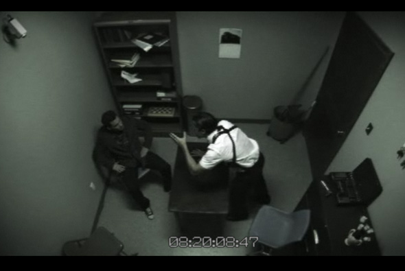
Viral site for a new NFS game, viewers are driven to the url which is seen at the end of video banners. Greeted by a looping video apparently from a security camera, there are no hints as to what can be done. By clicking on certain areas of the site i.e. the lightswitch, you trigger events and unveil clues. Interesting way of teasing the audience, I first thought it was for a new film release, but after a quick search many forum posts have ‘solved’ the mystery. It always amazes me how often you present a puzzle and how people will spend an amazing amount of time and trouble to find the answer, check out this page. Nice idea and nicely executed.

Site here…

Melmac

By | WEBSITES | No Comments

Melmac website

Nice portfolio site of Danish agency Melmac. Nicely executed and easy to use portfolio of some good work, in particular the motion design section reveals some nice videos. Although done many times before, I like the full screen layout and the way each section and project is presented with fresh content with each click. Nothing ground breaking, just nice stuff!

Site here…

Beach Volleyball

By | WEBSITES | No Comments

Beach Volleyball

Very interesting site for the German beach volleyball team. I’ve selected this because of the mechanism used to explore each section of the site. Each section has its own 3D scene, using your mouse to move left to right the movement causes the camera to move and pan along a path. This all provides a very fluid and intuitive navigation system that looks and feels great – with the camera floating through the scene it gives a really interesting and enjoyable way of exploring the site.

Created by Decade One.

Website here…

Lexus RX 350

By | WEBSITES | No Comments

Lexus RX 350

Russian website for the Lexus RX 350. Working on the premise of not clicking, you interact with all sections of the site just by mousing over elements of the site. Initially a bit clunky but you get used to it, but it is an interesting approach that works well. The site looks great, with loads of really effective transitions and animations, and many nice touches. Some sections are done in a quasi 3D paralax style which, again, looks great and works well – nice site. 

Made by Brand Studio.

Site here…

Nike Lab

By | WEBSITES | No Comments

Nike Lab

Nike’s site to promote their products for the olympics. This is a great example of good slick website design, lots of great touches and rollovers/animations. Full Flash site, with many sections, it is functional, easy to use, but with the addition of looking great and providing a good user experience – great attention to detail.

Created by AKQA

Site here…