All posts by Dan

Dry In Motion – UNIQLO

By | WEBSITES | No Comments

Dry In Motion

Another nice campaign site from Uniqlo. A series of slow motion videos with people dancing and moving, shown from various angles, play for short periods of time and change position on the site over time. There is a simple menu with links to the clothing, and thats it! I like the way the videos are in circles and the progress is displayed around this circle. Another nice minimal approach, nicely done, and strangely compelling to watch.

Website here…

MINT

By | WEBSITES | No Comments

MINT

Website of ‘MINT’ brazilian fashion agency. Showcasing shoots and magazine spreads, the 3D floating thumbnail navigation interface crops up again, controlled by the mouse wheel you zoom through the portfolio. The mouse controls the panning and tilt of your view and is nicely done. Lots of nice transitions and effects make this an enjoyable experience. Nice photos too…

Made by Grafikonstruct.

Site here…

Julian Velard

By | WEBSITES | No Comments

Julian Velard

Fantastic website for singer/songwriter Julian Velard. You are free to explore his mind and play puzzles, reveal music and experience his world. Incredibly addictive you want to explore every area, and discover all the scenes, it draws you in and of course the background music is his own. Great way of keeping the audience captive and providing an enjoyable way of promoting yourself. I played on this for over half an hour and loved it, really well designed and executed was a joy to play with.

Crafted by the amazing WEFAIL.

Website here…

Keal

By | WEBSITES | No Comments

Keal

Interesting site of Brazilian agency Keal. Nice take on the panning & scrolling navigation interface – the menu is also inlcuded which quite cool. Some good work too, nice touches and attention to detail, clean, crisp and modern.

Website here… 

Natasja Fourie

By | WEBSITES | No Comments

Natasja Fourie

Very stylish portfolio site of photographer Nastasja Fourie, great work, great site. Divided by ‘work’ and ‘play’ sections to display a collection of photographs. Slightly pretentious intro, but once past that, there is a nice soundtrack and sound fx, a motion design feel to it, lots of nice effects and transitions – all stylish. Really like the amount of animation and attention to detail throughout the site – really provides a nice presentation to the work.

Created by Kris Cook.

Site here…

DesignBolaget

By | WEBSITES | No Comments

designbolaget

Nice site of Danish design company DesignBolaget. Presented in an interesting way, the items of work are scrolled along, and enlarged – nothing ground breaking but fun, structured well and it looks good. Nice rollovers, navigation and style.

Site here…

The Eco Zoo

By | WEBSITES | No Comments

The Eco Zoo

Beautiful, stunning work! Not quite sure what it is for – but it is inspiring you to take better care of the environment. Just simply an amazing website. Built around a cut out concept where the stories of various characters are told, through a cut out look and feel executed in a 3d fashion. When you click on a character your view zooms to the pop up book of their story, the beauty of it is the panning and rotating of the camera around the book, there is a huge attention to detail – by rotating the view you can see more details and explore the scene. I love the concept and the look and feel of the whole site, it is truly inspiring – where technology and design meet in unison – the 3d element is smooth and perfectly executed, the visuals are great and fun.

Created by the ultra talented Masayuki Kido, known as ROXIK – of Pictaps fame. He used his own 3d engine ‘Sharikura’.

Website here…

Uniqlo Try

By | WEBSITES | No Comments

Uniqlo Try

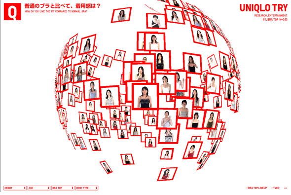
Wow, another amazing Japanese website for Uniqlo – the presentation of opinions of 343 customers to a bra Uniqlo make! The work created for Uniqlo has been consistently amazing, always technically brilliant backed up with a nice concept. This is another example of that, instead of producing something simple & boring, something that is essentially about a survey, a fantastic 3d representation of opinions has been created. Floating through the opinions the way the data is presented is constantly flowing from one state to another, making new 3d shapes, and morphing colours. I really like the crisp presentation coupled with the smooth transitions and fast performance of the site. Technically proficient and well executed to present a really enjoyable user experience.

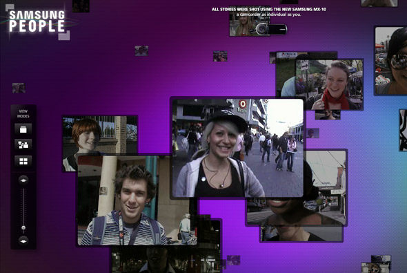
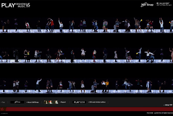
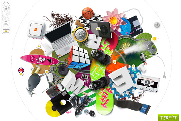
I have long been a fan of Japanese web design and its really good to see so many amazing sites appearing. The mix of music, technical excellence, and simple layouts provide the fun, colourful, and enjoyable approach that is often common place in Japanese designs. So often the more imaginative, conceptual side of web design is ignored for the slicker, polished look and feel, it is so refreshing to see a different viewpoint.  

Created by Simone Inc.

Website here…

Play > Smart

By | WEBSITES | No Comments

Play > Smart

Another great Japanese website, this time promoting the Smart car in Japan. In 3d you can design and drive your own Smart car, the great thing about the driving part is the way it is thought out. Presented in a ‘join the dots’ fashion, you drive your car from point to point, when completed the camera zooms out to reveal the picture you have just made, you can then download it or try again. There are several puzzles to complete and you get points to unlock design parts for your car. This is all set in a fun, easy to use look and feel, just a fun well thought out and executed site. Similar in many ways to the Red Bull Flightlab.

Created by CMD9.

Website here…

Samsung People

By | WEBSITES | No Comments

Samsung People

Site promoting Samsung’s MX-10 camcorder – hundreds of people were asked ‘Where is your mind?’, this site shows the results. A nice scrolling interface to display the various videos, which you can view in different ways. Good attention to detail and nice transitions and effects.

Made by Holler Sydney.

Site here…

360 Snap

By | WEBSITES | No Comments

360 Snap

Nice idea for Vidal Sassoon in Japan, a booth that takes 360 degree photos of people has been setup for a new promotion. This has resulted in a nice set of photographs which can be seen in this interactive gallery. Each photo can be enlarged and there are some nice results that provide a quirky slow motion experience. Would have been really cool to be able to rotate each picture!

Made by Imaginative Inc.

Site here…

TERM’IT

By | WEBSITES | No Comments

Term’it

Interesting site for Russian clothing brand Term’it. The explorable interface has 3 main levels, where you can zoom in, rotate and pan around to see the clothing amongst other things. Technically it well accomplished, and works well – the rotation and zooming is smooth and feels good to use. Nice attention to detail and intelligent loading of sections means it all provides a good user experience. I like the thumbnails of the clothing and the playful way they are displayed.

Made by PARK Studio.

Website here…

Joshua Sterns

By | WEBSITES | No Comments

Joshua Sterns

Photography portfolio of Joshua Sterns. Nice way of viewing & scrolling the images – in that the thumbs are displayed vertically, scrolling up and down by moving the mouse, it fits to screen size too. Also really nice way of filtering the images, i.e. portrait, etc – all the images shuffle around to display the criteria. Images can be clicked to view the full size – and are even deeplinked in the Flash. Very accomplished and well made photographers portfolio – nice!

Created by Zero Style.

Website here…

Spectra

By | WEBSITES | No Comments

Spectra

Very interesting way of presenting news, Spectra ‘visual newsreader’ for msnbc. You selected the channels to view, which then appear in a rotating ‘cloud’ of news items. The news items can be explored, saved, or you can click through to the full story. Your 3D view of the items can be changed and even interacted with a connected webcam – which is fantastic – as it works on the premise of colour. Each channel of news is a different colour i.e. blue for entertainment, hold up something blue to the camera and blue items will appear. What I really like is the attention to detail and the host of options and customisation available, your choices are saved, you can search – etc. Its a really nice concept and its always great to see new ways of presenting data in an interesting way. 

Created by Fluid and SSK.

Site here…